 Adobe Community

Copy link to clipboard
Copied
Hello everyone -
Im a self taught beginner, I love coming here and being able to get my questions answered! I built my first dreamweaver website and published it three months ago. (this is the first website I've actually published). However, I am running into a problem....it keeps changing on me even though I have not updated or touched the files since.
Everything looked great at first - but now it looks like one of the tabs cant find the CCS page (all the images are jumbled, none of the layout is right). Some computers see some images, while others dont. Then - it can suddenly change, it can work again, or something else can go wrong.
Any idea on what is going on? I am not experienced at hosting websites so I may be missing something. I did not have any security/SSL certficiates. I bought this and hope to have it set up asap. Go daddy is the host.
Any tips or links to articles/tutorials would be amazing. Thank you!


 1 Correct answer

katez95269803 wrote
Is it possible im having trouble because of chrome updates?
No. It's caused by code errors. For example, you have no opeing <body> tag, too many stray <h1, h2> nand <h3> tags and no clsoing </body> or </html>. This page cannot load properly.
Showing results for http://kzdesign.org/ads.html - Nu Html Checker
 13
Replies
13
13
Replies
13

Copy link to clipboard
Copied
What page causes trouble?
Copy link to clipboard
Copied
So - only so far these two have been inconsistent:
Advertisments - everything is jumbled for me, even though it was working before on the same computer, same internet browser. It looks like it cant read the CSS file.
Marketing - missing pictures for one section. Same as before, it was working fine on the same computer and browser.
Is it possible im having trouble because of chrome updates? But it is reassuring that I am only having trouble with the same pages. Thank you for trying to help me!!
Copy link to clipboard
Copied
katez95269803 wrote
Is it possible im having trouble because of chrome updates?
No. It's caused by code errors. For example, you have no opeing <body> tag, too many stray <h1, h2> nand <h3> tags and no clsoing </body> or </html>. This page cannot load properly.
Showing results for http://kzdesign.org/ads.html - Nu Html Checker
Alt-Web Design & Publishing ~ Web : Print : Graphics : Media
Copy link to clipboard
Copied
Thank you so much! Im going to try to go in and fix everything 
Copy link to clipboard
Copied
My gosh, that page is really huge. Even on my desktop, it's grosly oversized. I fear people on smaller devices (phones & tablets) will have a very awkward experience.
Apart from the liberal usage of absolute positioning for your primary layout (pure poison), you have critical code errors in your HTML and no content on your home page. It's all just images. When I hide images in my browser, guess what I see? A blank page. That's what Google sees too. A blank page that contains no keyword rich text inside HTML headings and paragraph tags. Ouch!
Work on the these 3 main things.
- Your site is not responsive to fit all devices.
- Owing to all the critical code errors, it cannot load properly.
- And it's not optimized for search engines.
Alt-Web Design & Publishing ~ Web : Print : Graphics : Media
Copy link to clipboard
Copied
You could create a responsive layout with Bootstrap. Being Mobile friendly is a big deal these days. Failure is not an option. Welcome! | Search | Google Developers
In this example, the layout breaks from 4 columns to 3 and then to 2 and finally to 1 on small devices.
Large desktop

Tablet

Phone

The code.
<!doctype html>
<html lang="en">
<head>
<meta charset="utf-8">
<title>Bootstrap 4</title>
<meta http-equiv="X-UA-Compatible" content="IE=edge">
<meta name="viewport" content="width=device-width, initial-scale=1">
<!--Bootstrap 4 CSS-->
<link href="https://maxcdn.bootstrapcdn.com/bootstrap/4.0.0-beta/css/bootstrap.min.css" rel="stylesheet" integrity="sha384-/Y6pD6FV/Vv2HJnA6t+vslU6fwYXjCFtcEpHbNJ0lyAFsXTsjBbfaDjzALeQsN6M" crossorigin="anonymous">
<style>
body {height: 100vh;}
.flex-grow {flex: 1 0 auto;}
</style>
</head>
<body class="d-flex flex-column">
<!--Centered navbar-->
<nav class="navbar navbar-expand-lg navbar-dark bg-dark">
<div class="collapse navbar-collapse w-100 order-1 order-lg-0" id="navbarNav">
<ul class="navbar-nav">
<li class="nav-item active"> <a class="nav-link" href="#">Home</a> </li>
<li class="nav-item"> <a class="nav-link" href="#">Menu 2</a> </li>
<li class="nav-item"> <a class="nav-link" href="#">Menu 3</a> </li>
<li class="nav-item"> <a class="nav-link" href="#">Menu 4</a> </li>
</ul>
</div>
<div class="d-flex w-100 order-0">
<div class="w-100">
<button class="navbar-toggler" type="button" data-toggle="collapse" data-target="#navbarNav"> <span class="navbar-toggler-icon"></span> </button>
</div>
<a class="navbar-brand text-center w-100" href="#">Brand / Logo </a> <span class="w-100"></span> </div>
<span class="w-100"></span> </nav>
<!--main content-->
<main class="container flex-grow">
<div class="row text-center">
<div class="col-sm-6 col-md-4 col-lg-3"> <img class="img-thumbnail" src="https://dummyimage.com/400x350" alt="logo">
<p>Lorem ipsum dolor sit amet, consectetur adipisicing elit.</p>
</div>
<div class="col-sm-6 col-md-4 col-lg-3"> <img class="img-thumbnail" src="https://dummyimage.com/400x350" alt="logo">
<p>Lorem ipsum dolor sit amet, consectetur adipisicing elit.</p>
</div>
<div class="col-sm-6 col-md-4 col-lg-3"> <img class="img-thumbnail" src="https://dummyimage.com/400x350" alt="logo">
<p>Lorem ipsum dolor sit amet, consectetur adipisicing elit.</p>
</div>
<div class="col-sm-6 col-md-4 col-lg-3"> <img class="img-thumbnail" src="https://dummyimage.com/400x350" alt="logo">
<p>Lorem ipsum dolor sit amet, consectetur adipisicing elit.</p>
</div>
<div class="col-sm-6 col-md-4 col-lg-3"> <img class="img-thumbnail" src="https://dummyimage.com/400x350" alt="logo">
<p>Lorem ipsum dolor sit amet, consectetur adipisicing elit.</p>
</div>
<div class="col-sm-6 col-md-4 col-lg-3"> <img class="img-thumbnail" src="https://dummyimage.com/400x350" alt="logo">
<p>Lorem ipsum dolor sit amet, consectetur adipisicing elit.</p>
</div>
<div class="col-sm-6 col-md-4 col-lg-3"> <img class="img-thumbnail" src="https://dummyimage.com/400x350" alt="logo">
<p>Lorem ipsum dolor sit amet, consectetur adipisicing elit.</p>
</div>
<div class="col-sm-6 col-md-4 col-lg-3"> <img class="img-thumbnail" src="https://dummyimage.com/400x350" alt="logo">
<p>Lorem ipsum dolor sit amet, consectetur adipisicing elit.</p>
</div>
</div>
</main>
<footer class="bg-dark text-warning text-center">
<p class="p-2">On short pages, footer hugs bottom of screen.</p>
</footer>
<!--latest jQuery Core-->
<script src="https://code.jquery.com/jquery-3.2.1.min.js" integrity="sha256-hwg4gsxgFZhOsEEamdOYGBf13FyQuiTwlAQgxVSNgt4=" crossorigin="anonymous"></script>
<!--Popper JS-->
<script src="https://cdnjs.cloudflare.com/ajax/libs/popper.js/1.11.0/umd/popper.min.js" integrity="sha384-b/U6ypiBEHpOf/4+1nzFpr53nxSS+GLCkfwBdFNTxtclqqenISfwAzpKaMNFNmj4" crossorigin="anonymous"></script>
<!--latest Bootstrap 4 JS-->
<script src="https://maxcdn.bootstrapcdn.com/bootstrap/4.0.0-beta/js/bootstrap.min.js" integrity="sha384-h0AbiXch4ZDo7tp9hKZ4TsHbi047NrKGLO3SEJAg45jXxnGIfYzk4Si90RDIqNm1" crossorigin="anonymous"></script>
</body>
</html>
Alt-Web Design & Publishing ~ Web : Print : Graphics : Media
Copy link to clipboard
Copied
This is SO SO helpful. Ive been meaning to create it to be mobile/tablet friendly, but have been kind of daunted by the idea. This really helps me out!
Copy link to clipboard
Copied
If you would be so kind, could you briefly explain how to make the website responsive? Thank you for all your help, its been a life saver. I almost gave up on this project, and coding in general.
I see how to build each one (desktop, tablet, mobile) but how do I tell the code to be responsive and read each device and know to switch between layouts?
Copy link to clipboard
Copied
there is a standard mecanism understood by all modern browser which is called media queries and which applies the right CSS to the right device, this filtering depends on the choiced properties (by the developer) such device width, orientation ratio, pixel density.... and others
https://developer.mozilla.org/en-US/docs/Web/CSS/Media_Queries/Using_media_queries
does this helps you ?
Copy link to clipboard
Copied
The Bootstrap code I posted earlier is responsive in all device widths. Bootstrap is a 12 box mobile first framework meaning it defaults to 1 col on devices less than 575px wide. See link below.
The five pre-built media query classes are:
.col-(extra small devices - screen width less than 576px).col-sm-(small devices - screen width equal to or greater than 576px).col-md-(medium devices - screen width equal to or greater than 768px).col-lg-(large devices - screen width equal to or greater than 992px).col-xl-(xlarge devices - screen width equal to or greater than 1200px)
Alt-Web Design & Publishing ~ Web : Print : Graphics : Media
Copy link to clipboard
Copied
Hm, when I cut and paste it into Dreamweaver and preview it in Google Chrome, it doesnt respond to making the window bigger or smaller. Is this normal? Do I have to do something else?
Oh thank you for pointing out the pre-built classes - that makes a lot of sense.
(Sorry im a visual/kinesthetic learner so its really hard for me to grasp this! lol!)
Copy link to clipboard
Copied
Copy & paste my entire code into a new, blank document.
SaveAs test.html.
Right-click on document tab and select Open in Browser.
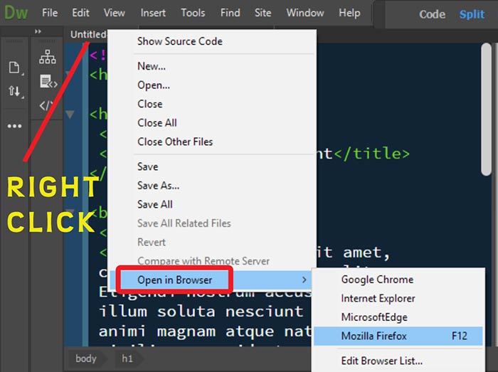
My mobile, tablet & desktop screenshots are from the latest Firefox but it also works in Chrome, MS Edge, IE 11, Safari...
Alt-Web Design & Publishing ~ Web : Print : Graphics : Media
Copy link to clipboard
Copied
AH!
Thank you, I re-copied and pasted it and it worked. So sorry, I must have missed part of the code before. Silly.
Thank you so much for all your help and time - I really really appreciate it!
 AdChoices