 Adobe Community
- Home
- Dreamweaver
- Discussions
- Responsive Website in Dreamweaver CC 2017
- Responsive Website in Dreamweaver CC 2017
Responsive Website in Dreamweaver CC 2017

Copy link to clipboard
Copied
I'm a newbie and have created a 5 page website for my company in Dreamweaver CC 2017.......dfwlonghornconstruction.com
The problem is with the display on a cell phone. I thought it was set up as a responsive site from the CC videos I watched and followed but apparently I'm a idiot and did not succeed. So, my question is this......how can I make a existing Dreamweaver CC 2017 website responsive so that it goes across all forms of screens properly without major changes to the CSS files or code, if possible?
I've been reading about Bootstrap and that sounds like a possibility until it sounds like I have to redo my website and reformat it.
HELP!
Sincerely,
Darrell


 10
Replies
10
10
Replies
10

Copy link to clipboard
Copied
To make an existing site a responsive site, you will need extensive CSS knowledge.
If I were to do that (change an existing site to responsive), I would get rid of my existing style sheet(s) and start afresh. I would style the site for the smallest device first. Once that is done, I would use media queries to override the original style rules for medium sized devices after which I would use media queries to override those style rules for larger devices.
But, because I have Bootstrap experience, I would recreate the site using the framework. I have found this to be the quickest and safest method.
Copy link to clipboard
Copied
Thank you for your response.
Copy link to clipboard
Copied
I just watched the videos and I get the jest of the media queries.....looks simple if I wanted to changed the color of text in a heading. Do I need to add every item such as (Body, Images, Footer, Aside, etc) in each media querie?
Copy link to clipboard
Copied
An emphatic no, you only need to change those elements that require changing in the next device. Colours are least likely to change from view to view.
I noticed that the video shows desktop first. That is what I used to do when I first started with responsive design, mainly because I was used to designing/developing a fixed layout (pre-handheld). I soon realised that mobile view was the hardest to create because of lack of real-estate. I got tangled up and decided to go for mobile first. With the restricted real-estate, concentrating on content is more important than design. Once the mobile view has been created, it is easier to add design to enhance the view on larger devices.
As an example, mobile view will have a single column while desktop view may have four columns.
This is where Bootstrap will help you. Bootstrap is classified as a framework, but is in effect a library of style rules and widgets. As a starter, Bootstrap 4 is probably the way to go where Bootstrap 4 Tutorial is a good starting point.

Copy link to clipboard
Copied
Its good everyone has different views. Personally l always start with desktop first as to me its far easier to take away whats not required or reposition elements using media queries for mobiile devices.
As a starter its very easy to get into poor coding habits, Bootstrap is one of them in my opinion. Of course this depends largely on how committed you are to web development. If you just delve in and out of it to maintain a single site and dont have the desire to learn to code frameworks might be the only option open to you.

Copy link to clipboard
Copied
You can get a pretty quick idea of what it entails to convert your site to a responsive layout by checking out some quick videos:
Making your site responsive in Dreamweaver CC 2017 [04/13] - YouTube
If you want to see Daniel Scott's full playlist, check it out here:
Make sure to press "✔ Correct Answer" on this post if this answers your question. Happy Creating!
Anissa • @anissat

Copy link to clipboard
Copied
I realize it's frustrating when you put a lot of time into something and it doesn't meet expectations. But don't be discouraged. We learn more from our mistakes than we do from successes.
I'm seeing some usability problems such as this. See screenshot.
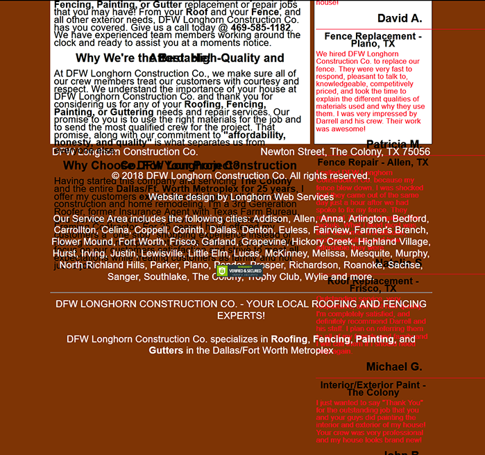
Start by fixing your code errors.
Showing results for https://www.dfwlonghornconstruction.com/ - Nu Html Checker
Also filenames should not contain spaces or special characters. You may use underscores _ or hypehns - in filenames. To avoid further errors, rename your images without spaces. EDIT: Also optimize your images for the web. Presently, they are way too big. I like to keep my images under 100 KB each for a faster loading web page
If this is for your business, you might want to spend a few dollars and purchase a responsive CSS Template from Project Seven.
Responsive Web Design Extensions, Apps, Add-ons and Plugins for Dreamweaver
Alt-Web Design & Publishing ~ Web : Print : Graphics : Media
Copy link to clipboard
Copied
For those who have replied with responses......thank you very much! I've been learning a lot of lessons in the past 4 months while creating my site/sites and I have many more to learn. Thank you!
Ok. Nancy.....my question is on what site are you viewing my website www.dfwlonghornconstruction.com The reason I ask is because when I pull it up in Google, Bing, or Yahoo it looks exactly as it does in Dreamweaver CC 2017 Live and also on the webpage view to see the changes. I was freaking out today when I saw the screenshot. Thank you for the HTML checker to help me with my coding. I'm definitely serious about this and I want it to be right. I know it's not going to be perfect, but I'm trying! Ultimately, my goal is to created approximately 40 websites that are similar in nature to my first one. Think of this like a mini franchise that I'm the mad scientist behind!
I come on here often and see your responses to others and I appreciate the time that you and others here take to help people like me get a better understanding of how and why to do certain things. I truly appreciate your knowledge and expertise!
Copy link to clipboard
Copied
darrelll75538883 wrote
Ok. Nancy.....my question is on what site are you viewing my website www.dfwlonghornconstruction.com The reason I ask is because when I pull it up in Google, Bing, or Yahoo it looks exactly as it does in Dreamweaver CC 2017 Live and also on the webpage view to see the changes. I was freaking out today when I saw the screenshot.
If you use the zoom feature in your browser you will see that all the text starts overlapping and causing a right old mess. I havent looked at your code but this is either as a result of you setting specific heights on your divs or using absolutely positioned divs.
You cannot be completely sure how a viewer has their browser set up. They may be sight challenged and need to zoom to read the information or they may just have a larger font set in their browser by default, so you need to take that possible situation into consideration when you build a page.
Copy link to clipboard
Copied
osgood_ wrote
If you use the zoom feature in your browser you will see that all the text starts overlapping and causing a right old mess. I havent looked at your code but this is either as a result of you setting specific heights on your divs or using absolutely positioned divs.
The explicit CSS Height values are wreaking havoc. But the layout is not responsive and that's a critical impediment to mobile and tablet users. So the layout needs to be rebuilt.
Alt-Web Design & Publishing ~ Web : Print : Graphics : Media
 AdChoices