 Adobe Community
- Home
- Dreamweaver
- Discussions
- Setting embedded youtube videos to fill the screen...
- Setting embedded youtube videos to fill the screen...

Copy link to clipboard
Copied
I would like to thank everyone for their continued help with this code. I think this is probably the last problem that I have been running into with the website. Thank you for all of your help.
I'm trying to make an embedded YouTube video stretch to fill all available width (and not stretch the page out) of a page on any resolution. Just like the adaptive pictures on my website. I already know how to use media queries, and the goal is to set the video to become completely adaptive on resolutions lower than 1000px. I'm using this for most of the elements on my website and I have been trying to use the same code for my video, but it's not working for some reason.
This is my page.
The video is toward the bottom of the page. Right now on small screens the video stretches completely out of the screen. I also don't have any styles applied anywhere for the video's div class, but I did try using the width:100% attribute, but to no avail.
this is the code for the embedded video...
<div class="videos">
<iframe width="1920" height="1080" src="https://www.youtube.com/embed/zIP2iVV6vOU" frameborder="0" allow="accelerometer; autoplay; encrypted-media; gyroscope; picture-in-picture" allowfullscreen></iframe>
</div>
I am aware that it is set to 1920, 1080, but I thought (like with the pictures on my website) I could style it differently with a media query?
Is there anything I could do to achieve the intended results?
Thank you again. I really appreciate all of this.
Message was edited by: Mod. (Link Removed)


 1 Correct answer

Responsive YouTube. No Bootstrtap.
...<!doctype html>
<html lang="en">
<head>
<meta charset="utf-8">
<title>Responsive YouTube video</title>
<meta http-equiv="X-UA-Compatible" content="IE=edge">
<meta name="viewport" content="width=device-width, initial-scale=1">
<style>
.container {
width: 80%;
margin:0 auto;
}
.responsive-video{
overflow:hidden;
padding-bottom:56.25%;
position:relative;
height:0;
}
.responsive-video iframe{
left:0;
top:0;
height:100%;
width:100%;
position:absolute;
}
 10
Replies
10
10
Replies
10

Copy link to clipboard
Copied
you're welcome.
I don't understand your objective. Currently, the video is adaptive to the width of the content which is actually adapted to the width of the page.
from the minimum width to 5000+ pixels wide the video adapts its own width.
so what do you want to do?
Copy link to clipboard
Copied
The pictures on my website are responsive. They change with the size of the page on mobile devices, so that you can actually see the complete image. When I pull this website with the video up on my mobile device or in a shrunken window of any web browser the video stays fixed at one size instead of changing (just like the pictures on my site) with the size of the screen.
Basically, before hitting play and full screen on the video, the tumbnail to the video is so large it cuts off on mobile devices. I don't want that. I want to scale responsively with the page.

Copy link to clipboard
Copied
Google for responsive youtube video. There are examples on Codepen if you search which are simple to implement, requiring a couple of additional css properties/selectors
Copy link to clipboard
Copied
If you had taken my earlier suggestion and rebuilt your site with Bootstrap, this would be a snap using the built-in responsive embed utility classes. The code can be easily inserted from the Bootstrap Snippets in DW CC. See screenshot.
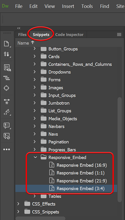
This code maintains responsive video + the correct aspect ratio (21:9, 16:9, 4:3 or 1:1) when video or slideshows are re-scaled to fit all devices.
<!doctype html>
<html lang="en">
<head>
<title>Bootstrap Responsive Video Examples</title>
<meta charset="utf-8">
<meta name="viewport" content="width=device-width, initial-scale=1">
<!--Bootstrap CSS-->
<link rel="stylesheet" href="https://maxcdn.bootstrapcdn.com/bootstrap/4.3.1/css/bootstrap.min.css">
</head>
<body>
<div class="container">
<div class="row">
<div class="jumbotron">
<h2>Responsive Embed</h2>
<p>Create a responsive video and scale it nicely to the parent element on any viewport.</p>
</div>
</div>
<div class="row">
<div class="col">
<h2>Aspect ratio 1:1</h2>
<div class="embed-responsive embed-responsive-1by1">
<iframe class="embed-responsive-item" src="https://www.youtube.com/embed/tgbNymZ7vqY"></iframe>
</div>
<hr>
<h2>Aspect ratio 4:3</h2>
<div class="embed-responsive embed-responsive-4by3">
<iframe class="embed-responsive-item" src="https://www.youtube.com/embed/tgbNymZ7vqY"></iframe>
</div>
<hr>
<h2>Aspect ratio 16:9</h2>
<div class="embed-responsive embed-responsive-16by9">
<iframe class="embed-responsive-item" src="https://www.youtube.com/embed/tgbNymZ7vqY"></iframe>
</div>
<hr>
<h2>Aspect ratio 21:9</h2>
<div class="embed-responsive embed-responsive-21by9">
<iframe class="embed-responsive-item" src="https://www.youtube.com/embed/tgbNymZ7vqY"></iframe>
</div>
</div>
</div>
<div class="row">
<footer> Footer goes here.... </footer>
</div>
</div>
<!--First jQuery then Popper then Bootstrap JS-->
<script src="https://ajax.googleapis.com/ajax/libs/jquery/3.3.1/jquery.min.js"></script>
<script src="https://cdnjs.cloudflare.com/ajax/libs/popper.js/1.14.7/umd/popper.min.js"></script>
<script src="https://maxcdn.bootstrapcdn.com/bootstrap/4.3.1/js/bootstrap.min.js"></script>
</body>
</html>
It's not too late to take up the Bootstrap challenge. The learning curve isn't difficult but you must apply certain rules to your markup for Bootstrap to work. And I'm afraid most of your current HTML & CSS would go in the trash.
Alt-Web Design & Publishing ~ Web : Print : Graphics : Media
Copy link to clipboard
Copied
It would be unreasonable to start over. I wasn't kidding when I said I have over 5000 pages already. I can clearly see that bootstrap is the superior way to do things, but it just wouldn't be possible. two years of code would go out of the window, and that would be unacceptable at this point. The website I've been linking to is simply a test of the actual thing which is much, much bigger already.
The code you posted above is for bootstrap or for what I have on my website already, though? Either way, thank you.
Copy link to clipboard
Copied
Bootstrap isnt the superior way to go, its a bloated lazy option if youre desperate or forced to use the workflow for financial or team building exercises. Anyone who doesnt fall into those categories should avoid frameworks.
Have you googled responsive youtube video. I would post the code here but lm on a silly mobile device at the moment.
Copy link to clipboard
Copied
Nancy would probably disagree with you. I mean, bootstrap seems to be pretty decent to me. It's just that it's too late for me with a 5000+ page website.
I've been googling it since last night, but the things that I've tried aren't working right now. I only make these topics after hours of looking it up myself and trying things based on my own knowledge of html/css/java script.
I can wait a little longer if you can't post it, though. My website isn't going anywhere.
Copy link to clipboard
Copied
Responsive YouTube. No Bootstrtap.
<!doctype html>
<html lang="en">
<head>
<meta charset="utf-8">
<title>Responsive YouTube video</title>
<meta http-equiv="X-UA-Compatible" content="IE=edge">
<meta name="viewport" content="width=device-width, initial-scale=1">
<style>
.container {
width: 80%;
margin:0 auto;
}
.responsive-video{
overflow:hidden;
padding-bottom:56.25%;
position:relative;
height:0;
}
.responsive-video iframe{
left:0;
top:0;
height:100%;
width:100%;
position:absolute;
}
</style>
</head>
<body>
<div class="container">
<div class="responsive-video">
<iframe width="1920" height="1080" src="https://www.youtube.com/embed/zIP2iVV6vOU" frameborder="0" allow="accelerometer; autoplay; encrypted-media; gyroscope; picture-in-picture" allowfullscreen>
</iframe>
</div>
</div>
</body>
</html>
Alt-Web Design & Publishing ~ Web : Print : Graphics : Media
Copy link to clipboard
Copied
That worked out perfectly and simply. Thank you so much, Nancy. 🙂
Copy link to clipboard
Copied
LIZZIE wrote
Nancy would probably disagree with you. I mean, bootstrap seems to be pretty decent to me. It's just that it's too late for me with a 5000+ page website.
I've been googling it since last night, but the things that I've tried aren't working right now. I only make these topics after hours of looking it up myself and trying things based on my own knowledge of html/css/java script.
I can wait a little longer if you can't post it, though. My website isn't going anywhere.
Yes, anyone that uses Bootstrap would disagree with me but that's ok.
The problem I have with it is it uses much more html/mark-up to create anything. I could deploy a slideshow/carousel, modal, accordion or tab panel etc using significantly less code than Bootstrap and IF I can do that and just as fast using my own bespoke snippets of code there is no reason for me to want or desire to use it. Why would I want to have complex code when I can generate simple and easy to manage code. Bootstrap creates <div> soup which eventually bloats the page and slows you down when troubleshooting.
Thankfully I dont work in a team environment where I accept that Bootstrap may have a role to play.
Anyway Nancy was generous enough to post a non-Bootstrap solution which required all of a couple of css selectors, not too bad and your problem is solved.
 AdChoices