 Adobe Community
- Home
- Dreamweaver
- Discussions
- Styles, with divs, please answer for me?
- Styles, with divs, please answer for me?

Copy link to clipboard
Copied
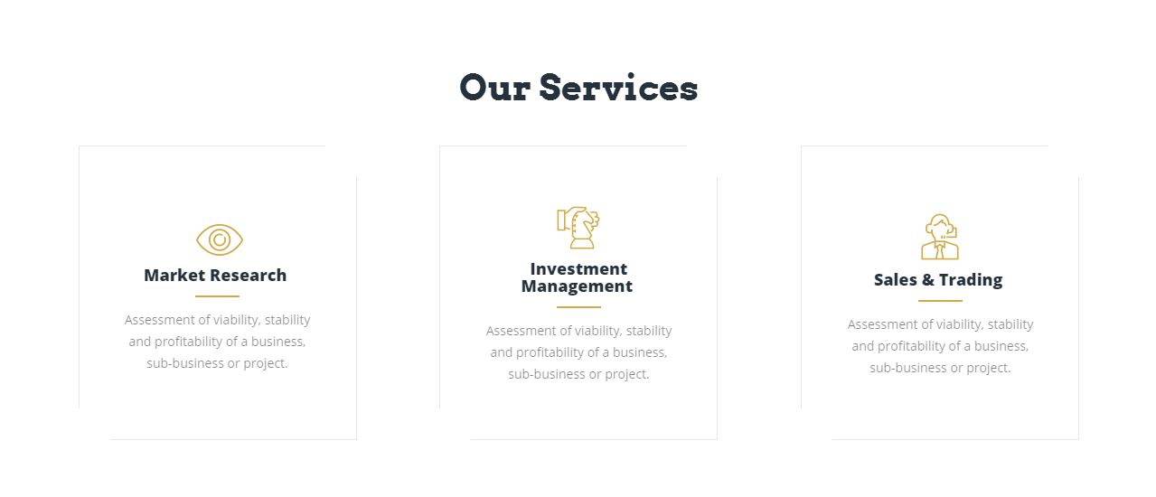
Hello just curious how do you mimmic this picture using Divs or HTML5 Elements using article,section an what not? I know tables is out dated.


 1 Correct answer

Thats the best part about flexbox, providing you use row wrap it automatically flows from rows to columns.
Resize the browser to see this in the demo.
 14
Replies
14
14
Replies
14
Copy link to clipboard
Copied
Use css flexbox, view the code for this demo -
Copy link to clipboard
Copied
Ok this is close to what I need how did you separate them so they are not next to each other? When you use flex?
Sent from my Verizon, Samsung Galaxy smartphone
Copy link to clipboard
Copied
change the margin values for the article elements.
Copy link to clipboard
Copied
After you change the margin css, is this the way to use the flex code to make it look like there in rows and columns?
Sent from my Verizon, Samsung Galaxy smartphone
Copy link to clipboard
Copied
Thats the best part about flexbox, providing you use row wrap it automatically flows from rows to columns.
Resize the browser to see this in the demo.
Copy link to clipboard
Copied
Oh ok where can you learn about flex styles ?
Sent from my Verizon, Samsung Galaxy smartphone
Copy link to clipboard
Copied
Look in the resources section of -
http://caniuse.com/#feat=flexbox
for anyone using browsers below 25 inch, (not 4k) or mobile devices flexbox is the most simple method available for building responsive layouts. For anything over 25 inch screen then css grid layouts is the up-comming best method, (in 1-2 years time).
Copy link to clipboard
Copied

Copy link to clipboard
Copied
Like this, using Flexbox:
<!DOCTYPE html>
<html>
<head>
<title>Example</title>
<meta charset="UTF-8">
<style>
* {
box-sizing: border-box;
}
body {
font-family: arial, helvetica, sans-serif;
font-size: 14px;
line-height: 20px;
}
.services_wrapper {
width: 85%;
margin: 0 auto;
}
.services_wrapper h3 {
font-size: 30px;
margin: 0;
padding: 30px 0;
font-weight: 400;
text-align: center;
}
.services {
display: -webkit-box;
display: -ms-flexbox;
display: flex;
-ms-flex-wrap: wrap;
flex-wrap: wrap;
-webkit-box-pack: justify;
-ms-flex-pack: justify;
justify-content: space-between;
}
article {
display: -webkit-box;
display: -ms-flexbox;
display: flex;
-webkit-box-orient: vertical;
-webkit-box-direction: normal;
-ms-flex-direction: column;
flex-direction: column;
-webkit-box-pack: center;
-ms-flex-pack: center;
justify-content: center;
width: 29%;
border: 1px solid #ccc;
padding: 25px;
text-align: center;
}
@media screen and (max-width: 768px) {
article {
width: 100%;
margin: 0 0 40px 0;
}
}
article h2 {
margin: 0;
padding: 0;
font-size: 18px;
line-height: 22px;
}
article p {
margin: 0;
padding: 0;
font-size: 14px;
line-height: 22px;
color: #808080;
}
hr {
border-top: 2px solid #C7A75E;
width: 30%;
}
</style>
</head>
<body>
<section class="services_wrapper">
<h3>Our Services</h3>
<div class="services">
<article>
<h2>Market Research</h2>
<hr>
<p>Lorem ipsum dolor sit amet, consectetur adipisicing elit, sed do eiusmod tempor incididunt.</p>
</article>
<!-- end article -->
<article>
<h2>Investment Management</h2>
<hr>
<p>Lorem ipsum dolor sit amet, consectetur adipisicing elit, sed do eiusmod tempor incididunt.</p>
</article>
<!-- end article -->
<article>
<h2>Sales & Training</h2>
<hr>
<p>Lorem ipsum dolor sit amet, consectetur adipisicing elit, sed do eiusmod tempor incididunt.</p>
</article>
<!-- end article -->
</div>
<!-- end services -->
</section>
<!-- end services_wrapper -->
</body>
</html>
Copy link to clipboard
Copied
Thank you

Copy link to clipboard
Copied
Bootstrap version 4 and Cards can do that.

<!doctype html>
<html lang="en">
<head>
<meta charset="utf-8">
<title>Bootstrap 4.0, Cards Demo</title>
<meta name="viewport" content="width=device-width, initial-scale=1">
<meta http-equiv="X-UA-Compatible" content="IE=edge">
<!--Latest Bootstrap 4 CSS-->
<link href="https://maxcdn.bootstrapcdn.com/bootstrap/4.0.0-beta/css/bootstrap.min.css" rel="stylesheet" integrity="sha384-/Y6pD6FV/Vv2HJnA6t+vslU6fwYXjCFtcEpHbNJ0lyAFsXTsjBbfaDjzALeQsN6M" crossorigin="anonymous">
<style>
html, body { height: 100% }
</style>
</head>
<body class="container">
<p> </p>
<p> </p>
<p> </p>
<p> </p>
<div class="row row-eq-height">
<div class="col-sm-4">
<div class="card card-block h-100 justify-content-center ">
<h3 class="text-center">Vertically Centered Content</h3> <p>lorem ipsum dolor sit amet, consectetur adipisicing elit.</p>
</div>
</div>
<div class="col-sm-4">
<div class="card card-block h-100 justify-content-center">
<h3 class="text-center">Vertically Centered Content</h3>
<p>Lorem ipsum dolor sit amet, consectetur adipisicing elit. Cumque iusto veritatis minus, maiores odio.</p>
</div>
</div>
<div class="col-sm-4">
<div class="card card-block h-100 justify-content-center">
<h3 class="text-center">Vertically Centered Content</h3> <p>Cumque iusto veritatis minus, maiores odio.</p>
</div>
</div>
</div>
<!--latest jQuery 3-->
<script src="https://code.jquery.com/jquery-3.2.1.min.js" integrity="sha256-hwg4gsxgFZhOsEEamdOYGBf13FyQuiTwlAQgxVSNgt4=" crossorigin="anonymous"></script>
<!--Popper JS-->
<script src="https://cdnjs.cloudflare.com/ajax/libs/popper.js/1.11.0/umd/popper.min.js" integrity="sha384-b/U6ypiBEHpOf/4+1nzFpr53nxSS+GLCkfwBdFNTxtclqqenISfwAzpKaMNFNmj4" crossorigin="anonymous"></script>
<!--Latest Bootstap 4 JS-->
<script src="https://maxcdn.bootstrapcdn.com/bootstrap/4.0.0-beta/js/bootstrap.min.js" integrity="sha384-h0AbiXch4ZDo7tp9hKZ4TsHbi047NrKGLO3SEJAg45jXxnGIfYzk4Si90RDIqNm1" crossorigin="anonymous"></script>
</body>
</html>
Alt-Web Design & Publishing ~ Web : Print : Graphics : Media
Copy link to clipboard
Copied
No comment, ( ).
).
Copy link to clipboard
Copied
Thanks 
Copy link to clipboard
Copied
Thank you guys sorry took me a while to respond i wasnt on my computer 
 AdChoices