 Adobe Community

Copy link to clipboard
Copied
I have written a website in html and css and have it just like I like it, but I need to make it optimal for mobile and tablet. I am using the bootstrap template and trying to "paste" my code on top of the template. I am struggling creating three columns next to each other(with picture and content). Could some one help me with creating the Div's? I want them to be of equal size.


 1 Correct answer

Web design is not word processing. When I see margin-left: 663px and negative top margins, it says you're in trouble. Coding is not your strength and this layout is not going to work for you.
My advice at his point is quit using Dreamweaver and switch to Muse. Muse is aimed at non-coders who like to work in a visual interface. The code that Muse generates is ugly to be sure but most non-coders don't care about that as long as it works well in all devices.
Nancy
 7
Replies
7
7
Replies
7

Copy link to clipboard
Copied
Please show us the code of the main document so that we can show you what to do.
Copy link to clipboard
Copied
You certainly put the cart before the horse doing it this way. You should have started with the Bootstrap layout, then customized it to suit your needs. Now you're essentially trying to fit a square peg into a round hole. It might be possible to shave off the edges to make it all fit or it might be best to start over with Bootstrap as your layout.
We would need to see your code.
Nancy
Alt-Web Design & Publishing ~ Web : Print : Graphics : Media
Copy link to clipboard
Copied
kingpat27 wrote
I am struggling creating three columns next to each other(with picture and content). Could some one help me with creating the Div's? I want them to be of equal size.
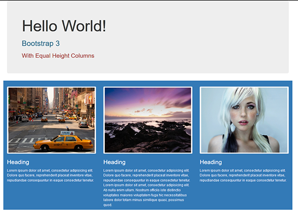
Copy & paste the code below into a new, blank document.
<!doctype html>
<html lang="en">
<head>
<meta charset="utf-8">
<title>Bootstrap 3.3.7 Starter</title>
<meta name="viewport" content="width=device-width, initial-scale=1">
<meta http-equiv="X-UA-Compatible" content="IE=edge">
<!--Bootstrap 3 CSS-->
<link rel="stylesheet" href="https://maxcdn.bootstrapcdn.com/bootstrap/3.3.7/css/bootstrap.min.css" integrity="sha384-BVYiiSIFeK1dGmJRAkycuHAHRg32OmUcww7on3RYdg4Va+PmSTsz/K68vbdEjh4u" crossorigin="anonymous">
<style>
/**custom styles for equal height columns**/
.sameheight { overflow: hidden; }
.equal {
margin-top: 2%;
margin-bottom: -99999px;
padding-bottom: 99999px;
}
</style>
</head>
<body>
<div class="container">
<div class="jumbotron">
<h1>Hello World!</h1>
<h2 class="text-info">Bootstrap 3</h2>
<h3 class="text-danger">With Equal Height Columns</h3>
</div>
<!--sameheight row-->
<div class="row bg-primary sameheight">
<!--begin 3 equal height columns-->
<div class="col-sm-4 equal"> <img class="img-thumbnail" src="https://placeimg.com/400/300/arch" alt="placeholder">
<h3>Heading</h3>
<p>Lorem ipsum dolor sit amet, consectetur adipisicing elit. Dolore quo facere, reprehenderit placeat inventore vitae, repudiandae consequuntur in eaque consectetur tenetur.</p>
</div>
<div class="col-sm-4 equal"> <img class="img-thumbnail" src="https://placeimg.com/400/300/nature" alt="placeholder">
<h3>Heading</h3>
<p>Lorem ipsum dolor sit amet, consectetur adipisicing elit. Dolore quo facere, reprehenderit placeat inventore vitae, repudiandae consequuntur in eaque consectetur tenetur. Lorem ipsum dolor sit amet, consectetur adipisicing elit. Ab nulla enim ullam. Nostrum officiis iste distinctio voluptates maiores voluptatem fuga hic necessitatibus labore dolor totam minus similique quasi, possimus quod.</p>
</div>
<div class="col-sm-4 equal"> <img class="img-thumbnail" src="https://placeimg.com/400/300/people" alt="placeholder">
<h3>Heading</h3>
<p>Lorem ipsum dolor sit amet, consectetur adipisicing elit. Dolore quo facere, reprehenderit placeat inventore vitae, repudiandae consequuntur in eaque consectetur tenetur.</p>
</div>
<!--/row--></div>
<!--/container--></div>
<!--latest jQuery 3-->
<script src="https://code.jquery.com/jquery-3.2.1.min.js" integrity="sha256-hwg4gsxgFZhOsEEamdOYGBf13FyQuiTwlAQgxVSNgt4=" crossorigin="anonymous"></script>
<!--Bootstrap 3 JS-->
<script src="https://maxcdn.bootstrapcdn.com/bootstrap/3.3.7/js/bootstrap.min.js" integrity="sha384-Tc5IQib027qvyjSMfHjOMaLkfuWVxZxUPnCJA7l2mCWNIpG9mGCD8wGNIcPD7Txa" crossorigin="anonymous"></script>
</body>
</html>
Alt-Web Design & Publishing ~ Web : Print : Graphics : Media
Copy link to clipboard
Copied
I took the advice given to me and decided to start from scratch. I have these defects that I need help fixing:
Tablet
- Center “The Squad”
- Gray on “Services”
- Align Reviews
- Dawn Daniels Testimony
- no left scroll
Phone
- Gap in navigation
- Stash, Ea$E and Ed Love profiles
- Karaoke and Production
- Align Reviews
- Testimonial space out
- Center Social at the bottom
- Center "The Squad"
Could you all look at my code to help me fix my defects and give me some pros on writing better code?
<!doctype html>
<html lang="en-US">
<head>
<meta charset="UTF-8">
<meta http-equiv="X-UA-Compatible" content="IE=edge">
<meta name="viewport" content="width=device-width, initial-scale=1">
<title>Elite DJ Squad</title>
<link href="css/singlePageTemplate.css" rel="stylesheet" type="text/css">
<!--The following script tag downloads a font from the Adobe Edge Web Fonts server for use within the web page. We recommend that you do not modify it.-->
<script>var __adobewebfontsappname__="dreamweaver"</script>
<script src="http://use.edgefonts.net/source-sans-pro:n2:default.js" type="text/javascript"></script>
<!-- HTML5 shim and Respond.js for IE8 support of HTML5 elements and media queries -->
<!-- WARNING: Respond.js doesn't work if you view the page via file:// -->
<!--[if lt IE 9]>
<script src="https://oss.maxcdn.com/html5shiv/3.7.2/html5shiv.min.js"></script>
<script src="https://oss.maxcdn.com/respond/1.4.2/respond.min.js"></script>
<![endif]-->
</head>
<body>
<!-- Main Container -->
<div class="container">
<!-- Navigation -->
<header>
<img src="536316_216591325123694_887001728_n.jpg" width="75" height="51" alt="Elite DJ Squad Logo"/>
<nav>
<ul>
<li><a href="#">THE SQUAD</a></li>
<li> <a href="#">SERVICES</a></li>
<li> <a href="#">REVIEWS</a></li>
<li> <a href="#">MUSIC</a></li>
</ul>
</nav>
</header>
<!-- Hero Section -->
<section class ="hero" id ="hero">
<h2 class="hero_header">Elite DJ Squad</h2>
<p class="tagline">We got a DJ for that</p>
<div class="button">Book Now</div>
</section>
<!-- About Section -->
<section class="about" id="about">
<h2 class="about_header">The Squad</h2>
<p class="text_column">
<img src="DJ_KRE_MIAMI.png" alt="DJ Kre Photo" width="250" height="150" class="krephoto"/>
<h2 class="kreText">DJ Kre</h2>
<img src="DJ_MZ_ELITE.jpg" alt="DJ Mister Zee" width="250" height="150" class="MZimage"/>
<h2 class="mZtext">DJ Mister Zee</h2>
</p>
<p class="text_column_middle">
<img src="IMG_0084.JPG" alt="DJ Stash Photo" width="150" height="250" class="stashPhoto"/>
<h2 class="stashText">DJ Stash</h2>
<img src="DJ-EASE-ELITE.jpg" alt="DJ Ease" width="250" height="150" class="DJease"/>
<h2 class="easeText">DJ Ea$e</h2>
</p>
<p class="text_column_right">
<img src="DJ-Bama-elite.jpg" alt="DJ Bama" width="250" height="150" class="DJBama"/>
<h2 class="DJBamaText">DJ Bama</h2>
<img src="DJ_ED_LOVE_ELITE-2.jpg" alt="DJ Ed Love" width="250" height="150" class="edLove"/>
<h2 class="EdLoveText">DJ Ed Love</h2>
</p>
</section>
<!-- Stats Gallery Section -->
<div class="gallery">
<div class="thumbnail">
<h1 class="stats">DJ Services</h1>
<h4>WEDDINGS</h4>
<h4>CORPORATE EVENTS</h4>
<h4>QUINCEAÑERAS</h4>
<h4>PARTIES</h4>
</div>
<div class="thumbnail">
<h1 class="stats">MC Services</h1>
<h4>MCEE</h4>
</div>
<div class="thumbnail_karaoke">
<h1 class="stats_karaoke">Karaoke</h1>
<h4 class = "Karaoke_header">2 MICS</h4>
<h4 class = "Karaoke_header2">OVER 28,000 SONGS</h4>
</div>
<div class="thumbnail_Production">
<h1 class="stats_karaoke">Production</h1>
<h4 class = "LicensedMusic_header">LICENSED MUSIC</h4>
</div>
</div>
<!-- Parallax Section -->
<section class="banner">
<h2 class="parallax">REVIEWS</h2>
<img src="fullsizeoutput_1b71.jpeg" width="300" height="200" alt="Gioardano Testimony" class = "Gioardano_Testiominal"/>
<img src="fullsizeoutput_1b68.jpeg" width="300" height="200" alt="Dawn Daniels Testimony" class ="Dawn_Daniels_Testimonal"/>
</section>
<!-- More Info Section -->
<footer>
<article class="footer_column">
<h3 class = "Testimonial_Title">This was the best party I've ever had!</h3>
<video controls class="Testimonial_Video"></video>
<p>We didn't worry about anything. The lighting, the sound, they can bring smoke if you want, they can bring the whole house... </p>
</article>
<article class="footer_column_right">
<h3>Elite DJ Squad didn't let us down last year so we called them again this year!</h3>
<video controls></video>
<p>The music was top quality, clean, fun to dance to, and a variety that everyone could enjoy.</p>
</article>
</footer>
<!-- Footer Section -->
<section class="footer_banner" id="contact">
<h2 class="hidden">Footer Banner Section </h2>
<h2 class="hero_header">MUSIC</h2>
<div class="mixes">
<iframe width="200" height="250" src="https://www.mixcloud.com/widget/follow/?u=%2Fpatrick-gray5%2F" frameborder="0" ></iframe>
<iframe width="200" height="250" scrolling="no" frameborder="no" allow="autoplay" src="https://w.soundcloud.com/player/?url=https%3A//api.soundcloud.com/users/104803021&color=%23ff5500&au..."></iframe>
</div>
</section>
<!-- Copyrights Section -->
<div class="copyright">
<div class="social">
<a href="https://www.thumbtack.com/profile/services/ip8l3y$LI3RQAQ/"><img src="thumbtack2-png (1).png" width="50" height="25" alt="Elite DJ Squad Thumbtack profile"/> </a>
<a href="https://www.instagram.com/elitedjsquad/"><img src="black-ig-logo.png" width="50" height="25" alt="Elite DJ Squad Instagram"/> </a>
<a href="https://www.facebook.com/EliteDjSquad/"><img src="facebook-128.png" width="50" height="25" alt="Elite DJ Squad Facebook"/> </a>
<a href="https://www.theknot.com/marketplace/elite-dj-squad-san-antonio-tx-1058899"><img src="The-Knot-logo.png" width="50" height="25" alt="Elite DJ Squad The Knot Profile"/></a>
</div>
<div class="Copy">
©2018 Designed by Graiety
</div>
</div>
<!-- Main Container Ends -->
</body>
</html>
@charset "UTF-8";
/* Body */
body {
font-family: Gotham, "Helvetica Neue", Helvetica, Arial, sans-serif;
background-color: #f2f2f2;
margin-top: 0px;
margin-right: 0px;
margin-bottom: 0px;
margin-left: 0px;
font-style: normal;
font-weight: 200;
}
/* Container */
.container {
width: 90%;
margin-left: auto;
margin-right: auto;
height: 1000px;
background-color: #FFFFFF;
}
/* Navigation */
header {
width: 100%;
height: 5%;
background-color: #B3B3B3;
border-bottom: 1px solid #B3B3B3;
color: #EDEDED;
}
.logo {
color: #fff;
font-weight: bold;
text-align: undefined;
width: 10%;
float: left;
margin-top: 15px;
margin-left: 25px;
letter-spacing: 4px;
}
nav {
float: right;
width: 50%;
text-align: right;
margin-right: 25px;
color: #EDEDED;
}
header nav ul {
list-style: none;
float: right;
}
nav ul li {
float: left;
color: #FFFFFF;
font-size: 14px;
text-align: left;
margin-right: 25px;
letter-spacing: 2px;
font-weight: bold;
transition: all 0.3s linear;
}
ul li a {
color: #EDEDED;
text-decoration: none;
}
ul li:hover a {
font-weight: bold;
color: #5B5A5A;
}
.hero_header {
color: #EDEDED;
text-align: center;
margin-top: 0px;
margin-right: 0px;
margin-bottom: 0px;
margin-left: 0px;
letter-spacing: 4px;
}
/* Hero Section */
.hero {
background-color: #B3B3B3;
padding-top: 150px;
padding-bottom: 150px;
background-image: url(../IMG_3563_small.jpg);
background-repeat: no-repeat;
background-position: 47% 0%;
color: #EDEDED;
}
.light {
font-weight: bold;
color: #717070;
}
.tagline {
text-align: center;
color: #EDEDED;
margin-top: 4px;
font-weight: lighter;
text-transform: uppercase;
letter-spacing: 1px;
}
.button {
width: 200px;
margin-top: 40px;
margin-right: auto;
margin-bottom: auto;
margin-left: auto;
padding-top: 20px;
padding-right: 10px;
padding-bottom: 20px;
padding-left: 10px;
text-align: center;
vertical-align: middle;
border-radius: 0px;
text-transform: uppercase;
font-weight: bold;
letter-spacing: 2px;
border: 3px solid #FFFFFF;
color: #FF0004;
transition: all 0.3s linear;
}
.button:hover {
background-color: #FF0004;
color: #FFFFFF;
cursor: pointer;
}
/* About Section */
.text_column {
width: 29%;
text-align: justify;
font-weight: lighter;
line-height: 25px;
padding-left: 20px;
padding-right: 20px;
color: #A3A3A3;
margin-left: 22px;
float: left;
}
.text_column_middle {
width: 29%;
text-align: justify;
font-weight: lighter;
line-height: 25px;
padding-left: 20px;
padding-right: 20px;
color: #A3A3A3;
float: left;
margin-top: -610px;
margin-left: 430px;
}
.text_column_right{
width: 29%;
text-align: justify;
font-weight: lighter;
line-height: 25px;
padding-left: 20px;
padding-right: 20px;
color: #A3A3A3;
float: left;
margin-top: -475px;
margin-left: 40px;
}
.about_header {
vertical-align: middle;
position: relative;
clear: none;
width: 100%;
text-align: center;
}
.about {
padding-left: 25px;
padding-right: 25px;
padding-top: 35px;
padding-bottom: 50px;
display: inline-block;
background-color: #FFFFFF;
margin-top: 0px;
max-width: 1120px;
}
.ceo{
width: 250px;
float: left;
margin-right: 1000px;
}
.krephoto {
border-radius: 100px;
padding-left: 0px;
margin-left: -68px;
}
.kreText {
text-align: center;
max-width: 250px;
margin-left: -30px;
}
.MZimage {
border-radius: 100px;
padding-left: 0px;
margin-left: -25px;
}
.mZtext {
max-width: 250px;
margin-left: 20px;
}
.DJBama {
border-radius: 100px;
margin-left: 767px;
padding-left: 0px;
margin-top: 40px;
}
.DJBamaText {
max-width: 250px;
margin-left: 830px;
margin-top: -270px;
text-align: center;
}
/* Stats Gallery */
.stats {
color: #717070;
margin-bottom: 5px;
}
.gallery {
clear: both;
display: inline-block;
width: 100%;
background-color: #FFFFFF;
/* [disabled]min-width: 400px;
*/
padding-bottom: 35px;
padding-top: 0px;
margin-top: -5px;
margin-bottom: 0px;
}
.thumbnail {
width: 25%;
text-align: center;
float: left;
margin-top: 35px;
}
.gallery .thumbnail h4 {
margin-top: 5px;
margin-right: 5px;
margin-bottom: 5px;
margin-left: 5px;
color: #52BAD5;
}
.gallery .thumbnail p {
margin-top: 0px;
margin-right: 0px;
margin-bottom: 0px;
margin-left: 0px;
color: #A3A3A3;
}
/* Parallax Section */
.banner {
background-color: #2D9AB7;
background-image: url(../headphones-690685_1920.jpg);
height: 400px;
background-attachment: fixed;
background-size: cover;
background-repeat: no-repeat;
}
.parallax {
color: #FFFFFF;
text-align: right;
padding-right: 100px;
padding-top: 110px;
letter-spacing: 2px;
margin-top: 0px;
}
.parallax_description {
color: #FFFFFF;
text-align: right;
padding-right: 100px;
width: 30%;
float: right;
font-weight: lighter;
line-height: 23px;
margin-top: 0px;
margin-right: 0px;
margin-bottom: 0px;
margin-left: 0px;
}
/* More info */
footer {
background-color: #FFFFFF;
padding-bottom: 35px;
padding-top: 35px;
}
.footer_column {
max-width: 50%;
text-align: center;
padding-top: 30px;
float: left;
}
.footer_column_right{
margin-top: 25px;
}
footer .footer_column h3 {
color: #B3B3B3;
text-align: center;
}
footer .footer_column_right h3 {
color: #B3B3B3;
text-align: center;
}
footer .footer_column p {
color: #717070;
background-color: #FFFFFF;
}
footer .footer_column_right p {
color: #717070;
background-color: #FFFFFF;
}
.cards {
width: 100%;
height: auto;
max-width: 400px;
max-height: 200px;
}
footer .footer_column p {
padding-left: 30px;
padding-right: 30px;
text-align: justify;
line-height: 25px;
font-weight: lighter;
margin-left: 20px;
margin-right: 20px;
}
footer .footer_column_right p{
padding-left: 30px;
padding-right: 30px;
text-align: justify;
line-height: 25px;
font-weight: lighter;
margin-left: 20px;
margin-right: 20px;
}
.Testimonial_Title{
margin-top:10px;
}
.Testimonial_Video{
padding-top:10px;
}
.copyright {
text-align: center;
padding-top: 20px;
padding-bottom: 20px;
background-color: #717070;
color: #FFFFFF;
text-transform: uppercase;
font-weight: lighter;
letter-spacing: 2px;
border-top-width: 2px;
}
.footer_banner {
background-color: #B3B3B3;
padding-top: 60px;
padding-bottom: 60PX;
margin-bottom: 0px;
background-image: url(../images/pattern.png);
background-repeat: repeat;
}
footer {
display: inline-block;
}
.hidden {
display: none;
}
.stashPhoto {
border-radius: 100px;
-webkit-transform: rotate(90deg);
-moz-transform: rotate(90deg);
-ms-transform: rotate(90deg);
-o-transform: rotate(90deg);
transform: rotate(90deg);
max-width: 250px;
margin-top: 119px;
}
.stashText{
width: 200px;
text-align: center;
margin-left: 430px;
padding-top: -500px;
margin-top: -270px;
}
.DJease {
border-radius: 100px;
margin-left: 420px;
margin-top: 0px;
max-width: 250px;
}
.easeText {
margin-top: 19px;
text-align: center;
margin-left: 411px;
max-width: 250px;
}
.edLove {
border-radius: 100px;
margin-left: 830px;
margin-top: 0px;
max-width: 250px;
}
.EdLoveText {
text-align: center;
margin-left: 830px;
max-width: 250px;
}
.thumbnail_Production{
width: 25%;
text-align: center;
float: left;
margin-top: -129px;
margin-left: 266px;
color: #717070;
}
.thumbnail_karaoke{
width: 25%;
text-align: center;
float: left;
margin-top: 34px;
margin-left: 225px;
color: #717070;
}
h4{
color: #52BAD5;
}
.Gioardano_Testiominal{
margin-left:100px;
}
.Dawn_Daniels_Testimonal{
margin-left:100px;
}
.LicensedMusic_header{
margin-top:-19px;
}
.Karaoke_header{
margin-top: -18px;
}
.Karaoke_header2{
margin-top: -12px;
}
.social{
float: left;
margin-top: -10px;
}
.Copy{
float:right;
}
.mixes{
text-align: center;
margin-top: 0px;
margin-right: 0px;
margin-bottom: 0px;
margin-left: 0px;
letter-spacing: 4px;
}
/* Mobile */
@media (max-width: 320px) {
body {
font-family: Gotham, "Helvetica Neue", Helvetica, Arial, sans-serif;
background-color: #f2f2f2;
margin-top: 0px;
margin-right: 0px;
margin-bottom: 0px;
margin-left: 0px;
font-style: normal;
font-weight: 200;
max-width: 320px;
}
.container{
width:320px;
}
.logo {
width: 100%;
text-align: center;
margin-top: 13px;
margin-right: 0px;
margin-bottom: 0px;
margin-left: 0px;
}
.container header nav {
margin-top: 300px;
margin-right: 0px;
margin-bottom: 0px;
margin-left: 0px;
max-width: 320px;
float: none;
display: none;
background-color: #B3B3B3;
}
nav ul li {
margin-right: 0px;
margin-bottom: 0px;
margin-left: 0px;
width: 320px;
text-align: center;
}
.text_column {
width: 320px;
text-align: justify;
padding-top: 0px;
padding-right: 0px;
padding-bottom: 0px;
padding-left: 0px;
}
.thumbnail {
width: 100%;
}
.footer_column {
width: 100%;
margin-top: 0px;
}
.parallax {
text-align: center;
margin-top: 0px;
margin-right: 0px;
margin-bottom: 0px;
margin-left: 0px;
padding-top: 40%;
padding-right: 0px;
padding-bottom: 0px;
padding-left: 0px;
width: 100%;
font-size: 18px;
}
.parallax_description {
padding-top: 0px;
padding-right: 0px;
padding-bottom: 0px;
padding-left: 0px;
width: 90%;
margin-top: 25px;
margin-right: 0px;
margin-bottom: 0px;
margin-left: 12px;
float: none;
text-align: center;
}
.banner {
background-color: #B3B3B3;
background-image: none;
}
.tagline {
margin-top: 20px;
line-height: 22px;
}
.hero_header {
margin-left: -20px;
line-height: 22px;
text-align: center;
width: 320px;
}
.about{
max-width: 320px;
}
.about_header {
vertical-align: middle;
text-align: center;
position: relative;
max-width: 320px;
}
.krephoto {
border-radius: 100px;
max-width: 250px;
margin-left: -19px;
}
.kreText {
max-width: 250px;
margin-left: 2px;
}
.MZimage {
border-radius: 100px;
margin-left: 4px;
max-width: 250px;
}
.mZtext {
max-width: 250px;
margin-left: 44px;
}
.text_column_middle {
width: 29%;
text-align: justify;
font-weight: lighter;
line-height: 25px;
padding-left: 20px;
padding-right: 20px;
color: #A3A3A3;
float: left;
margin-left: 36px;
margin-top: -189px;
}
.stashText{
max-width: 250px;
margin-left: 19px;
margin-top: 188px;
text-align: center;
clear: left;
}
.DJease {
border-radius: 100px;
margin-left: 10px;
margin-top: 3px;
max-width: 250px;
}
.easeText {
margin-top: 21px;
margin-left: 4px;
max-width: 250px;
text-align: center;
clear: left;
}
.DJBama{
margin-left: -50px;
margin-top: 480px;
}
.DJBamaText{
margin-left: 10px;
padding-top: 500px;
}
.thumbnail_Production{
width: 25%;
text-align: center;
float: left;
margin-top: 20px;
margin-left: 80px;
color: #717070;
}
.thumbnail_karaoke{
width: 25%;
text-align: center;
float: left;
margin-top: 30px;
margin-left: 90px;
color: #717070;
}
h4{
color: #52BAD5;
margin-left: 45px;
text-align: center;
}
.Dawn_Daniels_Testimonal{
margin-left:100px;
}
.footer_column_right{
margin-top: -100px;
}
.social{
margin-left: -20px;
line-height: 22px;
text-align: center;
width: 320px;
}
}
/* Small Tablets */
@media (min-width: 321px)and (max-width: 767px) {
.logo {
width: 100%;
text-align: center;
margin-top: 13px;
margin-right: 0px;
margin-bottom: 0px;
margin-left: 0px;
color: #043745;
}
.container header nav {
width: 100%;
float: none;
overflow: auto;
display: inline-block;
background: #B3B3B3;
margin-top: -3px;
}
header nav ul {
padding: 0px;
float: none;
}
nav ul li {
margin-right: 0px;
margin-bottom: 0px;
margin-left: 0px;
width: 100%;
text-align: center;
padding-bottom: 8px;
padding-top: 8px;
}
.text_column {
width: 100%;
text-align: left;
padding-top: 0px;
padding-right: 0px;
padding-bottom: 0px;
padding-left: 0px;
}
.thumbnail {
width: 100%;
}
.footer_column {
width: 100%;
margin-top: 0px;
}
.parallax {
text-align: center;
margin-top: 0px;
margin-right: 0px;
margin-bottom: 0px;
margin-left: 0px;
padding-top: 40%;
padding-right: 0px;
padding-bottom: 0px;
padding-left: 0px;
width: 100%;
font-size: 18px;
}
.parallax_description {
padding-top: 0px;
padding-right: 0px;
padding-bottom: 0px;
padding-left: 0px;
margin-top: 30%;
margin-right: 0px;
margin-bottom: 0px;
margin-left: 0px;
float: none;
width: 100%;
text-align: center;
}
.thumbnail {
width: 50%;
}
.parallax {
margin-top: 0px;
margin-right: 0px;
margin-bottom: 0px;
margin-left: 0px;
padding-right: 0px;
padding-bottom: 0px;
padding-left: 0px;
padding-top: 20%;
}
.parallax_description {
margin-top: 0px;
margin-right: 0px;
margin-bottom: 0px;
margin-left: 0px;
width: 100%;
padding-top: 30px;
}
.banner {
padding-left: 20px;
padding-right: 20px;
}
.footer_column {
width: 100%;
}
.about{
max-width: 757px;
}
.about_header{
width: 757px;
margin-left: -60px;
}
.text_column_middle {
width: 29%;
text-align: justify;
font-weight: lighter;
line-height: 25px;
padding-left: 20px;
padding-right: 20px;
color: #A3A3A3;
float: left;
margin-top: -630px;
margin-left: 472px;
}
.krephoto {
border-radius: 100px;
max-width: 250px;
margin-left: -46px;
}
.kreText {
width: 200px;
padding-left: 20px;
}
.MZimage {
border-radius: 100px;
margin-left: -25px;
max-width: 250px;
}
.mZtext {
margin-left: 10px;
max-width: 250px;
}
.stashPhoto{
max-width: 250px;
margin-left: -45px;
margin-top: 135px;
}
.stashText{
max-width: 250px;
margin-top: -300px;
margin-left: 420px;
}
.DJease {
border-radius: 100px;
margin-left: 400px;
margin-top: -2px;
max-width: 250px;
}
.easeText {
margin-top: 21px;
text-align: center;
margin-left: 390px;
max-width: 250px;
}
.DJBama{
margin-top: 470px;
margin-left: -84px;
}
.DJBamaText{
margin-top: 70px;
margin-left: -30px;
}
.edLove{
margin-left: 400px;
margin-top: -300px;
margin-bottom: 85px;
}
.EdLoveText{
margin-top: -65px;
margin-left: 400px;
}
.thumbnail_Production{
width: 25%;
text-align: center;
float: left;
margin-top: -160px;
margin-left: 80px;
color: #717070;
}
.thumbnail_karaoke{
width: 25%;
text-align: center;
float: left;
margin-top: 100px;
margin-left: 90px;
color: #717070;
}
h4{
color: #52BAD5;
}
.Gioardano_Testiominal{
margin-left:-10px;
margin-top: 20px;
padding-bottom: -40px;
}
.Dawn_Daniels_Testimonal{
margin-left:360px;
margin-top: -200px;
}
}
/* Small Desktops */
@media (min-width: 768px) and (max-width: 1096px) {
.text_column {
width: 100%;
}
.thumbnail {
width: 50%;
}
.text_column {
width: 100%;
margin-top: 0px;
margin-right: 0px;
margin-bottom: 0px;
margin-left: 0px;
padding-top: 0px;
padding-right: 0px;
padding-bottom: 0px;
padding-left: 0px;
}
.text_column_middle {
width: 29%;
text-align: justify;
font-weight: lighter;
line-height: 25px;
padding-left: 20px;
padding-right: 20px;
color: #A3A3A3;
float: left;
margin-top: -610px;
margin-left: 400px;
}
.banner {
margin-top: 0px;
padding-top: 0px;
}
.about{
max-width: 1096px;
}
.about_header {
max-width: 1096px;
}
.ceo{
width: auto;
float: left;
}
.krephoto {
border-radius: 100px;
max-width: 250px;
margin-left: 25px;
}
.kreText {
max-width: 250px;
margin-left: 25px;
}
.MZimage {
border-radius: 100px;
max-width: 250px;
margin-left: 28px;
}
.mZtext {
max-width: 250px;
margin-left: 70px;
}
.stashPhoto{
margin-top: 132px;
margin-left: -30px;
}
.stashText{
width: 200px;
text-align: center;
margin-left: 370px;
margin-top: -400px;
}
.DJease {
border-radius: 100px;
margin-left: 340px;
margin-top:-2px;
max-width: 250px;
}
.easeText {
margin-top: 21px;
text-align: center;
margin-left: 340px;
max-width: 250px;
}
.DJBama {
border-radius: 100px;
margin-top: 50px;
margin-left: 600px;
padding-left: 0px;
}
.DJBamaText {
max-width: 250px;
margin-left: 655px;
margin-top: -400px;
text-align: center;
}
.edLove{
margin-left: 663px;
}
.EdLoveText{
margin-left: 668px;
}
.thumbnail_Production{
width: 25%;
text-align: center;
float: left;
margin-top: -130px;
margin-left: 116px;
}
.thumbnail_karaoke{
width: 25%;
text-align: center;
float: left;
margin-top: 100px;
margin-left: 116px;
}
h4{
color: #52BAD5;
}
.Karaoke_header{
margin-top: -18px;
}
.Karaoke_header2{
margin-top: -12px;
}
}
Copy link to clipboard
Copied
Web design is not word processing. When I see margin-left: 663px and negative top margins, it says you're in trouble. Coding is not your strength and this layout is not going to work for you.
My advice at his point is quit using Dreamweaver and switch to Muse. Muse is aimed at non-coders who like to work in a visual interface. The code that Muse generates is ugly to be sure but most non-coders don't care about that as long as it works well in all devices.
Nancy
Alt-Web Design & Publishing ~ Web : Print : Graphics : Media
Copy link to clipboard
Copied
I do not want to use Muse, I want to use code. What is wrong with my code? I thought maybe you would run my page and see weird things and tell me what is wrong and how Its wrong and give me adequate advice on how to improve so I can go grow.

Copy link to clipboard
Copied
If you wish to use code, then can I suggest that you read through and experiment with the basics of web development provided by this site, (it is the one supported by Mozilla, (the creators of the firefox browser) Microsoft, and the W3C, (the standards body for the web)) -
 AdChoices