 Adobe Community
what is wrong with this code?

Copy link to clipboard
Copied
The right-col is slightly misplaced:
<html lang="en">
<head>
<meta charset="UTF-8">
<meta name="viewport" content="width=device-width, initial-scale=1.0">
<meta http-equiv="X-UA-Compatible" content="ie=edge">
<title>Document</title>
<style>
* {
box-sizing: border-box;
}
body {
margin: 0 auto;
width: 100%;
background: lightgray;
border-collapse: collapse;
}
div,
header,
footer {
padding: 10px;
border: 2px #0000ff solid;
}
#left_col,
#page_content {
margin-right: 10px;
margin-top: 10px;
margin-bottom: 10px;
margin-left: 0;
}
#right-col {
margin-top: 10px;
margin-bottom: 10px;
}
header,
footer {
text-align: center;
min-height: 50px;
}
#left_col {
float: left;
width: calc(15% - 10px);
}
#right_col {
float: left;
width: 15%;
}
#page_content {
width: calc(70% - 10px);
float: left;
}
#container,
#scripts,
#wrapper {
border: 0;
}
#left_col,
#right_col,
#page_content {
min-height: 500px;
}
footer {
clear: left;
}
</style>
</head>
<body>
<div id="wrapper">
<header>
<h1>Header</h1>
</header>
<div id="container">
<div id="left_col">Left Column</div>
<div id="page_content">Page Content</div>
<div id="right_col">Right Column</div>
</div>
<footer>Footer</footer>
</div>
<div id="scripts">Scripts</div>
</body>
</html>


 65
Replies
65
65
Replies
65

Copy link to clipboard
Copied
Hello,
sorry, at the moment I can't test the effects of your two different advices "right-col" and "right_col", but maybe you will find it out of yourself. 
Hans-Günter

Copy link to clipboard
Copied
Using floats is not a modern approach. You should consider using Flexbox or, at the least display: table. Both of these methods will naturally achieve the equal height columns you are attempting, which will not happen with your min-height solution. That said, the mispositioning of you right column, along with the "indent" of your 3 column structure, is caused by 3 things:
1. The 10px padding on your container
2. The use of "clear"
3. The "slip" that Hans-G mentioned
I would start over using a different approach. But if you really, really want to use floats, here is a more modern clearing technique:
#container:after {
display: table;
clear: both;
content: "";
}

Copy link to clipboard
Copied
Try this:
<!doctype html>
<html lang="en">
<head>
<meta charset="utf-8">
<title>Flexbox Columns</title>
<meta http-equiv="X-UA-Compatible" content="IE=edge">
<meta name="viewport" content="width=device-width, initial-scale=1">
<style>
.flexbox-container {
display: flex;
flex-direction: column;
}
/* Special Rules for Tablets, Desktops */
@media only screen and (min-width: 530px) {
.flexbox-container {
flex-direction: row;
justify-content: space-evenly;
}
}
.flexbox-container > div {
flex-grow: 1;
padding: 10px;
border: 1px dotted silver;
}
</style>
</head>
<body>
<div class="flexbox-container">
<div>
<h3>Column 1</h3>
</div>
<div>
<h3>Column 2</h3>
<h3>Column 2</h3>
<h3>Column 2</h3>
</div>
<div>
<h3>Column 3</h3>
</div>
</div>
</body>
</html>
Alt-Web Design & Publishing ~ Web : Print : Graphics : Media
Copy link to clipboard
Copied
Are you sure about that code, Nancy? It doesn't seem right. I put together a quick test page with your code followed by a quick layout made with our Harmony Flexbox tool:

Copy link to clipboard
Copied
And this is a flexbox layout from 2011, with support for older browsers that is not strictly required anymore.
<!doctype html>
<html>
<head>
<meta charset="utf-8">
<title>dw_flexbox_starter</title>
<meta name="viewport" content="width=device-width, initial-scale=1">
<style type="text/css">
body {
font: 100%/1.4 Verdana, Arial, Helvetica, sans-serif;
background-color: #42413C;
margin: 0;
padding: 0;
color: #000;
}
ul, ol, dl {
padding: 0;
margin: 0;
}
h1 {
text-align: center;
}
h1, h2, h3, h4, h5, h6, p {
margin-top: 0;
padding-right: 15px;
padding-left: 15px;
}
a img {
border: none;
}
a:link {
color: #42413C;
text-decoration: underline;
}
a:visited {
color: #6E6C64;
text-decoration: underline;
}
a:hover, a:active, a:focus {
text-decoration: none;
}
/* The actual page css */
/*The @media is for Safari, Android and iOS display, it is placed before the main css so that the cascade works correctly Also if it is placed after the main css, Chrome also inherits the css and does not use the new syntax, and most importantly, not the flex-wrap. */
@media
(-webkit-min-device-pixel-ratio: 0){
.container {
width: 100%;
}
header {
display: -webkit-inline-box;
}
/* a div with id name=contentWrap must enclose the
.sidebar, .content, #rtSidebar, aside html elements, in order enable flexbox 'again' */
#contentWrap {
display: -webkit-box;
-webkit-box-orient: horizontal;
-webkit-box-lines: multiple;
width: 100%;
}
.sidebar, .content, #rtSidebar, aside {
width: 190px;
-webkit-box-flex: 0.0;
}
.content {
min-width: 450px;
-webkit-box-flex: 2.0;
}
footer {
display: -webkit-inline-box;
}
}
/*The #contentWrap is only required because of none flex wrap supporting browsers*/
.container, #contentWrap {
background-color: #FFFFFF;
display: -ms-flexbox;
-ms-flex-direction: row;
-ms-flex-wrap: wrap;
display: -webkit-flex;
-webkit-flex-flow: row wrap;
display: flex;
flex-flow: row wrap;
}
header {
background-color: #ADB96E;
display: -ms-inline-flexbox;
display: -webkit-inline-flex;
display: inline-flex;
width: 100%;
}
.sidebar, .content, #rtSidebar, aside {
-ms-flex: 3 1 300px;
-webkit-flex: 3 1 300px;
flex: 3 1 300px;
}
.sidebar1, #rtSidebar {
-ms-flex-preferred-size: 180px;
-webkit-flex-basis: 180px;
flex-basis: 180px;
background-color: #EADCAE;
padding-bottom: 10px;
}
.content {
padding: 10px 0;
-ms-flex-preferred-size: 62vw;
-webkit-flex-basis: 50%;
flex-basis: 50%;
}
#rtSidebar {
background-color: #EADCAE;
padding: 10px 0;
-ms-flex-preferred-size: 180px;
-webkit-flex-basis: 180px;
flex-basis: 180px;
}
.content ul, .content ol {
padding: 0 15px 15px 40px;
}
nav ul{
list-style: none;
border-top: 1px solid #666;
margin-bottom: 15px;
width: 180px;
}
nav li {
border-bottom: 1px solid #666;
width: 180px;
}
nav a, nav a:visited {
width: auto;
text-decoration: none;
background-color: #C6D580;
}
nav a:hover, nav a:active, nav a:focus {
background-color: #ADB96E;
color: #FFF;
}
footer {
padding: 10px 0;
background-color: #CCC49F;
display: -ms-inline-flexbox;
display: -webkit-inline-flex;
display: inline-flex;
width: 100%;
}
/* Fallback for FF none support of flex wrap */
@supports not (flex-wrap: wrap) /*and not (-webkit-flex-wrap: wrap)*/ {
.container {
display: block;
width: 100%;
}
/* a div with id name=contentWrap must enclose the
.sidebar, .content, #rtSidebar, aside html elements, in order to enable flexbox 'again' */
#contentWrap {
display: flex;
flex-direction: row;
flex-basis: 100%;
}
header, footer {
display: inline-flex;
}
}
@media screen and (max-width:700px){
/* Notice how this rule is not applied until after the flex-flow */
.container {
min-width: 500px;;
}
header {
display: -ms-flex;
-ms-flex-direction: column;
}
header, #contentWrap, footer {
display: -webkit-box;
-webkit-box-orient: vertical;
-webkit-box-lines: multiple;
display: -webkit-flex;
-webkit-flex-direction: column;
display: flex;
flex-direction: column;
flex-flow: column;
width: 100%;
height: auto;
}
.sidebar, .content, #rtSidebar, aside {
width: 100%;
}
nav ul{
width: 100%;
}
nav li {
width: 100%;
text-align: center;
}
}
</style>
<!--[if lte IE 9]>
<script src="http://html5shiv.googlecode.com/svn/trunk/html5.js"></script>
<style type="text/css">
.container {
width: 960px;
margin: 0 auto;
}
#contentWrap {
margin-top: -22px;
}
.sidebar1 {
float: left;
width: 180px;
background-color: #EADCAE;
padding-bottom: 10px;
}
.content {
width: 600px;
float: left;
}
aside {
float: left;
width: 180px;
background-color: #EADCAE;
padding: 10px 0;
}
nav a, nav a:visited {
padding: 5px 5px 5px 15px;
display: block;
width: 160px;
text-decoration: none;
background-color: #C6D580;
}
/* ~~ The footer ~~ */
footer {
padding: 10px 0;
background-color: #CCC49F;
position: relative;
clear: both;
}
/* ~~ Miscellaneous float/clear classes ~~ */
.fltrt {
float: right;
margin-left: 8px;
}
.fltlft {
float: left;
margin-right: 8px;
}
.clearfloat {
clear:both;
height:0;
font-size: 1px;
line-height: 0px;
}
header img {
display:block;
}
</style>
<![endif]--></head>
<body>
<div class="container">
<header>
<a href="#"><img src="" alt="Insert Logo Here" width="180" height="90" id="Insert_logo"/></a>
<h1>Dreamweaver Flexbox Demo</h1>
</header>
<div id="contentWrap">
<div class="sidebar1">
<nav>
<ul>
<li><a href="#">Link one</a></li>
<li><a href="#">Link two</a></li>
<li><a href="#">Link three</a></li>
<li><a href="#">Link four</a></li>
</ul>
</nav>
<aside>
<p> The above links demonstrate a basic navigational structure using an unordered list styled with CSS. Use this as a starting point and modify the properties to produce your own unique look. If you require flyout menus, ensure you choose one that works correctly with a flexbox layout.</p>
<p>If you would like the navigation along the top, simply change the ul to 'display: inline-flex;' or include it in your 'header' section. Then create the menu styling.</p>
</aside>
</div>
<article class="content">
<h1>Instructions</h1>
<section>
<h2>How to use this document</h2>
<p>Be aware that the CSS for this layouts is a flexbox layout. Flexbox is a W3C specification that is specificaly for layouts. It does not rely on hacks such as, floats and positioning, this means that the requirement to use a 'float clear' is also not required for the layout. It also reflows the layout to fit the available viewport size, cutting down considerably on the css code required to create a responsive layout. Flexbox also has the added advantage that your html and css code is much cleaner and easier to read.</p>
</section>
<section>
<h2>Styling your content</h2>
<p>You can style your content as you would for any other layout. If you are creating a blog, an album or even an e-commerce page you can also have that content re-flow automatically using flexbox.</p>
</section>
<section>
<h2>Logo and other styles replacement</h2>
<p>An image placeholder was used in this layout in the header where you'll likely want to place a logo. It is recommended that you remove the placeholder and replace it with your own linked logo. </p>
<p>Use the Property inspector to navigate to your logo image using the SRC field (instead of removing and replacing the placeholder in code view)</p>
<p>To see what css properties are applied to any element, simply select 'live view - inspect' then hover over the item in your layout and CSS Designer will list all the properties that are set.</p>
</section>
</article>
<aside id="rtSidebar">
<h4>Backgrounds</h4>
<p>In traditional css layouts, the background color on any block element will only show for the length of the content. Using flexbox this problem does not exist. The background color fills the entire sidebar.</p>
</aside>
</div>
<footer>
<p>This footer will also automatically reflow.</p>
<address>
Address Content
</address>
</footer>
</div>
</body>
</html>
Copy link to clipboard
Copied
Anyone else?

Copy link to clipboard
Copied
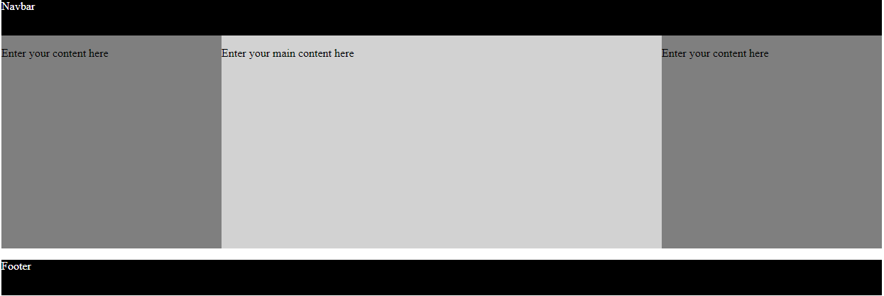
ALsp, here is your punishment:
<!doctype html>
<html>
<head>
<meta charset="UTF-8">
<title>Untitled Document</title>
<style>
nav, footer {
background-color: black;
color: white;
height: 50px; /* not used in production */
}
main {
display: flex;
height: 300px; /* not used in production */
}
section.main {
width: 50%;
background-color: lightgray;
}
aside.left, aside.right {
width: 25%;
background-color: gray;
}
</style>
</head>
<body>
<nav>
<p>Navbar</p>
</nav>
<main>
<aside class="left">
<p>Enter your content here</p>
</aside>
<section class="main">
<div class="contentArea"><p>Enter your main content here</p></div>
</section>
<aside class="right">
<p>Enter your content here</p>
</aside>
</main>
<footer>
<p>Footer</p>
</footer>
</body>
</html>
Copy link to clipboard
Copied
here is your punishment:
ROFL
I'm standing at the door waving them in.
Copy link to clipboard
Copied
Hardly the response I expected. Here I am, dead serious and what does our resident extensions creator do? ROFL 
Copy link to clipboard
Copied
I was going to call you a scoundrel... but you know...
Copy link to clipboard
Copied
Ingratiation will get you nowhere.

Copy link to clipboard
Copied
HS03KFU01 : Did any of the responses above help you solve your challenge? If so, can you mark the answer as correct for the benefit of other users?
Thanks,
Preran
Copy link to clipboard
Copied
Preran wrote
HS03KFU01 : Did any of the responses above help you solve your challenge? If so, can you mark the answer as correct for the benefit of other users?
Thanks,
Preran
I think there are a few correct answers that fall into the category of teaching someone to fish or handing them a fully-cooked swordfish steak. And there are a couple of clearly wrong answers (or bad copy and paste jobs). Add this all up and I'd reckon the original poster may be a little confused. But this seems to be par for the course on this forum. There is a clear, reasoned approach to teaching most times, but sometimes you need to first determine the level of learning the student needs.
Copy link to clipboard
Copied
ALsp wrote
There is a clear, reasoned approach to teaching most times, but sometimes you need to first determine the level of learning the student needs.
Should not any poster in this forum already know html and css?
I don't see it as anyones job to actually teach users in this forum, but as the users responsibility to learn for themselves. Asking questions is one thing, especially when one cannot 'see' the problem or the code error and supplying complete examples is also part of the process.
Maybe that's part of the problem now, with Dw users expecting Dw to do everything for them, (generalised comment, not directed at the OP).
Copy link to clipboard
Copied
pziecina wrote
Should not any poster in this forum already know html and css?
I don't think so 
I don't see it as anyone's job to actually teach users in this forum, but as the users responsibility to learn for themselves.
There are no jobs here. It's a volunteer thing. I'm sure there are is the occasional contract made, but I'd say that's the exception. So, while it's not a requirement, I think it might come natural to some folks to be able to assess a user's skill level... either by the quick analysis of a web page, or the nature of their question, and then answer accordingly.
Maybe that's part of the problem now, with Dw users expecting Dw to do everything for them, (generalised comment, not directed at the OP).
I think it's the reverse. In fact, I'm sure it is. When Dreamweaver first started, it basically did do everything. Users adept at coding were few and far between. I'm not sure if you remember those days - or if you came into the community much later, along with other UltraDev users. By that time, the old newsgroup had in fact devolved into factions.
So, the question is... do we belittle or ignore non-coders or do we try to educate them a little. There is no easy answer for a lot of folks, but my experience, supporting thousands of my own customers tells me that coding for some is as daunting as learning to speak Sumerian - and Gerry, me, and our support volunteers tend to be gentle. It's easier to do on our end because no one else is fighting to inject alternative answers and viewpoints at every turn.
Copy link to clipboard
Copied
I'll just stick to helping users where I can, and not trying to teach them. Otherwise I know my answers would end up being more like those in technical manuals, which I think would only make matters more confusing.
Copy link to clipboard
Copied
I'll take an order of bourbon-glazed salmon, please

Copy link to clipboard
Copied
pziecina wrote
I'll just stick to helping users where I can, and not trying to teach them. Otherwise I know my answers would end up being more like those in technical manuals, which I think would only make matters more confusing.
I'm only interested in helping users that are going to help themselves and that means generally getting into the code and looking at the code I provide them and learning something, even if only small steps from that, otherwise its a waste of my time and I DONT LIKE time-wasters.
Copy link to clipboard
Copied
ALsp wrote
I think it's the reverse. In fact, I'm sure it is. When Dreamweaver first started, it basically did do everything. Users adept at coding were few and far between. I'm not sure if you remember those days - or if you came into the community much later, along with other UltraDev users. By that time, the old newsgroup had in fact devolved into factions.
I'm not certain if answering this is going to cause a problem for the OP, as it is going off-topic.
Back at the begining of Dw the general method in use was html tables, or straight forward html with in-line styles, (no css). It was the introduction of css layouts that made knowing html, css, very important, and Dw started to move away from none coders at that point, as it was simply impossible to build more than 'cookie cutter' sites without knowing css.
Once coding knowledge became a requirerment Dw did still try to offer a none coding knowledge environment, but ap divs and its built in js function fell short, and contributed to the generally held opinion by many that the code produced by Dw was amaturist at best, very bad at worst.
Then came the iPhone, which changed everything again, and Dw tried FGL's then when that failed introduced bootstrap, (it had to introduce something). No matter what I think about bootstrap, if Dw is for none coders then the choice was the best of a bad bunch.
Copy link to clipboard
Copied
Back at the begining of Dw the general method in use was html tables, or straight forward html with in-line styles, (no css). It was the introduction of css layouts that made knowing html, css, very important, and Dw started to move away from none coders at that point, as it was simply impossible to build more than 'cookie cutter' sites without knowing css.
I don't think it will confuse anyone that needs to here it, and I understand where you are coming from. But here's the thing that often goes unsaid -- or perhaps ignored:
In 1997, tables were still the defacto method for laying out web pages. Dreamweaver 2 introduced a table editor. Dreamweaver 3 enhanced that editor. It was an enormous boon for the typical non-coding Dreamweaver user. You could do it all from dialog boxes. Not just creation, but adding rows or columns, deleting, and spanning.
When CSS became the way to go, Dreamweaver's planners could have easily programmed layout tools. They didn't, and that, to anyone willing to admit the obvious, is the single most egregious mistake Macromedia made... and Adobe continues to make by proxy.
It's really not an arguable point and is completely separate from your admirable desire to put coding skills in the forefront.
I asked Nancy a question yesterday... one she probably considered a leading one, but it was an honest question. We are seriously considering automating Bootstrap... at least in terms of row/column creation and management. We are considering it because it's something that users who have bought into the Bootstrap cult desperately need. We may not have the stomach to actually do it, but we are considering it because Adobe certainly does not appear to have the talent or the will to do it themselves.
Copy link to clipboard
Copied
ALsp wrote
I asked Nancy a question yesterday... one she probably considered a leading one, but it was an honest question. We are seriously considering automating Bootstrap... at least in terms of row/column creation and management. We are considering it because it was users who have bought into the Bootstrap cult desperately need. We may not have the stomach to actually do it, but we are considering it because Adobe certainly does not appear to have the talent or the will to do it themselves.
The bootstrap user environment needs so serious help from somewhere.
I personally will stick with what I write, but simple things like those you mention would I think help users, but I'm not certain if the Dw developers or managment know how to use bootstrap themselves. Re-ordering, (especially now it 'sort of' uses flexbox should be possible with the click of a button, (a few times maybe) in Dw, after all changing the order of elements is simple with flexbox.
Copy link to clipboard
Copied
pziecina wrote
The bootstrap user environment needs so serious help from somewhere.
A personal psychologist would come in handy.
Copy link to clipboard
Copied
Re-ordering, (especially now it 'sort of' uses flexbox should be possible with the click of a button, (a few times maybe) in Dw, after all changing the order of elements is simple with flexbox.
Yes, but unless you write the CSS or assign the classes for the order property, things will appear out of order in Dreamweaver's content editing mode. I was speaking of users that want to stick with default source ordering, for whatever reason. They would need to move entire nested DIV constructs around, which is sometimes an adventure. A UI would handle it seamlessly and accurately.
Copy link to clipboard
Copied
Yes, but unless you write the CSS or assign the classes for the order property, things will appear out of order in Dreamweaver's content editing mode.
That point is still a subject of arguments when it comes to accessibility. As you probably know Mozilla brought up the point a few years ago about re-ordering in flexbox and grids, as screen readers read the source code not the rendered page. So if an element is re-ordered, they argued that the source code should reflex the re-ordering.
If the proposal about re-ordering is ever accepted, (be a level 2 spec) then Dw's live view will have to be updated.
 AdChoices