 Adobe Community
- Home
- FrameMaker
- Discussions
- Re: How to change existing Icons for Note and Caut...
- Re: How to change existing Icons for Note and Caut...
How to change existing Icons for Note and Cautions in Framemaker 11?
Copy link to clipboard
Copied
Hi There,
I have existing document, created in FM 11, which uses Note and Caution Styles. I want to change Note and Caution icons, but I am unable to do that. The existing icons have not been inserted using anchored frames, but have been embedded using autonumber format.
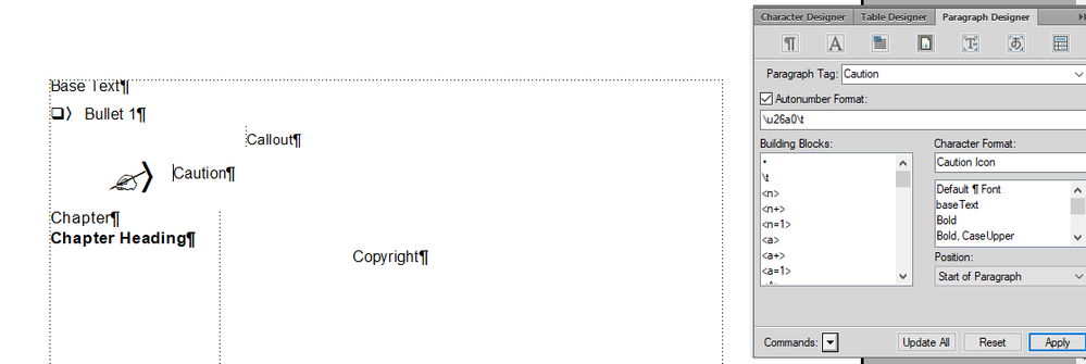
Posting below the existing style definitions of Note and Caution in FM 11:
Existing result in the document after applying the above style definitions:
I want the desired output as:
Can someone help me with how to change these icons in FM 11?
Thanks and Regards,
Rinni
Copy link to clipboard
Copied
Rinne,
please look into the character format Caution Icon. There a special font is used which provides the icon. If the font also provides one of your new favourite icons, this will just change the reference character (currently O in the numbering category of the paragraph format).
The same holds for the other paragraph formats - with corresponding character formats - for the icons in question.
HTH Klaus
Copy link to clipboard
Copied
Before changing these, be sure to check into what standards apply to your industry. There are ANSI and ISO standards for when to use the
⚠ U+26A0 WARNING SIGN (\u26a0 in FM markup), and
the terms NOTICE, CAUTION, WARNING, DANGER
Under ANSI Z.535, for example, ⚠ is optional for CAUTION, but required for WARNING/DANGER, with specific coloration.
Anyway, it looks as if the existing documents are using glyphs from the MS Wingdings "overlay" font, \x4f (ASCII "O" codepoint) for the flag, and \x32 (ASCII "2" codepoint) for the facing-up sheet. This technique is worth stepping away from, as it's only reliable for print and PDF output.
If your default font populates codepoint U+26A0, you can eliminate the Character Font for format "Caution" and change the autonumber to:
\u26a0\t
Otherwise, you'll need to apply a Char.Fmt that invokes a suitable font, such as Segoe UI Symbol.
On the paper sheet with paperclip, I'm not sure what Unicode character (if any) that would be. If it's in some font, below codepoint U+FFFF, use the same change. If it's above U+10000 (SMP code range), it won't work in FM yet. An icon more commonly used for NOTE is:
☝ U+261D WHITE UP POINTING INDEX
(which this forum engine may trash).
Copy link to clipboard
Copied
Hi @Bob_Niland
Thank you for your reply. As suggested by you, I updated the autonumber format for Caution icon and got the following result:
Still, I can't see the desired icon for "Caution"
If there is a character list or Windings list available in which proper autonumber formats or ASCII values are mentioned for particular icons, then it will be helpful.
I want to make the existing things work and creating new Note or Caution Styles is my secondary and last option, since we have 500 pages plus documents and these are official docs. So, I am trying to make the existing things work first.
Thanks and Regards,
Rinni
Copy link to clipboard
Copied
You're still applying the Character Format "Caution Icon". I don't think we've seen its definition. If it's still Wingdings, it's not going to work.
Copy link to clipboard
Copied
In addition to Klaus and Bob's excellent advice, you can also use graphic images for these.
The short version is: set up two paragraph tags, on each for the graphic and the text, put the graphics on a reference page in separate labeled frames, use Paragraph Above or Below to bring the graphic into the paragraph tag for the graphic, then use a two-column table to control placement, with one column containing the graphic and the other containing the text.
Barb Binder has a blog post that provides step-by-step information on how to do this.
https://www.rockymountaintraining.com/adobe-framemaker-icons/
Copy link to clipboard
Copied
LinSims: …put the graphics on a reference page in separate labeled frames, use Paragraph Above or Below to bring the graphic into the paragraph tag for the graphic…
This is what I used to do, back when the shop's production environment was FM7 (pre-Unicode). For print & PDF, it worked, with the FrameAbove bringing in an entire banner from the RefPage with the icon (when used), signal word, and both text and background color to optimized sRGB values. The icon was an EPS graphic.
It was even then not ideal for translation, where the signal words needed to be translated.
In modern workflows, I'd also be concerned with whether RefPage content flows to all outputs (e.g. HTML, XML, eBook). If I were still generating content that needed these admonishments, I'd be thinking of doing both icon & signal as text, likely with the signal words as Variables. Since Frame still doesn't have body text Anchoring to frames above para, the borderless table approach has some appeal.
Copy link to clipboard
Copied
Hi @LinSims
Thanks for your reply. I will surely look at this URL for creating new styles, but for now I want to make existing things work first. Creating new styles is my last and secondary option.
Thanks and Regards,
Rinni
Copy link to clipboard
Copied
Hi @tech 27:
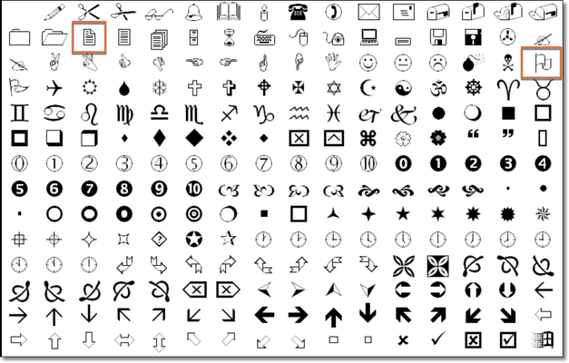
As per the above answers, the symbols are appearing because the character styles called Caution Icon and Note Icon are changing the font to Wingdings in Paragraph Designer > Numbering. The capital O in Wingdings maps to the flag, and the number 2 maps to the page icon. Unicode issues aside, this is an easy way to assign a graphic via a paragraph style, but you are limited to a font's character set.
Wingding character set
Now you want to shift to actual graphics. There are ways to convert a graphic to a font, but since I don't do this, I won't recommend a specific application. You can google it. This would allow you to continue to assign the graphic through the Paragraph Designer. (Talk with Bob about the unicode issues.)
Alternatively, you can do this with a 2-cell table as described here: https://www.rockymountaintraining.com/adobe-framemaker-adding-an-image-in-front-of-a-paragraph/. It's a bit fussier but will avoid the unicode issues and having to convert a graphic to a font.
~Barb
Copy link to clipboard
Copied
Hi @Barb Binder
Thanks for your reply.
Wanted to ask how do we come to know about : "The capital O in Wingdings maps to the flag, and the number 2 maps to the page icon"
or for that matter how are we identifying the character associated with particular icon. Is there any list available for this?
Thanks and Regards,
Rinni
Copy link to clipboard
Copied
You can open Character Map and select a font to see what's available. Or you can get BabelMap, which is like Character Map on steroids.
There's also this website, which provides information on unicode support for a whole lot of fonts and also shows what the glyps are for the various code ranges. I believe it's no longer being updated but it is incredibly informative:
Copy link to clipboard
Copied
tech27: …how do we come to know about : "The capital O in Wingdings maps to the flag, and the number 2 maps to the page icon"
That's part of it's worthwhile to avoid doing it that way anymore (in the emergent Unicode age).
When using this legacy codepage/overlay font technique, you need to have a mapping table or tool, such as MS Character Map, FM's Character Palette, or a 3rd party tool like BabbleMap.
Even so, the hack doesn't necessarily survive into all workflows. If you output to HTML, readers on non-MS platforms don't have Wingdings, and may see basically random glyphs instead of your intended flag or page-sheet icons. If you use Unicode code points instead, most platforms will provide some sort of sane glyph 'fallback' these days.
Alas, it is still sometimes necessary to use overlay fonts. FM is not fully into the Unicode age yet, lacking SMP support (U+10000 and above). Several of the Creative Commons icons, for example, are in SMP space as Unicode, so had to be rendered via overlay in a recent FM project of mine.
Copy link to clipboard
Copied
LOL, @LinSims:
- You type faster than I do, and
- I guess I had two posts on the same topic. I found one and you found the other. I think I like yours better—it's more detailed. 😂
~Barb
Copy link to clipboard
Copied
Just throwing my 2c worth into the ring :-).
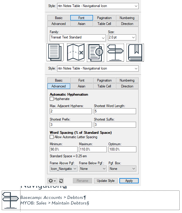
We used to have something similar. It became too tedius to update whenever our icons needed to change. So we did what @Barb Binder suggested: a 2-cell table. We created a paragraph style for each image, with a Font Size of 2pt. On our Reference pages, we created a frame for each image, which is then set as the Frame Above Pgf (Advanced tab). You would then simply apply the appropriate paragraph style to the first cell:
Whenever we need to update the image, we simply update the image in the Frame on the Reference page, and all instances are updated automatically.
Copy link to clipboard
Copied
Hi @QuintinSeegers
Thanks for your reply.
This will surely help me if I decide to create new styles, but for now I want to make existing things work.
Creating new styles is my secondary and last option.
Thanks and Regards,
Rinni


