 Adobe Community
- Home
- FrameMaker
- Discussions
- Re: inconsistency in fonts on the same page
- Re: inconsistency in fonts on the same page
inconsistency in fonts on the same page

Copy link to clipboard
Copied
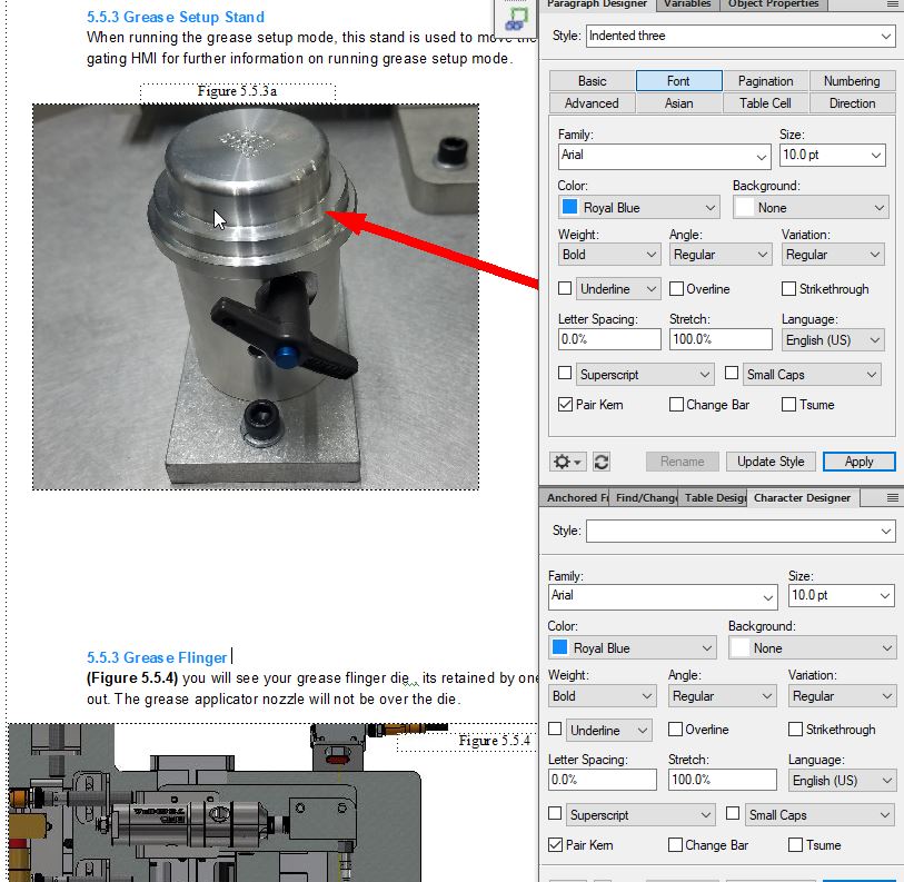
i am geting inconsistent fonts in framemaker, see this page i attached an attachment the top Title 5.5.3 Grease Setup Stand appears bolder and darker then lower one 5.5.3 Grease flinger . anyone know why this could be? I have related font style in the snip. thanks!


 14
Replies
14
14
Replies
14

Copy link to clipboard
Copied
I locked your other thread - you can add images by using the picture icon.
What's the issue here? Are you using the same paragraph tag for both the "5.5.3." bits of text?
Copy link to clipboard
Copied
yes i am, and on several pages its lightening the second paragraph tag . how can i fix this? the second number should be 5.5.4 which i corrected. but on 10 pages i am having this issue. i am semi new to framemaker and did it this way for table of contents purposes
Copy link to clipboard
Copied
I'm not seeing any font difference - are you saying that the "5.5.3 Grease Flinger" should read "5.5.4 Grease Flinger"? If it should, then it probably indicates an issue with your auto-numbering building blocks.
Copy link to clipboard
Copied
when i convert this to a pdf it shows lighter on the bottom sections. it appears this way on both my screens (using dual screens) im taking it as my screens maybe go lighter on the bottom of the scrolling and its not a editing issue after all
Copy link to clipboard
Copied
just a color im seeing in the font difference. does the lower 5.5.3 appear to be a lighter blue or is it the same color blue for both top and bottom 5.5.3
Copy link to clipboard
Copied
also i am not using autonumbering, i am new to framemaker and have not figured that out yet. this document will be converted to pdf as a service type manual. i am semi worried because it does appear the fonts are darker on top and lighter the bottom. although in paragraph designer they are both assigned indented 3 with the same font style, color style, and size. i want to be sure there is not another control of this font or that it will be lighting duplicates of the same style on the same page if this makes sense.
Copy link to clipboard
Copied
Sorry, can't tell - I'm partially colourblind, so it's not registering any difference to me - look to see if you've got an override on the paragraph tag (it will show a little asterisk down in the bottom left corner)
Copy link to clipboard
Copied
i dont see an override as being active. i can maybe push the document through with it as is. wondering if someone else can pull up the attachment and see if there is a difference. any other causes you are aware of that would create a color indifference
Copy link to clipboard
Copied

Copy link to clipboard
Copied
Bullet press continued and 3.4.4 Outer Seal grease applicator . the front appears to be slightly bolder or darker on bullet press on top.
Copy link to clipboard
Copied
Hi,
I imported your screenshot above into Corel Photopaint. When I put both paragraphs side by side, they really seem to be slightly different.
Can you put your insertion mark into both paragraphs and check these questions:
Does one of the paragraphs have an asterisk in the left bottom of the FrameMaker window? This indicates an override. The settings of this specific paragraph would differ from the original settings. Please make sure that your insertion mark is really in your paragraph.
Are there any differences in the paragraph designer in the Font tab? In your original post only one of the dialogs show a paragraph tag. The insertion mark was not in the paragraph in the lower dialog.
I would also apply the paragraph format again to both paragraphs. And I would also select the whole paragraph and apply the Default Paragraph Format (Format | Characters).
Best regards
Winfried
Copy link to clipboard
Copied

Copy link to clipboard
Copied
i have them assigned this paragraph format, i think i have it assigned correctly with no variation but maybe i am missing something
Copy link to clipboard
Copied
Hi,
In your screenshot both blue paragraphs look identical.
Did you selected both paragraphs and applied "Default Paragraph Format"?
Obviously both paragraphs have the same settings.
What I would also check: In the PDF zoom in and out and check whether you notice any difference. Possibly this is just an effect in Acrobat which appears only at certain zoom levels.
Best regards
Winfried

 AdChoices