Exit
  • Global community
    • Language:
      • Deutsch
      • English
      • Español
      • Français
      • Português
  • 日本語コミュニティ
  • 한국 커뮤니티
0

Why is FrameMaker using different CYMK/RGB values for Pantone library colours compared with Illustrator?

Community Beginner ,
Jun 12, 2014 Jun 12, 2014

Evening all -

this is by no means the first time I'm banged my head against the colour management brick wall, and I doubt it will be the last

I am running Frame 12 and Illustrator CC on Windows 7.

Both these Adobe products ship bundled with Pantone libraries. (Correct me with I'm wrong, but these "libraries" are basically a bunch of look-up tables, mapping named Pantone colours to various CYMK, RGB, etc equivalents?)

Can anyone tell me why these two different Adobe applications appear to give different definitions for the same Pantone colours?

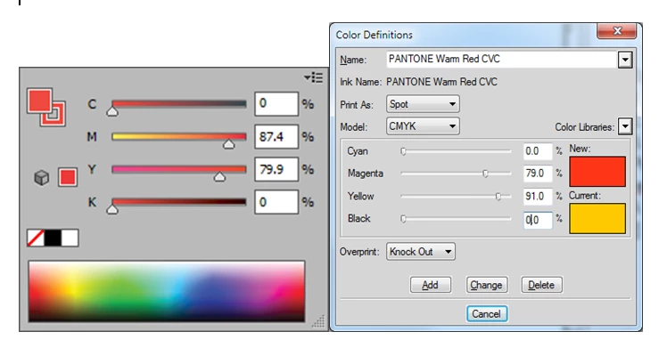
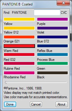
For example, if I choose the Pantone Coated library > 'Warm Red'

In Illustrator CC (left screenshot), it offers this as C0% M87.4% Y79.9% K0%

in FrameMaker 12 (right screenshot), I get C0% M79%  Y91%  K0%

Untitled.png

Why are they different?

Are the library definitions shipped with the products simply different?
Frame's dialog ominously mentions "© Pantone, Inc., 1986, 1988"

Untitled1.png

And if I go to C:\Program Files (x86)\Adobe\AdobeFrameMaker12\fminit\color and open the corresponding .bcf file in an editor, the header says:
"BCF 2.0PANTONE¨ Coated 1.1 ©Pantone, Inc., 1986, 1988.PANTONE¨* Computer Video simulations displayed may not match PANTONE-identified solid color standards.  Use current PANTONE Color Reference Manuals for accurate color.  To order publications from Pantone, Inc., in the U.S. please call the toll-free number (800) 222-1149 [within NJ, call (201) 935-5500].  In other countries contact your local Pantone representative.  *Pantone, Inc.'s check-standard trademark for color.[1]"


whereas if I go to C:\Program Files (x86)\Adobe\Adobe Illustrator CC\Presets\en_US\Swatches\Color Books and open the corresponding .acb swatch file in there, in amoungst the hex gibberish I note it says:

"=$$$/colorbook/PantonePlusCoated/title=PANTONE+^R Solid Coated/$$$/colorbook/PantonePlusCoated/prefix=PANTONE *$$$/colorbook/PantonePlusCoated/postfix= CK"$$$/colorbook/PantonePlusCoated/description=Copyright^C Pantone LLC, 2010"


Have Pantone perhaps changed their colour definitions between 1988 and 2010?
(I'm thinking it would be sensible to establish this one way or the other before we get into any convoluted discussions about the Windows GDI etc etc)

3.5K
Translate
Report
Community guidelines
Be kind and respectful, give credit to the original source of content, and search for duplicates before posting. Learn more
community guidelines
Community Beginner ,
Jun 12, 2014 Jun 12, 2014

Hmpf, well, doing some googling comes up with a bazillion "Why do Pantone colours not match between Illustrator and Photoshop" and "Why do Pantone colours not match between different versions of Illustrator" type threads...

(e.g. Pantone Color Changes )

So I think we can "safely" say that if the Pantone libraries shipping with Frame 12 and TCS5 really are from 1988 (!!?) then they almost certainly do contain different CYMK equivalents compared to the ones in Illustrator CS.

So, basically, we are all banjaxed before we even start, and there's no way whatsoever that any graphic I make in Illustrator and import into Frame is ever going to look the same colour as text or table rulings in Frame, unless I specify both manually as explicity CYMK (or RGB) values, and don't label them as Pantones at all..... which, of course, that no subsequent output device can ever say "aha! a Pantone!" and use colour management to get the best RGB or CYMK conversion for it.

Ho hum.

Sometimes I really think I'd be best just having a big box of crayons on my desk......

Translate
Report
Community guidelines
Be kind and respectful, give credit to the original source of content, and search for duplicates before posting. Learn more
community guidelines
LEGEND ,
Jun 12, 2014 Jun 12, 2014

David,

Indeed Pantone have changed their formulations several times since the last century and have added hundreds of new colours to the libraries. If you are using SPOT colours for printing on a press, then for all intents and purposes, it doesn't matter as the ink is mixed to the Pantone specs at print time and you're printing a specific plate. The problems creep in when outputting on digital or web presses where the Pantone SPOT colour is converted to a CMYK equivalent.

That being said, you can get new(er) Pantone colours into FM (the FM libraries haven't changed since 1988, BTW) to match those in use by other Adobe Creative apps. This is done by creating a swatch set of the project colours in AI or Photoshop and saving those to an EPS or PDF file. Then import that file onto a Reference page and FM will automatically add those swatch colours to the document color catalog. I do this all of the time when collaborating with various creatives in producing catalogs. The sample swatch file is part of the "style guide" for the publication and can be used for proofing to check how well the printer (shop or specific device) will match the actual Pantone book swatches.

If you need to know how well a specific device matches, take a gander at Pantone's calibrated printer list samples at : Support - calibrated lookup tables for licensed printers

Download a couple of samples from different manufactures. Note how the CMYK/RGB values needed to reproduce the Pantone colour are different even between devices!

Understanding colour management is sort of like trying to always get the same colour of light-brown on a piece of toast everywhere. If I say just set the toaster at "3" for the perfect toast that I get at home, in all likelihood it's not going to give you the same colour at your place. Different brands of toasters, different heating elements, different dial calibrations, different power feeds, different bread, different moisture contents, etc.

Translate
Report
Community guidelines
Be kind and respectful, give credit to the original source of content, and search for duplicates before posting. Learn more
community guidelines
Community Beginner ,
Jun 13, 2014 Jun 13, 2014

Thanks Arnis!

Arnis Gubins wrote

You can get new(er) Pantone colours into FM ...  by creating a swatch set of the project colours in AI or Photoshop and saving those to an EPS or PDF file. Then import that file onto a Reference page and FM will automatically add those swatch colours to the document color catalog.

Aha! Brilliant. I should've thought of that! (As I'm was well aware that my Colour Definitions list often gets full of spurious entries from imported graphics... some of us may well remember all those RGB colours from paletted PNGs, for instance).

I wonder what Frame will do with these definitions if I defined the Pantone in Illustrator as an L*A*B spot colour though? (I will experiment!)

Understanding colour management is sort of like trying to always get the same colour of light-brown on a piece of toast everywhere. ...

Now come on, don't start going into the "Wooo, colour management! It's complicated!" thing. It's not exactly quantum mechanics. There is nothing "complicated" about how Adobe hasn't deigned to update FrameMaker's Pantone libraries since 1988. (Indeed, since Adobe only acquired Frame in 1995 (?), Adobe have NEVER updated its Pantone libraries!!) I'm struggling to see how this is acceptable, really? What are they playing at?!  To me, this is just yet another example of where colour "management" doesn't work properly because of poor quality software, but the vendor hopes to get around it by going "wooo! colour management! complicated!!" and obfuscating the actual problem.

But anyways, enough moaning - I shall fill in that bug report/feature request form suggesting that they might like to update those libraries. But Arnis' workaround will do very nicely in the meantime

Translate
Report
Community guidelines
Be kind and respectful, give credit to the original source of content, and search for duplicates before posting. Learn more
community guidelines
Community Beginner ,
Jun 13, 2014 Jun 13, 2014

lmao I filled in a report on this. Love the thank you message it displays:

"Requests and suggestions from our customers are what help us to continue creating cutting-edge, world-class software

Yep, the cutting edge of 1988!

Translate
Report
Community guidelines
Be kind and respectful, give credit to the original source of content, and search for duplicates before posting. Learn more
community guidelines
Community Beginner ,
Jun 13, 2014 Jun 13, 2014

OK, I did some experimenting.
I made a swatch in Illustrator CC, with Pantones define as spot LAB values.

I saved this as an EPS and imported it onto a new Reference Page in Frame 12.

Arnis, it works PERFECTLY in CYMK mode!   The colours in the swatch all appear in the my Frame colour definitions, and if I examine their CYMK values, they match exactly the CYMK equivalents Illustrator uses if I take the Pantone out of spot LAB mode and view the CYMK equivalent. Given that Frame doesn't support LAB, we can't really ask for better.

However, it all goes belly up in RGB mode

As per the definitions in the Frame11 Maker.ini reference, in my maker.ini [Preferences] section, I have GetLibraryColorRGBFromCMYK=None, which is meant to "Display and print the RGB values from the library color description."

However Frame12 isn't doing this - it is using its own bogus algorithm to convert the CYMK value to RGB, the same broken behaviour we saw in this thread here https://forums.adobe.com/thread/1485020
when text colour in CHM output was all wrong.

For instance, compare this "Spruce Green" (Pantone 355C) - in Illustrator (right hand side), if I take it out of Spot LAB mode and ask for an RGB equivalent, I get 0-148-77.

Frame obfuscates this a little by expressing the values as percentages, but converting it to values out of 255, we get 0-220-0 (that lurid lime green colour)

Untitled.png

Now I don't think I'm being unreasonable in asking how on EARTH is that supposed to be a good equivalent to the original Pantone?!? It's zeroed the blue channel!!!    Truely bizarre.

Translate
Report
Community guidelines
Be kind and respectful, give credit to the original source of content, and search for duplicates before posting. Learn more
community guidelines
LEGEND ,
Jun 13, 2014 Jun 13, 2014

David,

What options did you use for defining the colours internally and what options for output in AI? I suspect that if you examine the EPS file you created from AI for the Panotne 355C, the only values in there are the CMYK ones - no LAB nor RGB. So FM has to use the algorithm mentioned in the other thread and creates the lime green based upon the algorithm. If you have set the AI drawing to an RGB color mode and set the EPS export option for "Include CMYK Postscript in RGB files" to OFF, then you would get the desired RGB values in the EPS file.

Pantonee355_RGB.png

If you're so intent on using Pantone Spot colours to get RGB, then you can create your own ACF library file with the exact RGB definitions that you want (you can then use whatever values you get in Photoshop, Illustrator or whatever source that you're trying to match). The structure of the file is as follows:

ACF 1.0

My Color Library             <----  name of library

LibraryVersion: 1.0

Copyright: © 2014 <your name here>. All rights reserved.

AboutMessage: User defined Spot colours for RGB

Names: Partial

Rows: 4

Columns: 4

Entries: 1           <---- number of colours in file

Prefix:         <---- used for display in FM, e.g. "Panotne"

Suffix:           <----- used together with prefix, e.g. "CVC, CVU, etc."

Type: Process <---- Spot, Process, Tint, Mixed (need to add specifier to Data lines)

Models: CMYK RGB

PreferredModel: RGB     <---- whatever you want

Data:

0.98 0.11 1.00 0.02              <---- CMYK values (0-1)

0 38143 19967     <---- RGB values as 16-bit, i.e. 16-bit = ( [RGB value (1-255)]*256) + 255; zero is still zero

Spruce Green                   <---- name of colour

The acf file needs to be installed in the fminit\color folder.

Also, a note of caution, If you screw something up in the acf file (like the incorrect number of entries in the file or you're missing a component value, this will hang FM if you use the View > Color > Definitions... option. You'll need to kill FM, fix or remove the ACF file and re-start. Also, FM only reads the libraries at the start, so if you need to make any changes to the ACF definitions, you have to r-start FM for those changes to take place.

[I know, FM doesn't make it easy, but it can be done...]

Translate
Report
Community guidelines
Be kind and respectful, give credit to the original source of content, and search for duplicates before posting. Learn more
community guidelines
Community Beginner ,
Jun 15, 2014 Jun 15, 2014

Thanks Arnis, there's some excellent info in there!

If you're so intent on using Pantone Spot colours to get RGB...

Well it's not so much that, as that I'm intent on using FrameMaker 12 for advertised purpose: single sourcing and outputting in multiple formats. And some of those formats (HTML Help) are in the RGB domain.

Frame ought to be able to capable of this (by referring to it's bundled Pantone libraries, which should contain good CYMK and RGB equivalents for the Pantone colours), but it's ending up pretty woeful in practice, because not only are Frame's Pantone definitions a quarter of a century out of date, but it keeps doggedly refusing to use the RGB definitions! So at present I'm pretty much having to have a seperate Frame source files and template for my HTML Help work. Obviously this is a PITA.

You've given me a lot to work with there, though, thanks!    I need to open up my EPS swatches in a text editor and see what Illustrator CS has actually been putting in there. If it's not adding the RGB data, I need to amend my Illustrator settings so that it does! or if that can't be done, I shall have to hack together one of those ASCII Colour File .acf definitions.
(It's difficult to justify doing this kind of laborious research work on the client's time though - particularly when my excuse is "well, you know what TCS5 suite I persauded you to fork out all that money for, because it was the best tool for the job? Well, it doesn't actually work properly, so I'm having to play with technology for the 1980s in a text editor to try and fix it )

I will post back here with my findings!

A question:

was there ever a GUI front end utility from Adobe or a 3rd party, for editing ACF files? Maybe even something on DOS or 16 bit windows?  I still have a Windows XP installation on a Oracle Virtual Box VM which could probably run something like that....

Translate
Report
Community guidelines
Be kind and respectful, give credit to the original source of content, and search for duplicates before posting. Learn more
community guidelines
LEGEND ,
Jun 16, 2014 Jun 16, 2014

>> So at present I'm pretty much having to have a seperate Frame source files and template for my HTML Help work. Obviously this is a PITA.


That's pretty much the whole idea. You should have separate templates for the various Publish outputs. Each of the formats (HTML5/ePub/Mobi/CHM) have various differences & limitations compared to a print/PDF workflows. That's why the Set Template button is right there on the Style Mapping page. Use semantic naming for your tags and colours (e.g. instead of Spruce Green, why not CorporateColour or something like that?) and then use an optimized template for each of the required Publish outputs. This is especially true for using the colours. If you know what RGB you need, then in another template, just create that colour as an RGB one in FM in the first place. FM templates coupled with the Style mappings in the STS file settings, give you a lot more control then either route by itself. [other issues notwithstanding... ]


The EPS swatch that I showed in the previous message was imported from AI, where the options were set to RGB and to not include CMYK in the RGB postscript, to show you that it can be done.


Regarding a GUI for editing the ACF, there never was one, AFAIK. There is a detailed description in the PageMaker 6 User Guide (if you can find one) and a bit of detail in this publication: ftp://ftp.adobe.com/pub/adobe/pagemaker/all/6.x/hificolr.pdf


All I'm saying is that there are (as typical in FM) any number of ways to accomplish what you want (a specific RGB colour), but due to the decrepit state of FM's documentation, this topic is not covered in any useful manner. Hopefully, the information provided here will help you find the path of least resistance to getting your work done.

Translate
Report
Community guidelines
Be kind and respectful, give credit to the original source of content, and search for duplicates before posting. Learn more
community guidelines
Community Beginner ,
Jun 16, 2014 Jun 16, 2014

Well, I already have pretty much ended up with a different template for my CHM output, for a bundle of other reasons 😕

But one common thing I was hoping to still be able to retain across the whole portfolio was common Pantone colours.

Unless I'm completely misunderstanderizing FrameMaker's implementation here, it is supposed to be able to refer to a Panton definition, which contains both CYMK and RGB values, and use the one specified in my PDF generation settings (or, in my maker.ini file, in the case of CHMs, it will use the RGB one)

I opened my EPS swatch and it did indeed only seem to have the CYMK values in it (hard to be 100% sure as there were pages of PostScript blurb).

Hopefully if I fiddle with my Illustrator settings, I can create an EPS with RGB and CYMK values defined, and then the next task will be to get Frame to read them both!

Translate
Report
Community guidelines
Be kind and respectful, give credit to the original source of content, and search for duplicates before posting. Learn more
community guidelines
LEGEND ,
Jun 16, 2014 Jun 16, 2014

David 😄 wrote:

Unless I'm completely misunderstanderizing FrameMaker's implementation here, it is supposed to be able to refer to a Panton definition, which contains both CYMK and RGB values, and use the one specified in my PDF generation settings (or, in my maker.ini file, in the case of CHMs, it will use the RGB one)

That may be true for FM, but remember that the Publish modules have been stripped out of RoboHelp and these are working only with the MIF versions of FM files. If you check your Temp folders after a Publish output, you will find a MIF version of your FM file generated every time. Now if you examine the ColorCatalog definitions within that MIF files, what information do you suppose was passed to the RH modules? Hint: it starts with a capital "c"....

Perhaps the question you should be asking is how do RoboHelp's publish modules handle CMYK input?

Translate
Report
Community guidelines
Be kind and respectful, give credit to the original source of content, and search for duplicates before posting. Learn more
community guidelines
Community Beginner ,
Jul 01, 2014 Jul 01, 2014

Arnis Gubins wrote:

What options did you use for defining the colours internally and what options for output in AI? I suspect that if you examine the EPS file you created from AI for the Panotne 355C, the only values in there are the CMYK ones - no LAB nor RGB. So FM has to use the algorithm mentioned in the other thread and creates the lime green based upon the algorithm. If you have set the AI drawing to an RGB color mode and set the EPS export option for "Include CMYK Postscript in RGB files" to OFF, then you would get the desired RGB values in the EPS file.

Hi Arnis, I really appreciate your answers on this.

I haven't been able to work on it for a few weeks (licensing woes: the client I'm working for upgraded me to TCS5, so I lost Illustrator..... it's taken until now to get it back....... the main reason being that this client's purchasing team had no process for dealing with subscription-only-software billed monthly on a credit card.... ARRRGH ... but let's not get sidetracked! )

In this shiney new Illustrator CC 2014 (version 18), if I draw a rectangle, fill it with Pantone 355 C from the built in swatch library, and save to EPS.....

If my Doc Colour Mode is RGB and I leave "Include CMYK Postscript in RGB files" OFF, and open the resulting EPS in WordPad, I see:

%%DocumentCustomColors: (PANTONE 355 C)

%%CMYKCustomColor:

%%RGBCustomColor: 0 0.5859 0.2282 (PANTONE 355 C)

If however, my Doc Colour Mode is RGB and I set "Include CMYK Postscript in RGB files" ON, and open the resulting EPS in WordPad, I see:

%%DocumentCustomColors: (PANTONE 355 C)

%%CMYKCustomColor: 0.9578 0.0376 1 0.0040 (PANTONE 355 C)

%%RGBCustomColor:

I'm guessing that if the EPS were to contain both CYMK and RGB definitions for the Pantone 355, then FrameMaker could use them both in the appropriate contexts?

Is there an easy way to make Illustrator write them both?  Can I add them both manually to the EPS file in WordPad?

Or can I make two EPS swatches, containing the same named Pantone colours but on has RGB definitions and the other has CYMK definitions? And then I place *both* swatches on a Reference page and would Frame be smart enough to merge them?
Or is the only sure way going to be to hand-craft a .acf file?
(I guess I can experiment with all this myself, but someone may already know the answer... )

Translate
Report
Community guidelines
Be kind and respectful, give credit to the original source of content, and search for duplicates before posting. Learn more
community guidelines
Community Beginner ,
Jul 01, 2014 Jul 01, 2014

Hmm... research finding No.1:

Adobe's help for Illustrator says that "Include CMYK PostScript In RGB FilesAllows RGB color documents to be printed from applications that do not support RGB output. When the EPS file is reopened in Illustrator, the RGB colors are preserved."

This suggest that even when I set Include CMYK PostScript In RGB  to ON, so the EPS file contains a CMYK definition of the Pantone, the RGB values are still in EPS somewhere? But, I suppose, not in a format that FrameMaker can make use of?

Translate
Report
Community guidelines
Be kind and respectful, give credit to the original source of content, and search for duplicates before posting. Learn more
community guidelines
Community Beginner ,
Jul 01, 2014 Jul 01, 2014

Hmmm, Research Finding No.2:

All done with my maker.ini file's GetLibraryColorRGBFromCMYK=None, so Frame is meant to "use the values from the library")

In each case, I'm importing an EPS file onto a reference page, to populate Frame's Color Definitions.

1. EPS containing a CMYK definition of a Pantone  >   the resulting Color Definition in Frame has the correct CMYK value (but the RGB is just calculated using Frame's own rubbish algorithm and looks like hell)

2. EPS containing an RGB definition of a Pantone > Frame gives an error when importing the EPS, only displaying a grey box instead of the TIFF preview, but the resulting Color Definition has the correct RGB value. The CMYK one is (as you might imagine) wrong

3. EPS containing both RGB and CMYK definitions for a Pantone > Frame gives the same import error. In the resulting Color Definition, Frame has only used the CMYK value from the EPS. It ignores the RGB value in the EPS and uses it's own hopeless algorithm to dream up a new one.

So, I was hoping the EPS with the Dual definitions might triumph, but it doesn't work. Ho hum.

Translate
Report
Community guidelines
Be kind and respectful, give credit to the original source of content, and search for duplicates before posting. Learn more
community guidelines
Community Beginner ,
Jul 01, 2014 Jul 01, 2014

Another tryout:

I imported two different EPS's onto a reference page, one containing the CMYK definition of a Pantone, the other containing an RGB definition of the same named Pantone.

I just end up with a single Pantone entry in my Frame Color Definitions, and it's using the CMYK definition and ignoring the RGB one (using its own algorithm for it).

Harumph.

Translate
Report
Community guidelines
Be kind and respectful, give credit to the original source of content, and search for duplicates before posting. Learn more
community guidelines
Community Beginner ,
Jul 01, 2014 Jul 01, 2014

ARRRRRRRRRRRRRRRRRRRRRRRRRRRRRRRRRRRRRRRRRRRRRRRRGH

OK, here's what I tried this time:

I used Arnis' template to create a .acf file in Notepad, containing CMYK and RGB definitions of my Spruce Green colour. (FWIW I set "preferred" mode to RGB, not sure what practical difference it makes).

I restarted Frame and lo and behold, there in the Color Definitions dialog was now my very own library with my one colour in it. I could add it to the document's color definitions, and switch between CMYK and RGB mode, and it had the right definitions and colour for both of them. I could color some text with my new colour, and make PDFs in both CMYK and RGB output modes, and they both looked very similar in Acrobat (the CMYK one was, unsurprisingly, sliiiiiightly different to what I saw on screen in Frame, as Frame had been displaying me the RGB definitions, but Acrobat was converting the CMYK to RGB on the fly to display on screen.)

But then the facepalming moment:

I tried CHM output via the Publish command.

ARRRRRRRRRRRRRRRGH.

I get the horrible lime green again.

Frame totally disregards the RGB definition in has for the colour, and does bogus maths on the CYMK version, resulting in a totally wrong hue.

It's beginning to look like this is a bit of a no win situation.

There's no way I can have a single set of colour definitions across Illustrator and Frame that will output reliably to both CYMK print and on-screen HTML Help.
Any time a colour definition possesses numbers for CYMK, it ruins the CHM output's colour, even if a valid RGB definition is also present.

The only way to get reliable colour in CHM output is to have a purely RGB definition of a library.

This is, of course, conversely, no use for creating PDFs for print.

I basically just need two different swatches: one RGB one and one Pantone one,

Frame documents that will end up as CHMs have the RGB EPS added to a reference page;

Frame documents that will end up as PDFs and might get printed have the CMYK EPS added to their reference page.

Or, another solution is just to keep everything in RGB mode. That way, PDFs look OK on screen and match my CHMs exactly. When printed on paper, the printer will just have to convert RGB > CMYK themselves, which will probably give perfectly acceptable results anyways.

Translate
Report
Community guidelines
Be kind and respectful, give credit to the original source of content, and search for duplicates before posting. Learn more
community guidelines
Community Expert ,
Jul 01, 2014 Jul 01, 2014

> Or, another solution is just to keep everything in RGB mode.

That's what we do. We aren't routinely printing to color hardcopy yet, but at least the FM colors and the imported object colors can be made to match on screen and when end users do convenience printing to color printers.

If your colors are in-gamut for sRGB, that would be the color space to use.

Working out what the color triplets are can be challenging. For in gamut colors, an application like BabelColor might be useful. For out of gamut colors, rendering intent arises as an issue, as does the problem of wandering hue when scaling chroma in any color systems other than Munsell. Older thread on this mess: ANSI Z535.1 Safety Colors in Frame

You can get the PDF workflow to "Tag Only Images for Color Management" or "Tag Everything for Color Management" for color management, specifying sRGB IEC 61966-2-1:1999.

Tagging "everything" is not recommended, as it makes black text behave as composite black, which really slows down printing, and may even waste color ink/toner on end user printers. So if you have color text, getting that text to match non-text objects of the same color could be a problem. For small amounts of it, importing the color text as EPS text objects, anchored at insertion point, would be a work-around.

Since Frame is never going to get color management, Distiller seems to really need an option for "tag all color objects" (which would exclude anything with primaries all-0s or all-255s).

Translate
Report
Community guidelines
Be kind and respectful, give credit to the original source of content, and search for duplicates before posting. Learn more
community guidelines
Community Beginner ,
Jul 01, 2014 Jul 01, 2014

Error7103 wrote:

. Older thread on this mess: ANSI Z535.1 Safety Colors in Frame

I was on that thread! (Guess what my login was back then.....:) )

Since then, the only progress seems to have been the introduction of the new Publish feature, which breaks things in a whole new way )

Translate
Report
Community guidelines
Be kind and respectful, give credit to the original source of content, and search for duplicates before posting. Learn more
community guidelines
Community Expert ,
Jul 02, 2014 Jul 02, 2014

> Since then, the only progress seems to have been the introduction of the new Publish feature, which breaks things in a whole new way )

If it's any consolation, Frame's ostensible competitor had a grand opportunity to do a clean-sheet color management implementation, but I see no evidence that they did. Their marketing puffery is silent on the matter. In searching their forum on it, the topic gets no hits, but I do see users complaining about the quality of graphics output.

It doesn't help, of course, that Windows is now the dominant (often sole) native platform for DTP apps, and has only fake CMYK.

I'm only a bit surprised that I haven't yet seen complaints here about deep color. I suspect that FM can't handle more than 24 (RGB) or 32 (CMYK) bit color file imports at all.

Even TV is getting wide gamut 10-bits per primary color. Once desktop and mobile displays get beyond today's primitive LCDs, end users are going to begin to expect accurate and predictable colors (as are merchants who are tired of getting shoe and clothing returns because the actual colors are substantially different than shown on their web page and as further distorted by the end user display).

Translate
Report
Community guidelines
Be kind and respectful, give credit to the original source of content, and search for duplicates before posting. Learn more
community guidelines
LEGEND ,
Jul 01, 2014 Jul 01, 2014

David,

As I mentioned earlier, the CHM output routines are from RoboHelp and use the content that FM outputs in the MIF file. The MIF file information doesn't have the RGB definitions, but rather CMYK conversions.

Instead of trying to put everything into a single file, use the apply template option in the Publish routines to first apply a user-specified template that has the correct RGB colours automatically at output time. It's lot less frustating and this is the way the operations were designed to operate in the first place. The process is realtively simple. Create a CMYK template for print and another with just the RGB version of the Color Catalog for online Publish outputs.

Translate
Report
Community guidelines
Be kind and respectful, give credit to the original source of content, and search for duplicates before posting. Learn more
community guidelines
Community Beginner ,
Jul 02, 2014 Jul 02, 2014

Thanks Arnis, this is more or less what I've ended up doing.

I'm confused at to why the MIF files can't store the RGB definitions, though. It's just a text file, same as a .acf file is just text - I can't see any technical reason why the MIF shouldn't store those numbers? As CHM is an RGB-only medium, it seems totally daft from Frame to generate it from a CMYK definition.

(I appreciate the answer is "because they kludged the functionality in from RoboHelp, which they bought with Macromedia 9 years ago"...  but since then they've sold/rented us TCS1, TCS2., TCS3, TCS4 and now Frame12, all supposed to have ever-greater levels of integration between Frame and CHMs.... how many years is it going to take them to get this workflow right? 19? 29? .... Ah well......)

At least thanks to Arnis, I now know more about this subject than I ever dared dream   You haven't quite lived until you've hand-crafted an .acf in Notepad

Translate
Report
Community guidelines
Be kind and respectful, give credit to the original source of content, and search for duplicates before posting. Learn more
community guidelines
LEGEND ,
Jul 02, 2014 Jul 02, 2014

I'm confused at to why the MIF files can't store the RGB definitions, though. It's just a text file, same as a .acf file is just text - I can't see any technical reason why the MIF shouldn't store those numbers? As CHM is an RGB-only medium, it seems totally daft from Frame to generate it from a CMYK definition.

That's just the way MIF was implemented in the last century, when it was originally designed for print production (and even then it was a kludge to get it to work in the RGB-centric Windows world). FM is not doing the generating of CHM - the RoboHelp routines are and they only read MIF, not the internal FM binaries.

Sometimes the sum is the lesser of the parts when developers use a Frankenstein approach to cobble together features from disparate programs, rather than doing it right the first time.

(At least it's not a total Chindōgu implementation, as some other marketing-driven features have been.)

Translate
Report
Community guidelines
Be kind and respectful, give credit to the original source of content, and search for duplicates before posting. Learn more
community guidelines
Community Beginner ,
Jul 03, 2014 Jul 03, 2014

Well they change the MIF format for every release, so it's not backwards compatible ...   I hope that's not the only reason they change it!!  they could also make it support some new features.

At least I have enjoyed reading Chindōgu - Wikipedia, the free encyclopedia this morning

Translate
Report
Community guidelines
Be kind and respectful, give credit to the original source of content, and search for duplicates before posting. Learn more
community guidelines
Community Expert ,
Jul 03, 2014 Jul 03, 2014
LATEST

> Well they change the MIF format for every release, so it's not backwards compatible ...

We'd like to think that they extend it for every release, so that it remains backwards compatible (older FMs merely ignore the new tags).

You'd think it would be possible to just toss in the RGB defs along with the CMYKs.

Translate
Report
Community guidelines
Be kind and respectful, give credit to the original source of content, and search for duplicates before posting. Learn more
community guidelines
Community Beginner ,
Jul 02, 2014 Jul 02, 2014

well we can start complaining about Deep Colour after we get the shallow colour working!!

Translate
Report
Community guidelines
Be kind and respectful, give credit to the original source of content, and search for duplicates before posting. Learn more
community guidelines