• Global community
    • Language:
      • Deutsch
      • English
      • Español
      • Français
      • Português
  • 日本語コミュニティ
    Dedicated community for Japanese speakers
  • 한국 커뮤니티
    Dedicated community for Korean speakers
Exit
0

background and word logo the same color and can see text

New Here ,
Mar 09, 2022 Mar 09, 2022

Copy link to clipboard

Copied

hi, I would like a black background and black word logo, how can i the logo be visible? thxx


Views

120

Translate

Translate

Report

Report
Community guidelines
Be kind and respectful, give credit to the original source of content, and search for duplicates before posting. Learn more
community guidelines
Adobe
Community Expert ,
Mar 09, 2022 Mar 09, 2022

Copy link to clipboard

Copied

I don't know if this is remotely what you're after, but it seems to me that there has to be something lighter to separate the letters from the background, or the letters themselves must be a sufficiently different black to make them legible

tromboniator_0-1646885368582.png

tromboniator_1-1646886003646.png

The top one is a lighter fill behind the black letters with a path offset and feather effect applied; second one is lettering in dark gray rather than black; third is a stroke with a gradient from 100% white to 0% white.


Peter


Votes

Translate

Translate

Report

Report
Community guidelines
Be kind and respectful, give credit to the original source of content, and search for duplicates before posting. Learn more
community guidelines
Community Expert ,
Mar 10, 2022 Mar 10, 2022

Copy link to clipboard

Copied

For accessibility, this is not a very good idea.

Votes

Translate

Translate

Report

Report
Community guidelines
Be kind and respectful, give credit to the original source of content, and search for duplicates before posting. Learn more
community guidelines
Community Expert ,
Mar 11, 2022 Mar 11, 2022

Copy link to clipboard

Copied

LATEST

ajkiamc,


From the wording "background and word logo the same color", the answer can only be what Peter said, namely to have something lighter to separate them, and that something will then be what shapes the logo and makes it visible.


The additional approach where either is darker and the other is paler, that Peter mentions and shows in the second sample, is strictly against the wording.


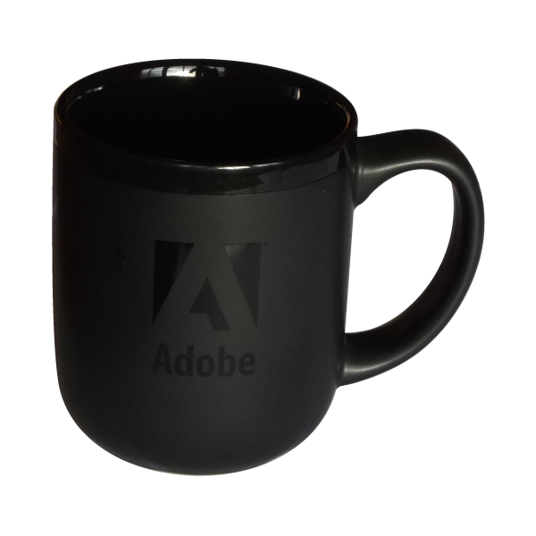
But both ways, and especially the latter, can be seen/perceived as a representation of the real world experience that the same black can appear differently depending on reflection of light by different surface properties, especially the contrasts between lustrous and lustreless where the former can also have highlights; this could be built into the logo, a bit like what we can see on the Adobe 17 oz Stealth Mug which actually has the exact same black colur throughout.


Click Here to see in Chrome 


Votes

Translate

Translate

Report

Report
Community guidelines
Be kind and respectful, give credit to the original source of content, and search for duplicates before posting. Learn more
community guidelines