


Copy link to clipboard
Copied
Hi. I'm trying to do some lettering styling. Part of this is doing a negative Offset Path (-2.5px) on a large/thick capital 'A' (converted to outlines). But the top of the inner triangle of the 'A' just won't stay sharp - it gets beveled off. I've tried adjusting the Miter Limit in the Offset Path options from 1-500, but nothing works.
- Is this truly not possible?
Don't want to do it all manually (making not a compound path, adjusting points, etc.) as there are a lot of other attributes being added to each letterform. And really would like to keep the overall 'master' letterforms the larger size (not reverse what I'm doing) due to all of the other layered attributes I'm doing (e.g, fills, effects, etc.) and how they interact.
Basic Example:


 1 Correct answer

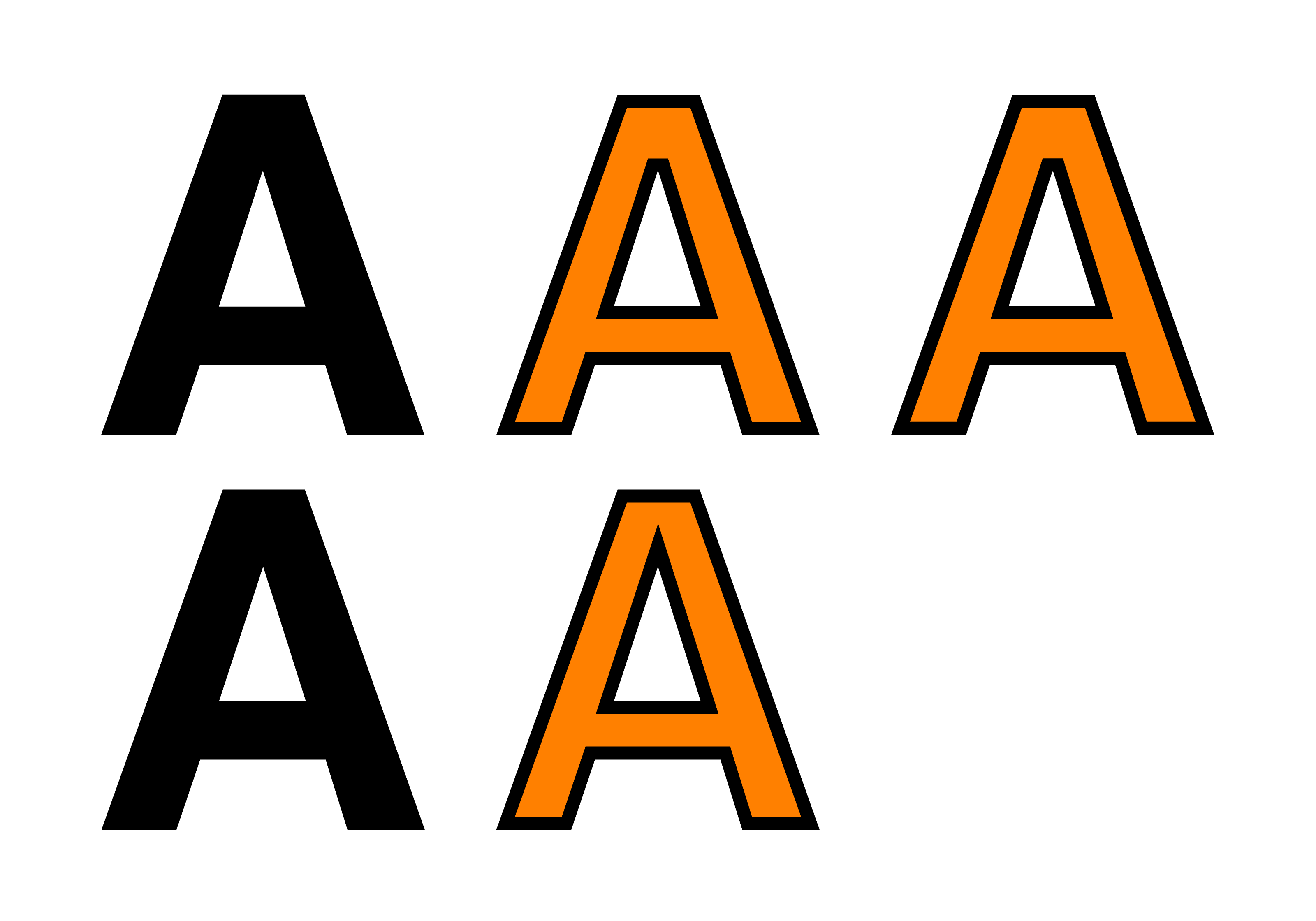
I assume the black outer "A" shape is the original source letter and the inner orange shape is the end result of the negative path offset, correct?
The first thing I would check is the pointed top of the counter inside the black "A" shape. There might be two anchor points there joined by a tiny horizontal line. If anything like that is present no amount of miter adjustment will help.
It is also common for inner negative path offsets to generate some odd, line segments as the effect negotiate
...Explore related tutorials & articles
 4
Replies
4
4
Replies
4
Copy link to clipboard
Copied
I assume the black outer "A" shape is the original source letter and the inner orange shape is the end result of the negative path offset, correct?
The first thing I would check is the pointed top of the counter inside the black "A" shape. There might be two anchor points there joined by a tiny horizontal line. If anything like that is present no amount of miter adjustment will help.
It is also common for inner negative path offsets to generate some odd, line segments as the effect negotiates it way around sharp corners. The right join of a letter "B" where the two loops meet often generate what you're seeing at the top of the counter in your "A" shape.
IMHO, it's actually better to generate a standard positive path offset around the outside of source letters. There won't be so many odd looking artifacts as there will be by creating an offset going inside the source letter. Make the original "A" the size of the orange shape and then create a 2.5px positive path offset around it (coloring it black).

Copy link to clipboard
Copied
Jethro,
I see what Bobby sees: a (clearly visible) horizontal line, which seems quite deliberate, and justified as I see it, to avoid a spiky appearance of the inner bounds (of the original letter) and literally in line with the shape of the outer bounds.
So if you wish to have a spike upwards into the shape of the letter you will have to do something manually to actually change the outlined letter; you can Direct Select the two Anchor Points and Object>Path>Average.
But is that what you wish?
Top row is based on original letter, first with negative offset, second with stroke inside.
Second row is after averaging.
 Click/RightClick to get closer, Click again to get really close
Copy link to clipboard
Copied
Ahhh, sorry. Didn't look closely enough with direct select. Indeed there were 2 points at the top of the inner triangle that were not detectable at full size. Since original letter looked pointed, didn't think to check up super close.
And thanks for the tip on averaging. This helped me figure out how best to deal with them.
Copy link to clipboard
Copied
For my part you are welcome, Jethro.

 AdChoices