

- Home
- Illustrator
- Discussions
- Pantone Bridge CMYK vs Illustrator CMYK conversion
- Pantone Bridge CMYK vs Illustrator CMYK conversion

Copy link to clipboard
Copied
I'm wondering if anyone can explain why I'm getting different CMYK numbers when I convert a Spot color in Illustrator vs the CMYK numbers out of a Pantone Bridge book.
For instance:
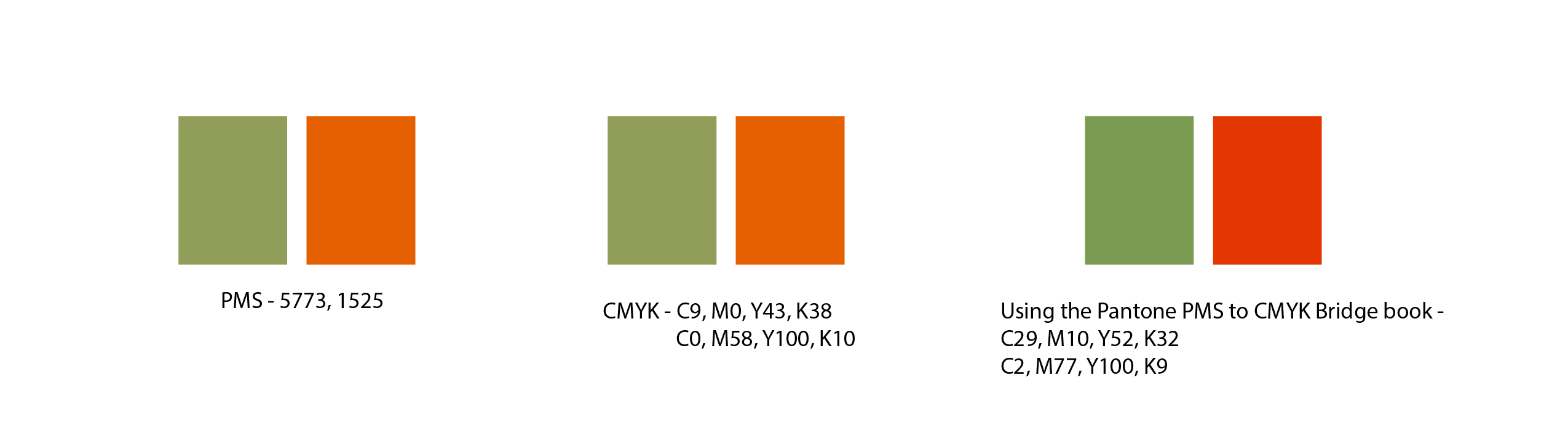
PMS 5773 converted to CMYK through Illustrator - C9, M0, Y43, K38
PMS 5773 build according to Pantone's Color Bridge book - C29, M10, Y52, K32
I feel like I'm missing something obvious here.
thanks


 1 Correct answer

I would not even use a conversion to CMYK when printing on an inkjet printer if you will be printing with spot inks.
The inkjet printer may have inks that are better at simulating the Pantone spot ink than the CMYK conversion.
But if you want to simulate how the CMYK conversion (for your printing process) looks on your inkjet, I would trust Illustrators color management (if your color management and print setup is done right).
The point of Pantone Bridge (like the CMYK conversions that were in the
...Explore related tutorials & articles
 19
Replies
19
19
Replies
19

Copy link to clipboard
Copied
Pantone Bridge CMYK a redo formulations ( in an effort to generate a closer match due to the improvements in desktop proofers. The Illustrator formula is standard CMYK percentages suitable for offset printing.
Copy link to clipboard
Copied
Pantone spot inks are normally not possible to reproduce with CMYK inks (that's why they are special mixed inks).
Whatever Pantone has based their CMYK percentages simulation on is unclear and specific for a particular CMYK inks on particular paper and a particular printing press.
Illustrator simulates the Pantone color by taking into account those printing conditions using Color Management.
The CMYK profile that is set in Edit > Color Settings: Working Spaces CMYK defines the conversion to CMYK values.
Copy link to clipboard
Copied
Thanks for the reply Ton,
If I understand you correctly, converting a spot color in Illustrator to CMYK is the most accurate (for basic ink jet printer use)? What is the point of the Pantone Bridge then?
Copy link to clipboard
Copied
I would not even use a conversion to CMYK when printing on an inkjet printer if you will be printing with spot inks.
The inkjet printer may have inks that are better at simulating the Pantone spot ink than the CMYK conversion.
But if you want to simulate how the CMYK conversion (for your printing process) looks on your inkjet, I would trust Illustrators color management (if your color management and print setup is done right).
The point of Pantone Bridge (like the CMYK conversions that were in the old Adobe CS apps) is that people want to have a fixed set of values that they can refer to (even though they will give different results when used on various paper/printing processes).
Copy link to clipboard
Copied
You're right, normally I wouldn't bother, but I'm setting up a brand guide for a client and want to give them the most accurate CMYK breakdown.
Copy link to clipboard
Copied
When setting a branding guide, you ultimately are the person setting the color formulations. If you determine, through a series of tests, the bridge formula is more accurate under certain color management settings, than Pantone's standard CMYK formula, then you establish that in your branding guide. Make sure you spell out how you arrived at your decision ( paper, printer, color settings, etc. ). Branding guides are all about communication.
Sent from my iPhone
Copy link to clipboard
Copied
Another option for you is to just use the 5773 spot color reference number and, because your case is an "open loop" working environment, avoid any CMYK conversion reference. End user will then be responsible for matching the spot color via whatever working spaces they use or their vendor uses. Not all Pantone spot colors were re-formulated under Bridge. Some were left alone, while others like 5773 were given a formulation update. And, not all Pantone spot colors can be converted to LAB, CMYK, RGB. The match simply will not happen even under the best circumstances ( just look at side-by-side samples in the Pantone Solid-to-Process Guide.
Copy link to clipboard
Copied
jdanek wrote
And, not all Pantone spot colors can be converted to LAB, CMYK, RGB.
I agree that, if possible, it is best to postpone the conversion when the printing circumstances (and the CMYK Output Profile) are known).
I don't agree that Pantone colors cannot be accurately described with Lab values.
CIE Lab is based on all colors that humans can see, and Pantone colors certainly fall into that definition.
Lab values are also the values that Pantone gives to Adobe to display and convert their colors.

Copy link to clipboard
Copied
pantone don't make invisible ink yet?!
Copy link to clipboard
Copied
They probably do and it's free!
Copy link to clipboard
Copied
I was talking about print matches, maybe I could have been more clear. The advantage to spot color is they can be consistent in a print environment. What is seen on one's monitor will deviate. But, I digress.
Copy link to clipboard
Copied
I agree, spot colors can only be reliably reproduced when they are used as they should, by mixing inks using a certain formula.
Simulating them with process inks is generally not possible (although Pantone seems to suggest that with their Color Bridge).
Displaying them on a monitor screen can also be problematic.
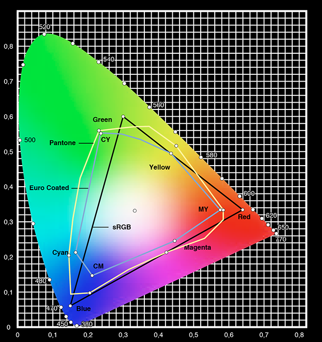
Years ago attempted to compare the sRGB , Euro Process inks and Pantone colors, and it's clear that displaying them and converting them is not always possible.
Copy link to clipboard
Copied
I did not check what version of Illustrator you are using, but it looks like an old version (or at least the document you are using comes from a CS5 or earlier version).
C9, M0, Y43, K38 are the old values as Pantone used to give (and they changed them in Color Bridge)
These were fixed values. Newer version of Illustrator use the Lab values and color management and will give you even different conversions:
In Europe Pantone 5773 will give C 47,73, M 30,59, Y 64,24 and K 13,96%
Copy link to clipboard
Copied
I think that's part of the problem. The file was created in 2005 (don't know which version of Ai). I'm using CC 2017 and get a [Converted] notice when I open the .esp file.
My Color Bridge is new within the last couple years.
Does that help?
Copy link to clipboard
Copied
If you must give your client CMYK values, I would not use the old Pantone CMYK values, but use the Color Bridge values (so you can point at Pantone if they don't like it).

Copy link to clipboard
Copied
Hi all, this is a very useful thread and I'm hoping to piggyback if anyone's willing to offer advice. You all seemed more seasoned than I!
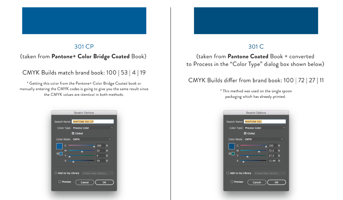
I'm wondering if someone can advise me on the best way to print Pantone colors—specifically how to change those to CMYK for digital printing. There seem to be a few methods. I normally begin by designing in Illustrator (CMYK mode of course), using the Pantone Coated Book color (301 C in this instance). I then double click the Pantone swatch in the swatch palette > change the color type to "Process" and ensure that the document Color Mode is "CMYK". However, I notice that when I use this process—the CMYK builds are a bit different than the CMYK builds listed on the Pantone site.
I recently reached out to Pantone with this question and here is their (forgive me), lengthy response:
CMYK values are not definitive method of specifying a color. These values are dependent on the output device (printer/press) and the conditions of that device (inks, substrate, etc). The values we publish on our website, software and our guides such as the Color Bridge are the values we use based on our press, inks and substrate the guides are produced on as well as our printing process. To achieve Pantone colors with another printer and paper/material it is highly likely that the Cyan, Magenta, Yellow and Black separations will need to be adjusted. The values we publish are meant as a starting point. For example, Pantone 301 C is a Solid ink color (spot color) and when printing this in CMYK, it will be dependent on the specific printer output and variables.
In Adobe applications, the CMYK or RGB data is based on the color settings and algorithms built into the software to convert from one color space to another. This data can and likely will differ from the data we publish in our guides, software and on our website. If you are aware of the printer profile or CMYK workflow used when printing I would recommend converting this way. This would give you CMYK separations based on your printers output. If you go to EDIT and COLOR SETTINGS in your Adobe program, this will show you the CMYK profile that is being used during conversion. By changing this, the CMYK values of the Pantone spot color will change as the math used to go from Spot to CMYK depends on this color setting.
Ultimately you are attempting to achieve Pantone 301 C when printing in CMYK. The best method would be to speak with your printer to determine what printer profile or workflow they recommend you use in the software for conversion (or if they want it converted at all) as this would give the best output values based on their press/printer conditions and setup.
So, yes— a great response to cover their bases and all of that makes sense. Yes, I can reach out to each separate printer and change my color settings to match their printers output for each individual job, but if different prints & manufacturers are used throughout the life of their brand— it seems inconsistent. And this client has BIG PLANS!
With all of that being said, I still don't feel like I have a firm way to handle color codes in this client's brand guide. I currently list the Pantone colors and their RGB, CMYK and Hex "equivalents" straight from Pantone's website so I have something to fall back on. But since Pantone's CMYK numbers differ from the method mentioned above— I feel as though I should make a note of this in the brand guide. I've worked at companies that use both color conversion methods for digital printing, so there doesn't seem to be a set industry standard and there's so much confusion surrounding this topic, even when I'm asking professional printers.
I may also note in the client's brand guide that spot color printing is the way to go for brands that are high profile and need to match long term over several SKUs— but that's quite expensive and I'm sure they'll rarely go this route.
The screenshot below (left) shows the codes listed on Pantone's site. The right image shows the CMYK builds from the Adobe Illustrator conversion method of manually changing the Pantone color to "Color Type > Process" and "Color Mode > CMYK".
Thoughts/suggestions? This client will be printing on fabric, paper and plastic—so this is a big deal and she'll be selling her products in some large stores. I know Pantone has textile and plastic books as well, so I'll be looking into that— if anyone has tips on that as well, I'm forever grateful.
Thank you all in advance for any brilliance you can offer!

Copy link to clipboard
Copied
The conversion taking place in Illustrator depends on the color management settings.
That is in order to get values that work for all those different media types and printing processes, the color management settings will need to be appropriate for the workflow.
You will need to talk to all these printing providers about the matter and see how you can connect to their processes, so either you do the color conversion or they do.
In case they can't tell you which profiles to use for conversion, you might need to do test prints on all different media in order to find out a color match.
But still they might change something in their workflow (be it the machine, the inks or the fabric) and then you need to adjust your settings as well.
Copy link to clipboard
Copied
Thanks very much, Monika! This is quite helpful. Oh the joys of color!

Copy link to clipboard
Copied
The color management settings in Illustrator will apply on a RGB to CMYK conversion only. (menu File > color mode)
The conversion from Pantone to RGB or CMYK will use strickly the LAB reference color of the Pantone color to do the conversion.

 AdChoices