- Home
- Illustrator
- Discussions
- Hi, I'm sorry, but I've corrected a previous post ...
- Hi, I'm sorry, but I've corrected a previous post ...
Copy link to clipboard
Copied
Hi there,
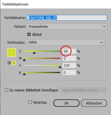
the CMYK information for Pantone-Colors in the app and on the website are different (see example below). How can I fix this problem / which information is correct?
 2 Correct answers
Adobe applications use color management to convert a Pantone ink to the closest possible CMYK equivalent.
This depends on the CMYK working space in your color settings.
Pantone just gives CMYK values which may or may not be correct for your printing process.
I would go for the Adobe color managed solution.
Hi,
I'm sorry, but I've corrected a previous post due to a serious mistake.
The "PANTONE+ Color Bridge Coated" swatch is bundled with the Adobe application from CS6. And it was never updated afterwards.
However, "PANTONE Color Finder" has been updated.
So now there is a difference in the color percentages, but they are not right or wrong. This is because the converted conditions are different.
The PANTONE Formula Guide is original, and using it in spot colors is the correct way to use it.
"PANT
...Explore related tutorials & articles
Copy link to clipboard
Copied
Adobe applications use color management to convert a Pantone ink to the closest possible CMYK equivalent.
This depends on the CMYK working space in your color settings.
Pantone just gives CMYK values which may or may not be correct for your printing process.
I would go for the Adobe color managed solution.
Copy link to clipboard
Copied
Hi,
I'm sorry, but I've corrected a previous post due to a serious mistake.
The "PANTONE+ Color Bridge Coated" swatch is bundled with the Adobe application from CS6. And it was never updated afterwards.
However, "PANTONE Color Finder" has been updated.
So now there is a difference in the color percentages, but they are not right or wrong. This is because the converted conditions are different.
The PANTONE Formula Guide is original, and using it in spot colors is the correct way to use it.
"PANTONE Color Bridge Coated V4" installed fromPANTONE Color Manager has the same value as "PANTONE Color Finder".
"PANTONE+ Color Bridge Coated" should be considered the CMYK value provided in "PANTONE solid coated.acb and PANTONE solid coated.acbl" before CS5.
Susumu Iwasaki
Copy link to clipboard
Copied
I will add further.
Prior to CS5, three swatches "PANTONE color bridge CMYK UP.acb, PANTONE color bridge CMYK EC.acb and PANTONE color bridge CMYK PC.acb" were bundled.
This is a different CMYK value from "PANTONE+ Color Bridge Coated".
Susumu Iwasaki
Copy link to clipboard
Copied
The key thing is that there is NO single fixed CMYK translation of Pantone colours. So what is wrong is that you expect it. For a while, Pantone themselves stopped giving people CMYK values, which was the right decision. But their customers demanded these number back, rather than learn how colour actually works.
Copy link to clipboard
Copied
Understanding that there is no single CMYK translation, would the Pantone provided values be the "most consistent"? For example if you need to provide CMYK brand guidelines for a logo.
Copy link to clipboard
Copied
No. Those Pantone values don't take into account the paper you use, the printing process or even the region you are printing in (different color profiles in Europe and the US for example).
Copy link to clipboard
Copied
You may want to read small print on your books and or digital files. The values for process colours varies depending on printing conditions (ICC Profiles). I have two books with different conversion values the one is for Fogra39 the other says CGATS. Using LAB values and converting to your ICC may give even better results, remember that there is both document colour settings and application colour settings so there is still plenty East's to make problems.
Copy link to clipboard
Copied
Just worth a mention that the new Pantone books differ from old pantone books even in the colours being mixed (But with the same Pantone Numbers)… and I'm even talking about Pantone on a specific substrate. If Pantone is note even consistent with itself how do we expect applications to be consistent. (We have two digital printers and noticed there was a variance in the colour, and when checking older and newer books we saw that the printer Pantone Libraries are consistent with the books for the same year as the release) differences can be in hue, lightness or saturation.
Find more inspiration, events, and resources on the new Adobe Community
Explore Now


