- Home
- Illustrator
- Discussions
- Betreff: Paragraph justification Ai vs ID
- Betreff: Paragraph justification Ai vs ID
Paragraph justification Ai vs ID
Copy link to clipboard
Copied
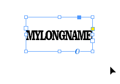
I used the justification settings in InDesign to set the glyph scaling to 50% minimum, 100% desired and 100% maximum. When I decreased the width of the text frame in InDesign, the text inside came closer and closer together per the letter spacing settings, then it scaled down the width of the glyphs and the text became compacted inside as expected.
However, in Illustrator all the same settings are available but they just don't work. Decreasing the width of the Illustrator text frame just makes the text wrap, or disappear completely if "No Break" is set in the characters panel. The only time it seems to have any effect is if I set the paragraph justification to 'full justify' and then the text letters get spread out to where they touch the sides of the text frame at all times. But this isn't what I want, I want it to squish down like in InDesign such as when you widen the text frame, the characters will stay in the middle and only decrease in size and spacing when the text gets smaller.
Is this a bug/feature that there's a secret workaround for, or has it been like this for decades and everyone just lives with it?
ILLUSTRATOR:
INDESIGN:
Explore related tutorials & articles
Copy link to clipboard
Copied
Try and set it to full justify
Copy link to clipboard
Copied
I tried it, and full justify is the only way I could get it to expand out. But I want it to not expand more than my settings. In InDesign setting full justify does the same, but having center justify is what makes the text stay in the middle and it gets thinner if the text box width is decreased. It is helpful in some cases to use this, but most of the time when text is shorter in characters they do not want to see the outer characters touching the sides of a wide text frame.
Copy link to clipboard
Copied
Until today I wasn't aware of this different behaviour.
I just find it interesting, but it's certainly not desirable - it should only be compressed as much as needed. I guess your only option is reporting it to the engineers.
Copy link to clipboard
Copied
I can't speak for everyone, but when I have any significant amount of text and I need to manipulate it carefully I always use InDesign. Illy's text tools just aren't as good. Once you have exactly what you want you can either export and import or copy and paste - I'm not so keen on the latter (you can guarantee the customer will rewrite everything a few times over) but sometimes you need the text to interact with an Illy element more directly... it's swings and roundabouts... (but these days they do have foam padding, it was plain old concrete and sharp gravel in my day).
Copy link to clipboard
Copied
So your answer is on the side of "it's been a decades-long issue and everyone has just learned to make 'peace with it'" ?
Copy link to clipboard
Copied
No. My answer included "Illy's text tools just aren't as good".
They are not the same: different evolutionary paths.
But why they can't be the same is a question for Adobe.


