Problems exporting RGB to CMYK
Copy link to clipboard
Copied
I have been given a logo and was asked to save 2 JPEGs one for print and one for the web (Pantone 294c and 543c)
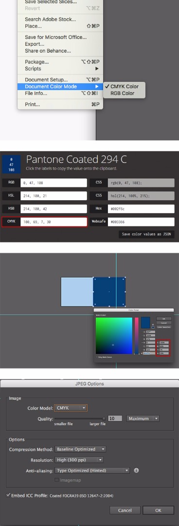
I matched RGB values for both colours when exported for print and CMYK values when exported for the web, made sure that document colour mode was set to RGB when exported for web and CMYK when exported for print. I also set the right colour mode in JPEG options log when exporting my files.
As far as I know it is normal for CMYK files to look duller when compared to RGB. The problem is that when I view my files on the web the CMYK JPEGs look overly bright (see example no 1.) . Am I doing something wrong or is this normal?
1. In the example below, you can see how CMYK colour appear

2. These are RGB colours, how they should look

Explore related tutorials & articles
Copy link to clipboard
Copied
Why do you export JPEG for print?
When exporting for the web, convert to RGB.
CMYK files don't belong on the web.
Copy link to clipboard
Copied
Though you are allowed to save a .jpg as CMYK, best to never do that as there is no purpose for a CMYK .jpg.
Viewing the RGB jpg on an RGB monitor is fine. Expecting a CMYK file format to show correctly on an RGB monitor is not.
What are you working on a digital brand standards guide? There is likely a better way to reach your goal, but we need to know exactly what you are doing and find you a better method that working with CMYK jpegs.
Copy link to clipboard
Copied
I was given an EPS file of company logo and was asked to export two JPEGs one for print and one for the web.
As far as I am aware CMYK colour mode is for print and RGB for the web.
Here is what I did when exported JPEG for print (see below). I did exactly the same thing in RGB mode when exporting for the web. Is this correct way of doing it?

Copy link to clipboard
Copied
Whomever asked you for a CMYK .jpeg for print was mistaken. You absolutely need to get the correct information from them, as this logo might be printing in 2 spot color stations rather than tints of CMYK. 2 spots would be seen as a higher color quality for a logo, than 4 process colors used to make 2 colors.
If they do not know what they need, ask them what they are using this for or the name of the printer. I try to guide people away from the antiquated .EPS format and Monika has written an excellent article on the topic.
Copy link to clipboard
Copied
JPEGs will be used for brochures, magazines etc. as people, ask them to supply hi and low resolution jpegs all the time.
Would it be okay to export jpeg for print as RGB?
Copy link to clipboard
Copied
Why don't they just used the EPS for printing?
I don't get it.
Copy link to clipboard
Copied
Jpeg is a lossy format the colors are compressed, so the quality level for printing will be compromised. Even with a maximum quality level you will have problems with gradients getting bumpy transitions and colors shifting as they are compressed. Jpeg has to make a decision on which colors to throw out, so colors will never be accurate, and hard to color manage.
Now if you are doing lower quality work such as for trade shows some of the signage is only up for a couple of days and if you have a tight deadline we used pdf with a small amount of compression to make deadlines. We would not do this on the high profile signage, but on aisle banners and items that go up higher that noone see close up.
Do not use jpeg for print, or CMYK for digital work.
Copy link to clipboard
Copied
What version of Illustrator do you use?
And where did you get these CMYK values?
Copy link to clipboard
Copied
I use the most recent version of Illustrator and CMYK values were sent to me by the company from their branding style guide.
Copy link to clipboard
Copied
As far as I understand, you are not using color management to convert the Pantone colors to CMYK, but just using the percentages from whatever source.
I am not surprised that your CMYK version looks lighter, If you let Illustrator do the conversion, you will come closer to what you see in your RGB version.
Copy link to clipboard
Copied
As far as I know it is normal for CMYK files to look duller when compared to RGB. The problem is that when I view my files on the web the CMYK JPEGs look overly bright (see example no 1.) . Am I doing something wrong or is this normal?
1. In the example below, you can see how CMYK colour appear
2. These are RGB colours, how they should look
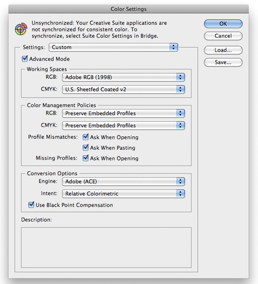
What are your RGB and CMYK working spaces in your Illustrator Color Settings? What is the Rendering Intent?
Only in certain closed loop work spaces would you use RGB for print and that would depend on the RIP and output device. I would avoid showing any CMYK swatches online. Don't forget, you are viewing color on a monitor. Each monitor, even the same exact one ( side-by-side ) will show color differently. But, looking at your examples above, something is definitely not right and it could come down to the way your monitor is generating that specific color. This appears to be a great exercise in proper color management protocols.
Copy link to clipboard
Copied
Here are my Illustrator color settings. I work from an iMac in case that makes any difference.
Anything I should change in my settings?

Copy link to clipboard
Copied
Here's what I have...

...not sure, but take a look at your RGB work space and your CMYK CMPolicies. I say "not ure" because I hardly ever run into consistency problems, but try my settings to see if there is any difference in what you are trying to do.
Copy link to clipboard
Copied
There will not be any differences since Color management was not used for getting the CMYK values.
For RGB export for Web your setings are wrong. Nobody uses Adobe RGB for web purposes.
Copy link to clipboard
Copied
Ton Frederiks- could you suggest how to use color management? I changed colors to cmyk values in illustrator and exported as cmyk, however, colors still come up very bright when I open the file in Chrome. They appear normal in safari and when I open my jpeg in Picture Preview.
Does it mean that colors will look different when printed? Or do they appear different simply because the color mode is not meant for web?
Copy link to clipboard
Copied
Chrome isn't a colour managed CMYK viewer, you could see anything or nothing. Use publishing software only to check colours.
Copy link to clipboard
Copied
Safari uses color management to display CMYK jpegs, the other browsers don't (and some OS don't know what to do with CMYK jpegs either). So it's never a good idea to look at CMYK jpegs in Browsers.
What I get when using your color managent settings when converting the Pantone color to CMYK is the middle example.
The one on the right comes from Color Bridge and matches your values, but is not using color management, just the values provided.

Copy link to clipboard
Copied
Ton, it was an experiment to see if a change in color settings would make any difference. Historically, Adobe RGB with a more appropriate gamut, will maintain semblance with CMYK. sRGB is a very suitable video space, which is the monitor. It could be the original Spot color conversion is not being interpreted correctly on the posts' OS.


