• Global community
    • Language:
      • Deutsch
      • English
      • Español
      • Français
      • Português
  • 日本語コミュニティ
    Dedicated community for Japanese speakers
  • 한국 커뮤니티
    Dedicated community for Korean speakers
Exit
0

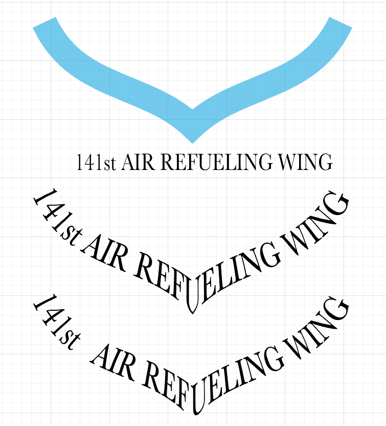
Text on Path stumped. Looks like a hybrid of Rainbow on the ends and Skew in the middle

New Here ,
Dec 04, 2022 Dec 04, 2022

Copy link to clipboard

Copied

Looking to do over a hundred so I need a repeatable process.


Thanks!

Mike

TOPICS
Draw and design , Type

Views

763

Translate

Translate

Report

Report
Community guidelines
Be kind and respectful, give credit to the original source of content, and search for duplicates before posting. Learn more
community guidelines
Adobe
Community Expert ,
Dec 04, 2022 Dec 04, 2022

Copy link to clipboard

Copied

Can you please select it and show us the object inside the Layers panel? You have to click on the triangle to open the layer. This looks like you have applied an envelope.


Or is this something that you want to do?


A carefully constructed envelope might help. When the text is longer or shorter you might get in trouble:

Bildschirmfoto 2022-12-04 um 16.32.05.png


You might want to take a look at the plugin FilterIT (not free)

Votes

Translate

Translate

Report

Report
Community guidelines
Be kind and respectful, give credit to the original source of content, and search for duplicates before posting. Learn more
community guidelines
New Here ,
Dec 04, 2022 Dec 04, 2022

Copy link to clipboard

Copied

This is something I'm trying to do

Votes

Translate

Translate

Report

Report
Community guidelines
Be kind and respectful, give credit to the original source of content, and search for duplicates before posting. Learn more
community guidelines
New Here ,
Dec 04, 2022 Dec 04, 2022

Copy link to clipboard

Copied

I tried that plugin, but I need more control. The text will extend to the ends fairly close each time

Votes

Translate

Translate

Report

Report
Community guidelines
Be kind and respectful, give credit to the original source of content, and search for duplicates before posting. Learn more
community guidelines
Community Expert ,
Dec 04, 2022 Dec 04, 2022

Copy link to clipboard

Copied

That plugin usually gives better results than Illustrator with its envelopes.


Are all your crests the same shape or does that vary?


What I did to make the mesh: Started with a rectangle, roughly the shape of the text.

Then applied Object > Mesh > Make with Warp

Used a Warp that somewhat fits the shape of the crest.

Object > Mesh > Release This gives you the mesh, a grey object.

Then adjusted that carefully. Make very sure that your anchors and handles are precise or the text will go haywire. You can use the Add anchor point tool to add points to it and then the anchor point tool to edit them, break handles, etc.

Then used the mesh to distort the actual text.

You can perhaps - when your text is shorter - add rectangles at both sides, to make it match the opriginal size. You might mave to improvise a lot.

Votes

Translate

Translate

Report

Report
Community guidelines
Be kind and respectful, give credit to the original source of content, and search for duplicates before posting. Learn more
community guidelines
New Here ,
Dec 04, 2022 Dec 04, 2022

Copy link to clipboard

Copied

I'll try that:) it seems like it could be easier somehow:) Thank you!

Votes

Translate

Translate

Report

Report
Community guidelines
Be kind and respectful, give credit to the original source of content, and search for duplicates before posting. Learn more
community guidelines
New Here ,
Dec 04, 2022 Dec 04, 2022

Copy link to clipboard

Copied

all the crests are the same shape


Votes

Translate

Translate

Report

Report
Community guidelines
Be kind and respectful, give credit to the original source of content, and search for duplicates before posting. Learn more
community guidelines
Community Expert ,
Dec 04, 2022 Dec 04, 2022

Copy link to clipboard

Copied

All of the same shape is surely a relief 🙂

If it doesn't work out at the center, you can of course try to make it in 2 parts. That way you are in full control of where the text is split.

Votes

Translate

Translate

Report

Report
Community guidelines
Be kind and respectful, give credit to the original source of content, and search for duplicates before posting. Learn more
community guidelines
Enthusiast ,
Dec 05, 2022 Dec 05, 2022

Copy link to clipboard

Copied

LATEST

Andrew, To add to what Monica has already suggested.


Here I also used Envelope.

I too did not like how the text looked especially the U in the center.


To tweak, I used Envelope Distort>Edit Contents.

You are still working with Live Text.

I added a space after st

I then Kerned the space between the letters FU. I used 100% instead of 0%


KScreen Envelope.png

Votes

Translate

Translate

Report

Report
Community guidelines
Be kind and respectful, give credit to the original source of content, and search for duplicates before posting. Learn more
community guidelines