 Adobe Community
Applying Golen Ratio to Logo
Copy link to clipboard
Copied
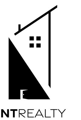
Hi, I am new to graphic design and I hear created this logo for NT Realty but something about it just seems off. I wanted to refine it by using the golden ratio - do you have recommendations on how to do that...
Ps: not sure if this is the right forum to do this in.
Explore related tutorials & articles
Copy link to clipboard
Copied
Just forget the Golden Ratio. It's snake oil.
Just make good design (which has got nothing todo with the Golden Ratio in the first place)
https://www.fastcompany.com/3044877/the-golden-ratio-designs-biggest-myth
Copy link to clipboard
Copied
Nothing to do with the golden ratio. Your proportions and angles are simply terrible. The door is too small, the gaps between the design elements unbalanced and the implied directions of the lines are fighting each other and are way too obviously just 90 and 60 degree angles. That and the way too large graphic is killing the text, which in itself has poor kerning and alignment. This logo is simply unusable and you need to start from scratch.
Mylenium
Copy link to clipboard
Copied
agree... do you think the concept is just as garbage as its execution? Or
more so the latter?
Copy link to clipboard
Copied
I like the idea... but unfortunately, it does not work well.
I know you are trying to create the N & T... alas it strains one eye to look at.
Now, theoretically, could make the top black too and then the windows white. Now, if you keep the break in the middle you still get the idea of a N kind of, sort of. Maybe not the T though.
I do have a cool piece of advice. Adobe has a huge community on Discord on the Adobe Creative Career server.
They also have server for Photoshop, Premiere, Xd and Illustrator as well.
There you can share your work and get feedback! It is super awesome. Now, if you have not used Discord... then it will take you a couple of minutes to understand it. In a way it works similar to old computer forums with nested comments under each section. However.... they do have live chats, workshops and lectures.
I would totally join it if I were you!!! Example they had Chris Do as a speaker a month or so ago! It was brilliant!


