 Adobe Community
- Home
- Illustrator
- Discussions
- can you explain simple steps to make this? I'm not...
- can you explain simple steps to make this? I'm not...
can you explain simple steps to make this? I'm not getting my idea similar enough . . .
Copy link to clipboard
Copied
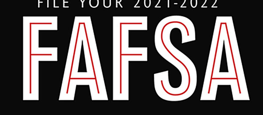
i like how the text in the black/white/red graphic looks
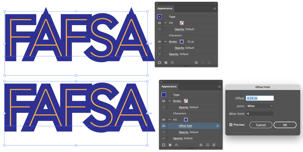
however, when i use a thin font in illustrator, and add a thick outline, its not working. the outlines gets sharp points. #1 is what Im getting; #2 pic is what i want.
I think i need to use a thinner font, for sure.
THOUGHTS? i'd love your help in explaining how to get #2!
Explore related tutorials & articles
Copy link to clipboard
Copied
Try adjusting the mitre limit in your stroke settings.
Copy link to clipboard
Copied
Another way, instead of a stroke, is to add a fill with offset path effect behind the contents.
Peter
Copy link to clipboard
Copied
I feel completely ridiculous. but i've spent an hour on trying to recreate your idea, Peter, - and am doing something wrong.
i would be so thankful if you could write the steps how you did that from square one. You don't know how thankful i'd be! i'm confused with adding strokes, and outlining strokes and fills, and offsets - and how in your example there's no color for the fill.
I came up with this example - by using add a fill and ofset; but then i pasted on top of the blue the yellow letters. I'm thinking that's wrong and not the right way. any exact ways to do what you did would be amazing.
Copy link to clipboard
Copied
Delaney,
As Peter said, and as you can see in his screenshot, the new fill is to be behind (beneath) the actual Characters, just Drag it down below in the Appearance panel (and have only that selected when applying the offset effect).
I believe you may have it on top so it covers the original Type, so that in your latest screenshot there are two sets, the original beneath and the pasted copy above the new blue offset fill.
Copy link to clipboard
Copied
Not as solution - but only as a sidenote:
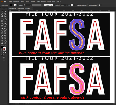
The example shown by the OP is definitely "handmade"!
see:
