 Adobe Community
- Home
- Illustrator
- Discussions
- Color Gradation problem is Pattern Brushes in Ai
- Color Gradation problem is Pattern Brushes in Ai
Color Gradation problem is Pattern Brushes in Ai
Copy link to clipboard
Copied
Hello Everyone!
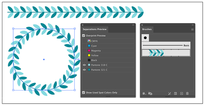
I've found in pattern brush a very powerfull tool for decorating complex shapes such as ceramic art produced in form of ceramic decals. But unfortunately i've encountered a fatal bug that compromises the use of it. What happens is that after converting the raster file into the pattern brush it changes the gradation of the pantones, in this case always brighter. The resulting shape is always lighter than the original file. The problem is that other pieces use the original file because the styling is in straight line. Then the result is a total different image from the pattern brush.
I'm enclosing an image with the problem. Hope Adobe can explain/solve this because it's such a powerfull tool and yet unnusable if not coerent in color gradation. Thank you all. ( Luis Monteiro - Graphics designer / Pre-press Designer )
Explore related tutorials & articles
Copy link to clipboard
Copied
Don't mix image and vector versions of the pattern.
Preferrably use vector.
You may need to adjust the colors after image trace.
Copy link to clipboard
Copied
Ton thanks for the reply. In this particular case i have to use image only patern created in Photoshop with 2 spot colors ( Pantones ). To replicate the brush effect of the original file provided by our Client i have to use image due to correct color gradation. I Havn't explored yet if we have the same tool in Photoshop . Maybe in that software it would result just fine. Nevertheless i will have to print / Rip it to CTS on Ai...
Copy link to clipboard
Copied
Are you using a brush made from a Photoshop file with spot channels?
That seems to work fine for me.
Copy link to clipboard
Copied
Yes, that is exactly what I did and do usually. But remember the problem is on color gradation, not in 100% of each of those spot colors. When I use 100% it works just fine. Unfortunately, it doesn't work on different gradations. They come a lot lighter than the original file. You have to try to guess what is the percentage of lightness to darken first the .psd file to compensate. But this is working on guess. I work with control of what I'm doing because on scree-printing we will have to reproduce the final arts somewhere latter in time...
Copy link to clipboard
Copied
In the Photoshop version of the spot color brush, the colors always overprint, while in Illustrator you need to set that specifically for each color (overprint or darken).
But previewing the interaction of percentages of spot inks will never be accurate, you need a proof print to judge them.


