• Global community
    • Language:
      • Deutsch
      • English
      • Español
      • Français
      • Português
  • 日本語コミュニティ
    Dedicated community for Japanese speakers
  • 한국 커뮤니티
    Dedicated community for Korean speakers
Exit
0

Colours darker and duller in Illustrator

New Here ,
Jul 05, 2021 Jul 05, 2021

Copy link to clipboard

Copied

Hi All!


I hope you can help - my issue is with colours on illustrator, every time I use it the colours appear to be darker and in general duller, not as bright and vivid as they should be. This happens when I create new colour, paste colour ID or even when paste image in AI (preview of the image is nice, but when pasted in AI the colour change)


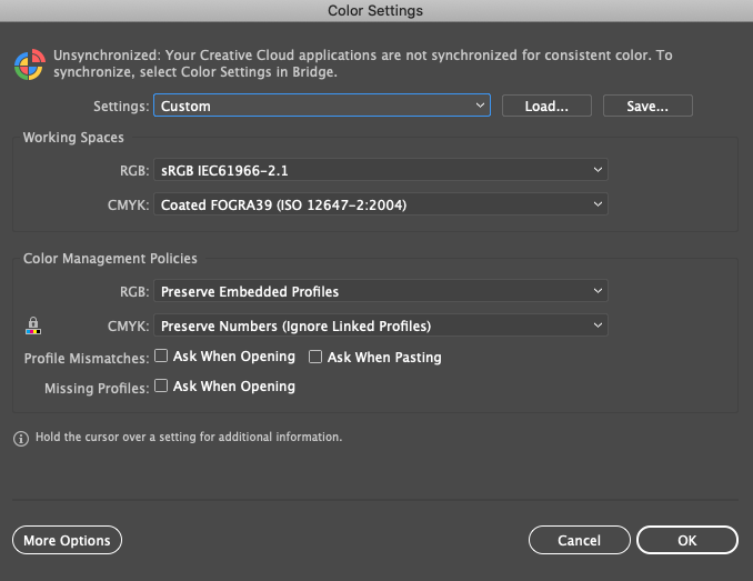
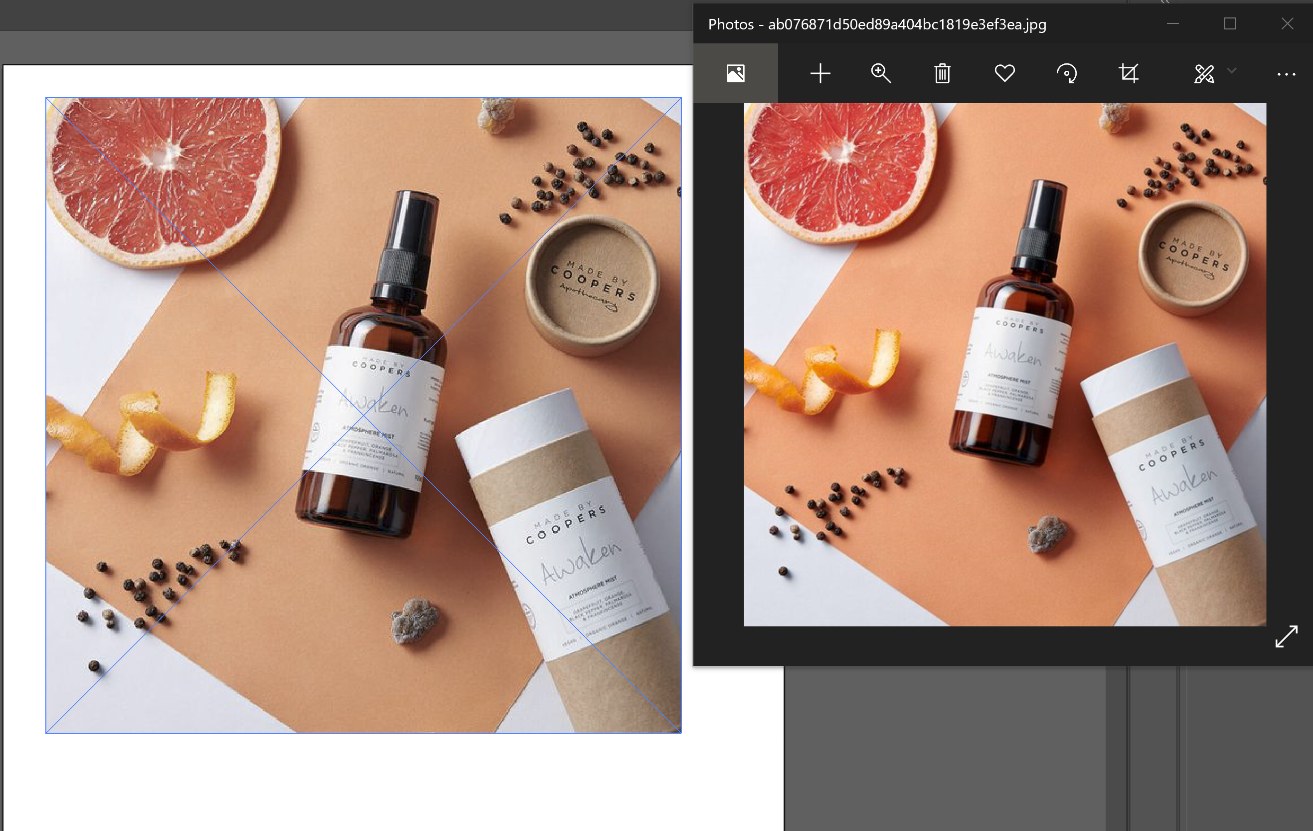
Just to clarify, my colour settings is set to RGB, and settings are the same as image attached. I will also attach the screen grab of previewed image vs the same when pasted in illustrator to show the colour difference. This is just the quick way to show you the issue, but this issue gets really annoying when trying to design and use nice and bright colours.


I read previous chats about similar issues and still no fix. I did see some people advising to change to preview in CPU but I don't have this option - could this be the issue? I only get GPU. I have a DELL XPS laptop I wonder if anyone knows if I need any extra drivers, anything I need to do or what could be the issue? And ways to fix it


Please! Help! Thanks! 

TOPICS
Bug , Performance , Tools

Views

917

Translate

Translate

Report

Report
Community guidelines
Be kind and respectful, give credit to the original source of content, and search for duplicates before posting. Learn more
community guidelines
Adobe
Community Expert ,
Jul 06, 2021 Jul 06, 2021

Copy link to clipboard

Copied

What is the image’s Color Space (ICC Profile)? 


As far as I know Windows Photos is not Color Managed and therefore useless for previewing images. 

Please open the image in Photoshop, set the Status Bar to »Document Profile« and post a screenshot. 

Votes

Translate

Translate

Report

Report
Community guidelines
Be kind and respectful, give credit to the original source of content, and search for duplicates before posting. Learn more
community guidelines
New Here ,
Jul 06, 2021 Jul 06, 2021

Copy link to clipboard

Copied

Hi thanks for your response.

How can I check ICC Profile? 

Okay so I did save a random colour palette and viewed it in Windows photo and it does look brigher than it is shown in illustrator after saving as jpeg. It can be quite misleading though during design process on Illustrator. Is there anything you would recommend for Windows? 

Also attached the screen grab off with 'document profile' below

Votes

Translate

Translate

Report

Report
Community guidelines
Be kind and respectful, give credit to the original source of content, and search for duplicates before posting. Learn more
community guidelines
Community Expert ,
Jul 06, 2021 Jul 06, 2021

Copy link to clipboard

Copied

Windows photo can be used to check if the photo is working at all. Don't ever rely on it for color.


What you need to do now:

- learn how color works, RGB, CMYK etc

- learn color management. It has been there for 20 years. It won't go away.


This is the very basic info: https://helpx.adobe.com/photoshop/using/understanding-color-management.html

There is a lot more to learn.

Votes

Translate

Translate

Report

Report
Community guidelines
Be kind and respectful, give credit to the original source of content, and search for duplicates before posting. Learn more
community guidelines
Community Expert ,
Jul 06, 2021 Jul 06, 2021

Copy link to clipboard

Copied

LATEST

That image is untagged so the image does not actually have a defined appearance.


So as per @Monika Gause ’s recommendation please familiarize yourself with Color Management basics. 

Votes

Translate

Translate

Report

Report
Community guidelines
Be kind and respectful, give credit to the original source of content, and search for duplicates before posting. Learn more
community guidelines