 Adobe Community
- Home
- Illustrator
- Discussions
- Creating a compound path makes small shapes appear...
- Creating a compound path makes small shapes appear...
Copy link to clipboard
Copied
Long-time AI user, first-time poster here, ripping my hair out over a compound path issue! In the process of finalizing a logo design, I created a fairly complex compound path that's behaving strangely (see image below). The "white noise" shapes on the top version's banner — which were filled with white (no stroke) for simulation purposes — appear smaller in the bottom version, after the compound path was created. The dimensions of each small shape are identical to the top version, but they look as if they've shrunk, and that's not what I'm going for. I tried creating the compound path using "Exclude" in Pathfinder, then using the good ol' "Make Compound Path" command, and got the same results for both. I printed them out to confirm that it's not a display/monitor issue, and they print exactly as shown below. Is there something I'm missing? Thanks in advance for any suggestions!
 1 Correct answer
It is anti aliasing, opacity masks behave better than compound paths.
Take your example with the white filled noise.
Group the white filled noise.
Select both the noise and the background shape.
In the Transparency panel, click Make Mask and uncheck Clip and check Invert.
Open attached example PDF in Illustrator.
That did not work (thanks to the reliable forum software).
You can download the example here:
https://shared-assets.adobe.com/link/d3815c0d-69eb-4258-7268-12ee891ae8eb
Explore related tutorials & articles
Copy link to clipboard
Copied
Anti-aliasing.
Before: white objects were anti-aliased.
After: colored objects are anti-aliased.
My theory is that anti-aliasing happens to the outside of the object, thus making it appear larger.
You could try and turn off smoothing in Preferences > General. Is there still a difference then?
When you print it on a Postscript device, do you see any difference?
Copy link to clipboard
Copied
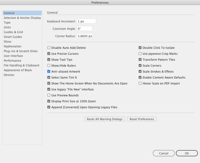
Thanks, Monika — interesting theory! I tried turning off "Anti-Aliasing" in the Preferences, if that's what meant by "smoothing" (see below). Still got the same results when I created the compound path (small shapes shrunk). 😕
Sadly, I don't have a Postscript printer — just comparing them on my old b&w laserprinter, which is admittedly not ideal. Do you think the 2 versions might actually print the same on a PS printer? That would be great, but it still doesn't solve the issue for on-screen applications of the Logo.
Copy link to clipboard
Copied
To be clear, the blue box, "Anti-aliased Artwork" is what I deselected before making the compound paths again:
Copy link to clipboard
Copied
As far as I can see unchecking Anti-aliased Artwork only has an effect in CPU Preview, GPU Preview will always anti-aliase.
Copy link to clipboard
Copied
Robin,
Are you sure the white noise shapes have no effect/whatever applied (which might act more or less like a (white) stroke?
You can have a look at (one/some of) them in the Appearance palette (after selecting).
Copy link to clipboard
Copied
Hi, Jacob — nope, zero effects applied! I've been experimenting with adding a white stroke around the white noise items (and then outlining/expanding the strokes) prior to creating the compound shape. So far it's a bit messy and complicated, but *could* be a workaround — definitely far from perfect, though.
Copy link to clipboard
Copied
Update: I added a white stroke to all of the "white noise" shapes > outlined those strokes > merged the results in Pathfinder so that each shape was significantly larger than before > created the compound path. It's taking some experimentation, but this seems like it could be a decent workaround for now. Still an issue that needs explaining/solving, though!
Copy link to clipboard
Copied
It is anti aliasing, opacity masks behave better than compound paths.
Take your example with the white filled noise.
Group the white filled noise.
Select both the noise and the background shape.
In the Transparency panel, click Make Mask and uncheck Clip and check Invert.
Open attached example PDF in Illustrator.
That did not work (thanks to the reliable forum software).
You can download the example here:
https://shared-assets.adobe.com/link/d3815c0d-69eb-4258-7268-12ee891ae8eb
Copy link to clipboard
Copied
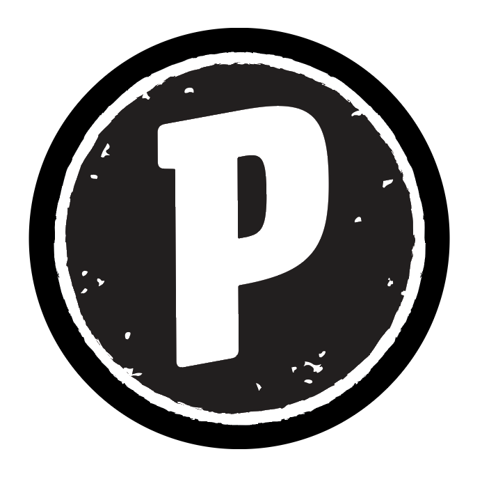
Hi, Ton — thanks for this helpful suggestion! It seems to work beautifully and fix the issue I was having, but I'm still a little unclear on opacity masks (no pun intended), specifically how they appear both on-screen and when printed. If I create the opacity mask as you described above (which I did), is the selected area still 100% of the original color? It seems like it is when I view the results in Illustrator, but when I export the files to various formats — for instance, as a PDF or an EPS — and then "place" them into a new AI document to test them, I get unexpected results. For example, in this 1-color version of the logo's related icon, everything is 100% Process Black, but the inner circle with white noise (which has an opacity mask applied) looks slightly lighter than the outer ring...as if the opacity is set at, say, 90% black (which it isn't). Opening/sampling the files in Photoshop tells me that the areas with opacity masks applied are, in fact, slightly lighter than those without. Any suggestions here? Should I simply group all of the elements together when I create my opacity masks? And, if I do that, will everything still print at 100% of the intended color/tint, despite the lighter appearance on-screen? Any help or additional insights would be fabulous — thanks again!
Copy link to clipboard
Copied
Robin (treading water while Ton is elsewhere),
It is always safer to use white than black for an Opacity Mask, because black is a more woolly concept, especially in CMYK and when you work between CMYK and RGB.
In this case I believe that a Group formed of the white noise thingummies (and only that/those) applied to the black surface with Clip unticked and Invert Mask ticked ought to work.
Copy link to clipboard
Copied
I agree with Jacob, white as the main mask color seems to be the safer choice, although when checking a PDF in Acrobat, I don't measure a difference between a black or white mask approach.
Export as psd seems to work fine, but letting Photoshop do the conversion to pixels shows the problem with black as mask.
Copy link to clipboard
Copied
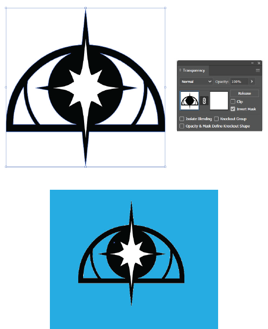
Hi! I was having the same issue with making a compound path as OP washaving, specifically with my star. I tried your opacity mask solution and it's not working for me. As you can see, I set the star's fill shape as white, selected the whole logo, made an opacity mask, and un-checked "clip" and checked "invert mask."
But when I put the logo over the blue square to see if it worked, I have two issues. 1) The star still isn't acting like a compound path and 2) I have all this white noise around the black shapes that wasn't there before. I'm a total loss for how to resolve this.
Any advice?
Copy link to clipboard
Copied
That looks like it should work.
Can you share the problem file (Dropbox, CC filesharing, Google, WeTransfer...) and I will have a look at it tomorrow.


