 Adobe Community
- Home
- Illustrator
- Discussions
- How to add shadows/"stencilize" this figure
- How to add shadows/"stencilize" this figure
How to add shadows/"stencilize" this figure
Copy link to clipboard
Copied
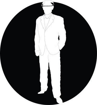
I am trying to create a logo - a very meaningful logo to me. It's based on my grandfather who passed away.
I drew the outline and everything, but I cannot give it the character with shadows. I don't know how to draw, so I really have no clue how to make the shadows organic and bring the life out of the figure.
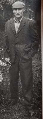
I noticed that what I am trying to do is something that is very present in stencil art, the shadows are simple, yet they define the shape of whatever it is - I think we are all familiar with the Obama stencil. Or the Al Pacino one from Scarface.
I will only use two colors - black and white. I already managed to put the shadow for the hat, but I simply cannot do it for the suit.
The whole logo isn't finished yet, I still have to smooth out all the corners and everything, but that shouldn't affect the shadows, so I'm reaching out for help. I am not expecting anybody here to waste their time doing the homework for me for free.
Here are the pictures - one of the logo, one of the original pictures with my grandfather
Explore related tutorials & articles
Copy link to clipboard
Copied
Your lines are rather fussy -- what tool are you using to draw them? With a silhouette like this you'd probably want simpler lines just capturing the essentials rather than every tiny detail. Use the pen tool if you're not already, and make smooth curves without too many anchors.
You don't really specify what kind of help you want... I guess 'draw the darker areas' isn't enough of a hint? It's hard to know what else to say. You can see the contrasts -- the folds of the clothes, the shadows on the face. You've already done it on the hat. Just keep going.
Copy link to clipboard
Copied
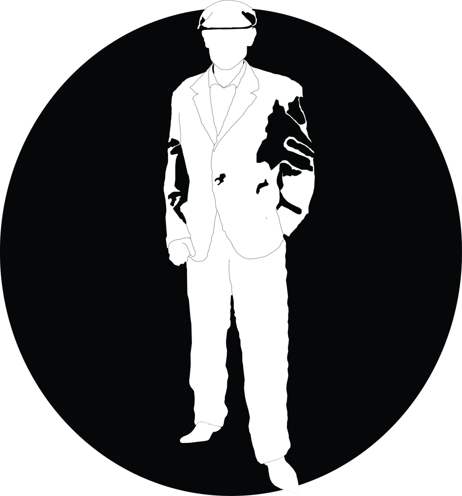
Yes they are! I traced the image with pen tool, but I might have been too accurate, because I replicated every single fold. If you can suggest how to simplify it and make it look cleaner, please tell me.
Hm.. I don't know how somebody can help without physically drawing the shading.. but that is work that is paid. I actually traced all the shadows.. and boy oh boy did it turn out terrific
I have no experience or knowledge with drawing and shadows, so it's almost impossible for me to define the suit and pants with shadows - i do not understand how clothing works or how shading for clothing works.. so I cannot do much. It turned out well on the hat (I also traced that down from the original pic), but when I tried with the suit.. horrific. I'm trying to avoid the face (at least the eyes), because it would contribute to the anonymity - something that will be very meaningful for the logo, because I myself will not show my face, so it would contribute to the character and meaning of the logo. It's the clothes that are the problem
Copy link to clipboard
Copied
Do you have an image editing software such as Photoshop?
You could open the photo in it and increase its contrast to get an idea of where the shadows need to go.
There are several methods to get to a somewhat sufficient result:
- brightness/contrast (simple, but most probably won't help that much)
- posterize
- levels
- curves
- RAW conversions.
I suggest that you dive into the documentation to get to know how these work.
Maybe use a search engine to find tutorials on how to make something like the "Che Guevara" artwork. The one on the t-shirt in the 70s
Copy link to clipboard
Copied
I do have Photoshop, I don't know of how much use it would be. You can see in the reply above how tracing the existing shadows turned out...
I actually did dig into the documentation on how to make stencils - how to turn a photo and make it ready for a stencil. I din't try the techniques out because I am convinced that the reulst will be similar to how the tracing of the shadows turned out (image in reply above)
Thank you for your input!
Copy link to clipboard
Copied
Using Photoshop was meant to "get an idea". I didn't want you to autotrace the result.
Copy link to clipboard
Copied
Hm, I'm not much of a drawing person, so I don't know how to do it otherwise
Copy link to clipboard
Copied
Hi,
I have a few tutorials that may help you: https://www.pluralsight.com/courses/sports-bottle-package-design-photoshop-illustrator-2270
https://www.pluralsight.com/courses/adobe-illustrator-cc-creating-tshirt-design
Copy link to clipboard
Copied
Seems like those are paid courses, correct?
I didn't check whether a credit card is required for the free trial
Copy link to clipboard
Copied
cirjakvoja,
All based on your using only black and white.
You may (re)consider the dramatic effect of just the line details (with thicker lines, lest they disappear in small sizes) as shown in the clothing on the logo image.
Otherwise, you may be happier if you use (cross)hatching.
Or underdo the shading (making the black parts narrower/shorter/split up with white parts in between) which will bring it closer to what you get with more (grey) colours (or (cross)hatching).
I like the (too) accurate Pen Tool tracing, adding suspense.
Copy link to clipboard
Copied
I am not sure I quite understood you.
I know what cross-hatching is, but I don't think it would be quite suitable for a logo.
I am not sure if you are referring to the shading in the pic I attached, if you are.. I personally cannot see how I can use it at all, it looks horrible, doesn't really add the definition of the clothing and the folds.
I didn't quite understand what you said unfortunately, but it does sound like you are trying to suggest something useful
Copy link to clipboard
Copied
Not unusually, I find myself in general agreement with Jacob. My impulse is to be very conservative with the use of shadow, perhaps tracing around only the darkest spots (and maybe not all of them), then selecting most or all of those and going to Object menu > Transform > Transform Each and scaling them down until you find a pleasing result. It won't take a lot of black to be too much.
Peter
Copy link to clipboard
Copied
Thank you Peter!
Any suggestion as to how to determine which are the darkest spots?
Copy link to clipboard
Copied
By using Photoshop as I suggested above.
Copy link to clipboard
Copied
I would just find the most obvious dark spots by eye, and any place I had any question about I would leave blank. I really think it doesn't want much more than hints of shadow, but that's opinion, and not any sort of authoritative dictum.
Peter
Copy link to clipboard
Copied
cirjakvoja,
No more unusually, I find myself in agreement with Peter.
Especially in connexion with artwork like this logo, with a purpose of giving a true core representation, a well chosen amount of enhancement, which may be obtained by adding and/or removing details/parts, may well make the core representation truer than one truer to any actual template.
If this seems as woolly and unintelligible as it is meant, you may consider this:
Starting out with just the line details (with thicker lines, lest they disappear in small sizes) before any shading is added, in other words before the first logo image in your (OP) original post, you can start asking yourself the question (a number of times as you go):
Which (further) addition will (most strongly) enhance what is meaningful to me?
And then add only that, remaining aware of your freedom to use/interpret/change/adapt/ignore any or all of the detail/parts in, or derived from, the photo; it may help you to bear in mind that any ever so slight change in his posture, such as a slight turn of the upper part of the body (no turning of neck and head) and even down to a slight turn of his left hand hidden in his pocket, would have given clearly visible changes in shading.
In the process, you can use the following Layers, from the top down, and apply hiding/showing to go back and forth, keeping everything locked except for the top Layer (you will know why if you forget it, Ctrl/Cmd+Z is your friend):
The current version of the logo (mostly shown, but you can hide it temporarily as part of comparing with anything beneath);
The previous versions of the logo (always hidden, except for comparison, also keep it/them to fall back on);
The original photo as a Template (Layer) or just with reduced Opacity;
The original photo;
One or more versions of the original photo converted to a reduced number of greys as excellently suggested by Monika/Simeon;
Copy link to clipboard
Copied
I still don't understand, perhaps you need to be more detailed and clear what you are talking about (sorry, I am one of those people who you really need to explain every detail to, I have a hard time connecting one and one)
What are line details? Are you talking about the outline of the suit, or the outline of the shadows? In my OP I attached two pictures - in the second one is the logo, it consists of the outline of the whole body, but all the lines are the exact same thickness.
What does "(with thicker lines, lest they disappear in small sizes)" mean?
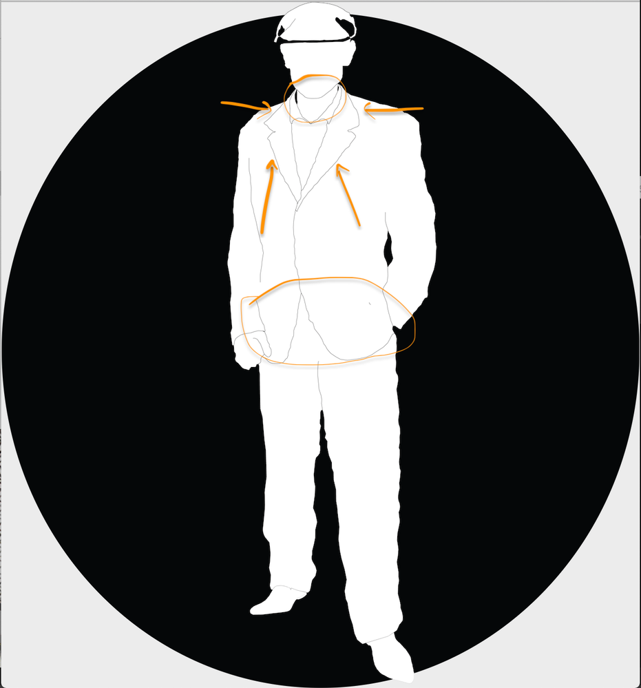
What is important is what I marked in the photo below: the lapel & collar of the suit, front panel of the suit (the bottom part of the suit where the two sides of the suit meet), the definition of the neck from the shirt. I am not too worried about thaving the shirt details visible, but the curvature of the suit would definitely be the most important part as though that's what defines the shape and character of the figure in the logo -
This is definitely not something easy to pull off, it seems to be quite advanced actually. The hat looks perfect, now only if I can get the same character to the suit and pants...
Copy link to clipboard
Copied
cirjakvoja,
What are line details? Are you talking about the outline of the suit YES, or the outline of the shadows NO?
What does "(with thicker lines, lest they disappear in small sizes)" mean?
It means that the lines (the ones you point at/encircle) are so thin that when you reduce the size of the logo they will disappear because they become too thin to see at much smaller sizes. If you make them (all) thicker (increasing their identical thickness) to start with, then they will also be visible at smaller sizes. A logo also needs to look right at small sizes.
Of course they must not be too thick, either. The right thickness is your choice.
In any case, I believe you should add line details to the head/face, not too much, a suitable combination of showing and hinting.
And then I would suggest your looking at how it looks without the shading on the hat.
And then only add the amount of shading that is actually needed (if any), where it is actually needed.
To my eyes, the shading on the hat, which fills the whole area that is darker, is also too heavy because it is black; just as much as the shading on the jacket. It is more like holes than shades, as if they are part of the background.
This is the reason for the suggestion in my first answer:
Or underdo the shading (making the black parts narrower/shorter/split up with white parts in between) which will bring it closer to what you get with more (grey) colours (or (cross)hatching).
Like the line details, shades ought to be a suitable combination of showing and hinting, neither too little nor too much. The right underdoing is your choice.
Copy link to clipboard
Copied
Hi there,
Thanks for reaching out. I hope your issue is resolved now. We'd appreciate if you can mark the appropriate answer correct.
If you used any other method, please share it here. It'll help other users having similar concern.
If you still have issues, let us know. We'll be happy to help.
Regards,
Ashutosh


