 Adobe Community
- Home
- Illustrator
- Discussions
- How to match a color at 100% opacity with color at...
- How to match a color at 100% opacity with color at...
Copy link to clipboard
Copied
I am trying to match two colors for a diagram I am making. One is a solid color the other is at 50% opacity to show some text and linework below. Both are on a white background, is there a way to match the 50% opacity one top of white to the solid color?
 1 Correct answer
Perhaps another way:
https://drive.google.com/file/d/1_7dDp1tSxlHXX9UnAS7A0RGPgNveFl9a/view?usp=sharing
Explore related tutorials & articles
Copy link to clipboard
Copied
Marco Emilio,
I am afraid you can only make the desired match in greyscale by having identical reversed percentages of K value and Opacity, such as 50% K at 100% Opacity along with 100% K at 50% Opacity.
Copy link to clipboard
Copied
Thanks Jacob, I was worried that may be the case.
Copy link to clipboard
Copied
I am not sure if I understand what you are asking, but if you want a 100% color non transparent color that looks like the 50% transparent color, just select it and choose Object > Flaten Transparency...
Copy link to clipboard
Copied
Ton, thanks for the reply. That is helpful! I hadn't used that function before; I think I will be able to use this. What I was orignally looking for was a way to go in the opposite direction. Where I would start with an object and 'un-flaten' it so that it has 50% transparency, but has the same color as the original.
Copy link to clipboard
Copied
As I suspected, I did not understand what you wanted.
You can try eyeballing the 50% color with the HSB sliders by changing the saturation and brightness.
Copy link to clipboard
Copied
Marco Emilio,
Actually, I came to think that it will sometimes be possible to at least get close for certain pale to mid tone colours:
You can try this, starting with the desired 100% opacity colour:
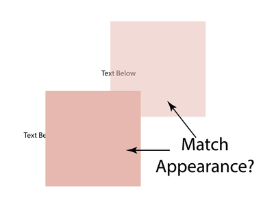
1) Move a copy of the path with the colour and set the Opacity as desired (as you have in the screenshot/image);
2) Switch to CMYK colours, but only in the Color palette; I am/have been assuming that you are working in RGB;
3) Select the original and (albeit only temporarily) clear the insignificant CMYK values (it can be one of the CMY and K) and change the significant ones to the nearest integer values (just to remember more easily), then insert higher values in the lower opacity copy and adjust the relevant C/M/Y values to get the best possible match;
4) Optionally, you may consider a certain adjustment of the original full opacity colour;
5) Switch back to RGB to get rid of the ugly colour values;
6) Optionally, you may fine tune the colours in RGB.
You can see a sample done hurriedly (without fine tuning) that way below; the dark one is the pale one at 100%.
Edit: My earlier (mis)conclusion was based on failed attempts with HSB, in line with the suggestion by Ton (which I saw when finally finishing this post); and then realized that the greyscale only way pointed at the similar CMYK way, both opposite to RGB.
Copy link to clipboard
Copied
Perhaps another way:
https://drive.google.com/file/d/1_7dDp1tSxlHXX9UnAS7A0RGPgNveFl9a/view?usp=sharing
Copy link to clipboard
Copied
Darken mode is the easiest way when a white background is used.
Trying to adjust the 50% to mimic the original 100% color is a moving target and impossible with saturated colors.
https://shared-assets.adobe.com/link/b5019901-5ab7-4837-4be5-0c4d5f33e2cd
Copy link to clipboard
Copied
Thank you Kurt, that was exactly what I was looking for!
Copy link to clipboard
Copied
"Trying to adjust the 50% to mimic the original 100% color is a moving target and impossible with saturated colors."
Possibly it's possible, Ton.
https://drive.google.com/file/d/123QDl7-e-u95BctBcfdB3n-kEi5S7_CF/view?usp=sharing
Copy link to clipboard
Copied
That is something different.
You cannot adjust the 50% opacity color (C20 M0 Y100 K0) in your example to look like the 100% one.
Copy link to clipboard
Copied
I'm not quite sure what you mean, Ton. Can you elaborate?
Or in other words: What behaviour (interactions) do you expect in the woody.ai and the woody_possible.ai files?
Copy link to clipboard
Copied
Take your woodpecker example color: C20 M0 Y100 K0
The saturation of that color is 100%
If you decrease the transparency to 50% and try to adjust the resulting color to get the impression of the original 100% color while maintaining the transparency.
It is possible with some colors, but not with heavy saturated ones.
Copy link to clipboard
Copied
No, of course it is possible, Ton.
We are probably talking about different things or thoughts.
Copy link to clipboard
Copied
We must be talking about different things.
I have attached an Illustrator pdf in my previous answer, it is impossible to adjust the values of the 50% color on the lower right to make it look like the color on the lower left.
Copy link to clipboard
Copied
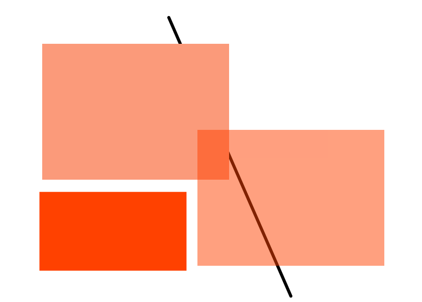
The light green rectangles (in file woody_impossible.pdf) have slightly different colour values. That won't work accurately, of course.
Left rectangle: H=59,66 – S=98,32 – B=86,95
Right rectangle: H=59,55 – S=100 – B=86,96
Here is another sample file:
https://drive.google.com/file/d/1D9nJldI_-EZ77Q4NlarY2VUVuDnY9rOM/view?usp=sharing
Doesn't that work for you, Ton? Or are we still talking at cross-purposes?
Copy link to clipboard
Copied
Yes the green values change the moment you make a swatch.
That is not the point, you cannot always adjust a 50 % transparent version of the swatch by changing the values to match the 100% version
Your trick is very good, a darken fill on top of a 50% fill and is the solution, but we are talking about different things.
Copy link to clipboard
Copied
Perhaps, Ton, we may reach an agreement and claim that the woody thing is possible and impossible at the same time. Depending on the point of view and concept.
Nonetheless, it may be pretty interesting if you could provide a sample file that may prove that it is impossible in some situations.
Copy link to clipboard
Copied
Your solution (with the knockout group) works fine when you restrict the viewing to Adobe applications or export the file as an image.
When saving as PDF Acrobat shows it fine, but when viewing the PDF in other viewers, like Apple Preview, or in various browsers you will get a different result, same with export to svg.
Instead of the knockout group and the double fill in the Appearance panel, 2 objects with the text in between will make the result more compatible with other applications.
See attached PDF
Copy link to clipboard
Copied
Good point, Ton.
On the other hand I'm not quite sure if I should really be responsible for the inability of countless PDF viewers to accurately display proper PDF constructs.
If that may be the case one day, I will immediately convert myself into a shepherd.
Copy link to clipboard
Copied
I do not held you responsible, Kurt (altough I would like to see a picture of you as a sheperd).
Illustrator does not work in a vacuum, so it is good to be aware of problems with other applications and be able to use a workaround.
I found that Illustrators transparency flattener shows the same problems as some other applications.
Copy link to clipboard
Copied
No vacuum, of course. I would never claim that. But considering the numerous mediocre PDF viewers that are not able to display even "simple" transparent objects and interactions correctly, I'm certainly a bit out of the game in this respect.
I will post a picture as soon as I am a full-time shepherd.


