 Adobe Community
- Home
- Illustrator
- Discussions
- Re: Identical Illustrator Art that prints differen...
- Re: Identical Illustrator Art that prints differen...
Identical Illustrator Art that prints differently...
Copy link to clipboard
Copied
There's a huge problem with art that's identical in Illustrator displaying and printing differently depending on how the layers are placed.
I've attached example PNGs.
Both images were traced from line art using Image Trace in Illustrator.
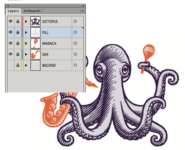
The first has the 'fill' color on a layer above the image outline, as you can see in 'Layers'.
The second has the 'fill' color BEHIND the image outline, as you can also see in 'Layers'.
You'll notice that the dark linework 'bleeds' thickly when the 'fill' is behind the outline.
And when the fill is above, the linework is thin –the same is true if the fill is on the same layer as the linework.
Both display identically, of course, in 'Preview'.
This is causing all kinds of problems to my clients, who, as in this case, wanted the linework to be 'empty' so they could place it over their own color choices. The linework thickens even more the more the image is reduced.


Explore related tutorials & articles
Copy link to clipboard
Copied
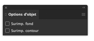
Maybe or the upper layer check these boxes are unchecked.
Also the transparency features may help
Copy link to clipboard
Copied
The layer icons in your screenshot are a too small to discern, but I guess the grey fill is not one large gray filled area, but a lot of little parts fitting between the darker elements. In that case the anti-aliased screen preview of the darker version on top might seem bolder than the other way around.
First, check if there are absolutely no line widths involved.
And hopefully no one has set some fancy Overprint setting ?
Then try combining and tweaking the parts from both layers, to form either a detailed dark Octopus layer on top of one large grey area on the Fill layer, or a detailed grey Fill layer on top of a large dark area in the Octopus layer. Then it's more obvious to stick to one preview and not get any unexpected results (judged by a screened other version).
If that's not helping, the please supply some more detailed screenshots in e.g. the Outline mode for separately visible layers.
Copy link to clipboard
Copied
"Both display identically, of course, in 'Preview'."
Do they also print identical from Preview?


