• Global community
    • Language:
      • Deutsch
      • English
      • Español
      • Français
      • Português
  • 日本語コミュニティ
    Dedicated community for Japanese speakers
  • 한국 커뮤니티
    Dedicated community for Korean speakers
Exit
0

Illustrator issues

New Here ,
Jan 25, 2021 Jan 25, 2021

Copy link to clipboard

Copied

Hello,


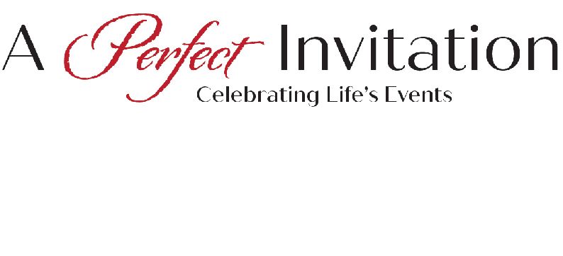
I am creating my logo in illustrator using the following fonts: Quiche Sans and Origins.  The Sans is fine but the Origins look very jagged.  Mind you the sizes are very large 70 and 50.  What or how do I fix it so that it looks fine on screen and prints well?  I had a banner made with that logo and it is nice but jagged.  OK, I did have the zoom about 300.  At 100 it still looks very painted.  Do I need to scrap this and find a bolder font?  The word Perfect is in Origins.  Unfortunately, I cannot attach the file.


On another note - when using adobe programs should one have no other programs open to keep the opening of the program from saying not responding and then 5 minutes later it's open but still hanging up?  very frustrating.  Thank you

Views

297

Translate

Translate

Report

Report
Community guidelines
Be kind and respectful, give credit to the original source of content, and search for duplicates before posting. Learn more
community guidelines

correct answers 3 Correct answers

Community Expert , Jan 25, 2021 Jan 25, 2021

Hi. If you have that issues just with that specific font, maybe that font is corrupted and you should use a different font.


Votes

Translate

Translate
Community Expert , Jan 25, 2021 Jan 25, 2021

Is Origins not supposed to be jagged? It looks jagged at the largest size here:


https://fonts.adobe.com/fonts/origins

Votes

Translate

Translate
Community Expert , Jan 25, 2021 Jan 25, 2021

Yes, the font has like little cutouts in the letters. @Doug A Roberts is correct. If this isn't what you want, I think you need to find another font to work with.

Votes

Translate

Translate
Adobe
Community Expert ,
Jan 25, 2021 Jan 25, 2021

Copy link to clipboard

Copied

Hi. If you have that issues just with that specific font, maybe that font is corrupted and you should use a different font.


Marlon Ceballos.

Votes

Translate

Translate

Report

Report
Community guidelines
Be kind and respectful, give credit to the original source of content, and search for duplicates before posting. Learn more
community guidelines
New Here ,
Jan 26, 2021 Jan 26, 2021

Copy link to clipboard

Copied

Thank you so much.  I will start working on the logo redesign.  Do you have any suggestions on the type family?  I want to stay in the script family.

Votes

Translate

Translate

Report

Report
Community guidelines
Be kind and respectful, give credit to the original source of content, and search for duplicates before posting. Learn more
community guidelines
Community Expert ,
Jan 25, 2021 Jan 25, 2021

Copy link to clipboard

Copied

Please show screenshots

Votes

Translate

Translate

Report

Report
Community guidelines
Be kind and respectful, give credit to the original source of content, and search for duplicates before posting. Learn more
community guidelines
New Here ,
Jan 25, 2021 Jan 25, 2021

Copy link to clipboard

Copied

A Perfect Invitation logo 2020 SMALL.jpgA Perfect Invitation logo 2020 SMALL.jpg


Votes

Translate

Translate

Report

Report
Community guidelines
Be kind and respectful, give credit to the original source of content, and search for duplicates before posting. Learn more
community guidelines
Community Expert ,
Jan 25, 2021 Jan 25, 2021

Copy link to clipboard

Copied

Is Origins not supposed to be jagged? It looks jagged at the largest size here:


https://fonts.adobe.com/fonts/origins

Votes

Translate

Translate

Report

Report
Community guidelines
Be kind and respectful, give credit to the original source of content, and search for duplicates before posting. Learn more
community guidelines
Community Expert ,
Jan 25, 2021 Jan 25, 2021

Copy link to clipboard

Copied

Yes, the font has like little cutouts in the letters. @Doug A Roberts is correct. If this isn't what you want, I think you need to find another font to work with.

Votes

Translate

Translate

Report

Report
Community guidelines
Be kind and respectful, give credit to the original source of content, and search for duplicates before posting. Learn more
community guidelines
New Here ,
Jan 26, 2021 Jan 26, 2021

Copy link to clipboard

Copied

Thank you.  I will start looking for a new font.  I really loved that cursive look.

Votes

Translate

Translate

Report

Report
Community guidelines
Be kind and respectful, give credit to the original source of content, and search for duplicates before posting. Learn more
community guidelines
New Here ,
Jan 26, 2021 Jan 26, 2021

Copy link to clipboard

Copied

LATEST

Thank you.  will start working on the redesign.

Votes

Translate

Translate

Report

Report
Community guidelines
Be kind and respectful, give credit to the original source of content, and search for duplicates before posting. Learn more
community guidelines