 Adobe Community
- Home
- Illustrator
- Discussions
- Re: "When spot colors are used with transparency.....
- Re: "When spot colors are used with transparency.....
"When spot colors are used with transparency..."

Copy link to clipboard
Copied
Hi,
I'm getting the error message, "When spot colors are used with transparency, changing them to process colors outside of Illustrator can generate unexpected results."
I'm working in a file that will be printed in large volume and needs to be right before sending to printer.
How do I remedy this? I'm not entirely sure what a spot color is, so not really sure where to start.
On a bit of a time crunch, so explanations (not links to articles) would be greatly appreciated.
Thanks!


Explore related tutorials & articles
 9
Replies
9
9
Replies
9

Copy link to clipboard
Copied
Please read this piece of the documentation to learn about spot colors:

Copy link to clipboard
Copied
you are likely not printing with spot colors if you don't know what they are.
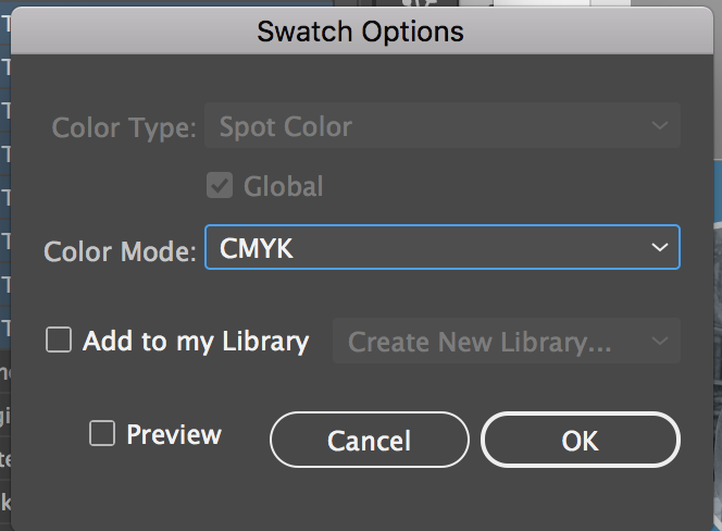
in the swatches panel you can select all the spot colors, select the 'swatch options...' from the flyout menu or the button at the bottom of the palette, in the options panel choose "process color" from the 'color type menu'
that will convert all the swatches to process. spot colors in the swatches palette are represented with a little black dot on the bottom right corner.

Copy link to clipboard
Copied
So I did all of this, but when I got to the options panel, the color-type menu was accessible.
Any idea what to do in this case?

Copy link to clipboard
Copied
Window >> Separations Preview (Check overprint to enable)
Do you see any other colors, besides CMYK? Those colors arento CMYK, but in color model Spot, and you need to change to CMYK. You may have missed one, or for example you may have placed an image that has a spot color channel assigned in Photoshop. To help you find what elements are in the post color option click on the visibility eyeball to solo (show only) that color as in my example below showing only PMS 4655 C,
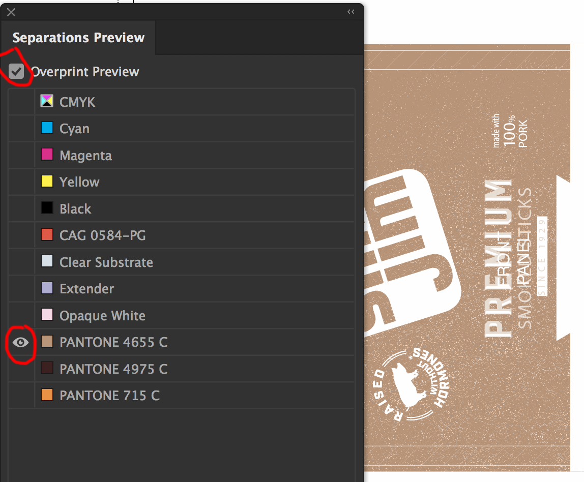
Option click on the solo'ed eyeball to show all again.

Copy link to clipboard
Copied
Thanks a lot, I found 1 color was seperated from the rest. as pantone.
It was from photoshop. And now I switched the colors within illustrator like you mentioned, and it's working!

Copy link to clipboard
Copied
You sir.... are a genius! Thank you!
(or ma'am 😉

Copy link to clipboard
Copied
I am not getting any options in the separation preview.

Copy link to clipboard
Copied
You're probably in RGB color mode... but start a new thread, this is from 2018.
Supply some screenshots...

Copy link to clipboard
Copied
as you say time crunch...
usually stuff gets printed as 'process'
where the inks are Cyan Magenta Yellow and Black - 4 inks,
the 'process' is the images and text being made up using a mix of those inks.
Spot colour (Pantone Colours etc) are used to introduce a special specific ink colour,
so they literally stick a pot of orange for example in the system, so that your print is made of process + 1x spot ink,
or many more if you added lots of spot colours.
for your jobs it sounds like the best plan is just to get illustrator to convert those Spot colours (as te_co) explains, in your design to the nearest matching colour that can be printed using a mix of CMYK inks.
as far as the print job goes, additional spot colours cost more as there will be an extra plate, extra ink, another stage in the process, and often a different machine to run it on so it all adds on to the cost. so you generally only use spots for colours that can't be represented as well in CMYK, or to match more accurately and get better Solid looking colours especially noticeable in light and bright colours.
A pantone book is a great help for choosing colours and finding ones that work well when you have to use CMYK only to print.

 AdChoices