 Adobe Community
- Home
- Illustrator
- Discussions
- Save For Web in Illustrator is Blurry & Awful - He...
- Save For Web in Illustrator is Blurry & Awful - He...
Save For Web in Illustrator is Blurry & Awful - Help!

Copy link to clipboard
Copied
Hello
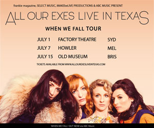
I'm hoping someone might be able to offer some advice, I'm embarrassed to admit that I'm completely out of my depth, I agreed to do a job putting together a digital ad that is to appear on the website of a magazine here in Australia. I've saved things for web previously and they've always turned out perfectly so when I agreed to do this I thought I had everything under control.
My problem is that when I export this file in Illustrator to 'Save For Web' everything turns ghastly, blurry and hideous. I've tried playing around with different settings,
and turning 'type optimized' on and still no luck.
The magazine prefers the ad to be:
Medium Rectangle | 300px x 250px | flash, gif, jpg | 60kb flash/40kb gif/jpg |
I'm probably doing something really obvious and daft wrong, but I can't figure out what that is.
If anyone (please) has any ideas I would be so grateful. I'm including a link to the file if you want to take a look at it and explain to me where I've gone awry.
thank you
phe


Explore related tutorials & articles
 51
Replies
51
51
Replies
51

Copy link to clipboard
Copied
that doesn't seem to be a public dropbox link. i get a 403 error, at any rate.
can you upload an image of your ghastly and hideous finished product the the forum?

Copy link to clipboard
Copied
+1.
This is also a good idea.
Copy link to clipboard
Copied
Copy link to clipboard
Copied
alright, well... that file has far too much detail in it for a 300 x 250 px image. if you're designing an ad that will be that small, it needs to be far simpler and use type that stands out at that resolution (your thin face is just going to get anti-aliased to nothingness).
Copy link to clipboard
Copied
Ok, I suspected as much.
Damn I'm not really sure how to work around that - the band manager who gave me the job wanted to add even more text to it!
Thank you *very* much for taking the time to help me.
Copy link to clipboard
Copied
Oh - that is the .ai file before I exported it to web. I didn't think that would be a problem (new at this). Should I have converted it to RGB before exporting to web?
Copy link to clipboard
Copied
Oh - that is the .ai file before I exported it to web. I didn't think that would be a problem (new at this). Should I have converted it to RGB before exporting to web?
if it is only going to be a web ad, work entirely in RGB from the start. use an RGB document profile.
Copy link to clipboard
Copied
Ok haha. Thanks, I downloaded the photoshop template from the magazine website and it's in RGB and the photo of the band is RGB so I'm not sure how it got to CMYK, perhaps I wasn't paying attention when I saved it?
I'll try playing around with the width of the type some more, thank you both very much.
Copy link to clipboard
Copied
Here's your Ad at the correct dimensions:
I'll add my comments/corrections in a separate comment.
Copy link to clipboard
Copied
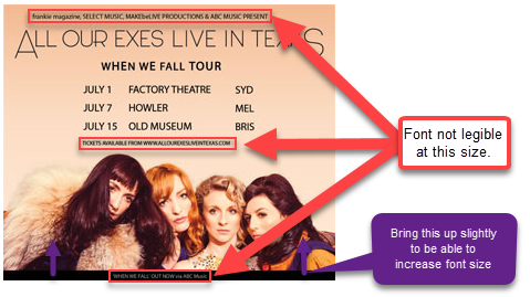
Hope this helps.
Best,
EW
Copy link to clipboard
Copied
Thank you, you're right the font is illegible, I'll adjust that.
I *think* opening it in photoshop and exporting it from there makes it look slightly less monstrous. I'm not sure why it would be any different than Illustrator but it seems slightly better.
But, that said I can't get the ad below 600px x 500px without it distorting.
Thickening the band's logo it tricky 'All Our Exes Live In Texas' is the logo and I think if I make it much thicker it's not going to fly.
Oh nelly.
Copy link to clipboard
Copied
I think the logo isn't really a problem..
Not sure why your getting distortion? My save of your file (in my opinion) looks just as good at the actual size than it does in the original Ai... although harder to read on the bits I have already highlighted.
What are your Import to Photoshop settings?
Here's where I would start from on the Photoshop side of things.... 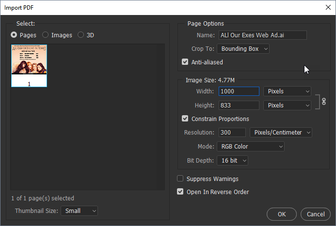
Then resize it down from there.
Copy link to clipboard
Copied
Also the whole monstrosity thing could be caused by your raster settings in Illustrator.

Also look at your Document Setup settings and make sure the preset is for High Resolution.

Best,
EW
Copy link to clipboard
Copied
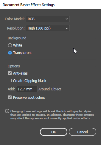
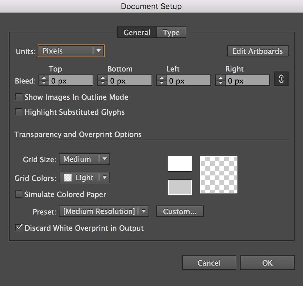
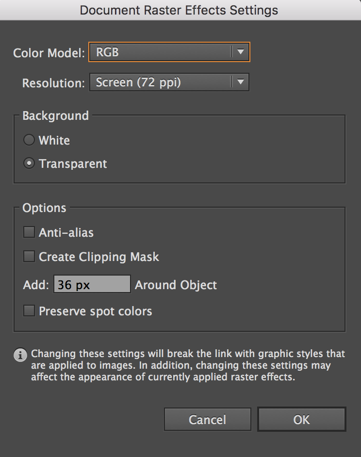
Thanks for the ideas! This is my document set-up and raster effects settings. Do they seem Ok to you?
Danny Whitehead suggested playing around with the antialiasing settings in the Character pallet, where is that exactly? Again sorry for all the questions.
Copy link to clipboard
Copied
raster effects settings won't matter unless you have raster effects like drop shadows etc. applied. i doubt you have.
Copy link to clipboard
Copied
IMHO - It won't matter that much... but I have personally noticed it that it DOES make some difference when you are essentially making a JPEG/PNG etc... which is essentially a rastered file (as it's made of pixels rather than paths at that point).
Happy to be disagreed with here 
Copy link to clipboard
Copied
it won't matter at all if raster effects haven't been used. it doesn't affect export.
Copy link to clipboard
Copied
Ok - For now I'm happy to agree to disagree.... but thanks.... I'd like to look into this more and find out how much raster actually has an effect.
I have always played it safe anyway as I don't see why it would cause any harm to the image or file size.
Copy link to clipboard
Copied
Ok, so with all of those adjustments this is what it looks like now in preview, sorry it's so big! you'll have to zoom out to see what it would look like on screen.
In the file I exported to photoshop I got it a little smaller but this was about as small as I could get it without it distorting too much.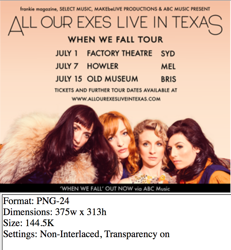
I think this might be an impossible problem, maybe I'll just have to beg the magazine to accept a larger file size? I wonder if that would work.
Copy link to clipboard
Copied
Can you post a Dropbox link to the new adjusted ai file?
Copy link to clipboard
Copied
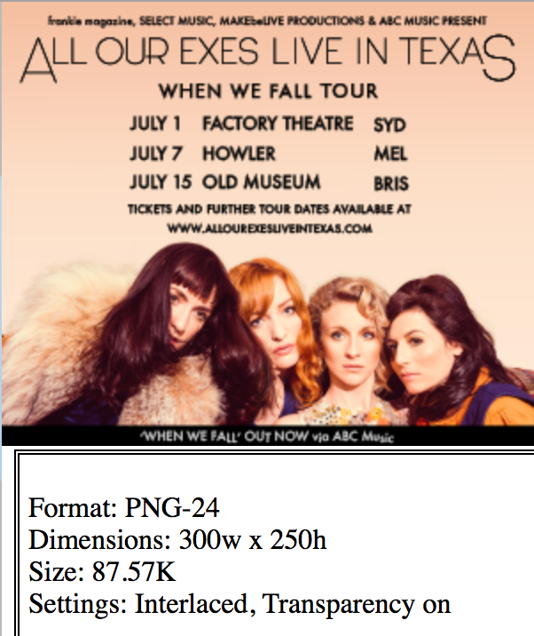
Dropbox - Exes-Export-VIA-Photoshop.png
Dropbox - Exes-Export-Attempt.png
Thanks again for all your help with this - I really appreciate it. Unfortunately for me it's 1.30 am here so i'm going to have to go to bed and I'll check back in the morning.
bonne nuit

Copy link to clipboard
Copied
I typeset your ad as a test...
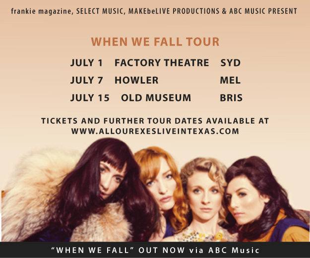
It doesn't have the logo, sorry. But the above is an Export > JPG @ 150ppi out of Illustrator ( oops, just noticed some spacing problems ). I used Myriad Pro Semi-bold and bold. The smallest size is 8pt. With some minor leading changes, the logo should fit. Another option would be to reduce the bottom bar thickness. But, the point is, the text is readable and crisp. At this size. When setting text ( White ) in Black, always increase the boldness and kerning.
Copy link to clipboard
Copied
Here's a 72ppi Export > JPG @ 300x250...
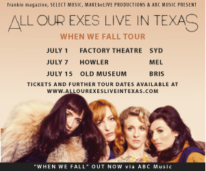
just barely readable. Some important ifo such as web site URL clearly should be larger. Pardon my makeshift logo ( position only ). Like previously suggested, try to get a larger sized ad, because if you cannot read it, what's the point?
Copy link to clipboard
Copied
Hello everyone
Thank you all so much helping me, I'm so appreciative of all the time and effort you've put in to my 'ghastly, blurry & hideous' Ad problem. This is the first time I've ever asked a question on a forum and I'm really touched by the kindness of strangers on the internet!
I enlarged the type and contacted the magazine explaining the difficulty I was having with so much text on such a small file and they suggested I make an animated GIF in photoshop - that way I can divide the text over three screens. I think this might be the solution. The woman I'm in contact with the magazine has helped put together a GIF in photoshop, this is what it looks like:

Better........? I think I need to smooth out the gradient on the second screen.

 AdChoices