 Adobe Community
- Home
- Illustrator
- Discussions
- Re: Seeking Designer Opinions on New Photography L...
- Re: Seeking Designer Opinions on New Photography L...
Seeking Designer Opinions on New Photography Logo

Copy link to clipboard
Copied
Good afternoon designers 
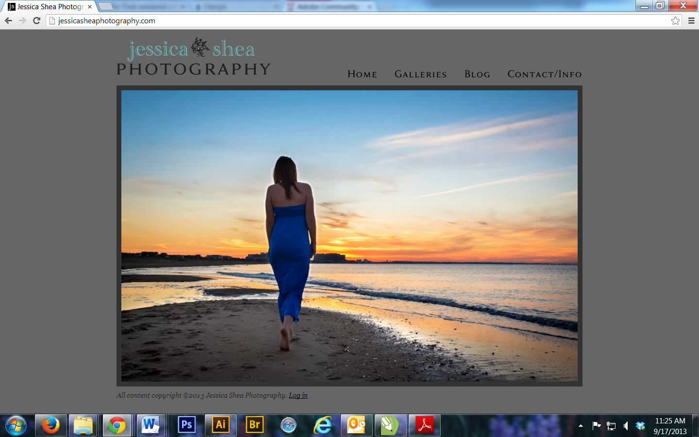
I've been in the process of redesigning my photography business, starting with the logo. Here is my old logo/website that I threw together 3+ years ago when I first started (blegh):
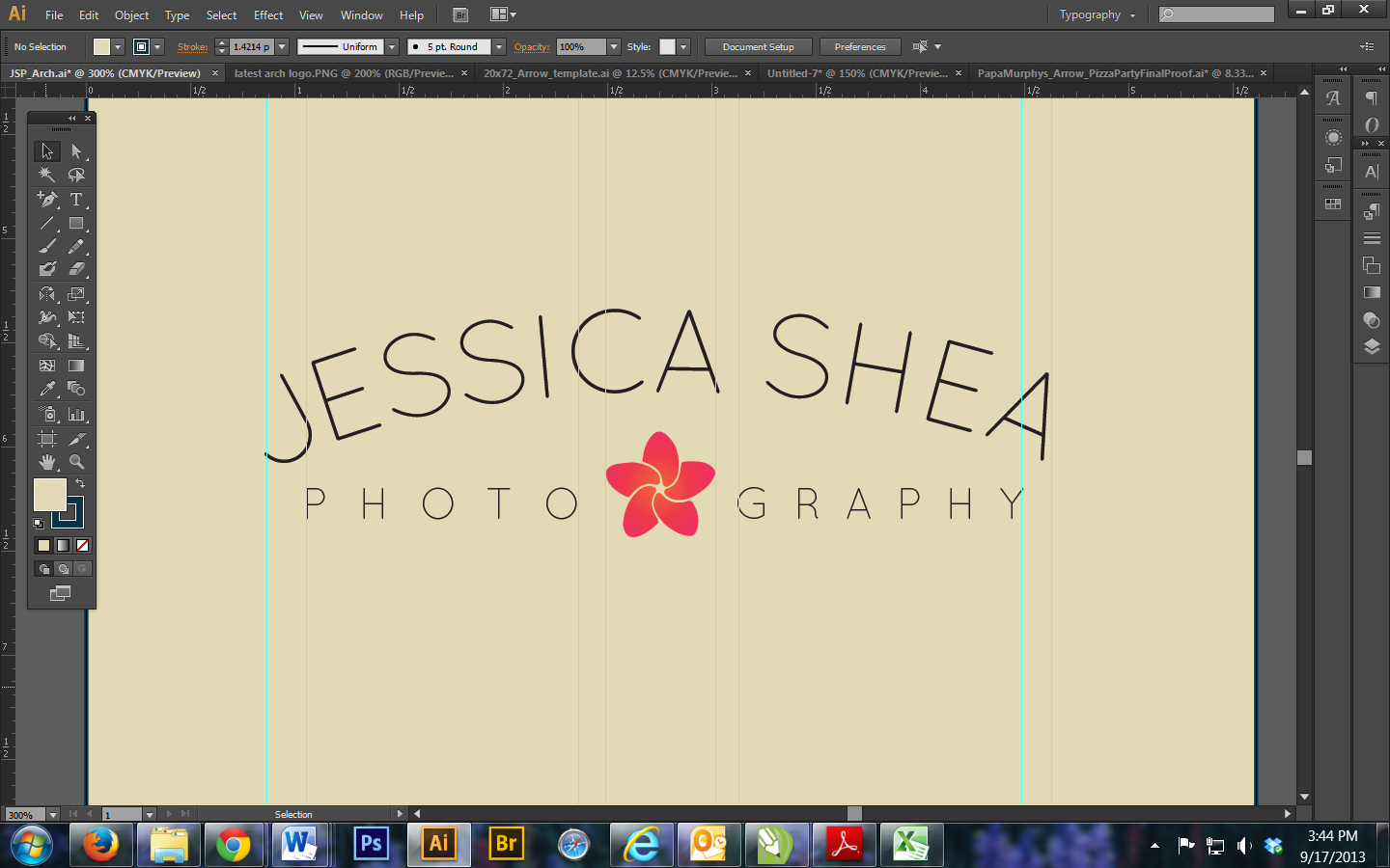
And this is what I've come to after months of messing around with fonts and designs. The plumeria is my favorite flower, and coral my favorite color, so I used it as an icon to represent my brand. My new site design will be much simpler, lighter, brighter, and modern.
I've included a clean version and a version with guidelines that I was using to show spacing areas of concern (between the text and flower, amount of space left on either side of the "Photography."

Now with guidelines:
I tend to go with what's visually accurate instead of what's technically accurate, but I feel like every time I make things perfectly aligned, it just looks off once those guides are gone. So I'm curious to see what you all think. Logos are supposed to be darn near perfect, but are there exceptions to that?
I've been staring at this for far too long and now I need outside opinions on it. Not necessarily major changes, just tweaks. I'm really looking to fine tune it, and since my name is uneven, it does look a bit uncentered. Does that bother anyone? Also, I'm debating on keeping 'Photography' narrower than 'Jessica Shea,' as I did try making it the same width of my name but it looked a bit funky since the hook of the J comes out further than the top of it, if that makes sense. Also, since I divided "PHOTO" and "GRAPHY" which aren't the same amount of letters long, I want to make sure they look evenly spaced despite it technically being unbalanced. I'm using Quicksand as the font if anyone's curious.
In summary, I'm looking for opinions on overall design, spacing and balance, and sizing (ex, size of the text, flower, etc).
Thanks in advance for any input!
~Jess


Explore related tutorials & articles
 46
Replies
46
46
Replies
46

Copy link to clipboard
Copied
For what its worth, I think the logo on post 10 looks great. Nice simple design, colours great. Sometimes you can over analyise your own work. Its a yes from me!
Copy link to clipboard
Copied
Haha, thanks for your feedback, throbnz. I agree, I'm totally a perfectionist and, naturally as a female, overanalyze everything. Nothing's ever quite done. Especially when it's something I know I'll have to live with indefinitely (DEFINITELY don't want to have to do this again anytime soon) and will be seeing it and dealing with it for watermarking, products, website, etc. every day.
That being said, I replaced the lines with leaves, since I agree the lines just weren't cutting it and i think leaves would make more sense. At this point I think I'm just fine tuning, filling up that empty space while adding to the overall design
Here are all the varieties: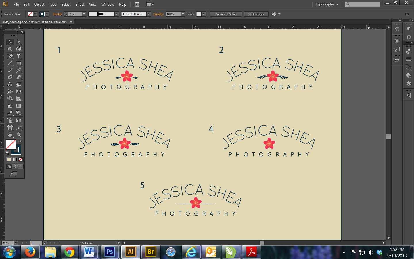
I can't thank you guys enough for helping me and inspiring me throughout this process!

Copy link to clipboard
Copied
Jessica,
I believe (or should I say beleave?) the leaves should be very simple and slender, maybe only just hinted (thus maybe not too far from being lines, just think of bamboo leaves) and not touch the flower.
What about the position/direction irregularities of the letters?
As part of the fine tuning.
Copy link to clipboard
Copied
I haven't read the entire thread..... so take what I post with a grain of salt.
Sorry, I think this is much stronger....
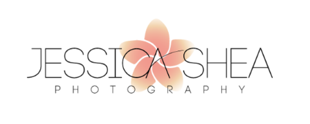
......but without the flower.
The curved text in your recent images just makes the entire logo appear to be unstable and unbalanced. There clearly appears to be no reason why the text is curved. Becuase of the nature of type the eye wants to READ the name rather than instantly percieve a logo. This creates visual conflict in my opinion. in addition to the fact that when read.. the logo causes the eye to end in a downward, right motion. This motion is commonly considered to promote feelings of meloncholoy or depression. Combine that with the fact that the spacing in the name makes the curved text appear to be off center (I realize it isn't) and I'd say you're headed in a completely unfruitful direction and trying to force something to work when it never really will.
My that's just my 2¢.

Copy link to clipboard
Copied
Nice one, Scott.

Copy link to clipboard
Copied
......but without the flower.
At last! A voice of discernment in this thread.
My rules of logo design:
- Be Ruthless. With yourself. With your client. With the design. To wit:
- What You Like Doesn't Matter. Anytime you hear yourself or your client, or any critic say "I like..." or "I don't like..." you and/or they are thinking wrongly and you need to say so or go back to the drawing board. This isn't about a touchy-feely, everyone's-a-winner, feel-good-about-yourself art class "critique" session. The only one whose "likes" matter is the target viewer, and that's impossible to know. It's not about what anyone "likes." It's about what works. It's about what it says.
- It's Work. Get over that. One concept is never enough. Always draw up multiple drafts, and make them as radically varied as you can. Otherwise, you have not even begun to fully explore possibilities. Let the exploration lead to something that works. If it doesn't, you haven't succeeded yet. Keep working.
- Design In Black Line Art. Forget color. Disallow grads. If the design is dependent upon grad fills or any other cheap and cheezy effect for its uniqueness or interest, it's already a failure.
- Know The Message. It's About Communication. What should the identity mark convey? (Hopefully more than merely, "Hey, I'm a plumber.") What differentiates the mark's holder from the competition?
- Nobody Cares. If you have to study it in order to "get it," it's already falied. Nobody's gonna bother.
- It Has To Stick. A logo is an entity's signature; its cornerstone. Is there anything at all distinctive about it? The second or third time it's seen a week later, will it ring a bell or will it just fade into the mental fog of looksame "logos"? Being technically "professional" is required, but isn't enough. Legal forms have required signatures since the beginning of civilization for a reason: They're assumed to be unique. Yes, by all means study examples of excellent logos. But study them to identify their strengths. Never allow yourself to think "I think I'll try something like that." That's not creative. That's starting from a standpoint of failure.
- Boil Down Essence. Make it elegant. Everything must have a purpose. If it doesn't have a purpose, throw it out. No gratuitous decoration. If it's not essential to the message, it's distracting from it.
- It Must Work Technically. Is the design versatile and robust enough for all the repro methods and display scenarios to which it will be subjected (single color, spot color, RGB, CMYK, print, web, signage, engraving, letterhead, placement ads, garment imprints...)?
Note the above is an unordered list. Each point is equally important. Each point must survive the trip from concept to repro-ready masters. But the first point (ruthlessness) directs the rest.
So in the present context, proceed as follows:
First, stop fretting over this. You are obviously already "married" to this one single treatment and are doggedly trying to make something out of it, when there's just nothing there. Straining at a gnat to swallow an elephant, as Aunt Molly would say.
Ruthlessness
Step back away from it. Wipe every wrinkle away from your forehead; every expression from your face. Stare at it coldly, unemotionally. Get yourself into a stoic, completely pragmatic mindset. Remove any notion of asking yourself "does this please me" or anything else. No frown. No smile. No narrowed, "artistically-sensitive, all-discerning, self-important" eye. You simply don't care about this logo. It's just another thing in this visually-cluttered world that just happens to be in front of your face. For a microsecond. And an annoying microsecond at that. Now you're looking at it more like its target viewers will.
Forget "Likes." Does it work?
Now ask yourself (again, with no facial expression; no emotion; no erudite discernment): In a visually noisy world is there anything even mildly interesting or attention-grabbing (let alone compelling) about this design? Does it do its job? You should be able to answer that right now. If you can't, let me help you: No.
Do The Work
You say you've been "at this for about 6 months now." Prove it. Let's see at least a small handful of your other radically-different drafts.
Disallow Effects
Remove that lame, cliche grad. Remove the pink. After doing so, what happened to uniqueness?
What Does It Communicate?
The thin type is wimpy, placid. Boring. Drab. As exciting as a funeral parlor. Is that commensurate with the nature of your photography? Do you specialize in snapshots of flowers?
In other words, what is the message? What is your mark supposed to be saying? "Hey, here's another run-of-the-mill local neighborhood photographer who probably has some equipment and knows how to press a shutter without a trace of originality or sophistication"? What are you actually selling? Flowers? Lenses? Or creativity?
Nobody Cares
What about your initial design draws attention; makes it stand out? Squint or cross your eyes a bit. What do you see? A meaningless faint grey arch with a pink blob under it? Does that "suck you in"? There's nothing here you haven't seen in countless amateurish "logos" made by the ubiquitous 12-year-old niece who "likes to draw." No drama whatsoever. Outside of purely technical labs or police departments, is that what people hire a creative photographer for?
The only point of drama in what you have shown so far is the modified crossbar of the CA ligature. That's it. Keep that as an objective possibility. But don't get married to it; it's not like that's never been done before, either.
Is It Memorable?
What about any of the designs shown so far makes them mentally "stick"? A pink flower? A lens diaphragm? A "clever" attempt to unify a flower and a lens diaphragm (with which you are so enamoured you haven't even noticed that in black it more easily reads as a meaningless star)?
Is It Elegant?
The flower/lens And the word Photography, just in case your brain-dead viewer misses what you hope to be obvious? "Oh yeah. I've got an idea. How about a tripod? Or some photo scrapbook corners?" That's how you ought to be ruthlessly talking to yourself: "Nope. Nothing memorable here. Just trite."
Those cliche dillywops you've added in post 26: Those are pointless additions just to fill the pointless whitespace void under the pointless arch. Just the act of doing that should have made you ruthlessly ask your ruthless self, "Why am I drawing these dillywops"? They are pointless decorations trying to justify a design error. And not even original decorations.
Technical Practicality
Are you ever going to have a physical place of business? A place to hang a shingle? If so, are you going to be able to afford a 60' x 180' billboard? Because that's what it's going to take for that thin typeface to read from any drive-by distance, let alone avoid being utterly washed-out by surrounding signage in the field of view of the annoyed customer who's driving while talking on the cell phone asking again for directions to your shop.
Oh, but you "like" that wimpy typeface. You're so proud of it, you'll no doubt want to have it engraved on some nice writing pens to use as promotional giveaways. How do you think those hairline strokes will hold up when reduced to a 2" wide imprint? And how will engraving render the graduated flower?
See what I mean? The path to decent logo design starts with ruthlessness.
Do not take offense at any of the above. This is exactly how I talk to myself when working.
JET
Copy link to clipboard
Copied
Hahahahahah, wow. That was so brutal all I can do is laugh. I'm so glad I could be an outlet for all your pent up frustration this thread has apparently caused you!!
You did have some good points. Thanks for that. But I'll go ahead and take your advice and stop caring about what you did and did not like now. I'm also not going to waste more space on here with the hundreds of other fonts and designs I played around with. All I'll say is that if several people remember my flower/aperture symbol from my last post, it worked. I'll continue on my journey and figure out what works for me, and I'm glad that some people could at least give me constructive criticism instead of just tearing it down without any solutions. I get that it's not perfect, hence why I posted it.
Have a lovely day in that ruthless brain of yours
Copy link to clipboard
Copied
Sorry you took offense, Jessica. As I said, none was intended. If you think I'm the least bit frustrated, you completely missed the point of sound advice.
JET

Copy link to clipboard
Copied
Jshea22 wrote:
I'm glad that some people could at least give me constructive criticism instead of just tearing it down without any solutions.
Constructive criticism is about asking the right questions that lead you to your goal. Constructive criticism is not necessarily about giving answers to these questions: http://www.uie.com/articles/critique/
I would rethink that flower as well. I didn't get the aperture in it. And without getting that, it's just a flower (I couldn't even tell which one). You said you chose that flower, because it's your favorite. But your logo has to express more than that. Your logo has to tell the viewer something about your work and about the way you see the world as a photographer. So people can decide if it's worthwhile to talk to you about their project.
Also: your logo shouldn't get more attention than the photos on your website, so having a brightly colored logo might make little sense.
Copy link to clipboard
Copied
Im gonna go against the grain on this one and say that all this questions on weather the logo speaks about your work, weather the flower clearly says photography, do people get it or not? Arent really important.
At the end of the day because you are a photographer, youll be known by your photography. I think your flower is as 'clear' as it needs to be. If you look at some of the most recognized logos they say nothing about the product or company.
I dont believe there is such a thing as 'constructive criticism'. A criticism is just what it is, criticism. People spewing their opinions about your work.
I think in your case, since it is a personal logo for your work whether you like it matters. You should then just worry about visual technicalities like kerning.
Since you are your own client without a deadline, apply it and live with it for a while and see how it works for you and tweak it as you see fit. You dont need to forsee the future and worry about wether it will look good on a pencil. If you choose to put it on a pencil, then you can evolve your logo to fit the criteria.

Copy link to clipboard
Copied
mec_os wrote:
...I dont believe there is such a thing as 'constructive criticism'. A criticism is just what it is, criticism. People spewing their opinions about your work
...
mec, you made me curious and I searched for it .
.
http://en.wikipedia.org/wiki/Constructive_criticism
when it comes to input for creative work, including my work, no matter how it is called, opinion, criticism, praise, etc., I agree with everyone regardless how opposing the different opinions may be. I consider all opinions as true. This is how different people react to the same thing and this is the nature of things.
Usually the creator wants the artwork to cause an intended reaction from all others but because that is impossible, the best that can be done is to optimize the artwork for a certain audience which is not an easy task but at least outlines the possibilities.
Copy link to clipboard
Copied
I would also add if you're goal was to get a bunch of "That's good. I like it." comments, the artwork would do better on your mom's refrigerator. No one ever improves by someone saying "I like it". All critism is constructive. If you are not a designer, you can't ask for "designer opinions" and expect them to all be favorable. If you brush off any negative comments, then you aren't really looking for any critism, you're only looking for praise.
Copy link to clipboard
Copied
I disagree, Scott, and I'll end the irrelevant "what is constructive criticism" debate here with the notion that there's a difference between getting feedback that I can move forward with, and getting needlessly brutal feedback that doesn't put me in a positive direction from where I started. Saying things like "No one cares" "whimpy" and "trite" aren't helpful in the slightest. I didn't take offense to JET's feedback, I just don't appreciate the overly dramatic prodding. Most of his ranting above came off as irritation, but such is text on a screen as opposed to in person critique.
I couldn't agree more with Mec_os in that there are many, many well-known logos out there that tell you nothing about the brand's products...Nike, McDonalds, Adidas, Starbucks...etc. Those don't seem to have any rhyme or reason behind their design other than McDonalds starts with 'M.'
I'm more than open to any and all critiques, and I even mentioned that JET had some good points. I'm not at all looking for people to just agree with me, I was merely explaining why I did what I did and seeing if it made sense. I've learned a lot from this thread indeed. There are a lot of negatives comments toward this design, you included, and I don't believe I brushed any off....but I'm not the only one who was annoyed by the tone of JET's response. Believe it or not I've considered everything everyone is saying. People are going to have their opinions and sometimes that replaces being constructive. That's all. If people want to keep tearing it apart, cool. Just let me know why.
Copy link to clipboard
Copied
So you disagree with me.... strictly praise is critism to you? Okay .
Copy link to clipboard
Copied
That would be your opinion, but it is not fact. I disagreed with your comment "all criticism is constructive." I'm not looking for praise.
At any rate, if you don't have anything to contribute to my dilemma, please refrain from commenting.
Copy link to clipboard
Copied
This is an open forum. You can't prevent anyone from commenting simply because you disagree with them. And, the simple request to do so reflects a fairly closed minded person.
Copy link to clipboard
Copied
It's pretty common sense that if you don't have anything to contribute to my problem then you're just trying to argue your opinion. And I'm not here to argue.
Copy link to clipboard
Copied
But my point was that I was contributing. True it may not have been the "Oh my that's wonderful" contribution you really wanted. But nonetheless, I contributed.
And it's very clear your attitude changed dramatically as soon as anyone stepped in and had anything other than praise to say about your new attempt at a logo.
It's impossible to help someone who fails to realize there's value in the opinions of professionals. I suspect you'd have plenty to post if someone started a thread "Sekking photographic advice for a non-photographer." All I was doing is offering critism as requested. It's a shame that you seem to have lumped me in with James' (JET) comments.
As for any comment by Wade... it's pointless. But hey, feel free to join his little "hate club" I'm sure that'll take you far.

Copy link to clipboard
Copied
I agree with you Jessica you can here for help. It was a simple request and everyone her understands it.
i do not think you need a logo but if it works for you then by all means as there are no rules to what works or does not work.
But s you can easily see there are users here who believe they have the answers when they do not and are perhaps guilty of being naive even at this late a date in their life.
And for instance anyone who could not see the blades of a lens iris in you logo is a bit out of touch with the physical nature of a modern photographic lens.
Perhaps they should one day actually taker apart a lens or shutter from a large format lens and they will see indeed it pretty much resembles you flower design.
But of course not being as experienced in things photographic they might not be so attuned to such matters and of course though they might be involved the visual arts they might simple not be as visual as one would expect a professional to be.
In other words you will find that many of the contributors here on the forum might be experienced on one level to the use of the application but not as experience in the actual world of the graphic arts, they have the years but not the range of experience.
BTW the reason I do not think ou need logo is that as a photographer I find that my work sells it self and is the best form of advertising.

Copy link to clipboard
Copied
I am no certain a logo is a good thing for a photographer but since you went down this rod an yu think it woks for you hen the obvious thing visually speaking is that one might consider bowing the word photography similar to the your name Jesica Shae and make it the appear to be the bottom lid of an eye. Now your logo might invoke the idea that you are intuitive about things you do.
Of course the flower might be slightly larger.
Keep in mind the top lashes of an eye are longer than the bottom.
Also keep in mind it does not have to necessarily come across as an eye it only has to be discoverable.
As far a rukes goes, there are no rules you only have to communicate your message. And if a logo works for you it looks like you are there right now.
Copy link to clipboard
Copied
I would ask all participants in this thread (and anyone reading it are welcome) to do a few things:
1) I would ask you to disregard any points this link was meant to prove and (re)read the article in its own right:
http://www.uie.com/articles/critique/
As I see it, the article is concise and convincing, and it unites the different aspects into a clear, comprehensive, and coherent, presentation of the concept constructive criticism, or well-done critique, complete with recommendations.
Reading it for the first time, after returning to this thread days after the last > latest post, made me decide to bring this up, as silly as it/I may be.
2) I would ask you to disregard any (parts of) posts that are not directly addressing the design/design options of the OP (original poster), in other words consider nothing but the actual criticism/critique as defined in the article,
and ask yourself: Does every last critique post in this thread meet the criterions of being constructive criticism/well-done critique?
Copy link to clipboard
Copied
Yes. For the most part. Once can't control how someone else reads 8-bit ASCii text.
-
- 1
- 2

 AdChoices