 Adobe Community
- Home
- Illustrator
- Discussions
- sidecar saturation problem on MacBook and iPad Pro
- sidecar saturation problem on MacBook and iPad Pro
Copy link to clipboard
Copied
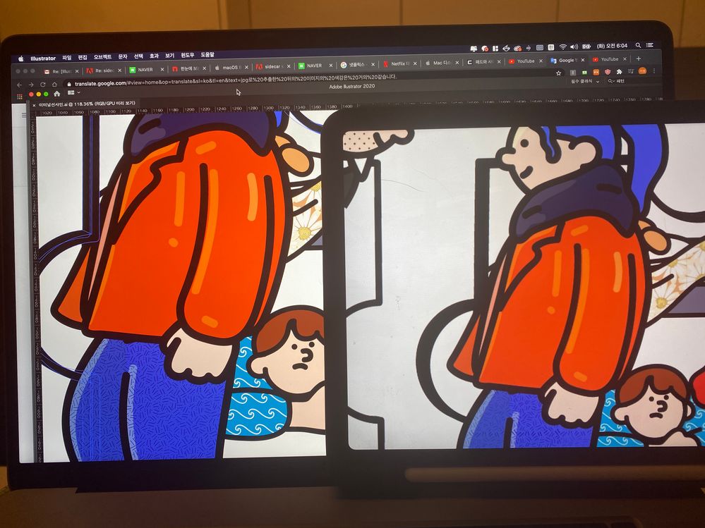
There is a noticeable decrease in saturation on the iPad Pro.
 2 Correct answers
kihoj,
I also see a definite difference in hue.
Maybe your best bet is to choose the colours to appear as close as possible to desired as an average of the different target devices (with default/normal settings), at least those you can view them on, so all appearances are preferably more or less equally good (or bad).
Hi there,
Thanks for reaching out. Please try toggling the True Tone by following instructions on this Apple article and let us know if it makes any change.
Regards,
Ashutosh
Explore related tutorials & articles
Copy link to clipboard
Copied
I see the difference in perceptible saturation, but I don't see how it's an Illustrator problem. Device displays all differ from eachother. Hardware and software controls that affect screen rendering are widely varied. Getting the displays of two different devices to look the same side-by-side may be on the fringe of possibility.
Copy link to clipboard
Copied
The color of the image after extracting as jpg is almost the same.
Copy link to clipboard
Copied
kihoj,
I also see a definite difference in hue.
Maybe your best bet is to choose the colours to appear as close as possible to desired as an average of the different target devices (with default/normal settings), at least those you can view them on, so all appearances are preferably more or less equally good (or bad).
Copy link to clipboard
Copied
Hi there,
Thanks for reaching out. Please try toggling the True Tone by following instructions on this Apple article and let us know if it makes any change.
Regards,
Ashutosh


