 Adobe Community
- Home
- Illustrator
- Discussions
- Stroke Weights Below 0.1mm Look All The Same
- Stroke Weights Below 0.1mm Look All The Same
Copy link to clipboard
Copied
Hi,
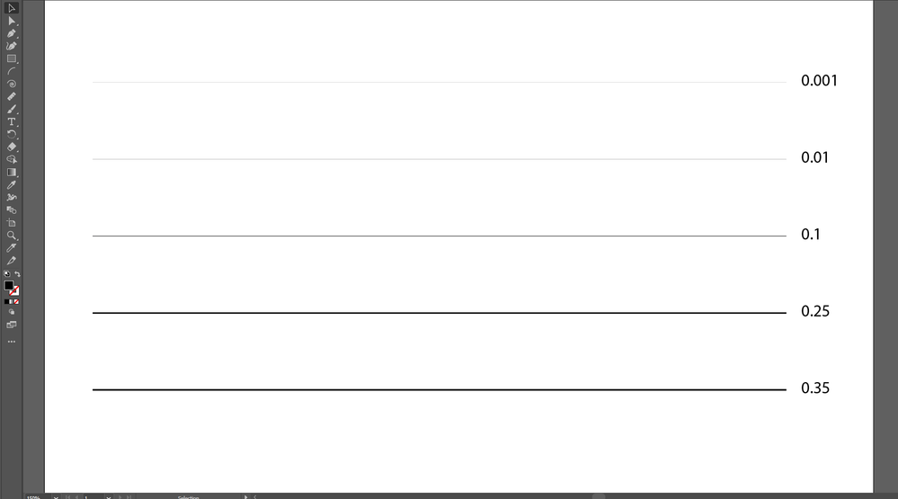
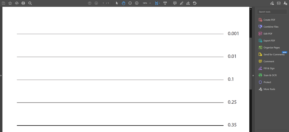
I want to have very thin lines, below 0.1mm. While in Illusatrator, the difference in stroke it noticiable, but when exported to pdf and viewed in Acrobat, all strokes below 0.1mm including 0.1mm look the same.
How can I fix this? Thanks


 1 Correct answer
I finally solved it by converting to very high JPG quiality and my lines display fine inside Acrobat.
For those who want to know, my vectorial document made in Ai was meant for Indesign, so I exported from there as JPG, and replaced that page for the JPG page inside Acrobat.
Explore related tutorials & articles
Copy link to clipboard
Copied
There is no reason to have a line less than 1 px in web, or .01mm in print. Why do want lines so thin that they are thinner than what a digital screen or printing press can reproduce? If you are going to print what screen Anilox roller do you plan on using?
Copy link to clipboard
Copied
Clearly in my first screenshot there is a difference between 0.1mm and 0.01mm. That's what I care about.
Copy link to clipboard
Copied
Hi, ShynnSup.
To try it out, open the "Preferences" panel in Acrobat and uncheck "Enhance thin lines" under "Rendering" in "Page Display".
Copy link to clipboard
Copied
Hi, this worked! But, is this a PC-dependant setting? I want to send my document through mail and want is displaying correctly on the other side. Can I hard code this setting into the PDF?
Having to tell the client to turn this off is a big no-no for me.
Copy link to clipboard
Copied
No, it's entirely a user preference. As far as I know it's not even scriptable.
Copy link to clipboard
Copied
ShynnSup,
"Having to tell the client to turn this off is a big no-no for me."
I am afraid that a certain client education is a necessary burden.
In this case, you could simply use the exquisite explanation by キィィ, and add your two screenshots to demonstrate what happens if it is ignored, (trying your best at) finding a gentle way of saying that eventually it is entirely up to the client to be able to fully enjoy the artwork you have created.
Seeing your artwork either way might pave the way for an openness and appreciation, and best possible cooperation.
Copy link to clipboard
Copied
I finally solved it by converting to very high JPG quiality and my lines display fine inside Acrobat.
For those who want to know, my vectorial document made in Ai was meant for Indesign, so I exported from there as JPG, and replaced that page for the JPG page inside Acrobat.
Copy link to clipboard
Copied
ShynnSup,
That is rather a long way to go to avoid the usual and obvious(ly right) way, see a bit more below.
If I may ask, which Color Mode did you use for the JPEG?
If you used the default RGB and it is for print on anything but non PostScript office printers, the colours will be converted in an uncontrollable way from the RGB gamut into the CMYK gamut which is generally smaller, but not wholly within it (unless you use the Adobe RGB), from the three colours R+G+B to the four colours C+M+Y+K which in itself is fundamentally woolly at best.
If you used CMYK, you might be there/close(r) colourwise, depending on the settings.
But whichever gamut you use, you will deliver a much larger file size with a lower quality, simply because of the rasterization:
It is a reasonable expectation to be able to zoom into a PDF, especially one with fine detail such as the fine lines all this started with, but with a JPEG, the client will see blurriness/pixelation/ugliness when zooming in, even at a very high resolution ("very high JPG quiality") which gives a correspondingly high file size.
You may start planning what to tell the astonished/dissatisfied client when asked about it.
And have you assessed the quality of the JPEG version in whicever way(s) the client is going to use it in actual print?
The high resolution JPEG is sometimes (but rarely) suggested/used as a representation of the artwork in cases of serious mistrust where the designer is really concerned that the receiver may misuse/steal the artwork (in those cases, the usual advice is to have a contract).
However close you can get to something usable/passable in the present case, I am afraid it is the safe way to recurrent unecessary trouble in the future.
Edit:
Actually, in my former post,
I deleted a suggestion of including a raster image preview of the artwork, only for the purpose of convincing the client of using Acrobat in the right way for viewing the PDF; this was essentially the JPEG you have chosen.
The reason for my deleting the suggestion before posting was that it would/could give the client the wrong impression of the artwork supplied.


