 Adobe Community
- Home
- Illustrator
- Discussions
- Re: Times Roman Bold font design different in Illu...
- Re: Times Roman Bold font design different in Illu...
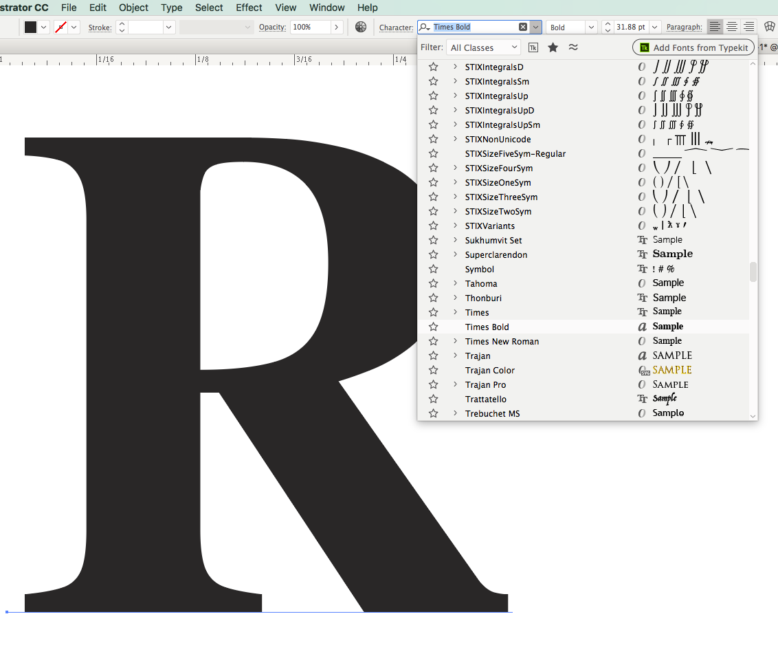
Times Roman Bold font design different in Illustrator

Copy link to clipboard
Copied
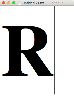
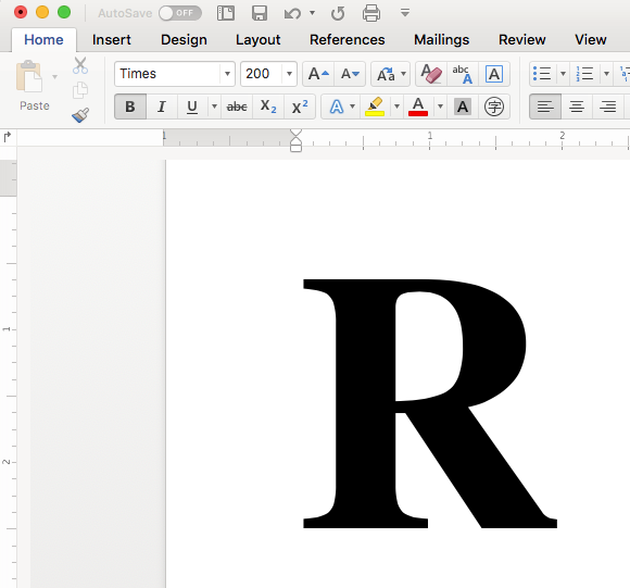
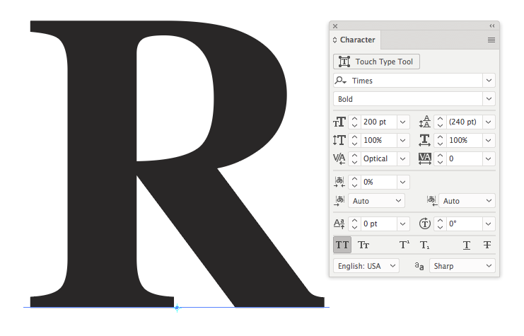
On all of our Macs, when we look at the font design "R" in Illustrator with Times Roman Bold, the gap closes in as you can see in these screenshots below.
Wondering if others are seeing this too. Aside from creating outlines in other apps and bringing it into Illustrator, I'm wondering if there is a way to make Illustrator read the fonts properly. Any suggestions much appreciated.
Text Edit:
FontExplorer:
Adobe Illustrator CC 22.0.1:


Explore related tutorials & articles
 11
Replies
11
11
Replies
11

Copy link to clipboard
Copied
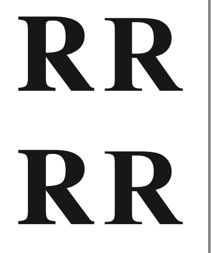
Looks like this.

Are you sure you selected the same TNR?
Copy link to clipboard
Copied
Thanks Monika. That to me looks like Times New Roman based on the longer narrower serif. I'm actually trying to get the regular Times Bold to work. It's very odd that Fontbook, Font Explorer and non-CC apps can see it properly. I notice Photoshop does the same as Illustrator. (Edit: Sorry, I realized I should have removed "Roman" from the question )
Times Bold
Times New Roman Bold
Copy link to clipboard
Copied
Update:
By forcing the postscript version of Times Bold to activate via Font Explorer, the true font design now works in Illustrator.
I still find it strange why Adobe Illustrator can't render the Mac OS Times.dfont properly when others can. Is this a localized issue or are other .dfont or other fonts not rendering properly? (at first glance, I don't think anyone would question the R looking odd in a sentence. It was just a curiosity that lead to finding this inconsistent font issue... Just curious now if any other fonts have this issue.
(note this has been consistent on 2 other macs in our office all having the same issue with the Mac's system times.dfont - PS: not that I'm advocating people to start using Times font, but just found this interesting...)
Copy link to clipboard
Copied
I can get them both.
At the moment I just don't see your problem anymore, because your screenshot shows them both as well.
Copy link to clipboard
Copied
Hi Monika, the issue is the one on the left is not the official design of the bold R. Where the leg meets the stem should have a gap like the R on the right.
The official Time Bold design can be seen here:
https://www.linotype.com/259/times.html
https://www.fonts.com/font/linotype/times/bold

Copy link to clipboard
Copied
Yes. The one on the right is the Times New Roman design. The one on the left is Times.
So maybe you just selected the wrong one.
Copy link to clipboard
Copied
Hi Monika,
Perhaps we can agree to disagree but the one on the left is actually not the proper design of Times Bold based on the original Times font by Stanley Morison.
If you follow the links to see the actual design of an R, you'll see there should be a gap between the leg and stem. In CC, it removes this gap. Here is Stanley Morison's design of the R: https://www.fonts.com/font/linotype/times/bold
If Linotype and others are displaying it incorrectly and the one of the left is actually meant to be Stanley's design, it means there is something strange going on. The examples shown in my original post are showing you the exact same font displayed in 3 areas: Font Explorer, Text Editor and Illustrator. Only Illustrator is showing it without the gap.
Anyways, hope this helps

Copy link to clipboard
Copied
It all depends on which foundry made the font.
There are several versions of Times and each one may look a little differently in the details.
Copy link to clipboard
Copied
Hi Monika,
While I agree with you that a typeface can be designed differently depending on the foundry, can I please ask you to try an experiment:
1. create the R with "times bold" in illustrator
2. create the R with the same font in Word
3. create the R with the same font in Text Editor
Do you see a difference in how the stem and leg meet?
The issue I'm trying to communicate is not which design is the correct one - but which rendering of it is correct. It appears Illustrator is displaying it differently than others. I am seeing the same issue in Photoshop.
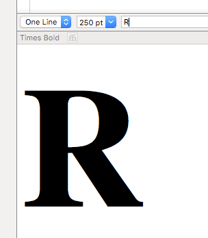
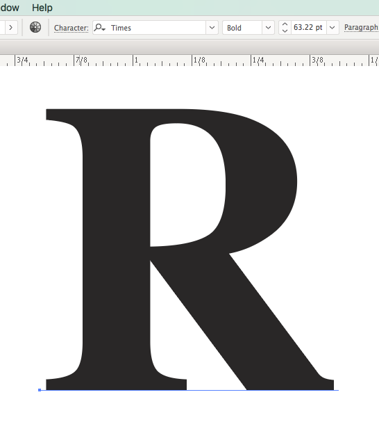
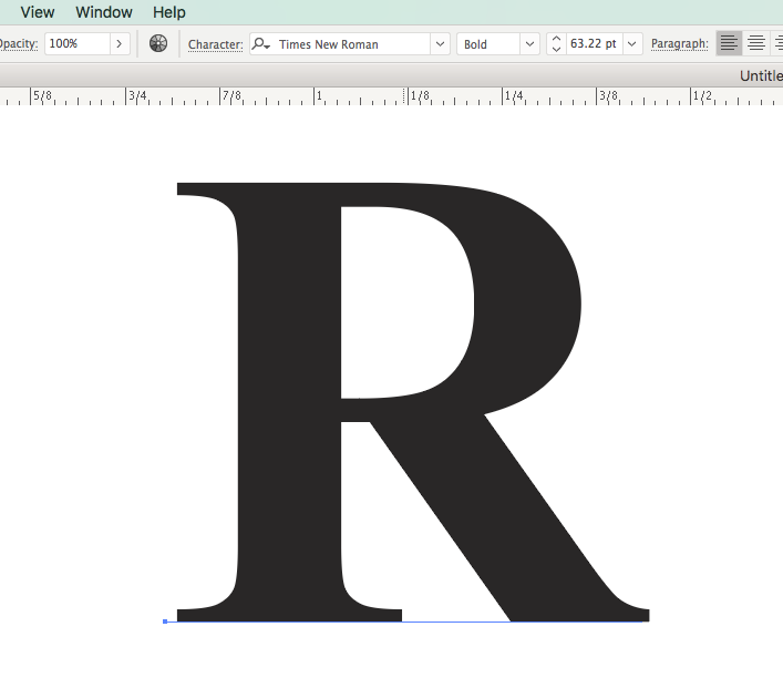
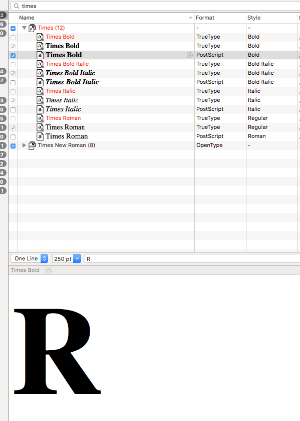
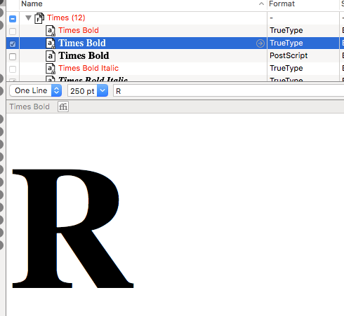
Here is the exact font - same foundry - shown in Font Explorer:
Now here it is in Word:
Here it is in Text Editor on a Mac (again, using the exact font)

Now here it is using Adobe Illustrator:
I'm wondering if you could consider the issue I'm trying to communicate. It's really not a issue of which foundry is correct. It's more of a issue that could Illustrator be deceiving us as designers in how it renders some fonts without us knowing it.
I hope I'm wrong and I hope it's really just this Times Bold that is the issue. Or it happens to be just my 3 macs. But I can see in your screenshots that it affects you as well.
Which then raises the question: which fonts are being rendered incorrectly.
Sorry if I'm being too picky. I'd hate for ad campaigns to go out with fonts being rendered incorrectly even if we are choosing the correct font.
Copy link to clipboard
Copied
OK, I'm seeing it as well now.
I still don't think it's a rendering issue. It's something with the fonts that causes this. And especially Times might still be hardwired somewhere deep inside the system.
You should definitely ask the question over there: Type & Typography
and hope for an answer by Thomas Phinney.

Copy link to clipboard
Copied
There is indeed something strange happening.
The Times Bold font R is displayed differently in InDesign, Illustrator and Photoshop compared to other Mac apps.
In InDesign you can ask to show the font location and that is the system Times.dfont, the same font used by other apps.
I tried this, Made a big bold R in Illustrator, saved as SVG (use System Fonts) and the result is different when you compare Illustrato and the SVG version in a browser.

 AdChoices