 Adobe Community
Typography effect

Copy link to clipboard
Copied
Version: CS5
Machine and OS: Mac Pro / OS X 10.7.2
I see this trend a lot but can't figure out how to do it. Screenshot attached because I don't quite know how to describe it effectively. Essentially, it seems like a thin stroke line that traces the center of each letter. I tried recreating this by creating outlines of a black font, adding a red stroke and adjusting its thickness until you could only see a bit of the black and the effect was similar but it was not clean by any means.
Any help? 


Explore related tutorials & articles
 81
Replies
81
81
Replies
81

Copy link to clipboard
Copied
photodrawken wrote:
His points about Monika's example are valid.
One only needs to look at CorelDraw's centerline trace to see how a "real" centerline trace should work. As I pointed out in my earlier example, it's not perfect when used on type, but is a true centerline regardless of the font weight.
I highly doubt that Corel Draw will get better results. Because it's autoatrace after all. The CD example in this thread shows round letters, so of course the results cannot be compared. The stroke being not in the middle of the letters: my screenshot was taken zoomed out and shows the path. If zoomed in the result is better. Just try it yourself.
As for the typography example in the other thread: I don't know what that has to do with the problem here.

Copy link to clipboard
Copied
Monika it does not work in Illustrator and that really is the issue whether Corel does it better or not is really irrelevant since the OP needs to accomplish what they need to do and not what they can settle for and if they fond that it worked for them then I would say they know from their own results.
Pretty clear to me.
Hard to argue with success!

Copy link to clipboard
Copied
Monika Gause wrote:
I highly doubt that Corel Draw will get better results.
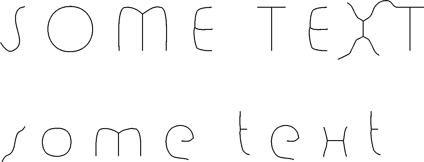
Then you should compare the two programs when using Bauhaus93 at 72pt. CDR gives a complete centerline trace, while AI gives four short squiggly little lines.
I'm now convinced that AI doesn't have the ability to do a centerline trace. As I said before, only when using skinny objects does one get something "sort of" close.
I want to take the opportunity to emphasize that I'm not here to start a flame war of CDR vs. AI. I'm just an AI rookie trying to learn the strengths and weaknesses of AI. If I discover that something isn't there, or is awkward and clumsy to accomplish, I'll call it as I see it. As I said in a different discussion, I had thought that installing AI would mean I could un-install CDR, but now I know that that was a false hope. I'll need to keep both programs and use each one for what it does best.
Ken
Copy link to clipboard
Copied
You;'re not startig a flame war I am not currently auser of Corel and think that though I liked it it unfortuntely did not work on the Mac very well.
I think you are correct and the other stuff might not be an actual reaction to anythiong you posted but more a reaction to what I posted and you should know there are two users on this thread who have never ver said they were wrong or mistaken about anything even when they clearly were.
So it will not get a response as too you are correct they see your point or anything like that it just will not happen never has and they never will admit to a mistake or error or that hey misunderstood.
So I think you answered your own questions and solved your own problems and I think though I am a fan of Illustrator this is a short coming of the program.

Copy link to clipboard
Copied
Then you should compare the two programs when using Bauhaus93 at 72pt.
Far be it from me to defend Illustrator's overblown autotrace feature—especially for this purpose. But not seeing a whole lot different of any real value going on here.

JET
Copy link to clipboard
Copied
That not very good in either case and still points to the need for such a feture for various purposes and not just for text.
I would say from lloking at these examples if they are indicative of the best results one can achieve then my mothod would be even if a bit time consuming, all though not ll that time consuming, would be the best approach if one wanted a reall good result.
A better feature would serve Illustrator well. I guess a skelton tool would be very cool.
Copy link to clipboard
Copied
JET,
How did you get that result in AI? In AI CS6, I use these settings:
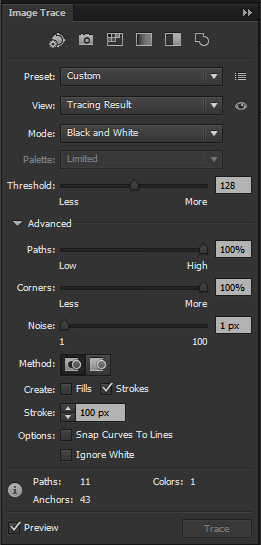
The result (below) looks like this:
The CDR result looks like this:
Ken
Copy link to clipboard
Copied
Ken,
That's what I was explaining here:
The tracing algorithm tries to match the resulting open paths' stroke weights to the thickness of the pixel areas it tries to follow....the Max Stroke Weight slider does not refer to the stroke weights of the resulting paths. It refers to the "thickness" of the pixel regions that are to be treated as strokes during the trace. Carefully read the tooltips that appear when you mouse over the various sliders.
For example: Suppose you have a scan of a line drawing that uses several different line weights. It might be anything from a coloring book drawing to a technical illustration. Illustrator's centerline setting for LiveTrace (Strokes on, Fills off) tries to match the several different line weights represented in the scan by individually applying different stroke weights to the "centerline" paths it creates.
The Max Stroke Weight slider defines a threshold (of image pixels). That threshold is where the autotrace decides whether to trace a closed path around a region of contiguous pixels, as opposed to trying to trace an open path along the "middle" of a region of contiguous pixels. (The autotrace feature can do both in the same trace.) So the higher you set that slider, the more often the trace will "choose" to draw a "centerline". So if you're not interested in anything but centerlines, just set that slider to its higest value (100). That tells Illustrator, "If the area you are trying to trace along is 100 pixels or less in 'width', then keep trying to trace it as a centerline, not as an outline."
But remember the first paragraph above: as it does this, it will still be trying to mimic the stroke weights of the paths to the "widths" of the pixel regions it is tracing along. It's still drawing "centerline" paths; it's just also giving them stroke weights as it goes. After the trace is done, though, it's a simple thing to just apply a single stroke weight to the resulting group of autotraced centerlines.
I never said it was intuitive. "Counter-intuitive" is what Illustrator does best. Nor am I "defending" Illustrator. You can badmouth this overrated program all you want to; if your complaint is factual, I'll quite willingly agree. I was simply demonstrating that Illustrator's autotrace feature does indeed include a "centerline mode" comparable to similar autotrace features in other programs in this category, lest anyone be misled by the repeated and completely erroneous assertions in this thread to the contrary.
I also clearly stated that I was not and am not actually recommending trying to use autotracing for this task, just as I very seldom recommend autotracing for anything. Autotracing is a cheap, substandard, amateurish practice for all but a very few special-case situations, wherein it just serves as a "necessary evil" workaround. Especially something as simple as centerlines in headline text like the subject of this thread should be done accurately and cleanly (i.e.; manually), and that's how I do it. If I needed to do it often, I would either buy a font, or use Fontographer or FontLab to edit a font. (This is a good example of the practical utility of CorelDRAW's ability to modify font files—something Illustrator cannot do, and just one of several quite valuable unsung utilities included in Draw.)
In AI CS6, I use these settings...
As I explained, I have not yet installed CS6. According to the marketing hype, the autotrace feature has been rebuilt. So I can't speak to the settings in CS6 or whether their behavior is the same. My guess is that they pretty much are, but I'll see that for myself when I get around to it. The original post was specifically in the context of CS5. Monika's screenshot is from CS6 and also suggests that the functionality is pretty much the same in this regard.
JET
Copy link to clipboard
Copied
JET,
If one of your previous examples was the result of tracing 72pt. Bauhaus93 in Illustrator, then I ask again: how did you do that? Step-by-step, please. Not trying to argue the point, just that I'm an AI rookie and want to see how it's done.
Ken
Copy link to clipboard
Copied
If one of your previous examples was the result of tracing 72pt. Bauhaus93 in Illustrator, then I ask again: how did you do that? Step-by-step, please...
Ken,
Again, you are using CS6. I am not. So I can’t give you precise values for CS6. The settings I used in CS5 are similar to those I depicted in my first post, except (mainly) that I set the Max Stroke Weight higher, because the Bauhous font you specified is heavier (i.e.; more pixels to be considered “a path” by the autotrace routine).
You threw out Bauhous 93 at 72 pt. as if it were some kind of deal-breaking proof that Illustrator’s centerline autotrace was dramatically inferior to that in Draw. You did not, however, specify the raster resolution at that size. Understand: all the settings relate to counts of pixels, not scale. So even if all the settings in CS6 are identical to those in CS5, the specific values I used would only be meaningful if you and I rasterized the 72 pt. type at the same resolution.
So don’t fret over specific values. Just understand what the various settings adjust. As I advised, carefully read the tooltips. They (at least in CS5 and earlier) explain what the various sliders affect. (Plus, the controls parameters are really not that much different from those in Draw.)
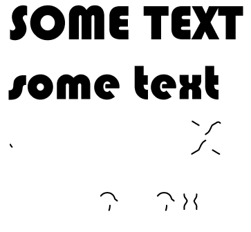
The orange example ( Bauhous at 72 pt., as you specified) is the one that was done in Illustrator CS5:
- Turn on Preview.
- Turn on Strokes, turn off Fills. (That’s essentially putting it in “centerline mode.”)
- Max Stroke Weight: Set to a high enough value to exceed the “widths” of the thickest character strokes (in pixels.)
- Min Stroke Length: Start with a low value. Nudge that value upward until you minimize occurrances of unwanted short strokes (like the “facets” it tends to draw at the blunt ends of some characters).
- Path Fitting: Determines how far the trace is allowed to deviate from the apparent “center” of the region of pixels. Think of it as similar to “smoothing”. Lower values results in more anchorPoints.
- Minimum Area: Set to a low value. With a raster image of solid-colored type, it shouldn’t really matter how low; it determines the minimm area of contiguous pixels that should be attempted to trace, as opposed to being considered meaningless noise. With rasterized type, there shouldn’t be any meaningless noise.
- Corner Angle: If you see the autotrace failing to make corners where it should, lower this value. If you see it making corners where it shouldn’t, raise it.
When satisfied that tweaking the settings is as good as it’s going to get, expand results. Select the group of paths that the autotrace generated. Set the stroke weight as desired.
Again, the above is relative to CS5 and prior. I don’t know how tightly those adjustments relate to whatever rework was ostensibly done in CS6. But you should be able to figure it out. And, of course, after all that twiddling, you end up with alot of time wasted on a bunch of useless sloppy garbage that really should have just been drawn deliberately anyway—this is pretty much equally true in AI and in Draw.
The simple truth is, as has been stated repeatedly by multiple correspondents in this thread, (including myself), autotracing is a very poor approach to this task of drawing uniform centerlines of type glyphs.
Some just don’t seem to hear that, and assume that everyone who has said anything about centerline autotracing is actually recommending it for this purpose. I am not, and I stated this multiple times. But centerline tracing is useful for other things, and the repeated claim that there is no centerline tracing in LiveTrace warranted correction.
It has never been unusual in this forum (and most others like it) for discussions to spur off onto related topics. Quite often, its such spin-offs that prove most valuable. Just because someone starts a thread, doesn’t mean that the thread is thereafter and forever “owned” by that person. It’s an open forum.
JET
Copy link to clipboard
Copied
JET,
Thanks for the steps, but it seems like AI CS6's tracing behaviour is different from AI CS5. Your point about the rasterize settings is a good one, and it almost allowed me to get the trace that you did. In my previous example, I rasterized the type at 300dpi; here, I used 72dpi before tracing:

Still not the result you got, nor the result I get with CDR's centerline trace.
The choice of Bauhaus93 at 72pt. was to limit us to using the same starting point for the discussion, not because that font is particularly important. Still, it's a good font to use for comparing CDR and AI in terms of achieving a centerline trace.
It seems you have a setting in CS5 that's not in CS6 -- the "Min Stroke Length". The other settings might be named differently, but look to be the same in CS6. You can see from my screenshot of the Trace Settings that I'm using the other settings as you described.
Based on the results I'm getting, I still have to say that AI CS6 does not have a centerline trace capability.
Ken
P.S., I'm in complete agreement with the separate discussion point made by several folks here that a centerline trace will not give the desired effect originally posted. Right now, I'm thinking that CDR's centerline trace is a time-saving starting point for the manual work needed to achieve the effect.
Message was edited by: photodrawken to add postscript.

Copy link to clipboard
Copied
photodrawken:
How did you get that result in AI? In AI CS6, I use these settings:
There is an "outline" mode icon on top of the "Image Trace" panel, did you see it?
Copy link to clipboard
Copied
Hi, I'm the original poster (a woman, by the way). Shocked to come back to so many responses to my question. I wrote the actual designer and will share if she responds. Really seems silly that people are arguing over this. Either way, none of the tips so far produce the right kind of results I need. With the amount of time it would take to tweak the centerline trace to get it to look good, i could have manually drawn it all. I appreciate all the time people have taken though to try and answer this question.
Anyway, like I said, I will share the response if I get one because the designer who created those images is truly a master.

Copy link to clipboard
Copied
Will you pretty please mark my answer as Extremely Helpful so I can receive my daily allotment of Swedish Meatballs.

Copy link to clipboard
Copied
cdeonis,
I apologize for my having failed to answer your post #5 until now.
My suggestion in posts #2&4 were based upon the approach of creating the letter from the centre line in one colour, and then adding the same width on either side in a different colour.
In post #4, based upon the lettershapes you showed in post #3, the two methods A) and B) were meant for letters where the centre line extends to the end of the lettershape (A) as in the C, and for letters where the differently coloured part goes round the end of the centre line (B) as in the other letters.
Obviously, these methods have nothing to do with deriving a centre line from an existing full lettershape.
I believe they may reflect the way the lettershapes shown in your post #3 were created.

Copy link to clipboard
Copied
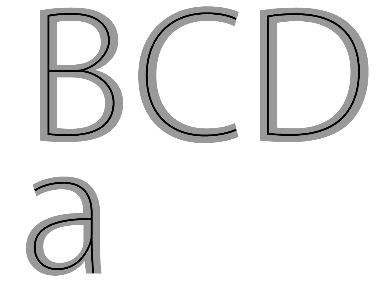
With all of these responses I'm surprised so many people are suggesting approaches like outlinining/path offset filters or (gasp) auto-tracing methods to create a proper centerline effect on lettering. The problem is NONE of those methods will ever deliver correct looking results. That especially goes for the auto-tracing hacks. Like I said last week: the only way to get professional looking results is by breaking up the individual letter forms into path segments and creating blends across those segments. And even with using that method the designer must do some manual tinkering to resolve what happens at letter joins. Other subjective decisions must be made to make the overall look seem balanced, especially if one is trying to create a centerline effect on serif letters or letters with an obvious thick/thin contrast.
I put together the "BIRD" example below using blends to not only create an accurate center line effect, but also the foundation for multi-line and chiseled prismatic effects.
One click filters can never get this sort of thing right because the filters often fail at letter corners and always fail at letter joins. I chose something with a "B" and "R" in it because those letters will make auto filters fall flat on their faces. The inner bevel effects in Photoshop look downright awful when they're dialed to go all the way to the letter center. The letter corners and joins always look horrible. It isn't just Photoshop that gets it wrong. ALL graphics programs get it wrong because it requires human intervention to get it right. For example, if someone wants a sign with proper looking raised prismatic lettering the lettering has to be hand carved and in order to look right. A 3D routing program does the same stupid bowled out corners and joins just like Photoshop's inner bevel filter.
I've been using the blends method for quite a long time (and usually using CorelDRAW to do it BTW) to create neon tube patterns for the insides of channel letter signs. It's a good way to get tube spacing properly balanced as well as get the look right if the neon is going to be exposed rather than hidden by a trim-capped acrylic face.

Copy link to clipboard
Copied
Glad you're here, Bob. Please expound on your methods, even if done in Corel.
I totally agree with everything you have to say on the matter.
I see that in your BIRD example, the first one filled with paths, has 7 seven lines that span each letter bar's width - an odd number so there's a central one and an equal number of lines on either side. Once you have this center line established any number of effects are now possible.
What I need to know is how you got the lines inside the letters, in the first BIRD.
Copy link to clipboard
Copied
The key is breaking up the original letter form into path segments. Take the capital "I" for instance. I'll break apart the four anchor points holding together the closed path. Then I'll create a blend between the two vertical paths. I'm used to doing this in Corel; I just tell it to create 7 steps between the two blended path segments. Often I have to apply Corel's "reverse path direction" tool to one of the path segments to get the resulting blend right. Illustrator works in a similar manner, but seems more labor intesive to me. Anyway, that's the foundation of the effect.
You'll do the same blending thing on pairs of path segments on all the other letter forms. On curved segments you have to experiement with how much of a path can be blended before the effect does unpredictable things. Ultimately you'll be piecing together the center line with results of multiple blends. It takes considerably more time than clicking on any automatic filter, but the end results are more precise and eye-pleasing.
The tricky thing is what happens at the joins. I had to do some manual work on the source paths of the blends to get the loop on the "R" looking correct around where the diagonal stem joins the loop. For the 7 step blend I had to first establish the center line and then blend between that and the paths on the outside of the loop (basically 3 step blends between the center line and outside path segment).
The prismatic effect is fairly easy once you establish the center. Lay down new shapes and snap the anchor points to the center line. Weld/cut/intersect pathfinder tools do the rest of the work. For certain bits of the work you have to make parts of the center line into closed paths in order to do some of the welding and cutting work.
Copy link to clipboard
Copied
Ahh I get it now! Smart!
Copy link to clipboard
Copied
Bob, thank you so much! You have definitely provided the most helpful answer so far. I'm going to go experiment with what you wrote.
Copy link to clipboard
Copied
Bob the Sign Guy wrote:
suggesting approaches like ... (gasp) auto-tracing methods to create a proper centerline effect on lettering.
Please read carefully before claiming that.
Nobody advised auto-tracing to do this stuff. Another question rose from this thread: "does Illustrator have a centerline tracing feature?"
And that was the cause to discuss the feature.
Copy link to clipboard
Copied
But Bob the Sign Guy has offered yet an even better and bigger issue that and a method that actually could lead to a much better blend feature as well and which also might actually bring about a way that would be rational for the engineers to build such a feature so his contribution seems to be very big indeed.
Well done Bob!
I mgiht submit such a feature request based on your approach but seeking a way to create an interface for it and to not have to manully break apart the letter forms.
Very cool.
Copy link to clipboard
Copied
Bob the Sign Guy musybe very skilled because as far as i cansee there is still a lot of work to do in order to get satisfactory results.
I wpould say if you are not skilled you probably have to commission someone that is and I would be very impressed if someone could make this into an actual automated feature.
Look at the problems with the lowercase "a" it took me about five to ten minutes to get it reasonably correct.
Copy link to clipboard
Copied
@ Wade: in order to develop vector graphics filters that will properly do center-line effects on lettering (as well as other effects derived from it like 3D chiseled prismatic effects) a number of new technologies would have to be in place.
The filters would need new levels of smarts to figure out what to do when the filter encounters a corner on the letter. They don't know how to do that so well. Even more difficult: how to handle areas where letter stems join -like the loop and diagonal stem on a "R" letter. The filter would need to know how to follow the curve all the way through the gap created by the diagonal stem. Right now it takes human intervention to rebuild the gap in that curve. Not to toot my own horn too loudly, but it does take some experience as well as tough subjective choices regarding areas in letter joins to make the effect look good. Typeface choice is very critical. Easier to do in all caps in a face like Gotham. Very difficult if you want to do it to mixed case lettering in something like Antique Olive. I'd stay away from serifed faces.
Perhaps new font technologies could build in some of the elemental shapes of letter forms for graphics filters to use. Typefaces are built upon these kinds of shapes. The shapes wouldn't be a visible part of the letter but could give guide lines on how the letters could be embellished correctly.
Unfortunately I'm not optimistic any new type of font technology would be developed to offer this sort of function. Arguably there's not a lot of money to be made in selling fonts made in a new technology due to piracy, availability of free fonts and the likelihood a new type of font technology like this would meet considerable resistance. For one thing, filter effects are typically seen as cheesy by those on the more high brow, influential side of typographical design. They would prefer letter forms be unaltered and not embellished. I can certainly agree with them in regards to distorting letters. That drives me nuts.
I suppose if Illustrator had some sort of shape prediction technology that was both smart and adjustable it could make center line effects a snap to create. IMHO, we're a long way off from that.
Copy link to clipboard
Copied
Actually I am not so sure either of use were correct about the possibilities of such a feature, I use to own several multiple master fonts tha allowed you to adjust te weight of the charcacters from very thin to very bold.
I wonder if a combination of multiple masters fonts, blending and offset path can work with an image trace feature.
Or just a way of turning text into temproary or live effect multiple master fonts.
I wonder?
Or of course the best feature is of course experience and skill development.

 AdChoices