• Global community
    • Language:
      • Deutsch
      • English
      • Español
      • Français
      • Português
  • 日本語コミュニティ
    Dedicated community for Japanese speakers
  • 한국 커뮤니티
    Dedicated community for Korean speakers
Exit
0

Avoid lines being cut when using text wrap

Explorer ,
Sep 05, 2022 Sep 05, 2022

Copy link to clipboard

Copied

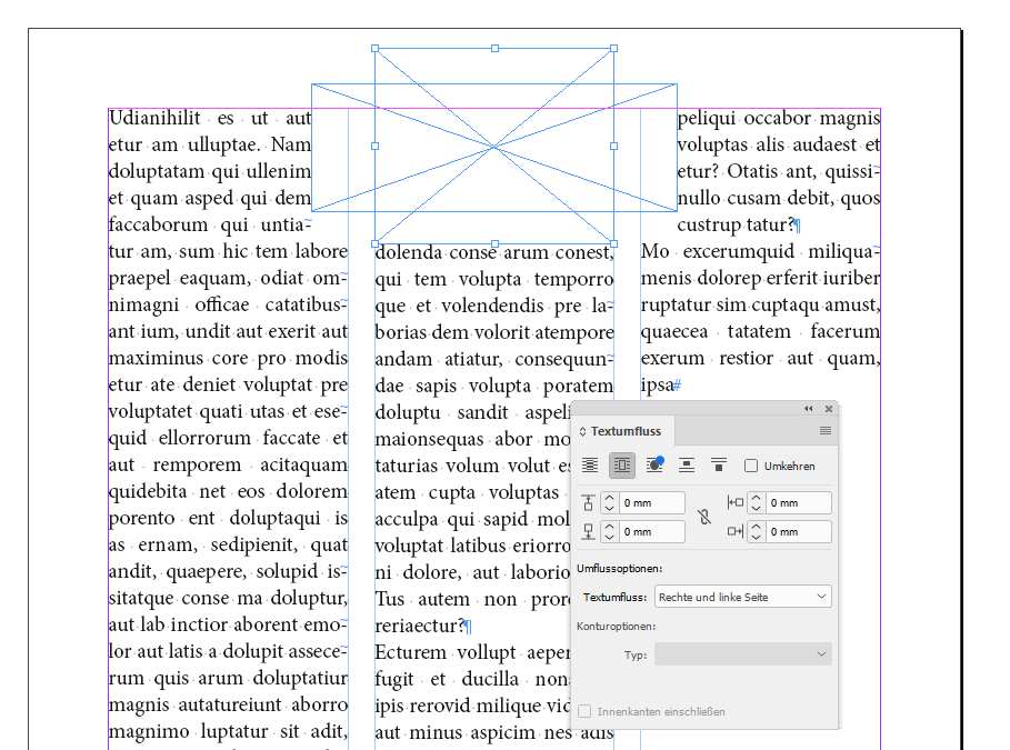
Hi, is it possible to avoid something like what's happening in the picture (where there's obviously space for the line to stretch to the the edge of the column), without using baselines?

Thank You! 

TOPICS
How to

Views

354

Translate

Translate

Report

Report
Community guidelines
Be kind and respectful, give credit to the original source of content, and search for duplicates before posting. Learn more
community guidelines

correct answers 1 Correct answer

Community Expert , Sep 05, 2022 Sep 05, 2022

Hi @yeshayac ,

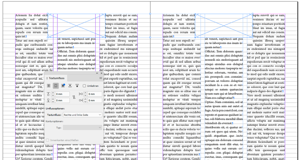
my tests are showing, that in this case it can make a difference if your text is aligned to the baseline grid or not.

Not aligned to the baseline grid:

TextWrapBehavior-NOT-OK-TextNOTAlignedToBaselineGrid.PNG


Aligned to the baseline grid:

TextWrapBehavior-OK-TextAlignedToBaselineGrid.PNG


Regards,
Uwe Laubender
( Adobe Community Professional )
Votes

Translate

Translate
Community Expert ,
Sep 05, 2022 Sep 05, 2022

Copy link to clipboard

Copied

I assume you mean the last line of the inset, boxed text?


Select the "full justification" alignment option for that paragraph:

JamesGiffordNitroPress_0-1662396433449.png


It has nothing to do with baselines.


—


â•Ÿ Word & InDesign to Kindle & EPUB: a Guide to Pro Results (Amazon) â•¢

Votes

Translate

Translate

Report

Report
Community guidelines
Be kind and respectful, give credit to the original source of content, and search for duplicates before posting. Learn more
community guidelines
Explorer ,
Sep 05, 2022 Sep 05, 2022

Copy link to clipboard

Copied

No sorry I meant this hole over here:

Votes

Translate

Translate

Report

Report
Community guidelines
Be kind and respectful, give credit to the original source of content, and search for duplicates before posting. Learn more
community guidelines
Community Expert ,
Sep 05, 2022 Sep 05, 2022

Copy link to clipboard

Copied

Okay, sorry. It helps if you draw a little on your example images if the description isn't crystal-clear. 🙂


What are the text-wrap settings on the inset box? Reduce the bottom margin until the line below remains at its proper distance (I think baselines will be required for this) but will ease spacing enough to let that adjacent line wrap.


Or set the text wrap to "Jump Object" and the bottom margin to zero.


JamesGiffordNitroPress_0-1662398790304.png


—


â•Ÿ Word & InDesign to Kindle & EPUB: a Guide to Pro Results (Amazon) â•¢

Votes

Translate

Translate

Report

Report
Community guidelines
Be kind and respectful, give credit to the original source of content, and search for duplicates before posting. Learn more
community guidelines
Explorer ,
Sep 05, 2022 Sep 05, 2022

Copy link to clipboard

Copied

Yeah that's what I try to do and then add add a shadow box to move the line directly under down but I was wondering if it could be fixed automatically. I don't want to use Jump object because I still want the text to wrap on the right side.

Thanks anyways!

Votes

Translate

Translate

Report

Report
Community guidelines
Be kind and respectful, give credit to the original source of content, and search for duplicates before posting. Learn more
community guidelines
Community Expert ,
Sep 05, 2022 Sep 05, 2022

Copy link to clipboard

Copied

Hi @yeshayac ,

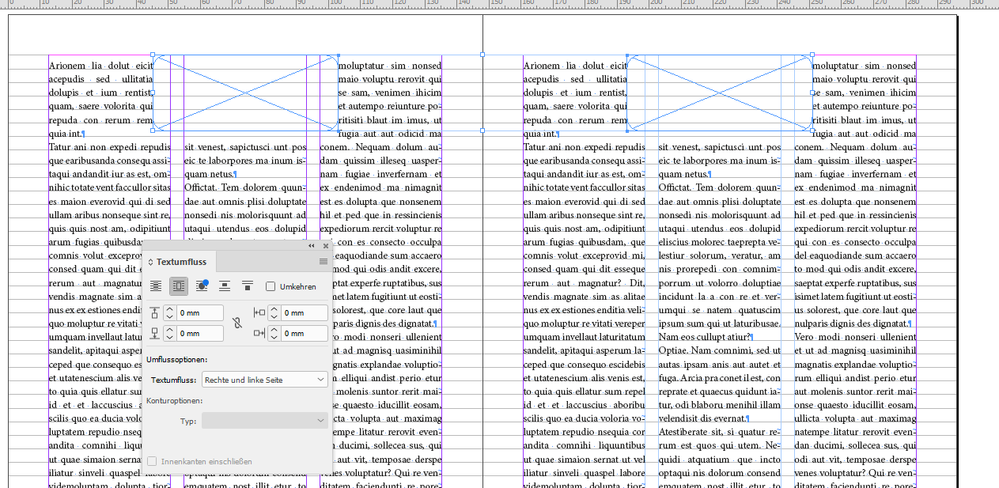
my tests are showing, that in this case it can make a difference if your text is aligned to the baseline grid or not.

Not aligned to the baseline grid:

TextWrapBehavior-NOT-OK-TextNOTAlignedToBaselineGrid.PNG


Aligned to the baseline grid:

TextWrapBehavior-OK-TextAlignedToBaselineGrid.PNG


Regards,
Uwe Laubender
( Adobe Community Professional )
Votes

Translate

Translate

Report

Report
Community guidelines
Be kind and respectful, give credit to the original source of content, and search for duplicates before posting. Learn more
community guidelines
Explorer ,
Sep 05, 2022 Sep 05, 2022

Copy link to clipboard

Copied

I´ve not aligned the text to the grid because my text has often different paragraphs than I want them to look distinct but not too far apart, and the baseline grid makes them be too separated, I want them separated but not too much 😅

Screen Shot 2022-09-05 at 2.16.36 PM.png

Thanks anyways!, I guess it's the tradeoff

Votes

Translate

Translate

Report

Report
Community guidelines
Be kind and respectful, give credit to the original source of content, and search for duplicates before posting. Learn more
community guidelines
Community Expert ,
Sep 05, 2022 Sep 05, 2022

Copy link to clipboard

Copied

I think this is a quirk, if not an actual bug, in InDesign. I find that setting text wrap to Skip by leading in the Composition section of the prefs, and carefully adjusting the positioning of the wrapped frame and the amount of offset can usually solve this problem.

Votes

Translate

Translate

Report

Report
Community guidelines
Be kind and respectful, give credit to the original source of content, and search for duplicates before posting. Learn more
community guidelines
Community Expert ,
Sep 05, 2022 Sep 05, 2022

Copy link to clipboard

Copied

Use baseline spacing double your leading. That is, for 14pt leading, set the baseline grid at 7pt. You can have styles do a half-step in spacing, although this does cause some cascading problems and needs careful management.


Another trick is to use baseline offset in a style. Have a subheading snap to the baseline grid, then shift it downward by a half-line or so with baseline adjust.


—


â•Ÿ Word & InDesign to Kindle & EPUB: a Guide to Pro Results (Amazon) â•¢

Votes

Translate

Translate

Report

Report
Community guidelines
Be kind and respectful, give credit to the original source of content, and search for duplicates before posting. Learn more
community guidelines
Community Expert ,
Sep 05, 2022 Sep 05, 2022

Copy link to clipboard

Copied

I see a lot of y'all suggesting two grid lines per line of actual type, and I just can't wrap my head around it. Seems to me this inevitably leads to cases whre the alignment across columns is going to be off by half a line....

Votes

Translate

Translate

Report

Report
Community guidelines
Be kind and respectful, give credit to the original source of content, and search for duplicates before posting. Learn more
community guidelines
Community Expert ,
Sep 05, 2022 Sep 05, 2022

Copy link to clipboard

Copied

LATEST

As I said, it does take extra management, but it's worked for me in some complex book layouts. You do have to "fix" half-line misadjustments but there's usually a way. (Best in layouts with multple headings and illustrations; not so great in flowing-text, but you rarely have to get tricky with text-only.)


The baseline-offset method also works quite well, even if it's a bit of a hack.


—


â•Ÿ Word & InDesign to Kindle & EPUB: a Guide to Pro Results (Amazon) â•¢

Votes

Translate

Translate

Report

Report
Community guidelines
Be kind and respectful, give credit to the original source of content, and search for duplicates before posting. Learn more
community guidelines
Community Expert ,
Sep 05, 2022 Sep 05, 2022

Copy link to clipboard

Copied

@yeshayac said: "I guess it's the tradeoff"

Exactly. Of course you can try to adjust it with a second text wrap element:

SecondTextWrapElement.PNG


Regards,
Uwe Laubender
( Adobe Community Professional )

Votes

Translate

Translate

Report

Report
Community guidelines
Be kind and respectful, give credit to the original source of content, and search for duplicates before posting. Learn more
community guidelines