 Adobe Community
- Home
- InDesign
- Discussions
- Re: Certain characters not rendering correctly
- Re: Certain characters not rendering correctly
Copy link to clipboard
Copied
Why is my 'u' character not rendering correctly? Sometimes when I export my files as jpgs the 'u' characters will appear similarly messed up to the zoomed out image below. This is the first time I've noticed it rendering incorrectly in indesign.
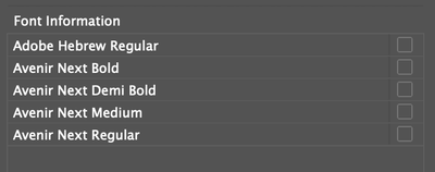
I've tried cpu/gpu rendering modes. I've tried all the opentype figure styles. It seems my Avenir Next medium and bold fonts render oddly at certain zooms. Let me know if anyone else has had similar issues... all my fonts are accounted for:
This is at 105% zoom.
This is at 125% zoom.
Regular style at 105%
Medium style at 105%
 1 Correct answer
Yeah, there have been complaints about this font for years.
It's bad TrueType hinting, and that's the type designer's doing.
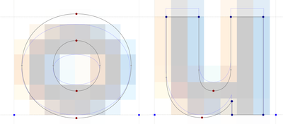
Here's an example showing the different hinting programmed into the Avenir Next Bold at a smaller type size.
I picked an extreme example to show what happens. Depending on the font size, the effect will be less pronounced, or more pronounced, or not at all. (I'm viewing this in FontLab, btw)
The actual letter outline is the darker one. The blue line is the hinting program
...Copy link to clipboard
Copied
When I googled Avenir Next, the internet is filled with complaints and questions about this buggy corrupt font.
Copy link to clipboard
Copied
Yeah, there have been complaints about this font for years.
It's bad TrueType hinting, and that's the type designer's doing.
Here's an example showing the different hinting programmed into the Avenir Next Bold at a smaller type size.
I picked an extreme example to show what happens. Depending on the font size, the effect will be less pronounced, or more pronounced, or not at all. (I'm viewing this in FontLab, btw)
The actual letter outline is the darker one. The blue line is the hinting programmed to these two letters. As you can see, the "o" is hinted to drop DOWN in pixels if necessary, where the "u" is programmed to drop UP a pixel if necessary. This is causing your imbalance. In fact, it's the only lower case letter that's hinted like that, so it's why it sticks out so much.
InDesign (any Adobe app, really) is honouring these hints for display. It doesn't affect printing of course, but that doesn't help with your image exports.


