 Adobe Community
- Home
- InDesign
- Discussions
- Re: Colors are not working in Indesign.
- Re: Colors are not working in Indesign.
Copy link to clipboard
Copied
I am trying to edit a texts colors but they are way off. The text I am trying to change is "Innehåll" and the color I am trying to acchieve is in the fill box next to the texts horizontal scale. I want a neon coloured text but somehow it turns out green/brownish. Really annoying and I am having the same issues in Illustrator. Does anyone know how to solve this? Thanks in advance!
 1 Correct answer
Please try setting
Edit > Transparency Blend Space > Document RGB
Copy link to clipboard
Copied
Building neon colors from process-color builds is near-impossible. There's are good reasons that Pantone has unique color books for describing the neon color palette. And why commercial printers creating neon printing jobs specify a separate run to lay down neon colors, whether it's perfecting a second press run to lay down that neon color or loading an additional print unit on the line for a CMYK+spot neon color job.
But this does bring up a basic question: do you need the color to appear in your InDesign document as the be all and end all of the process, or do you need to specify a neon color to be printed by your output provider to have it used for your final print job.
If your end purpose is to have the neon color show onscreen for a digital product, you're probably out of luck. Neon colors are essentially outside of the color gamut of RGB monitors. You can demonstrate this by taking a picture of a printed neon piece, digitizing it either with a digital camera or scanning it to create the digital file, and then opening it in Adobe Photoshop and comparing it to the piece itself. It'll likely be bright, but it won't show as a fully neon color onscreen because it's outside of the range your monitor can reproduce.
That test isn't be a total loss, however, because you can use the color sampling features of Photoshop to find the RGB/CMYK values of that neon color build. It won't be perfect, but it will likely be as close as you get. For onscreen reproduction, focus on the RGB values to get the best possible "pop" you can reproduce onscreen. And don't be disappointed when you find the CMYK equivalents are duller than what you can get from RGB.
If your end goal is to print that neon color build, the best way to do that is to create a new color swatch using the RGB/CMYK color build from your sampling and specify it as a spot color when you create it. This will let you define your neon build as a spot color separation your output provider can substitute with real neon ink and get you the results you're looking for.
Hope this helps,
Randy
Copy link to clipboard
Copied
Please post meaningful screenshots that include all pertinent UI elements.
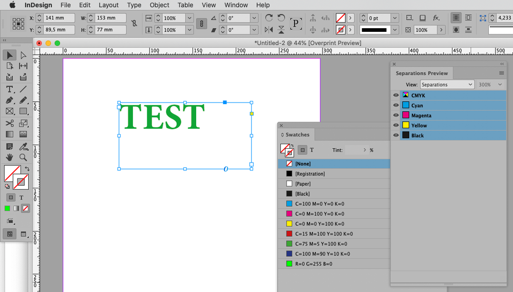
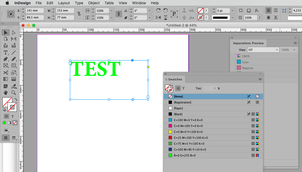
Is the color an RGB color and is Separations Preview on?
What is the ultimate output? If it is CMYK print you may have to resign yourself to using a color that is in gamut for the output color space.
Copy link to clipboard
Copied
It's an RGB color and Separations Preview is off. Nothing changes if I change it to "On". The ultimate output is two export this as a PDF and the final product is going to be digital. I won't print this.
Copy link to clipboard
Copied
Can you provide a copy of the file (feel free to remove all other elements)?
Copy link to clipboard
Copied
Copy link to clipboard
Copied
Please try setting
Edit > Transparency Blend Space > Document RGB
Copy link to clipboard
Copied
It worked, thank you!
Copy link to clipboard
Copied
OK. Going on the response you offered here, there are a couple of things you may want to consider to ensure the best results for your bright green type color.
1) Consider the background that bright color build goes on. You can pick an incredibly bright color as shown in the example above, but if you set it on a dark gray field like you have in your example, it's going to appear much duller in visual context. Setting that R0G255B0 color build snaps because it contrasts off a white background.
2) Your color wheel is your friend here. That bright green example would really pop if you look across the color wheel for, say, a 25% Magenta secondary color element to provide your background. Less so off Red or Blue tertiary color builds. But throw that over a 100% Cyan, even though both are fairly "bright" colors, would really muddy the contrast — much like the cool gray in your original example. If you want to keep the gray background, maybe shifting toward a slightly lighter and warmer gray would help your green type pop.
It initially stinks to design around limitations, but sometimes creative cheats can get you surprising results.
Good luck,
Randy


