


Copy link to clipboard
Copied
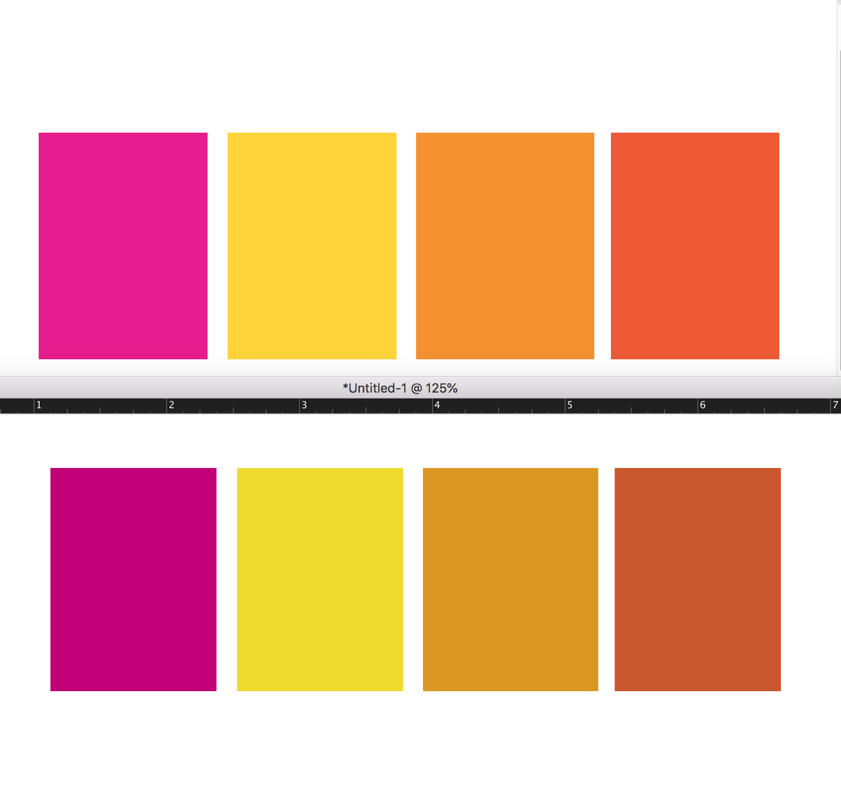
In the picture below the top row of colors is what the boxes look like when exported to pdf.
the bottom row is how they look in indesign, like they all have cyan added to them.
What setting in indesign is shifting my colors. New problem after upgrading to indesign 2019.


 3 Correct answers

I am happy to report that I solved it! I went into the indesign edit>color settings> then updated it to North America General Purpose 2.
This link has the solution. You need to throw away the color preferences for bridge, then restart bridge and all the apps stay synced.
Thank you everyone for all of your help. ; )

Just wanted to reply to this thread in case Adobe is watching, as I had the same problem just now. After trying several solutions in this thread, the one that worked for me was the one beccaru posted about changing the color settings back to North America General Purpose 2 worked for me, but I don't know how it changed in the first place. It's concerning that this issue lingers three years after others have the same problem.
Specs for me:
- MacBook Pro 16" (2019)
- MacOS Catalina 10.15.7
- InDesign 2021
 43
Replies
43
43
Replies
43
Copy link to clipboard
Copied
This link has the solution. You need to throw away the color preferences for bridge, then restart bridge and all the apps stay synced.
Thank you everyone for all of your help. ; )

Copy link to clipboard
Copied
wheres the link ?

Copy link to clipboard
Copied
These are the steps that have been working for me and my creative team:
1. If you use an Adobe supplied Color Settings preset, go to next step, otherwise use Photoshop Color Settings, to create your desired color settings, and then Save a named Preset.
2. Quit all Adobe apps
3. Hold down the Option key, and choose the Go Menu.
4. Chose Library.
5. Go to Preferences/Adobe/Color
6. Delete this file: ACEConfigCache2.lst
7. Go into Bridge 2018 (or 2019 if you have already deleted Bridge 2018), and go to Edit, Color Settings, and chose your desired preset, and click Apply. If done in Bridge 2018, you don't need to do it in Bridge 2019.
8. Quit Bridge, and now all your 2018 and 2019 apps will be "Synchronized" and will not revert back to the factory defaults!

Copy link to clipboard
Copied
This is the solution that worked for me:
Re: Adobe suit displays colors way too dark but exports correctly
Copy link to clipboard
Copied
Just wanted to reply to this thread in case Adobe is watching, as I had the same problem just now. After trying several solutions in this thread, the one that worked for me was the one beccaru posted about changing the color settings back to North America General Purpose 2 worked for me, but I don't know how it changed in the first place. It's concerning that this issue lingers three years after others have the same problem.
Specs for me:
- MacBook Pro 16" (2019)
- MacOS Catalina 10.15.7
- InDesign 2021 16.1.0.20
- Bridge 2021 11.0.1.109 (Included because Bridge is mentioned as a potential soure of problems below)

Copy link to clipboard
Copied
I recently discovered a surprising (to me, anyway) fix for this issue on my system, so I thought I'd share. In InDesign, under File > Document Setup..., if Intent: Print is selected, any RGB images appear dull (CMYK-converted). The solution is to choose Intent: Web instead and edit the Page Size dimensions to match your original. Voilà! Bright RGB images again. Now you can export vibrant RGB PDFs for screen display (by choosing to not convert colors) and CMYK PDFs for print use as needed (by choosing to convert colors). Hope this helps somebody else.

Copy link to clipboard
Copied
I love the simplicity of this. Amazing that Adobe won't solve this problem that should have never existed.
Copy link to clipboard
Copied
Agreed. Seems like RGB images brought into a "Print"-intended document shouldn't be dulled/converted by default. Lots of us make 8.5"x11"/17"x11" PDFs that are designed at print sizes but more often end up getting viewed on screen.
Copy link to clipboard
Copied
Exactly.

Copy link to clipboard
Copied
Set the document’s Transparency Blend Space to RGB and turn off Overprint Preview.
Copy link to clipboard
Copied
A document created with the Intent set as Web starts with its Transparency Blend Space set to Document RGB, if the Intent is set to Print the Blend Space starts as CMYK. You can change any document’s Transparency Blend Space after it is created, so you can have a Print Intent Document with the Blend Space set to RGB. The Blend Space affects the preview of the entire spread when there is any transparent object on the spread.
Also, turning on Overprint Preview previews the document as Document CMYK—it doesn’t matter what the Intent or Blend Space is set to.
Copy link to clipboard
Copied
OK, I understand that, yes, this does work, but I'd counter that it isn't particularly intuitive. After all, why should a change of a setting termed "Transparency Blend Space" affect the colors of all images -- even those that don't contain alpha transparency?
Copy link to clipboard
Copied
InDesign doesn’t have a document color space the way Photoshop and Illustrator do—you can mix RGB, CMYK, Lab, and Gray objects on the same page, so there has to be a single space to preview transparency flattening. When there is any transparent object on the spread the entire spread affected. The color is not actually converted, it’s just a preview of the flattened output. If you set the blend space to RGB you would still need to turn on Overprint Preview to get and accurate print soft proof.

Copy link to clipboard
Copied
Thank you! I have this issue with InDesign 2021 and got fixed with North America General Purpose 2.

Copy link to clipboard
Copied
Why does Adobe keep changing color settings on all the apps on every update now? I had to come here figure out the fix again because I couldn't remember.

Copy link to clipboard
Copied
Hi, I've tried every solution on this page for InDesign 22 and 21 and my colors are still dull and don't match any other program or source. Does anyone else have ideas? I've wasted nearly an entire day. I've checked color settings, GPU settings, blend transparency space and followed the whole Bridge synchronization steps (uninstall, trash color profile, re-install...) Nothing has worked and I'm losing my mind. When I open older files the colors seem fine. If I create a new swatch in the old document, it's dull and doesn't match. If I create a new document and new color swatch the color is dull. The attached pdf shows colors as they should appear on top, bottom row is same color codes but from InDesign.
Copy link to clipboard
Copied
When I open older files the colors seem fine
Could you share the old InDesign file that has the correct color appearance with the new swatch that doesn’t match?
Copy link to clipboard
Copied
I'm sorry that I can't help you. I think it's almost crimiinal that InDesign still is causing people this huge and frustrating problem. I've been retired for about 7 years, so I'm out of the fight, and it would take me a while to figure out how to help you. I hope you will report this problem to Adobe. They sure care about our money, but not so much about ease of use and logical interface.
Copy link to clipboard
Copied
The top row of colors in @mcswainwt ’s PDF are RGB colors with an embedded display profile, and the bottom row are DeviceCMYK colors—CMYK colors with no embedded color profile, so it’s not surprising that they don’t match.


-
- 1
- 2

 AdChoices