 Adobe Community
Copy link to clipboard
Copied
Can anyone point me to somewhere where I can understand how to set up Indesign's Colour Settings for photographs imported into Indesign?
Essentially I am a photographer with long experience with both Lightroom and Photoshop and printing my work on Epson printers, but I am pretty much a novice with Indesign. I am trying to use Indesign to make books via online printing services such as Blurb but am having trouble with colour settings and consistency.
All my photos are Tiffs generated from Raw files from Lightroom and all have the default color space from Lightroom - i,e, Profoto.
But when importing into Indesign there are huge variations from the colours I see in Lightroom or in print, From the Edit Menu I choose the colour space of Profoto (there are also options for Profoto 1.8gma and Profoto GG1.8 which I have ignored since they don't seem to alter things significantly). Then under Colour Management Policies I choose Preserve Embedded Profiles. Logically that seems to me to be the way to go - specify a working space in Indesign of Profoto and then choose to preserve the embedded profiles (which are also Profoto). But there are huge differences in colour from what I see in Lightroom or Photoshop.
So clearly I am doing something wrong and to be honest, I don't really know what I am doing. But whilst I don't necessarily expect to get an exact match between what I have processed in Lightroom or Photoshop and what is inside Indesign my current experiments are so far off.
so can anyone point me to a clear explanation of how to set up Indesign to give me the closest match to my photos in Lightroom?
Thanks
 1 Correct answer
Hi @Philip5023 , InDesign’s color management is more complex because ID allows you to mix objects and colors with different color spaces and profiles on the same page. The color management for placed images cascades—if the image has an embedded profile, the embedded profile is used, if it has no embedded profile (Document RGB or CMYK in the Links panel), the InDesign document’s assigned profile (Edit>Assign profiles...) is used, and if the ID document has no profile, the Color Setting’s current
...Copy link to clipboard
Copied
InDesigns display of images and colour is not accurate, it's only showing a proxy image.
If you keep your embedded profiles from your photos and place them.
Then export your PDF to X4a - there won't be any colour shifts.
You can check this in your exported PDFs.
But you really need to be using say Blurbs settings.
Copy link to clipboard
Copied
There is no monitor that can display ProPhoto, and you will need to be working in 16bit to use ProPhoto or there will be too far between each colour. Your big problem will be the output intent of the printing and how you want to bring your colours in gamut. (Note that most RGB spaces also assume whitepoint D65, whilst most print industry profiles assume D50 so there is allways some degree of interpretation).
Also you must also note that there is document colour settings, Application colour settings (and it is possible to override to have object specific colour settings). So there is quite a few places to go wrong.
InDesign uses the profile embedded in images, and converts colours to the Output Intent using the Transparency Bleng Space. If going from Prophoto you may want to go with Perceptual Rendering intent (The other option is Relative Rendering intent with Blackpoint Compensation)... Try exporting from Lightroom to AdobeRGB, and evaluate if you get a better result, since you will have more similar shape of the colour gamuts (If you have many bright yellows ECI RGB is even better, but you must install it)
Copy link to clipboard
Copied
Hi @Philip5023 , InDesign’s color management is more complex because ID allows you to mix objects and colors with different color spaces and profiles on the same page. The color management for placed images cascades—if the image has an embedded profile, the embedded profile is used, if it has no embedded profile (Document RGB or CMYK in the Links panel), the InDesign document’s assigned profile (Edit>Assign profiles...) is used, and if the ID document has no profile, the Color Setting’s current Working Space is used.
So, with this Color Settings any new ID documents would get ProPhoto assigned as the RGB space and Blurb_ICC_Profile as the CMYK space. Placed RGB images would have their embedded profiles preserved, and placed CMYK images would have their embedded profiles ignored (the Preserve Numbers (Ignore Linked Profiles) CMYK Policy). This setting would not necessarily have any affect on an existing doc, which normally would be saved with its own profiles and policies:
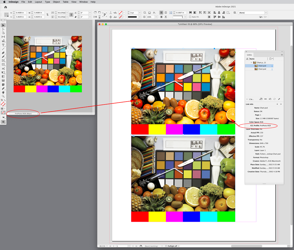
Placed images use a proxy for the preview, but the proxy responds to profile assignments. Here I have placed images with ProPhoto and sRGB assigned and you can see that ID is honoring those profiles with different previews:
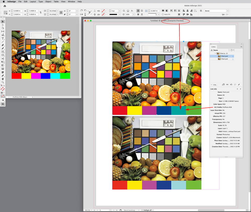
If I turn on Overprint Preview I get a soft proof of how the color is expected to print in my document’s assigned CMYK space—Blurb_ICC_Profile in this case:
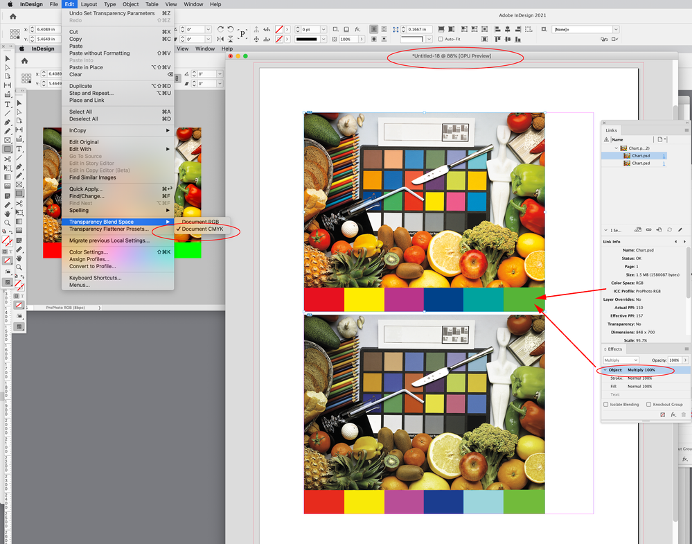
Also, if there is any transparency on the spread, including a Photoshop file without a flattened Background layer, the spread is previewed in the Document’s Transparency Blend Space. When a spread is flattened for output the color space has to be uniform in order to blend the transparency effects.
This might be why you are not getting a ProPhoto color match—your image’s bottom layer is not flattened:
Copy link to clipboard
Copied
Thanks to all for your extremely helpful and clear advice.
One question to Rob Day - is it necessary to set the working CMYK box to the Blurb .icc? Upon export using the Blurb or Magcloud pdf presets, presumably the export preset will convert to the relevant colour space.
Meanwhile thanks a lot for your detailed and really helpful explanation.
Philip
Copy link to clipboard
Copied
- is it necessary to set the working CMYK box to the Blurb .icc?
Yes, there has to be a conversion to the final CMYK press profile somewhere in the printflow—either on the Export to PDF via the Output tab, or at PDF print output. When you are color correcting your ProPhoto RGB images in Photoshop, set your Photoshop CMYK working space to the Blurb profile and turn on Proof Colors to see the CMYK soft-proof without actually making the conversion.
Unlike RGB-to-RGB conversions, CMYK-to-CMYK conversions can cause problems on press (e.g., single color blacks and grays converting to 4-color causing registration problems, or primary CMYK colors like 100% cyan or yellow getting contaminated), so there would be no point in setting the source profile for CMYK color to something like the default US Web Coated SWOP, and forcing a conversion of document CMYK colors to the Blurb profile somewhere downstream.
All of your ProPhoto images will eventually get converted to the Document CMYK output intent profile, which has to be the Blurb profile.


