 Adobe Community
- Home
- InDesign
- Discussions
- Betreff: Non-indented paragraph breaks
- Betreff: Non-indented paragraph breaks
Non-indented paragraph breaks
Copy link to clipboard
Copied
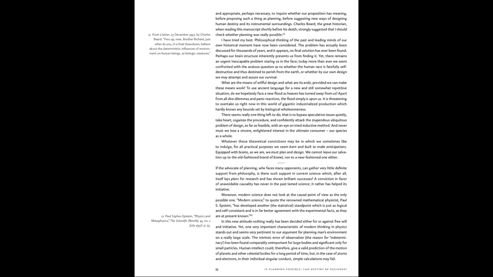
Formatting a book for print with numerous non-indented paragraph breaks in addition to standard paragraphs with indents. To be clear, the non-indented paragraph break is with an added empty line and was used selectively by the author for a stronger pause/separation between some sections/ideas, where a standard paragraph indent wasn't strong enough. The rest of the paragraphs have normal indents.
I'm unclear as to what should happen when the manuscript has an empty line paragraph break that falls at the bottom of a page in layout. How to signify a paragraph break on the following page? Should the top of the next page have:
1. a non-indented start to the line, with no added empty line?
2. a substitution of a standard indent instead?
The issue with #1 is that it gives the impression that the text on the next page is just a continuation of the preceding page, without a paragraph break or even a a new paragraph. #2 would not be accurate to the MS but from a reader's/user's POV, the eye's movement from the bottom of verso to recto is a built-in break of a kind. True as well of a paragraph break at the end of a recto where the act of turning a page is a kind of break.
It would seem that the convention should be more known, but search results on this are unclear. Appreciate any respone.
Copy link to clipboard
Copied
I've seen it where the empty line would actually contain a centered ellipsis. A style could be set up to auto-enter the ellipses and use the keep with previous setting.
Copy link to clipboard
Copied
I use a style (usually) named SEPARATOR, set up with a bullet of a style appropriate to the body font and usually a bit more stylish than a dot. I will give it a color tint if I'm using color in the layout, or a grayscale tint if not:
Set the spacing so that the glyph is centered between the margins (this gets a little wonky because you need to shift the bullet position, not the paragraph, per se), and either one full line of separation (if you're using a baseline grid or being meticulous) or equivalent (if not). Tweaking the bullet vertical position can help get a nice, "centered all around" look.
Use it for every instance of that "extra pause" between paragraphs, even if it falls at the top or bottom of a page. You're welcome to try and shift it with text tweaking, but personally, as a reader, I mind a separator at a page bottom or top a lot less than I do getting confused because the author shifted gears and the "pause" disappeared into a collapsed space.
—
╟ Word & InDesign to Kindle & EPUB: a Guide to Pro Results (Amazon) ╢
Copy link to clipboard
Copied
"... but personally, as a reader, I mind a separator at a page bottom or top a lot less than I do getting confused because the author shifted gears and the 'pause' disappeared into a collapsed space."
Quite an impact from this response.
Copy link to clipboard
Copied
It's one of those small book layout details that too often succumbs to esthetics; it "just doesn't look right" so the page break eats the pause-break.
I well remember any number of books where, a few lines into a page, I had to stop and say, "What the..." and re-read until I realized there was a content break in there. I find it very annoying, and even as a fussy, meticulous designer I have no problem parking a separator at page top or bottom.
—
╟ Word & InDesign to Kindle & EPUB: a Guide to Pro Results (Amazon) ╢
Copy link to clipboard
Copied
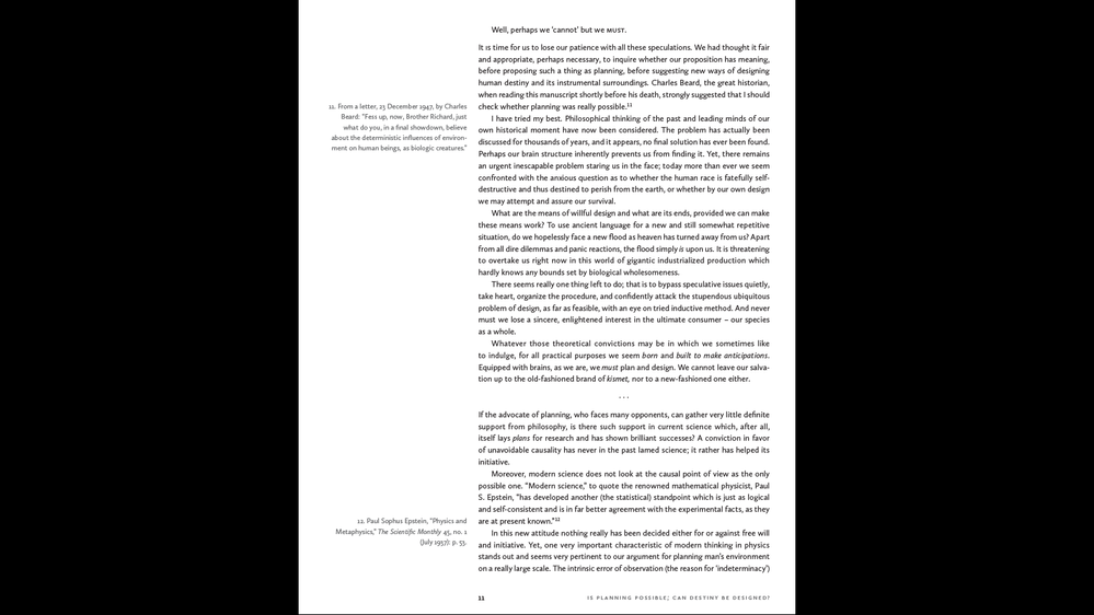
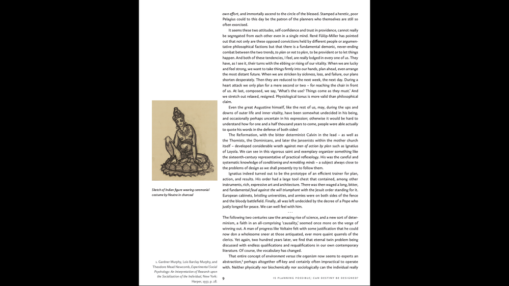
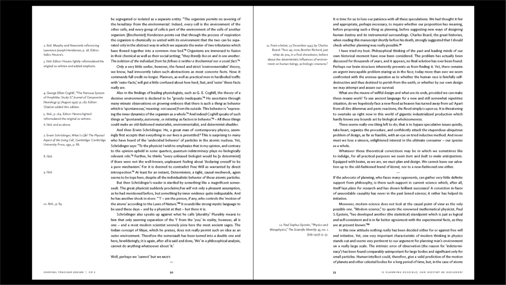
Have tried so many different separators, varied in additional empty lines and graphic symbols, and though I agree that the content's intended breaks should not be lost on the altar of esthetics, every option tried to date is displeasing and problematic. Part of the issue may be that the chapter openers are brief and have a higher baseline to align with horizontally orientated images opposite, and as discussed, the issue of breaks falling at the end/start of a new page are odd looking. I think this is why I initially fell into the camp of making the compromise in deference to esthetics. Yet, was I onto something valid with the idea of handling the breaks that fall at the end of the page (and particularly in the case of it without any separator other than a blank line) as their own implied break, and then overcoming the look of the succeeding paragraph somewhat appearing to be a continuation of the preceding paragraph, by converting it to an indented paragraph? Again, only for end-of-page breaks. Attached are a few examples of separators sampled. In some cases, 2 empty lines with a separator look fine, in other cases, a single blank line looks best. Conundrum.
Copy link to clipboard
Copied
The least obtrusive symbol, IMHO, is an em-dash, further reduced by using a light type or a gray tint.
I don't find separators un-esthetic in most cases and have always been able to work them into the page/line layout. There has to be a balance between pages-as-art and pages-as-information, and I'd put more weight on the latter in most cases.
Are you using a baseline grid? That can create/enforce a cleaner look, page after page, but of course comes with its own drawbacks.
—
╟ Word & InDesign to Kindle & EPUB: a Guide to Pro Results (Amazon) ╢
Copy link to clipboard
Copied
Baseline grid – I haven't used one. It's strict leading. I could never bring myself before to accept shifting leading to fit a baseline grid. The light version of an em dash doesn't work well here either. A major choice is whether to use 1 or 2 lines (equivalent) fo white space. Below are shots of it is with 70% grey and the light font. It gets very messy with the symbols at the bottom or top. I think this is a difficult call that I have to resign myself to a compromise on. I'm partial to just white space as every other aspect of the layout is asymmetrical and the centered text break symbols interrupt that a bit. Or if centered, than a nearly disappearing ellipsis or 2-em length thin line centered between two lines of space.
Copy link to clipboard
Copied
One caveat to this: if you export or convert to EPUB, these separators will disappear since they appear to be empty paragraphs. There are various workarounds, especially at the CSS level but it's a subtle gotcha if you aren't watching for it.
—
╟ Word & InDesign to Kindle & EPUB: a Guide to Pro Results (Amazon) ╢
Copy link to clipboard
Copied
Never insert an empty line, neither a forced break, nor another paragraph. Use only space before and after in the paragraph style. Those will be omitted at the top and bottom of a page or column.
If a space is between paragraphs I would use non-intended paragraphs.
Copy link to clipboard
Copied
Yes, when a space is between paragraphs, a non-indented paragraph always follows the space. I haven't been observing the best practice of using paragraph styles to apply that space on, and should. If one of the pitfalls of not doing so, however, is that the space 'will be omitted at the top and bottom of a page', I don't think I've seen this occurring, and wonder why.
Copy link to clipboard
Copied
Space above and below paragraphs is eliminated—collapsed—at page top and bottom. It's almost impossible to space paragraphs down from the top of pages except by using variations of Rule Above, or pulling the text frame top margin down.
If your spaces aren't disappearing, you're doing something... different. If it's an empty paragraph for spacing, that's a poor practice.
—
╟ Word & InDesign to Kindle & EPUB: a Guide to Pro Results (Amazon) ╢


