 Adobe Community
Page colours are different
Copy link to clipboard
Copied
I have created a 16pp brochure using the exact same colour backgorund (Dark Blue).
However when I printed the artwork all the pages came out the right blue, except one sheet which came out a very dark blue.
Now I am completely baffled by this; what am I doing wrong in the output settings when I convett to pdf?
Because there is no way this should be happening if this is the EXACT colours I use on every other page.
Copy link to clipboard
Copied
Do you have an object on that page with an effect (drop shadow, glow, etc.) applied? That would change the transparency and flattening on that page, which can affect color density, etc.
The PDF settings you use (especially the standard) have considerable effect on "complex" graphics that are layered, have opacity differences, etc.
╟ Word & InDesign to Kindle & EPUB: a Guide to Pro Results (Amazon) ╢
Copy link to clipboard
Copied
Not exactly the same but very similar.
I have a doc with the same B&W tiff (grayscale) in the background. On one page I added another layer with a CMYK eps, and for no reason, the B&W image changes.
I've been doing these for years (Spot the difference in a daily newspaper), I'm using a template I made (didn't change anything) and since the last Indd update, I get these weird tonal changes.
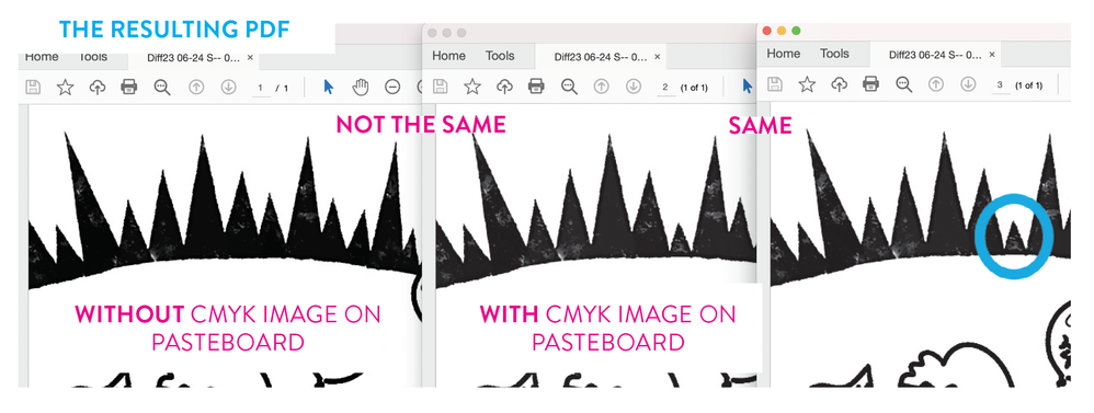
In the supplied sample, images 2 and 3 have the same "file" but come out different (page 3 is a "duplicate" of page 2 with the cyan added). Image 1 is a different file and comes out as the same colour/tone as 2 (as it should).
I have checked and rechecked, started from scratch, alas... there is no reason for this...
Adobe (again), something is wrong on your end.
Copy link to clipboard
Copied
RGB or CMYK source? Different (or no) source icc profile? Different rendering intent? Colour management settings? Output profile? Could be a lot of things, but EPS can not be colour managed, EPS is a format of the eighties and nineties of the previous century...
Copy link to clipboard
Copied
Not exactly the same but very similar.
Adobe (again), something is wrong on your end.
Hi @natsamson66 , Your grayscale problem is likely different than @matheww5155226 ’s color print problem.
Grayscales are previewed differently depending on your document settings.
If there is no transparency on the spread, and Overprint Preview is turned Off, grayscales are previewed as sGray—as they would display in a web browser. If you turn on Overprint Preview the soft proof is the expected output to your document’s assigned CMYK destination profile.
With Overprint Preview turned off and no transparency, the sGray preview:
With Overprint Preview turned on the print preview, or the expected output to the document’s assigned press profile Uncoated GRACoL 2013 in this case:
If there is any transparent object on the spread, and your Transparency Blend Space is set to CMYK you get the print preview even when Overprint Preview is turned off.
Copy link to clipboard
Copied
Hi Rob,
And everyone who chimed in.
Thank you all for taking the time to answer.
I understand what you're saying (and thank you, Rob, I was not aware of what you were explaining, and I'm glad to know it).
Still, there is something wrong with the way InDesign (Indd) handles the combination of a grayscale images with another transparency (is it really the only thing with?). You're talking about previews and web browsers, whereas I'm concerned with "dot-on-paper", which is my final output (and InDesign knows it from the moment I create my file).
When we place a "grayscale" image in a "print" document, it should theoretically not change and only be assigned to the "Black plate." I understand that there might be ink limit issues and other factors if you were stacking a pile of images (but that's not the case here). Even if it were, I believe InDesign should have a way to deal with all situations.
To put this job it in context, they are illustrations for a daily game of "Spot the difference" in a newspaper. It's a black line drawing with some grayscale screening and the addition of blue circles for the solution. It's important that the black doesn't get converted to CMYK (registration on newsprint is not the best), and the cyan (100%) only has to knock out the black.
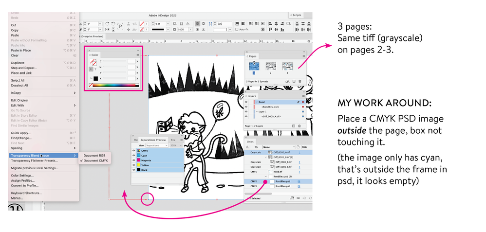
I am working in a CMYK document, I have Overprint Preview turned on and my grayscale images have no profiles assigned to them. There are no effects (trapping, shading, etc.) on anything. There's no fill, no colored frames on any box.
I don't understand why adding a transparent CMYK PSD file (containing an EPS shape) on top of a grayscale image alters the tonal value of the grayscale image. I was doing the exact same thing in Adobe Acrobat (adding the transparent CMYK file as a layer on page 3), and nothing changed. You might say InDesign is more sophisticated and (reacts) can do x, y, z, but it still doesn't make sense.
As a workaround, I placed a CMYK file on the pasteboard (not even touching the page) on pages 1 and 2, and my grayscale images change just like on page 3. So problem solved... No, not really, I don't know how you guys feel about it, but any workaround should be a red flag and is a door to mistake...
This is not a normal or acceptable behaviour. Anything that can change the value of an image should have a big warning — every time (especially in print, when you have a print run of thousand copies, it can be quite expensive).
Here's the setup: (attached JPEG of my setup)
Following are Separation previews: on page one and two, the CYAN plate is empty (grayscale image).
When only the black plate is checked, the image appears as intended (or like in photoshop).
When both BLACK and CYAN plates are checked (or composite), the tonal value changes (I understand they may appear similar in the attached JPEG, but it's a screenshot of a screenshot...).
Even when I remove the empty CMYK image from the pasteboard, the Separation Preview still shows the (incorrect) lighter tonal value.
When I output this as a PDF (the final format/file used for printing in the newspaper) without any color conversion (because as soon as you assign a profile, the black gets converted to CMYK), the result is not what we expect.
(please remember that on page one, the CMYK PDS was deleted but that the Separation Preview displayed the image with reduced tonal value, similar to pages 2 and 3), as we can see, it's not the same as page 2 & 3.
So, in conclusion, if there's something I'm setting wrong, I would appreciate knowing, as I feel I've covered all my bases, and this is really not a complex file or setup.
I consider myself an advanced user, even though I rarely comment here (I have been working with Indd since its release and regularly keep up with its technical aspects — here, tutorials and challenging assignments). When something becomes so complicated that we have to discover (somewhat) hidden features or invest a significant amount of time trying to understand and find workarounds for peculiar behaviors like this one, I'm sorry to say, there's a problem with InDesign and the way it works.
When I said "again" in my initial post, it was because unfortunately, InDesign (Adobe) often do "changes" things without enough testing, resulting in frustrating (and costly) consequences for its users (remember removing the default Shift-constrain in PSD or other changes in InDesign 2017?). While I apologize for mistakenly attributing it to a recent InDesign update, when in reality, I only became aware of it due to changing my own production methods, the fact remains that this grayscale issue is a big deal.
InDesign should fix this behavior: when you place a grayscale image in a print document and overlay or position something else on/under/beside it—regardless of what it is (another image, an EPS, RGB, or transparency)—it should not impact that grayscale image (like in Acrobat...).
Again, this makes no sense...
Thanks again — sorry for being so long with my explanation...
Copy link to clipboard
Copied
Can you share the InDesign page and placed image?
Some other threads on grayscale usage:
https://community.adobe.com/t5/indesign/dot-gain-or-gray-gamma/td-p/8365606
Copy link to clipboard
Copied
Is the blue colour a spot colour, or process? as mentioned before, transparency issues can change colour quite drastically, especially when a spot colour is converted to it's CMYK values (instead of using the RIPs look-up table)


