 Adobe Community
- Home
- InDesign
- Discussions
- Tabular lining working except with "1"s and "7"s
- Tabular lining working except with "1"s and "7"s
Copy link to clipboard
Copied
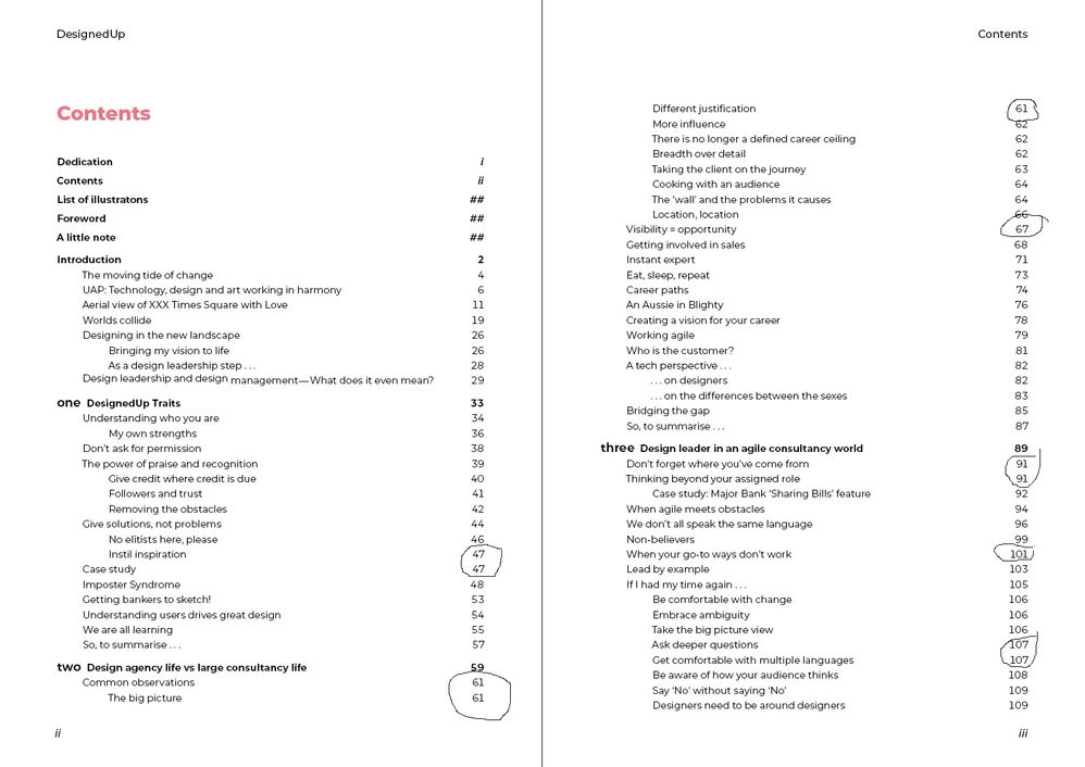
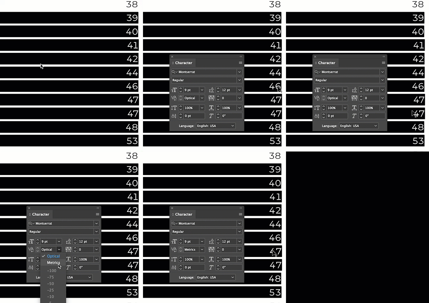
I'm using Tabular Lining for a Table of Contents because Montserrat page numbers were differing too much. It worked beautifully EXCEPT where the second number is "1" or "7" (see first screen shot "Contents"). I've tried everything I can think of:
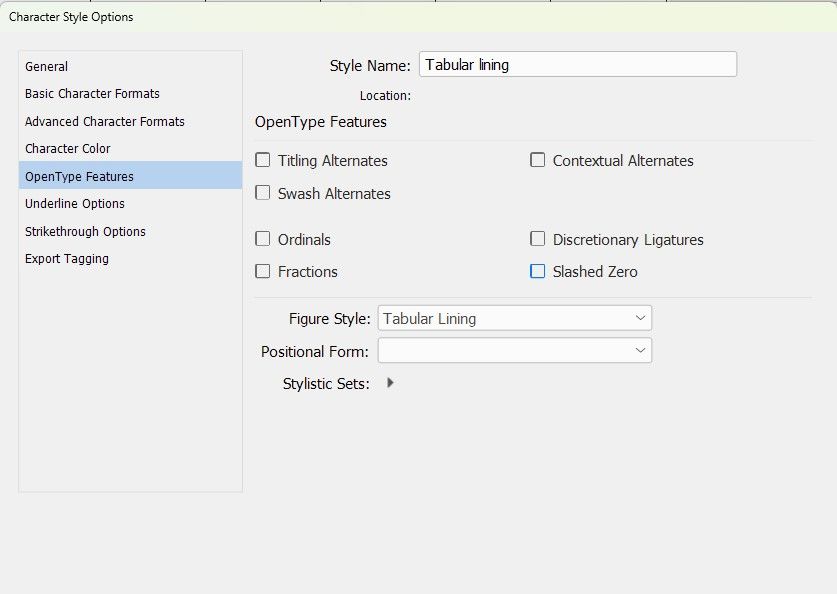
- Made sure the Character Style "Tabular lining" was set up properly (see "Character Style Options")
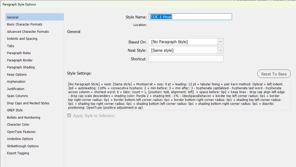
- Made sure the Paragraph Style was set up for Tabular lining figures. I deleted the "Based on" field in the Paragraph Style window to show its data (see first "Paragraph Style Options")
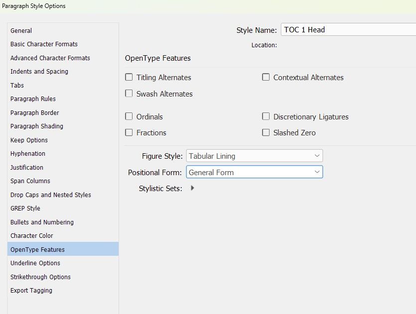
- Made a screen shot of the OpenType Features in the second "Character Style Options"
- Made sure there was no "+" next to the Character or Paragraph Style names and there were no sneaky overrides
BTW, tracking or kerning the numbers didn't make any difference. I've attached the InDesign file below.
Any ideas on why only those two occurances are not properly aligned?
 1 Correct answer
Hi @Susan Culligan:
Change the Kerning from Optical back to Metrics and redefine TOC Head 1 and TOC Head 2.
~Barb
Copy link to clipboard
Copied
There could be many reasons, and maybe there's a simple fix I'm overlooking — and I love Monserrat myself, but only for web use — but I'd bet it comes down to this: as a Google font, intended mostly for electronic use, it's not as meticulously constructed as fonts from print foundries. What you're seeing is sloppiness in the kerning and positioning data.
I'd substitute a "better" font for the page numbers, something established (with better metrics) and harmonious (for a nice look). I almost always use sans for TOC entries, and a nice serif for the numbers... not sure I can justify why except that I like the look.
But I have one site all in Montserrat that looks *exactly* the way I like, too. 🙂
╟ Word & InDesign to Kindle & EPUB: a Guide to Pro Results (Amazon) ╢
Copy link to clipboard
Copied
I'm loving Montserrat too. I started this book thinking it was wierd, but I've gotten used to it and am going to use it more.
See Barb's answer below—it worked perfectly!
Copy link to clipboard
Copied
Yep. FWIW, I've found very little use for Optical kerning except in some "art" elements, so I pretty much cross it off the list of useful adjustments (and thus didn't think of it here). Barb is one of those here who rarely has such blind spots.
Of course, working regularly with students reminds you just how many blind spots there are. 🙂
╟ Word & InDesign to Kindle & EPUB: a Guide to Pro Results (Amazon) ╢
Copy link to clipboard
Copied
Hi @Susan Culligan:
Change the Kerning from Optical back to Metrics and redefine TOC Head 1 and TOC Head 2.
~Barb
Copy link to clipboard
Copied
Barb, you're my new best friend!!! Thank you. So easy (unless you don't know it!)
Copy link to clipboard
Copied
I love new best friends! 😊
It was baffling at first, but finally it jumped out at me. Come back with questions in the future—we are always happy to help.
~Barb
Copy link to clipboard
Copied
Metrics crossed my mind, but with it affecting only two digits it seemed to be something more niche. Oh, well, I knew I should have paid more attention when they were teaching us the metric system. 🙂
╟ Word & InDesign to Kindle & EPUB: a Guide to Pro Results (Amazon) ╢
Copy link to clipboard
Copied
Generally, for flowing text in the page, I often recommend Optical in the paragraph style. But in specialty cases like this one, Metrics (built into the font itself) is better than Optical (where InDesign overrides the numbers in the font and does what InDesign wants to do).
Copy link to clipboard
Copied
Interesting. I just hauled up some book files and switched the body to Optical; in every case it was notably inferior in kerning and overall text spacing. That's been more or less my experience over time.
When using quality fonts (with good metrics), it *seems* that letting the original design metrics take precedence would be... better/best than letting ID apply its own interpretation.
╟ Word & InDesign to Kindle & EPUB: a Guide to Pro Results (Amazon) ╢

