Copy link to clipboard
Copied
I need to print on cardboard in white and 2 other colors. Black, pantone, white. Each of these colors must be overprinted. I can't define white though. If I put a fifth white color rgb or cmyk and then overprint, on the sheet it disappears when I create the pdf. On the one hand I understand that overprinting white does not return anything, but we are talking about a fifth color so this approach does not make sense. Can anyone help me with this?
I tried creating a fifth color c1 m1 y1 k1 to see if it changed anything by assigning a minimum value for each channel, but this is not the solution. I would like to have on the pdf if I deselect the "white" channel the elements disappear as with the other colors and reappear when I reactivate it, but white always punctures my underlying layers and if I deselect it nothing happens--because it punctures the color layers.
Translated with DeepL.com (free version)
 2 Correct answers
Hi @stefanofe , This has been a long running problem with InDesign (and Illustrator). There is no color management for Spot color overprints or tints in either application, so for Spot color output where the inks might be opaque, like screen printing, you have to ignore the Overprint Preview and check the separations in Separation Preview.
Here my [Paper] swatch is set to simulate cardboard, and with OP turned on my White Spot fill is displaying as transparent, as is PANTONE 3514, which is wha
...Note that for Separation Preview to work you need to have the Transparency Blend Space to be CMYK mode. CMYK 0,0,0,0 is not white but paper colour. If you have Overprint enabled then it is transparent (but it will warn you), note that Overprint is irrelevant in an RGB document.
In Separation Preview, you will see additional inks besides CMYK, and you can view then together or separately to analyse your work. I normally place opaque white, above other colours even if it will be printed first. This
Copy link to clipboard
Copied
question not at all professional and safe. We are human beings... if you have 2 files to manage a single solution, an error related to double management could occur. Sorry... I'm not asking for such a complex question... simply a flag that distinguishes the spot color allowing overprinting. You need to know that there is a difference between the white of a watercolor and the white of an oil colour. Dear Adobe... I'm asking for a flag.
Copy link to clipboard
Copied
Ask here: and then be prepared for disappointment because this is a feature that would be absolutely useless to 99% of the users here.
Copy link to clipboard
Copied
This would be trivial to manage with layers. Use one layer for each variation of 'white' that serves each need. While yes, any such A/B or duplicate content could lead to errors, but so could many designer mistakes. But it's still all in a single file with very quick and easy A/B comparison and content selection for proofing/print output.
┋┊ InDesign to Kindle (& EPUB): A Professional Guide, v3.1 ┊ (Amazon) ┊┋
Copy link to clipboard
Copied
suppose a white arrow above a black square... what do I do with a background?
Copy link to clipboard
Copied
Overprinting that will give you nothing but a muddy gray. Knock it out.
But the best advice anyone is going to give you is to talk to the printer.
Copy link to clipboard
Copied
What is the printing process you are outputting to? Is it screen printing?
Copy link to clipboard
Copied
The printing is offset. As for the muddy grey, that remains to be seen. However, I was simply giving an example and I improperly said "black". Any color... even yellow. I am asking for a function that is a principle that is independent of colors. If I have a covering color... it has to cover. Suppose a transparent lacquer. Why not allow a software that defines a transparent gray to be 100% opaque? Do you understand that a simple flag allows me to show a customer the reality even in a visual way without resorting to subterfuge?
Copy link to clipboard
Copied
The printing is offset.
Offset inks are transparent, so if you are printing something like this:
https://news.sundanceusa.com/news/white-ink-guide
there is no color managed preview with InDesign Spot colors and you would have to check Separation Preview to determine if the spot plates will output correctly.
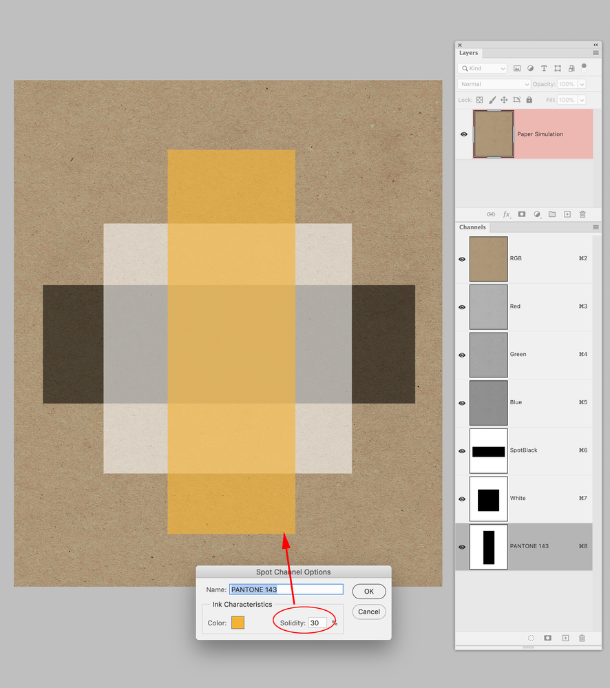
If it is for packaging and you want a more reliable view of ink opacity, use Photoshop Spot Channels with the Solidity setting set to something other than 0.
Copy link to clipboard
Copied
There are any number of specialty printing or output processes that lie outside the spectrum of general offset and digital presses. While it would be nice to have a switch for every variation and special need, the usual expectation and practice is that the designer will adapt either workflow or document to suit such oddities.
As noted, it's probably less than 1% of ID users who would ever need control of ink opacity at the document level.
Printing on cardboard also tends to be crude at best, with very low linescreens, huge traps and any number of practices that have to be followed. I will completely concede you know what you're doing with this project but heavy overprint is not really good printing practice, and overprinting dark colors with light ones is what makes press guys laugh.
Go put in your feature request where it will be read by someone other than other (powerless) users, and then you can either wait for it to be implemented, or turn to one of the workarounds you've been given, or ask your printer for specific recommendations about how they prefer to handle it. I would be unsurprised if the word comes back that you need to modify your plans.
┋┊ InDesign to Kindle (& EPUB): A Professional Guide, v3.1 ┊ (Amazon) ┊┋
Copy link to clipboard
Copied
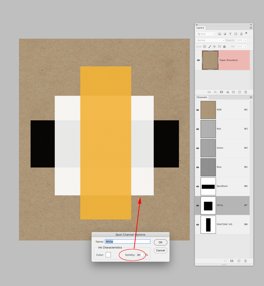
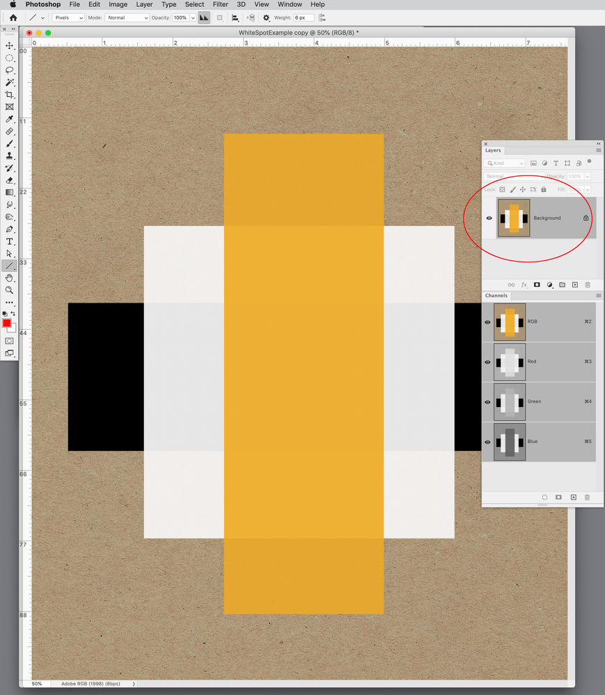
You will not get a new feature anytime soon, but the feature you are looking for already exists in Photoshop, so single pages can be done there. For showing your client a composite proof, Photoshop’s Merge Spot Channels will convert Spot Channels into into a composite RGB file.
I’ve attached a sample .PSD with 3 spots
Here my Spot Channels are overprinting on a cardboard simulation with Solidity set to 30%:
I can increase the Solidity to 80%, but if you have any experience with offset printing this is not going to happen on press:
For a client view I can Merge Spot Channels, but I think this 80% Solidity view would be misleading:
Copy link to clipboard
Copied
Do you understand that a simple flag allows me to show a customer the reality even in a visual way without resorting to subterfuge?
By @stefanofe
Define "simple."
What you think might be simple is not necessarily simple to implement and AFAIC, you still haven't made a decent case to dedicate any engineering resources to it. So you can either take the advice you've been given, including talking to the printer.
Copy link to clipboard
Copied
We sometimes print white ink (litho UV) on colorplan or kraft, it can take 5 times through the press to become opaque enough. I've also handled repro for White on Mirror board.
You should honestly take the advice in the first Reply, and give your clients some credit to be able to approve something that looks like a spot blue on a white background.
Your simple flag isn't simple at all. Not only do you ask for Opaqueness/Solidity, you also expect this to cover inks that are printed earlier, so now you need a flag for separation print order.
In the future it may be possible to define colours with spectral colour using CxF which might do what you want, but I can't see any drive to do so, especially with PANTONE and Adobe's current relationship.
Its not like this is a new problem. Foil separations are opaque (a lot more so than white ink) and need to overprint they go down on ink and colored stock, and when the background is black you can't see it on screen. So you tell the clients to turn Overprint Preview off or you create a visual.
I did think that you could have a background layer coloured in a spot colour called Kraft, then place duplicates of your spot white objects on the layer above ("faux_paque") but colour them up as 0%Kraft then add Opacity as required... but you want to KO other inks so it doesn't work. Note 0% Kraft colour will always knock out any Kraft coloured object below even when set to overprint.
Copy link to clipboard
Copied
This is an excellent and knowledgeable reply – thank you reproo2773183!
Copy link to clipboard
Copied
We sometimes print white ink (litho UV) on colorplan or kraft, it can take 5 times through the press to become opaque enough. I've also handled repro for White on Mirror board.
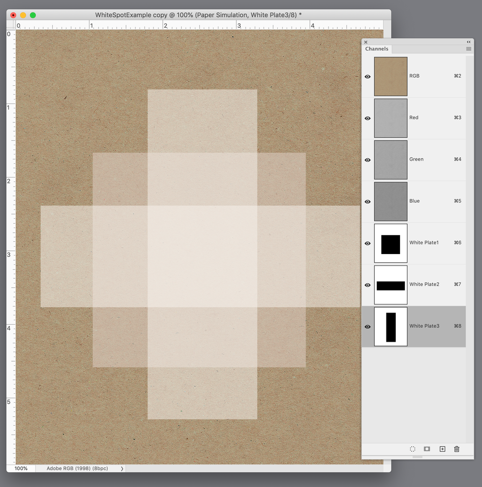
Hi @reproo2773183 , I do wish InDesign included something similar to Photoshop’s ink Solidity feature.
In Photoshop I can actually preview a hypothetical 3X hit of White ink on Kraft paper. While this does not provide the accuracy you might expect from color managed process inks where a press profile can be assigned to the process color, it’s certainly better than the InDesign options:
Copy link to clipboard
Copied
But now I'll tell you something that I hope will lead Adobe to make a change. Affinity Designer allows me to create a white spot color as an overprint. Sorry to say it... but at this point I think Adobe needs to do something!
in a competing program I can have a single project with the same display and printing and can't I have the same thing with Adobe? Maybe I'm wrong.
Copy link to clipboard
Copied
I hope will lead Adobe to make a change.
They don’t see our posts. Make a feature request and hope others will vote for it.
https://indesign.uservoice.com/forums/601021-adobe-indesign-feature-requests
Copy link to clipboard
Copied
If this hasn't already been posted, you can go here to make a feature request.
Copy link to clipboard
Copied
Let us know how the actual print project comes out.
That's... the only useful thing that can be added, again.
┋┊ InDesign to Kindle (& EPUB): A Professional Guide, v3.1 ┊ (Amazon) ┊┋
Copy link to clipboard
Copied
how do you deliver that to your printer?
AFAIK Acrobat doesn't support this.
Copy link to clipboard
Copied
In any case, I wanted to say this to everyone who made suggestions:
smart solutions stay smart. Many of you suggest this and I don't want to diminish that. But I have a white brush and a black wall in my hand. Brush white on black. I don't want to use chemical tricks to get white... I just want to brush knowing that my brush has a covering white pigment. Imagine if you had to use chemical devices despite the covering pigment. I don't belittle the intelligence of those who succeed. I only ask that you provide tools for fools like me who simply want to use a brush.
Copy link to clipboard
Copied
I was pretty much done here, but since you insist on insisting to insist you're right —
- Have you ever checked with an actual commercial printer about the viability of white overprint?
- Do you have any example of a print job where white ink overprinting created a satisfactory result?
- Subquestion: does the layout term 'knockout' mean anything to you?
- Has it occurred to you that the mature, professional layout tool throwing a barrier to your demand for white overprint is perhaps (technically/programmatically) smarter that you are? And that a cheap alternative tool — a very good one, for most layout and print design purposes, but still a fairly low-end knockoff — might be allowing you to set up a white overprint not because it's nice or agrees you're smart... but because it is (technically/programmatically) too stupid to know that's not a good/valid option?
- (Exercise for the student: come back with 100 words about the fundamental difference between Photoshop and GIMP, the latter of which some large population insists is just as good as the former. Hint: start with "CMYK.")
And, really, the key question:
- When you have this job run, will you report back honestly all exchanges with the printer and the quality outcome of the job?
Since the likelihood is that you'll respond with four "No's" I'll include a softball question to let you throw in a Yes:
- Are you convinced that some century-odd of combined experience here is simply pigheaded Adobe defenders who won't admit that you can "brush" white over color on an offset press?
┋┊ InDesign to Kindle (& EPUB): A Professional Guide, v3.1 ┊ (Amazon) ┊┋
Copy link to clipboard
Copied
Note that for Separation Preview to work you need to have the Transparency Blend Space to be CMYK mode. CMYK 0,0,0,0 is not white but paper colour. If you have Overprint enabled then it is transparent (but it will warn you), note that Overprint is irrelevant in an RGB document.
In Separation Preview, you will see additional inks besides CMYK, and you can view then together or separately to analyse your work. I normally place opaque white, above other colours even if it will be printed first. This way it is easy to toggle on and off. Let it be a colour you can distinguish from the white of the "paper".
Normally white ink (as spot colour) is created using a Spot colour with a pink or green appearace, so that you can see where it is (since the artbaord is white.)
Pantone white is not good white though, but UV printers using a RIP like Onyx use a spot colout called "Ink_White" for mapping to an Opaque White ink.
A spot colour with overprint should not knock out other layers… I do it all the time). This process is also used for Cut, Crease, Embossing, Varnishes and/or Foil where it is also impossible to visuallise correctly. (In Adobe Illustrator the Plugin ESKO Studio is used in many pcakage desugn firms where they need to visualise speciality inks, but it is still possible to design and proof, using experience to evaluate the results.) When one channel only is visible, then you will also see it as a film where the areas of ink are shown in Black, even if the ink in you press will be white.
Please if you share an example of how you are experiencing your work (a close up is fine) with the Separation Preview clearly visible.
Overprinting is a per channel operation so if you have a CMYK image and overprint a low percentage 1% in a Process colour it will limit that Colour to the top %, and it appears knocked out but it isn't, it's the 1%. In some rare cases you will not be able to Overprint but can use the "Darken" blend mode (Even if it is a lighter colour.) Think of Darken as "And also add this colour", so a Varnish, Metalic or white will not actually make the image darker. Avoid using Other bledmodes that use multiplication when mixing Spot colours, Multiply should not be used with Spot Colours. Some Transparency or effects may interfere with spot colours, but Separation Preview should help you trouble shoot.
-
- 1
- 2


