 Adobe Community
- Home
- InDesign
- Discussions
- Re: Words with apostrophe d--like he'd and she'd--...
- Re: Words with apostrophe d--like he'd and she'd--...
Words with apostrophe d--like he'd and she'd--get smushed together when exporting to epub

Copy link to clipboard
Copied
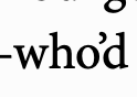
Apostrophe d words like he'd and they'd have a spacing issue when exporting from Indesign to epub. The spacing in the word gets smushed together and looks really off. To take "he'd" for example, it looks like the word hed with an apostrophe superimposed above and between the "e" and the "d."
Any recommendations on how to fix?


 11
Replies
11
11
Replies
11

Copy link to clipboard
Copied
What font is it?
What Epub settings?
What OS?
What version of Indesign?
Copy link to clipboard
Copied
Hi Eugene, thanks for the response. Font is minion pro. Epub settings are Split Document, Based on Paragraph Style Export Tags, Include classes in HTML, Preserve Local Overrides, Include Embeddable Fonts.
The issue happens with both Indesign 16.4 and the latest version.
OS is macOS Mojave 10.14.6 (MacBook Air). But it also happens on my MacBook Pro.

Copy link to clipboard
Copied
Screenshots might help. You didn't answer what version the EPUB is.
Copy link to clipboard
Copied

Copy link to clipboard
Copied
Hi @default61wtfophtlgv , the kerning would depend on the font, and in InDesign your choice of Metrics vs Optical.


Copy link to clipboard
Copied
@rob dayNope, that doesn't really resolve it. The generated CSS letterspacing is still wrong for those instances.
InDesign:

epub:

Copy link to clipboard
Copied
Confirmed with Minion Pro Regular.
It works fine with other fonts. Top and bottom lines are Minion Pro Regular and Bold:

Seem to be an issue with Minion Pro Regular and certain combinations such as o'd and e'd, but there are differences between regular and bold as well. This only happens in the exported epub.
Consider switching to an alternate typeface.
Or open in Sigil, and change remove or replace the negative letterspacing for these instances, which is the underlying cause: it is wrong for these letter combos.
Copy link to clipboard
Copied
PS This is the very reason why the Online Publishing option converts all the type to outlines and embeds a SVG instead of attempting to convert to actual text.
Which leads us to the following question: why we can't have that SVG option in the Object Export Options when converting text? That would solve this issue and other related type conversion problems once and for all when dealing with fixed layout epubs.
But no... SVG import is possible finally, so how about SVG export of text?
The only workaround is to export to a PDF, import into Illustrator, and convert the text sections to SVG there, and import and replace the text section in InDesign, changing the object export options to "use existing image for graphic objects" and export to epub.
Which is just ridiculous, of course.
I doubt, however, that the InDesign dev team will be allowed to add this option, because it would compete with their online publishing feature. Wouldn't want to allow the users to take back control over their web export, right?
Sigh.
Copy link to clipboard
Copied
Rob and Rayek, thank you for the helpful replies. Rayek, I just changed the font to Baskerville and exported to epub, and the issue was gone. Good to know it wasn't something else I was unaware of in the document secretly messing things up. Also good to know I can just change the document to Baskerville before exporting to epub and then afterward change it back to Minion Pro.
That said, real bummer about Minion pro. That's my favorite font. Can't believe it'd produce such a glaring error. Those ultra-contracted words look unprofessional.
Thanks again. Appreciate the generous help. And if anyone thinks of a way to fix this--or work around this--while keeping Minion pro, I'm all ears.
Copy link to clipboard
Copied
It’s not happening to me, here’s a Fixed Layout export on the right of my metrics/optical example with Minion and Times:

Using ID CC2020, here’s my Minion version:

Copy link to clipboard
Copied
Not sure if the CSS font-kerning property works with ePub, but you could try adding it to your ePub’s CSS stylesheet.
https://developer.mozilla.org/en-US/docs/Web/CSS/font-kerning

 AdChoices