 Adobe Community
- Home
- InDesign
- Discussions
- Re: Background color for photo: "paper" or "none?"...
- Re: Background color for photo: "paper" or "none?"...
Background color for photo: "paper" or "none?" Does it matter anymore...?

Copy link to clipboard
Copied
I've been doing graphic design for a very long time, through PageMaker, Quark and InDesign. In the past we would always designate "paper" as the background for any photos or text that didn't have a reason to use transparency. Now it seems that "none," or transparent, is the default. It is okay that most of my images and text boxes have a background of "none," or should I go through my InDesign files and change all to "paper?" Just curious. Does it matter anymore? This is a large book that is loaded with photos and artwork, some transparency is needed on a few. It will be sent to the printer as a "press ready" PDF. So? what about those backgrounds on my images?
Is there a preference anymore?


 13
Replies
13
13
Replies
13

Copy link to clipboard
Copied
The default [Paper] swatch is unique and represents the actual paper color with no ink printed. If I set the [Paper] swatch to pink, a blank page will display as pink—doesn’t matter what the [Paper] swatch color mode, or Overprint Preview setting is:

If I make a CMYK 0|0|0|0 White swatch and use it as the fill for the container frame holding a transparent PSD it will preview differently depending on whether Overprint Preview is turned on, but the output values for [Paper] and 0|0|0|0 White will be the same:
Overprint/Separation Preview turned Off

Overprint/Separation Preview On:


Copy link to clipboard
Copied
You should be using [None].
In simplest of explanations, the [Paper] colour in InDesign is really to allow you to change what your background is in your document to simulate the paper you are printing on. Most times, of course, your paper is white (or near white) so it's not really something people change often. But, say, you are printing on a coloured paper (like a cream stock or a kraft envelope) and you want to see on screen what your design will look like on that stock, you can edit [Paper] to something that approximates that colour. This is purely for the screen, and does NOT show up in output files. If you colour an object with the modified swatch, it will output with as if it was white.
Therefore, you giving your images a background of [Paper] is like laying a sheet of paper between your image and whatever background items you have. This will affect how certain Transparency effects work when applied to the image itself within the frame, e.g. Multiply.
Copy link to clipboard
Copied
Oops. rob beat me to it!
Copy link to clipboard
Copied
Ah, well very good to know, but I did wonder if there was still something that happened with processing time when the images come in to printer's software, on "backgrounds of none?
We once diligently went through the document and made sure all the backgrounds were "paper" unless there was a reason not to be. (we had to explain what "paper" meant of course.) I used to teach a certificate course through UCSC Extension and Cabrillo Colleges and that's what we taught everyone: "use background of paper" unless you have a good reason not to. You would be marked down for using "none" without a reason. Now I guess I'll teach myself the opposite. : )
I think the processing time went into the printer softeware looking for the edges of the "transparency/background of none" in all instances, and it was maybe time consuming. Anyway, happy to leave it, in general, on the default and follow your suggestion: none it is.
Copy link to clipboard
Copied
I don't see how one or the other would add anything to the complexity of the processing time ... just the INTENT of what you want to see.
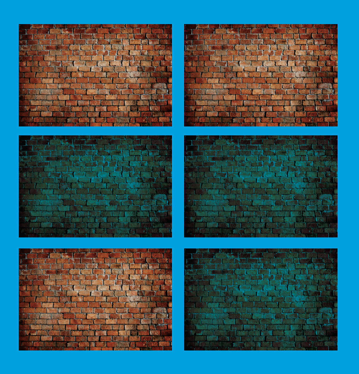
Back to my example (see attached): the top two images are different only in that the one on the left has [Paper] as a background colour to the frame; the one on the right is None.
On the second row, Multiply has been applied to the image's container frame, so both interact with the background colour, hence multiplying with the blue... the results, consequently, are the same.
However, on the third row, the Multiply has been applied to the image contained in the frame. On the left, the image is being multiplied only to what's immediately behind it, i.e. the [Paper] (white background) of the frame only, but goes no deeper than that, hence it knocks out of the background. On the right, the image (with the None background) interacts instead to the blue background.
So, in your project, it may make no difference, but you can see the importance of having None if you ever want the image to interact with the background in certain desired ways.
Copy link to clipboard
Copied
I get it...that paper is the actual paper color (I'm not trying to duplicate the look of it) I'm not trying to set it here. I'm assuming that the paper is "white" or "cream" or whatever, and that will happen when it's printed.
The question is: is the quality of the image, when reproduced...or the processing time for the printer (commericial 4-press printer) the same if I have a book filled with images that are (not needing a transparcncy setting) and either loaded into "container boxes" of "paper" or "none?" If there are quality or processing time issues, that's all I'm concerned about. It's a pretty basic question. Nothing fancy, no transparency, no k.o.s, and no "layers." I will keep them "none" unless I should change them for a reason.
And thank you for your response!
Copy link to clipboard
Copied
The question is: is the quality of the image, when reproduced... I'm assuming that the paper is "white" or "cream" or whatever, and that will happen when it's printed.
The color of the [Paper] swatch would have some affect on the softproof of the image (Overprint Preview turned on), but not its actual output values. These 3 pages would have the same CMYK output values—the appearance of the printed CMYK values would be affected by the paper’s color because offset inks are transparent:


Copy link to clipboard
Copied
When it's set to paper - and you make a PDF - you can turn on the transparency grid in Acrobat Preferences.
Under Acrobat Preferences
Page Content And Information
- Show Transparency Grid: Displays the grid behind transparent objects.

Copy link to clipboard
Copied
Yes I remember doing this too. It was to compensate for a Quark bug that would make some graphics that had contours come out "jaggy" so the frame always had to have a paper color.
In InDesign the frame can be whatever color is required.

Copy link to clipboard
Copied
There is a difference between "paper" and "none" but it is not applicable when you are making the final result for printing. The difference will be seen if you take what you made and stick it over something else. There are many ways and reasons why this might happen. A fill of "paper" will print as nothing, but WILL COVER WHAT IS BENEATH - what you might have seen will be deleted. A fill of "none" will show what is below.
At least, that's my understanding of what "paper" does. I may be completely wrong, I haven't tested it.
Copy link to clipboard
Copied
It’s worth noting that the Overprint Preview (the print soft proof), and the Transparency Blend space settings can have a significant affect on the appearance of a [Paper] filled object when it is interacting with transparency—for print projects you really have to pay attention to the Overprint/Separation Preview setting.
Here the Transparency Blend Space set to CMYK with Overprint Preview turned on and off:


Same page with the Transparency Blend space set to RGB:


The same will happen in Photoshop when the Background layer is filled with 100% transparent pixels vs. 100% opaque white pixels.
Overprint Preview also works differently with process vs. spot colors:
Copy link to clipboard
Copied
Thank you Rob. I'm so glad to have asked my question and have gotten all the answers, good ones, that I would ever want. I'm going to have to come back to this later, but wanted to empress my thanks now. I love this kind of stuff!
Copy link to clipboard
Copied
All these answers were interesting and helpful. : )

 AdChoices