 Adobe Community
Copy link to clipboard
Copied
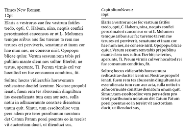
My book designer used Capitolium News 2, 10pt. for the main text in my coffee-table book that will be 9 x 12". The text seems huge! (I have the PDFs) The font size she used looks like the large print books on the market. I am accustomed to Times New Roman, 12 pt. which I understand is the industry standard. How on earth did an experienced book designer make such a bad decision?
What Capitolium News 2 font size is equivalent to Times New Roman, pt.12?
Thanks for your help.
 1 Correct answer
The difference is mostly in the x-height. If I set all caps the cap heights are the same. News has less contrast so it will hold up better under variable printing conditions.
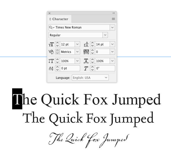
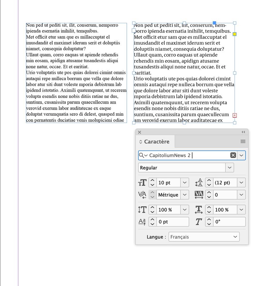
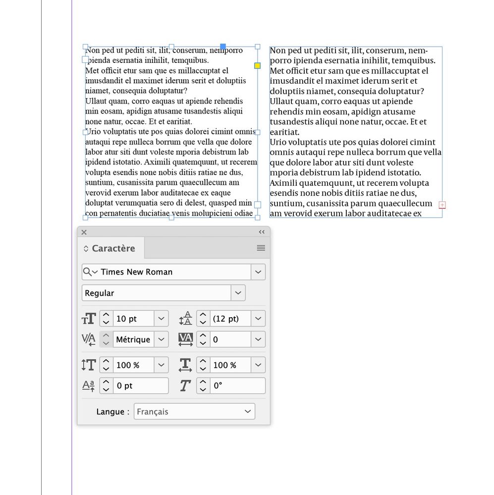
The font’s x-height affects how it sets. This text is all 12pt:
Copy link to clipboard
Copied
It would be easier to judge if you could post a screenshot of a typical page.
Copy link to clipboard
Copied
Why would Times New Roman be an industry standard? What industry?
What's wrong with Capitolium? Why is it a mistake?
If you wanted to use Times New Roman you should have specified this - Times New Roman is a font that a lot of designers would avoid.
There is a difference - hope this helps - but really should have make specific font requests to the designer. How are they to know what you prefer unless you tell them?
And to be honest, the designer should have gotten this info from you before beginning - it would be part of a discussion at briefing stage.
If no font choices were discussed - then a designer would use something that they felt worked well.
If it's already done and printed - not much you can do. If you want the font changed then it's something you'll have to bring up with your designer.
There is a difference for sure
Copy link to clipboard
Copied
If you wanted a specific font and size, as already pointed out, it should have been specified. And your remark about TNR 12 point being an industry standard has zero basis in truth. There is no industry standard for a font choice.
Copy link to clipboard
Copied
The other thing to bear in mind that the font size depends on your zoom. Zoom from 100% to 200% and it's twice as big. Never assume the size it opens is some kind of industry standard.
Copy link to clipboard
Copied
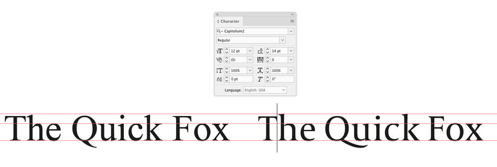
The x and cap heights are virtually identical.
12pt:
Copy link to clipboard
Copied
Thanks.Ollie
Copy link to clipboard
Copied
You need to show us what you are seeing, since it does not seem to reflect what we are seeing.
Also, if you are printing from Adobe Acrobat check all your print settings, since it will scale by default.
Copy link to clipboard
Copied
So, let me see if I've got this right ...
- You're receiving a proof, printed or PDF digital, of a book manuscript someone else is producing for you.
- You're very unhappy with the text on the page. It appears to be too large for your approval.
- They told you the type size is set smaller than you expect, but the resulting text is larger than you're used to.
- Multiple type samples here show that for a given type size the x-height and baseline to top of caps height between the two fonts in question are near identical.
I'm going to ask a dirty question of you: have you seen the InDesign file your book designer is working with? Can you go to the designer's studio/office and see the type spec used with your very eyes? Or review it with your book designer by real-time screen sharing over the internet? With all due respect, you've got a basic calibration problem here: either your designer is mistaken about the type spec for the job (possible, but not likely) or your own eyes are mistaken about the size of type being used in the layout.
Nothing personal, but your designer can define the size of the type in your book layout in numerical, empirical terms. And you feel that is wrong. If you're looking for a dispassionate third party to decide on your complaint, I'll bet you a nickel you're gonna lose.
I'm not saying that the type isn't set way too large for you; just that you and your designer battling about point size by long distance isn't going to satisfy either one of you. And I say that as someone who's produced lots of books for a wide range of clients. If you can visit your book designer, either in-person or virtually through sharing your designer's screen, and review the InDesign document file(s) for the job, you two can probably resolve this on the spot. And make adjustments accordingly.
In short, you don't need us. You need to work this out on the spot with your book designer, and then act accordingly.
I know this isn't the answer you were looking for, but it's the one which will help you past your issue.
Randy
Copy link to clipboard
Copied
Was the attachment a PDF? Did you print it at 100%?
Can you share the PDF? If you have AcrobatPro you can get any text’s point size
Copy link to clipboard
Copied
Copy link to clipboard
Copied
Use a sharing service like Dropbox so everyone can see it. If you can’t do that click to my account and send me a message.
Copy link to clipboard
Copied
Just realized in my earlier comparison post I was showing Capitolium 2. The Capitoleum 2 News version has a larger x-height, so upper & lower case settings might appear visually larger when compared to a font with a smaller x-height. Gerard Unger is a highly regarded type designer, so I assume the News version has a larger x-height for legibility at smaller point sizes and the poor printing conditions.
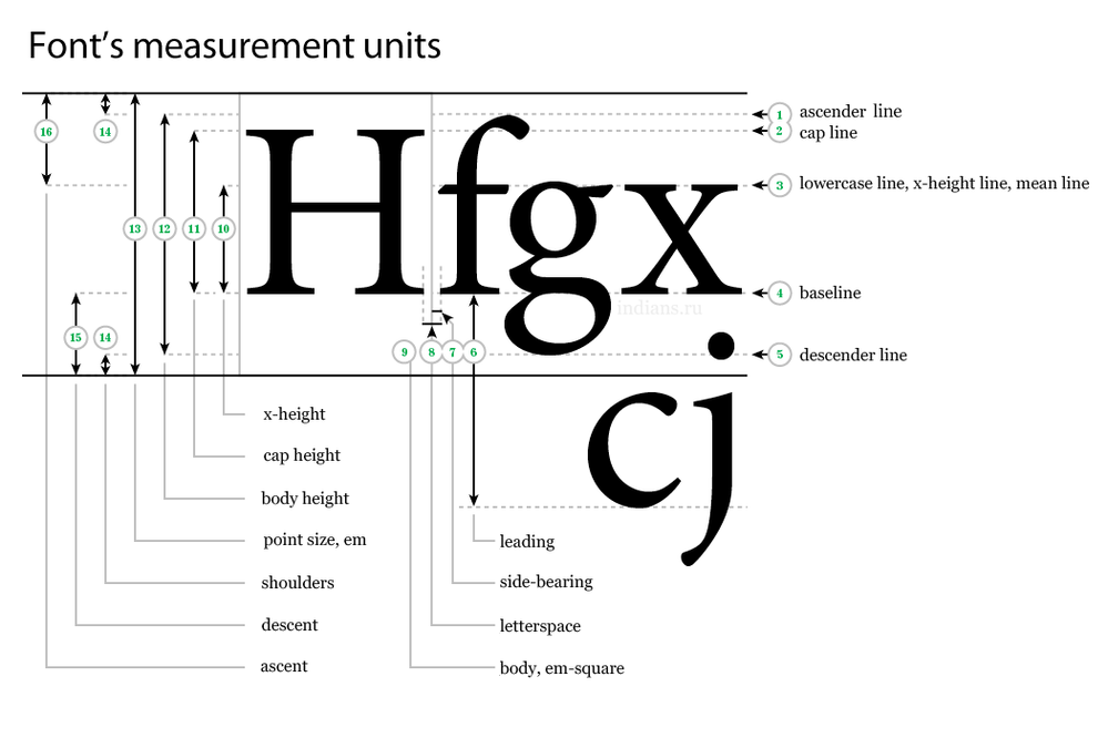
Point size is measured from just above the ascenders to just below the descenders, so fonts with larger x-heights can appear larger at the same point size.
Why don’t you just ask the designer to set the text smaller, or use the Capitolium 2 version?
Copy link to clipboard
Copied
I also find that CapitoliumNews 2 seems huge compared to Times using the same size.
Copy link to clipboard
Copied
The difference is mostly in the x-height. If I set all caps the cap heights are the same. News has less contrast so it will hold up better under variable printing conditions.
The font’s x-height affects how it sets. This text is all 12pt:
Copy link to clipboard
Copied


