 Adobe Community

Copy link to clipboard
Copied
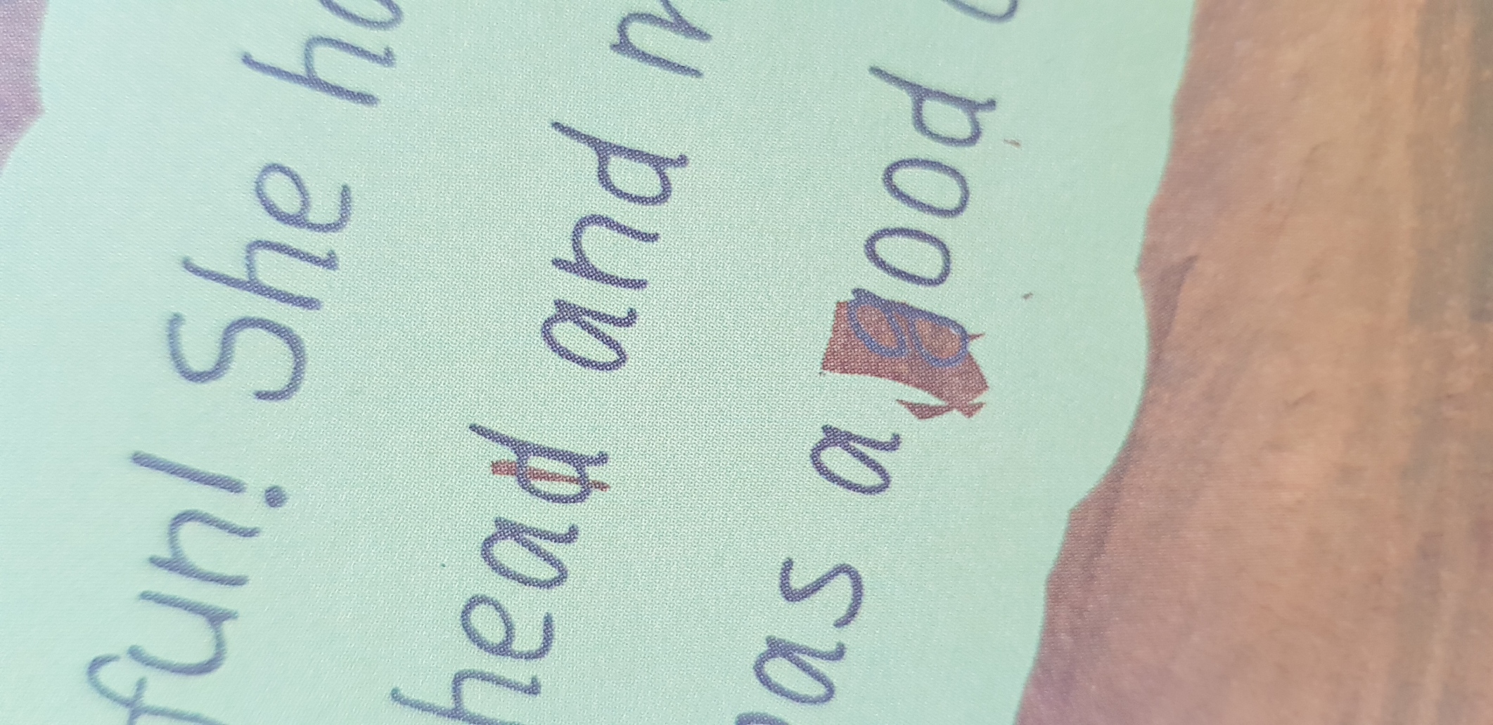
I've completed an InDesign document for a childrens book. Some of the text has a stroke effect around it. Whether I create the PDF from InDesign or Photoshop there are strange gaps in the stroke.
When the file is published online its fine, its only when saved as a PDF that this happens, and if I save the file again the gaps appear in different places each time.
I can't have these weird gaps on the printed book. Any ideas why this is happening and how I fix it?
Thanks
Ian Robinson


 1 Correct answer
I'm beginning to think it might be something on my device, and besides I've found an alternative by drawing the effect in photoshop.
Incidentally, you can apply stroke in InDesign, I applied text and stroke in InDesign first.
Thanks for your attempting to help.
 6
Replies
6
6
Replies
6

Copy link to clipboard
Copied
Please explain how you applied the "stroke effect".
You can apply a stroke to text, but InDesign does not have a stroke effect.
Copy link to clipboard
Copied
Forgive my poor use of the terminology, I'm relatively new to Photoshop and InDesign. It effects the stroke applied to the text, and only when saved as a PDF. Curiously even after the stroke is first applied to a photoshop file (.EPS, .JPEG etc) and then placed into an InDesign Document.
Copy link to clipboard
Copied
It's a little confusing but in Photoshop strokes are applied to text as an effect, but not in InDesign.
Anyway, I'm not able to reproduce the problem.
If you can post your InDesign file I'll see if I can troubleshoot it.
Copy link to clipboard
Copied
I'm beginning to think it might be something on my device, and besides I've found an alternative by drawing the effect in photoshop.
Incidentally, you can apply stroke in InDesign, I applied text and stroke in InDesign first.
Thanks for your attempting to help.
Copy link to clipboard
Copied
Yes, of course you can apply a stroke in InDesign. In InDesign it is not considered an "effect". In Photoshop it is considered an effect.
Glad you found an alternative.

Copy link to clipboard
Copied
My first thought is a bad/corrupt typeface. If this is a freebie typeface you got online, they aren't necessarily the best constructed files out there.
Regradless...what exactly have you applied as a stroke? Am I correct in assuming you've applied a reallllly thick stroke to your type? (i.e. yellow in one case, and light blue in the other). That has probably so over complicated your design that it's freaking out your printer's output. I would seriously consider doing this a different way, e.g. draw that bubble in Illustrator and place it behind the text that has NO stroke on it.

 AdChoices