 Adobe Community
- Home
- InDesign
- Discussions
- Re: How to desaturate proportionally? (Yes, that's...
- Re: How to desaturate proportionally? (Yes, that's...
Copy link to clipboard
Copied
Greetings from Vancouver 🙂
Happy new year, incidentally....
I have a screenshot from ColorThink wherein I have the 'worst' Pantones from a delta-e 2000 point of view. On the left is the sRGB rendition of the Pantone's LAB colours and on the right their SWOP rendition. I use it to show that math only goes so far... and that our eyes are more sensitive to changes of hues in lightly saturated colours.
And as you can see *onscreen*, the left is more saturated than the right. I need this to be maintained in print, in InDesign.
Now, I need this difference to be maintained as I import this into InDesign and it doesn't. I haven't found a way to massage, convert, import this screenshot into indesign that would maintain the saturation difference from left to right as seen in the image above.
How do I desaturate the image proportionally so that the left side is dragged down to swop and the right side desaturated proportionally to the left side even further down? The point is to have a print that shows the same kind of differences between the left and right that you see above.
Thank you for your help, and health and prosperity to you and yours in this new year!
Antoine
PS: attached are screenshots of what I see in InDesign 2021 on my mac.
 1 Correct answer
This really is not an InDesign issue. InDesign does not provide image editing or other manipulation features.
When you place an image into InDesign, it inherits the color space of the image file you place. If that image file was saved with an ICC sRGB profile, the image will be interpreted as being in the sRGB color space by default, for example. However, when you place an image into an InDesign document and you specify Show Import Options in the file dialog box, you receive a dialog that prov
...Copy link to clipboard
Copied
This really is not an InDesign issue. InDesign does not provide image editing or other manipulation features.
When you place an image into InDesign, it inherits the color space of the image file you place. If that image file was saved with an ICC sRGB profile, the image will be interpreted as being in the sRGB color space by default, for example. However, when you place an image into an InDesign document and you specify Show Import Options in the file dialog box, you receive a dialog that provides a number of options. Look at the Color tab. By default, it will show the ICC profile already embedded in the image you are choosing to place although you can choose other profiles via the pulldown. You can also choose a Rendering Intent to be applied when the image is converted to some other color space for output; the Rendering Intent could make a tremendous difference in color conversion from an RGB to a CMYK color space.
Two additional notes:
What you see on the screen in InDesign depends on whether there is any transparency on the page or not and/or whether you have Overprint Preview and/or Proof Colors enabled.
When you print (typically by exporting to PDF/X-4 and output to either a direct PDF printer or via printing from Acrobat), unless you have a wide gamut printer, those saturated colors will in fact be desaturated by the nature of typical process CMYK printing.
Bottom line is that demonstrating gamut differences as you are attempting to do via standard process CMYK printing is exceptionally difficult if not impossible to accomplish without really fudging the process (i.e., not showing the true results).
Copy link to clipboard
Copied
Dear Mr. Isaacs,
I repent!
I was dreading someone like you, I mean, you are in my view one of dozen luminaries in the industry, would tell me it was difficult however you have surpassed my most dreadful expectations, I'm afraid. I'm very thankful that you took the time to write to me here. I might need to use opencv to skew all pixels towards one hue but I shudder at the thought itself.
I'm writing a book on colour management, as you may have noticed from the attached jpg's. Could I have the temerity to ask if I could communicate with you off-forum? There's a chapter I devote to the human side of the historical evolution of colour management and eventually, once I'm there, I believe you are someone that has contributed to this field and I'd be honored to talk with you.
Thank you kindly,
Antoine
Copy link to clipboard
Copied
Sure. I sent you a private message that contains my e-mail address.
Copy link to clipboard
Copied
I think you also have to consider that you are converting the Pantone solid ink Lab values into the small sRGB space, and a number of Pantone colors would also be outside of the sRGB gamut.
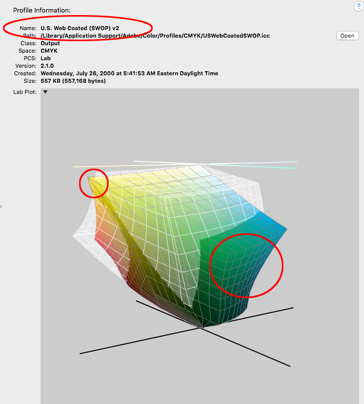
CMYK and RGB gamuts typically intersect—the CMYK space might not be totally contained within an RGB space. There are SWOP CMYK colors (cyan/gereens and yellows) that would get clipped (not displayed accurately) on an sRGB display. You can see the problem using Apple’s ColorSync utility, which lets you compare 3D plots of different color spaces.
Here is sRGB shown in white compared to US Web SWOP Coated in color. You can see that there is a significant percentage of SWOP CMYK color than cannot be accurately displayed in the small sRGB space, and there would also be even more Pantone solid ink colors outside of the sRGB space:


