 Adobe Community
- Home
- InDesign
- Discussions
- How to go about setting a »No hyphenation book«?
- How to go about setting a »No hyphenation book«?
Copy link to clipboard
Copied
Hi there!
I am about to do the text setting of a 200+ pages book in which for a certain reason hyphenation is not allowed. It will feature quite normal page layout dimensions and justified text of may be 10 pt and everything – but again: no hyphenation.
I can think of two ways trying to minimize the bad optical consequences of this harsh constraint:
- Kind of loosing the Justification settings
- Picking a typeface, that first of all fits well under these circumstances especially
Anybody around here, with some in deep experiences with a task like this? What else would you suggest?
Thanks a lot!
 1 Correct answer
My problem with this is that I kind of detest glyph scaling values other than 100 %. Even 99/100/101 gives me sleeping problems. So I have to stick with Word and Letter Spacing basically. And with selecting a suitable typeface for this task of course. I did quite some testing these days, and I found those four to be about the best ones:
Adobe Garamond Pro
Charter
Life
Quay
Copy link to clipboard
Copied
Designing the book with a longer line length.
For example, a wide 1-column layout will have less need for hyphenation and justified white spaces than a 2- or 3-column layout.
Also choose a font with a taller x-height, such as Noto Sans & Serif https://fonts.google.com/?query=Noto. Or Roberto https://fonts.google.com/?query=roboto
| Classes & Books for Accessible InDesign, PDFs & MS Office |
Copy link to clipboard
Copied
Bevi has given you good advice but justified text with no hyphenation will never yield a very good result. If you want to break rules like this, it's usually a good idea to tell us why.
Copy link to clipboard
Copied
Yeah, no question about it. But in this case, it’s a matter of sacrifice one thing in order to achieve another thing (which my client needs). And I’m up to minimize the damage that sacrifice may cause 😉
This includes selecting the »ideal« typeface(s) for this. In combination with some (yet to be elaborated) smart H&J settings, I believe that a result is possible, which is at least uhm, acceptable.
I tried Bevi’s fonts as well as some others before. It’s interesting that under this crucial circumstances they all »behave« differently, and even more that good old Adobe Garamond Pro is among those doing quite well here.
Copy link to clipboard
Copied
Work with Paragraph Styles!
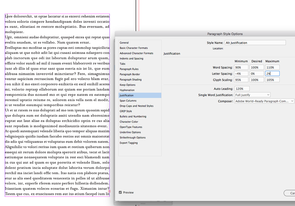
In my experience, I had similiar tasks, I got the best results if I did some adjustments in the Justification section of the Paragraph Styles. Depending on the selected font and the selected lenght of the lines and paragraphs (the longer the better) I did not only allow the spaces between words, but also between the glyphs to have a range. In the last caste I allowed the space between the glyphs -4% 0% 5%.
Copy link to clipboard
Copied
Yep! Especially that Letter Spacing Minimum value of -4 or even -5 seems to do half of the trick. While pumping up the Maximum does not, for me.
Copy link to clipboard
Copied
By the way: Can I make InDesign’s preflight detect (and count) any of those famous »Yellow H&J Violations« within my document? I tried it, but in vain.
Copy link to clipboard
Copied
you can define the range preflight is detecting, by creating custom profile and checking some of the text options.
Copy link to clipboard
Copied
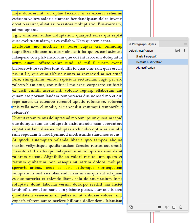
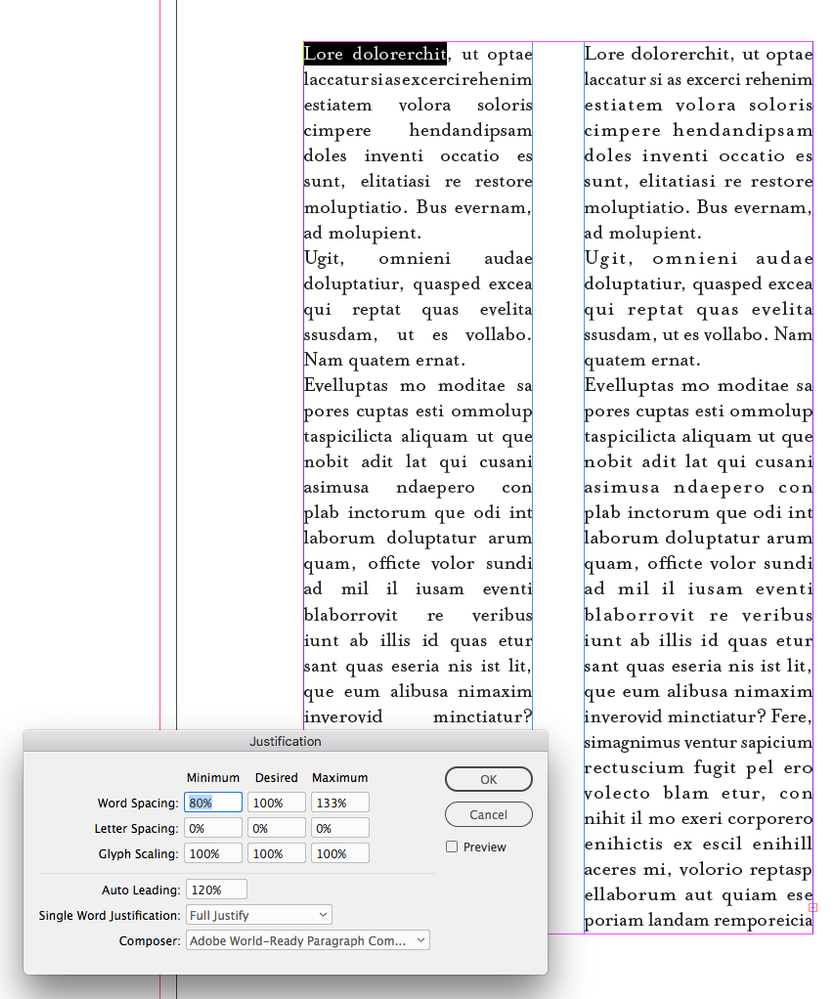
There’s not a justification preflight rule, but the more flexible the Justification settings are, the fewer violations:
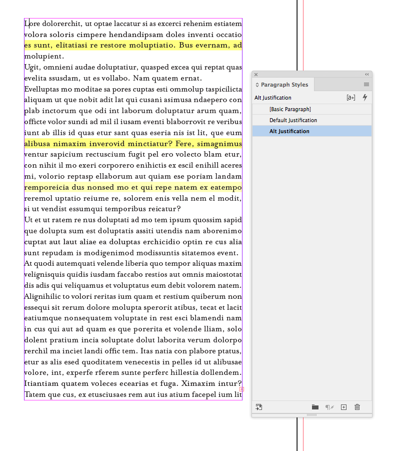
With a more generous glyph scaling there are no violations:
Copy link to clipboard
Copied
Sure, that is no surprise. But the more generous you allow the H&J values to be, the worse will the result look like.
Copy link to clipboard
Copied
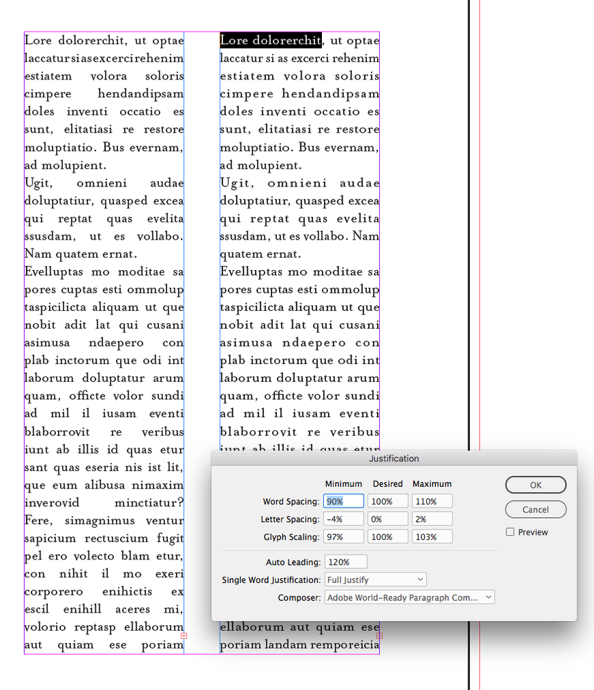
The problem with the default justification, no hyphenation, and short measures, is the Min & Max Word Spacing. I can tighten those allowances, and compensate with Letter Spacing and Glyph Scaling. I can’t easily see the difference between 97% and 95% glyph scaling, or a 4% change in letterspacing, but the rivers created by 133% max word space are more than obvious.
Copy link to clipboard
Copied
My problem with this is that I kind of detest glyph scaling values other than 100 %. Even 99/100/101 gives me sleeping problems. So I have to stick with Word and Letter Spacing basically. And with selecting a suitable typeface for this task of course. I did quite some testing these days, and I found those four to be about the best ones:
Adobe Garamond Pro
Charter
Life
Quay
Copy link to clipboard
Copied
The typeface would have an affect, as well as the point size—in the end it’s the average number of characters per line that will determine whether there will be problems with justification. You certainly can improve how text will justify by changing the defaults.
With a very tight measure—4-6 words per line— you can see the problem with default Justification and no hyphenation on the left vs. a custom Justification on the right:
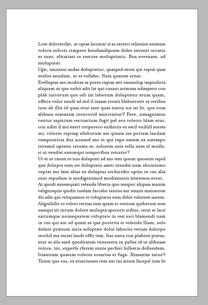
A 4" column with 12/14 text and no hyphenation:


