 Adobe Community
- Home
- InDesign
- Discussions
- Re: Image saturation suddenly varies between Indes...
- Re: Image saturation suddenly varies between Indes...

Copy link to clipboard
Copied
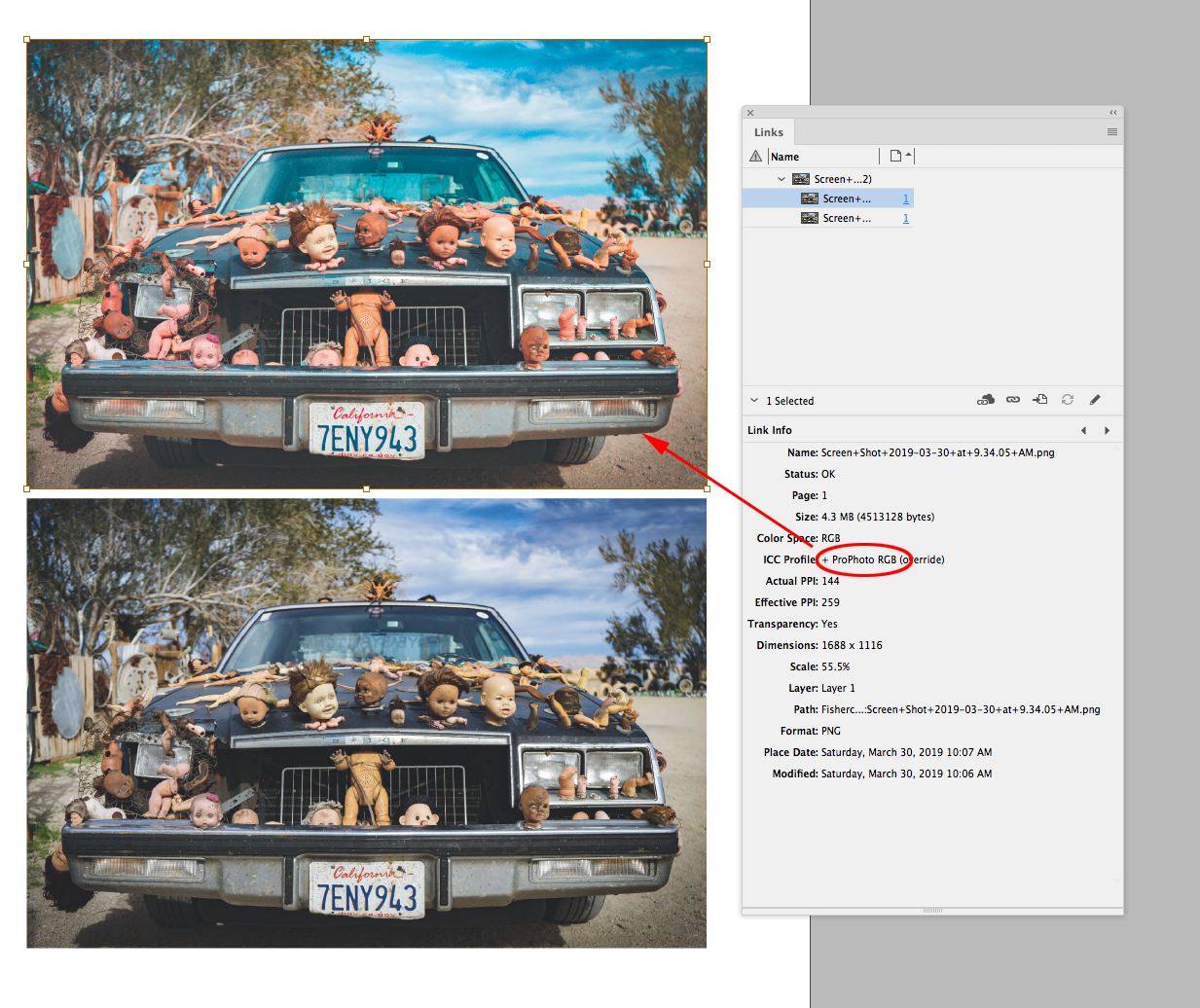
I am working on a project in Indesign and flipping back and forth between it and Lightroom. Everything was fine at first, all images looked good in Indesign, then something happened and now all of the images are overly saturated in Indesign. I don't remember changing any settings, but may have hit a hot key that changed it? Any help is appreciated! (First image is the Indesign photo, second is Lightroom)


 1 Correct answer
Thanks all for your help. Turns out it was an even simpler fix than I thought:
Instead of hitting Shift + W to view my document in Presentation mode, I accidentally hit Shift + E which toggles GPU mode. In trying to figure out the problem I accidentally hit Shift + E again, turning GPU mode off and returning the photos to their original colors. I don't totally understand what GPU is or why I would want it, so any comments on that would be appreciated as well!
 10
Replies
10
10
Replies
10

Copy link to clipboard
Copied
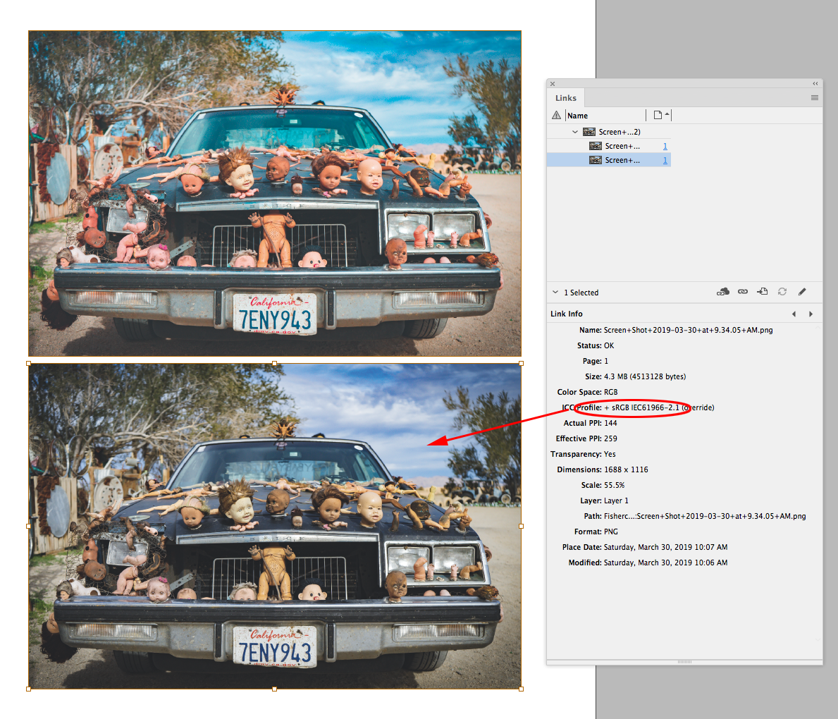
It looks like the bottom image has sRGB or a monitor profile assigned, and the top image has the same RGB values, but with ProPhoto RGB or some other wide gamut RGB profiled assigned.
If you place an RGB image saved with no embedded color profile, the InDesign document’s assigned profile is used to color manage the placed image. Check your document's assigned profile (Edit>Assign Profiles...), and also select the image and check its profile in the Links Info panel.
Copy link to clipboard
Copied
As Rob describes it is most likely a missmatch in ICC profiles, and/or assumed differences in ICC profiles. (Personally I am a bit on the side to avoid ProPhoto since it may mean I am working with theoretical colours that cannot be displayed on most monitors today)
Copy link to clipboard
Copied
Personally I am a bit on the side to avoid ProPhoto since it may mean I am working with theoretical colours that cannot be displayed on most monitors today
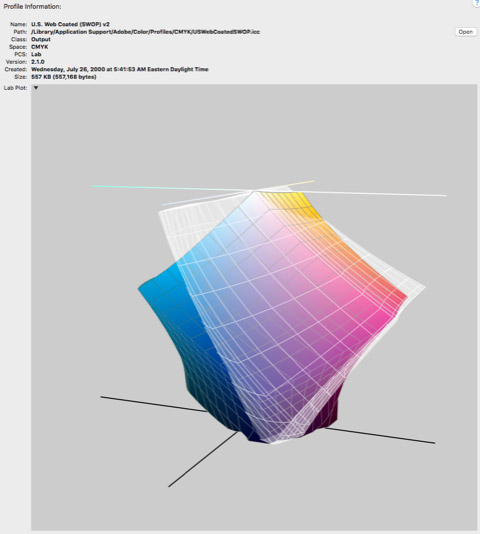
Small RGB spaces like sRGB have the opposite problem—they usually clip the CMYK print gamut. CMYK and RGB spaces normally intersect (CMYK doesn't necessarily fit entirely inside of the sRGB color space), so there is a large chunk of the printable CMYK space that is outside of the smaller sRGB gamut, which you can’t get at when editing with sRGB.
So sRGB might be better if you can’t get a contract proof (really ?!), and you are outputting blind. But you have to be willing to work with the extra small gamut where sRGB and CMYK intersect.
Here's default SWOP Coated compared to sRGB (the white plot)—you can see the significant parts of the cyan/blue and yellow CMYK gamut you give up when working in sRGB.
Copy link to clipboard
Copied
Rob, I am not saying sRGB is the ideal. Just saying I would not go with ProPhoto. Personally I use sRGB where possible because, but if I need a fuller Gamut there are ECI RGB or AdobeRGB as better alternatives, and where necessary it is possible to work in the CMYK of the output process.
Copy link to clipboard
Copied
Just saying I would not go with ProPhoto.
If you don‘t have control over the final conversion into the print space ProPhoto can indeed be a problem. I think it has gotten a bad reputation because if it gets sent out to an unknown print provider, and the ProPhoto RGB profile gets stripped, or a random default profile like sRGB is assigned as the source, the result could be very bad (the OP’s top image would be an example)
If you do have control over the conversion to the final CMYK space (or are sending to a trusted print vendor that understands CM), the only difference you would see in a conversion from AdobeRGB to CMYK vs. ProPhoto to CMYK would be colors on the outer edges of the destination CMYK gamut (i.e. 100% Cyan) that are not in the AdobeRGB gamut.
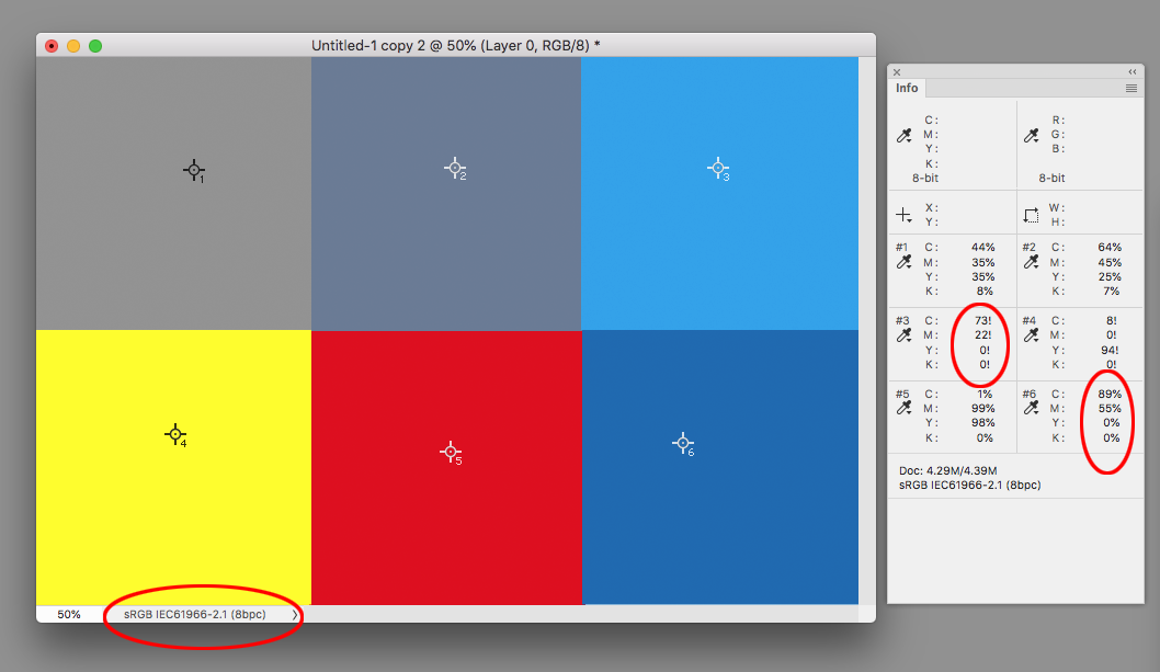
So in this ProPhoto RGB example there are 2 patches that are out-of-gamut to the GRACol Coated destination—a saturated cyan and yellow. You can see the conversion will be close to pure 100% cyan and 100% yellow

If I make a conversion into the smaller AdobeRGB space, the shared in-gamut colors get identical conversions to GRACol CMYK, but the out of gamut cyan and yellow patches get contaminated because parts of the GRACol CMYK space are still outside of AdobeRGB.

Copy link to clipboard
Copied
Note that the exclamation mark in the values means you are out of gamut. (i.e. 100% C is the closest you can get to the colour you have defined) Yes the Adobe RGB has a problem with the pure yellow, which is where the ECI RGB comes in. (And there are several other RGB spaces that have wrestled with this problem)
My point was to be weary of creating colours that you can neither see nor print. I am not saying that it is wrong to use Prophoto, but there are many redundant colours that can not be displayed or printed. More is not always better. The redundancy to accommodate the extreme colours comes at the cost of having less granularity between those colours that can be seen and printed.
ColourSync has problems displaying ProphotoRGB in comparison, but this is an attempt to visualise what I am talking about. The inner area is an iMac screen, colours you can display as you are editing your photos. The light grey are all the colours you can create but not see on your monitor, and yes there is a fraction of those colours that you can print, but not see on your monitor (you can compare with your calibrated monitor to understand better how much of the ProphotoRGB you cannot see in on your device).
If you must push use Prophoto RGB please push use 16bit colour for that RGB to make sure you have enough granularity between colours. Colour quality is more than the extreme colours. No colour space is bad, but each has it's strengths and weaknesses.
Copy link to clipboard
Copied
If you must push use Prophoto RGB
Just to be clear I‘m not pushing for any RGB editing space, just noting the very real print limitations with a smaller space like sRGB. I would not use ProPhoto when there is no contract proofing before going to press. If the output is to a wider gamut device like CcMmYKk inkjet, the limited sRGB gamut might be even more of a problem.
Note that the exclamation mark in the values means you are out of gamut.
Yes I know, I selected the 2 out-of gamut colors to show the CMYK clipping that happens with smaller RGB spaces. Note that for the shared in-gamut colors the conversion for ProPhoto and Adobe RGB to CMYK is the same.
ProPhoto does a better job bringing the colors out on the edge of the CMYK gamut into gamut. You can edit in ProPhoto and still get a preview of the conversion to any CMYK print space via Proof Colors, and see the final output numbers in Info, but you do want control over the final conversion, and some understanding of CMYK output numbers, or risk a bad conversion from an unknown printer.
If I convert the same swatches to sRGB the gamut clipping to GRACol gets really bad with the cyan and blue and the yellow shifts to green 8|0|94|0:
Copy link to clipboard
Copied
Thanks all for your help. Turns out it was an even simpler fix than I thought:
Instead of hitting Shift + W to view my document in Presentation mode, I accidentally hit Shift + E which toggles GPU mode. In trying to figure out the problem I accidentally hit Shift + E again, turning GPU mode off and returning the photos to their original colors. I don't totally understand what GPU is or why I would want it, so any comments on that would be appreciated as well!
Copy link to clipboard
Copied
 Ok. GPU is the Graphics Processor, this is the part of the computer that prepares images for the screen. Depending on your hardware this can have limitations that make your graphics display faster, but during this tech transition phase with some loss of quality in certain cases.

Copy link to clipboard
Copied
Thank you so much Ellen! I've been going crazy over this for months!!

 AdChoices