 Adobe Community
- Home
- InDesign
- Discussions
- One Pantone colour and CMYK values has different H...
- One Pantone colour and CMYK values has different H...
Copy link to clipboard
Copied
Hi all,
I have two indesign documents. In both I have specified a colour to be Pantone 7363 CP. In each the CMYK values are the same. However, the Hex and Lab are both different! What's going on here?
Thanks for your help,
Andy
 1 Correct answer
The CP colors are PANTONE+ Color Bridge swatches, and are defined as Process CMYK—they are CMYK simulations of the PANTONE + Solid ink spot colors.
Like any CMYK defined swatches they change appearance depending on the document’s assigned CMYK profile. When the color appearance changes, the conversion to the Hex (RGB) or Lab color spaces would produce new values representing the changed color appearance.
So the expected appearance of CMYK 100|63|12|67 on coated paper on a US Sheetfed Press w
...Copy link to clipboard
Copied
(Update, I discovered I'd assigned different CMYK profiles to each document. However, I'm not sure why that changed the LAB, and HEX, while CMYK was unaffected. Also, it changed the actual appearance of the colour on screen. Again, in a document for print, where the CMYK remained the same, I'm not understanding why the digital representation changed. In both documents the RGB profiles were the same.)
Copy link to clipboard
Copied
The CP colors are PANTONE+ Color Bridge swatches, and are defined as Process CMYK—they are CMYK simulations of the PANTONE + Solid ink spot colors.
Like any CMYK defined swatches they change appearance depending on the document’s assigned CMYK profile. When the color appearance changes, the conversion to the Hex (RGB) or Lab color spaces would produce new values representing the changed color appearance.
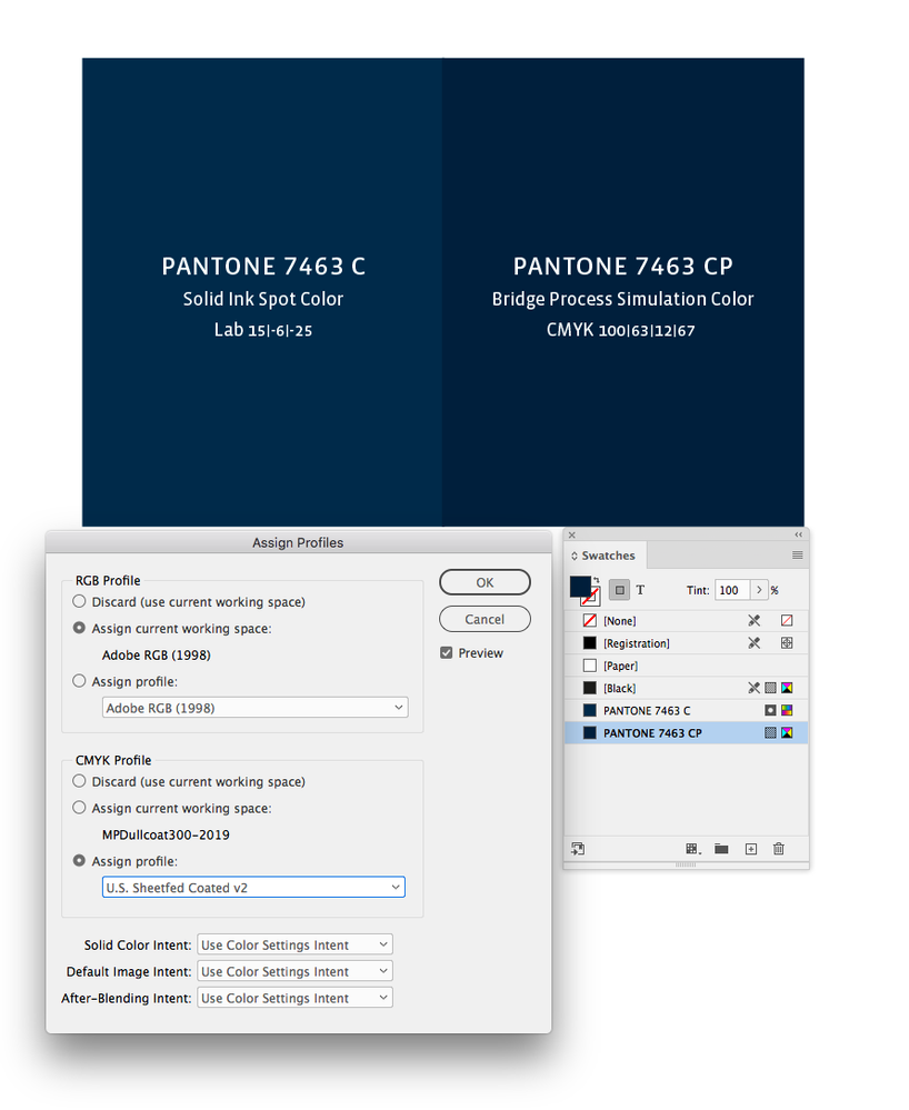
So the expected appearance of CMYK 100|63|12|67 on coated paper on a US Sheetfed Press would be this:
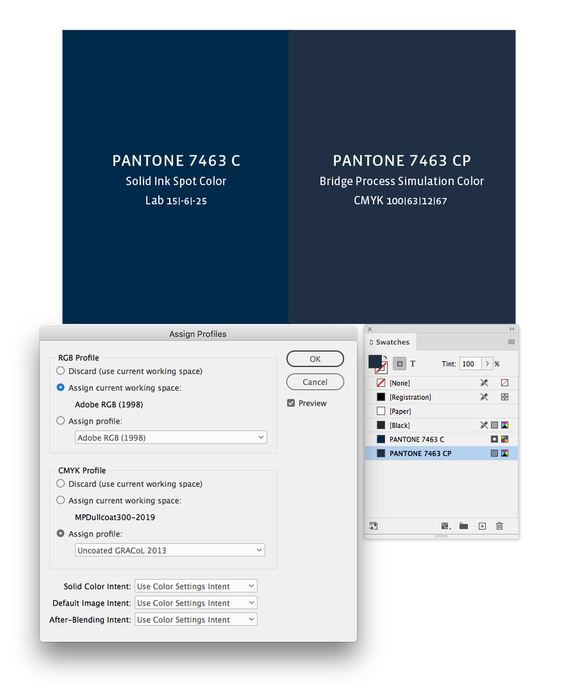
But if the assigned profile is for an uncoated sheet running on a GRACol press the appearance for the same numbers would be this:
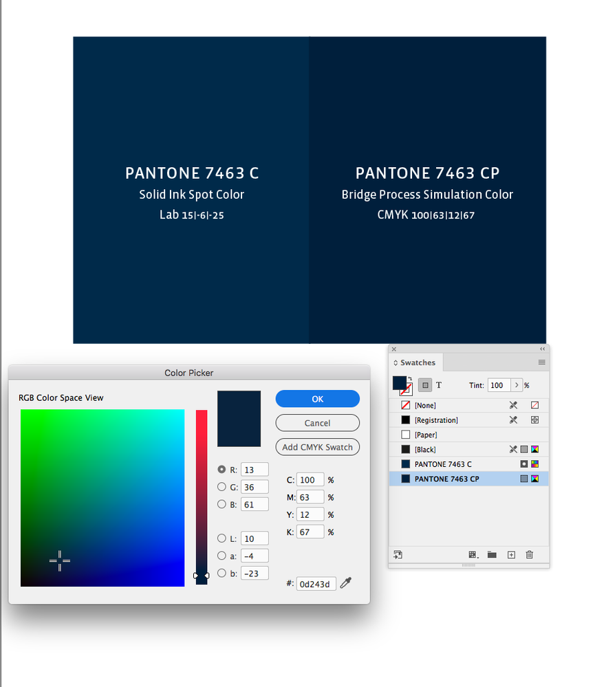
The InDesign Color picker shows the conversion from the source CMYK values to Lab or RGB, and I get different conversion values for the selected CMYK color depending on the document CMYK profile. The RGB conversion in this case is US Sheetfed Coated to AdobeRGB (my document’s RGB profile assignment):
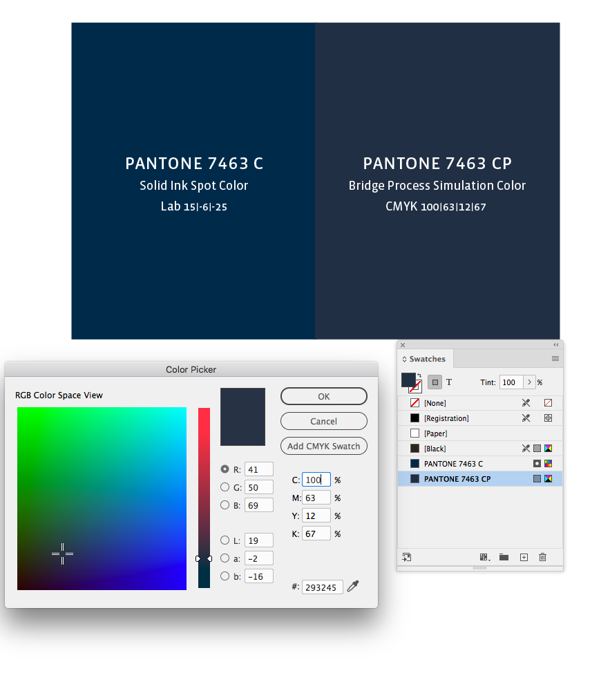
And the conversion from Uncoated GRACol to AdobeRGB:
Copy link to clipboard
Copied
Hi there Rob,
Thanks for the thorough and excellent answer. Massively appreciate the visuals.
Only, it makes me wonder what the point in CP colours are? It seems I have erroneously expected CP to constrain the CMYK output to match the Solid Coated colour (as near as process can), whereas it seems they only indicate a rough CMYK match in a particular environment. So, I'm not sure why CP specifications would ever be useful. It seems it would always be better to specify C or U, and let the programme or printer determine the best CMYK match in that situation.
What do you think?
Thanks again for getting involved and sharing the knowledge,
Andy
Copy link to clipboard
Copied
It seems it would always be better to specify C or U, and let the programme or printer determine the best CMYK match in that situation.
Right, the Bridge libraries are device specific and Pantone does not publish the output profile.
Also, the old CS6 Bridge libraries that still ship with ID, have inconsistencies that don’t make sense—the colors within the library seem like they have been converted with different profiles. The latest Bridge swatches, which you can get via the Pantone Connect plugin, seemed to have fixed those problems, but I still think it would be better to use the Solid+ Coated library as the color source, and make the conversion into the correct CMYK space.
There are also problems with using Ink Manger and Spot Tints, so it can be better to set the Solid Ink color to Process and convert to CMYK from the Swatches panel, in that case the document’s assigned CMYK profile will be used for the conversion. Converting from the Lab source values should make the best conversion, but the destination profile has to be correct.
The thread might be useful:
https://community.adobe.com/t5/indesign/branding-color-guide/td-p/10818696?page=1
Copy link to clipboard
Copied
Wow, thanks Rob,
This looks fascinating, though admittedly, my head is still stretching to absorb the knowledge.
It seems, re the Pantone Bridge books, that their value is 1. to give Hex values for sRGB, and 2. to give an indication of whether a colour can be represented in CMYK. But, the actual CMYK values are virtually pointless. Gosh, it would help if Pantone were very clear about what their books do and don't do. (Although, I note that they are not good at giving clear information in other instances too. For example, indentifying which generation a colour book belongs to. This requires detective work rather than as simple '2016 series' printed on the cover. And their reasoning behind their numbering systems could also do with being clearly published.)
Your thread is extremely interesting, and like the others, I thank you for your work. I have one question. You write 'And the Bridge CMYK values display inconsistently relative to the more accurate solid ink Lab color display.' I'm not massively familiar with Lab color, nor am I quite sure what you mean here. Can you point me to any threads/resources to get a better grip of when to use Lab? Until now, Pantone, CMYK, and RGB are the only ones I specify in, so it would be good to know when and how to use Lab.
Thanks again. Love your care for this area,
Andy


