

Pantone to 4C conversion wrong per spec swatches

Copy link to clipboard
Copied
I work for a printer and we have been coming across a new problem that seems to have started with CS6 suites (InDesign, Illustrator, Photoshop).
That being, we get pieces of art that use spot color, but want to print their piece four color due to the cost of separate plates.
What I am finding is when we use the ink manager to convert PMS to CMYK, the actual color breakdown from PANTONE is incorrect in CS6 to current.
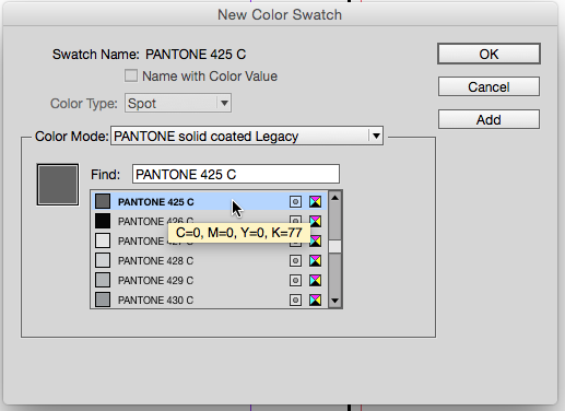
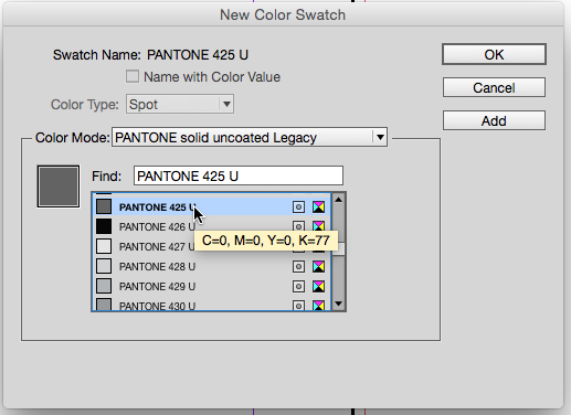
Here is an example PANTONE 425 C converted to 4 color should be C:0 M:0 Y:0 K: 77 This is directly from "Pantone solid to process guide" swatch book.
When I use the color palette or ink manager this is the breakdown I get C:62.29 M:51.48 Y:49.24 K:34.92, which is wrong and completely plays havoc with the press and our operators.
Has anyone else in the Prepress arena had this problem and what are your solutions, other then double checking every spot to conversion?
My question to Adobe is why has this happened? It is uniform across the board in all apps, prior to CS6 conversion worked correctly.


 9
Replies
9
9
Replies
9

Copy link to clipboard
Copied
My question to Adobe is why has this happened? It is uniform across the board in all apps, prior to CS6 conversion worked correctly.
Starting with CS6 Pantone changed their swatch color definitions. There is now a clearer difference between spot color libraries (i.e., PANTONE+ Solid Coated) and process color simulations of their solid ink libraries (i.e., PANTONE+ Color Bridge Coated). The solid color libraries are defined as Spot color with device independent Lab values. The Bridge libraries are defined as process color with Pantone's recommended, (device dependent) CMYK definitions.
If you convert the solid color spot swatches via Ink Manager, the conversion is color managed and the results would depend on the document's CMYK profile. If you don't like Pantone's Bridge CMYK values it is possible to go to an older version of InDesign and get the legacy libraries and use those swatches in newer versions.
More in this thread:
Copy link to clipboard
Copied
Hey Rob, I went and did some investigating today, and it turns out that the Pantone Bridge Coated and Uncoated Guide color conversion mixes changed from the same year CS6 came out. The reason I know this is because I have an old Solid to process guide from Pantone dated 2001. Not only that they have stated in numerous community threads on their website that yes, they update and change the colors. So the conversions in the Creative Suites are working correctly, my company is using an older guide and matching from that, which in most cases—is what works best for our commercial offset presses.
I do appreciate the feedback, and did double check to make sure I had the most current plug-ins for the Pantone Books, and it did lead me to other avenues for answers.
Have a great day 
Kimberly
Copy link to clipboard
Copied
it turns out that the Pantone Bridge Coated and Uncoated Guide color conversion mixes changed from the same year CS6 came out.
Yes that's right. Prior to CS6 all of the libraries actually had the same CMYK definitions, with the exception of Photoshop (Photoshop has always used Lab values for its solid ink libraries). The Pantone+ Bridge Libraries were introduced with CS6, for users who wanted a single Pantone defined CMYK simulation, and they are very different than the legacy library builds.
I still have the legacy libraries and you can see the swatches are all defined the same, which made it impossible to have an accurate screen preview when the intended output was a spot color ink and not a process conversion.
The newer Lab values for the solid inks display out-of-gamut colors and coated vs. uncoated more accurately. Also the color appearance is not affected by the document's CMYK profile, so they preview better for spot output.
The Bridge neutral grays can be problematic because I'm not sure Pantone publishes the CMYK space that was used to make the conversion for the process Bridge library. The older libraries were obviously hand built because you wouldn't get the black only 77%K conversion with a typical CMYK profile.
The Bridge values for 425 certainly don't seem right under almost any press conditions—I think the conversion of the solid Lab values you were showing (to GRACol?) would be better assuming the press is printing to GRACol.


Copy link to clipboard
Copied
We will continue to watch the color conversion and do what is correct for our offset press. They have not switched to GRACol yet, we have been updating to a new rollers program. Once that is in place we will be switching to a new RIP server system and calibrate our proof system to GRACol, then the presses to GRACol.
However I m on the GRACol system for our digital press and generally we hit color (including spot conversions) almost perfect. As you can tell I am juggling multiple color systems (one for offset press and one for digital), at least it makes the day interesting.
I thank you for all your information and help it was very informative and hopefully we can help others with this post.

Copy link to clipboard
Copied
Surely there is an option on your RIP to manually specify the CMYK you want to replace each spot with?
But then watch out that your RIP doesn't also try to colour manage that value!! 
I thought there might be a work-around to this by creating another spot colour based on CMYK values and then aliasing that to the Pantone you're wanting to separate. But when you select all spots to process in the ink manager it breaks all the links/aliases before converting... 
You could: (1) export a PDF with the "CMYK-based spot" as alias to the Pantone, then (2) place the PDF in InDesign again and export again with all spots to process selected. This should work, but is quite messy. (Probably safer to use the RIP or PDF editing software.)
Copy link to clipboard
Copied
Our RIP software is really old and we are in the process of updating and converting to the GRACol industry standard.
However we tend to get art from clients in the PDF format, and from there we can alias a Pantone to the color mix we want for one color and this has worked really easy.
It doesn't occur all the time but when it does it generally starts with design not being thought through to the end and how the final will print. I have had designers using registration for their black, or a four color black using a color mix without 100% K (all you really need for a richer black is about 20% C, 100% K), or converting their Pantone colors themselves without checking the color conversion and making sure it's consistent throughout the design. Then wondering why the printed pieces is not looking right.
For most problems we encounter we have found a work around, but I just didn't realize how much of a shift Pantone had created in SOME of their color conversions from Pantone solid to four color CMYK. It was explained to me—by Pantone—that these changes in mix occur because they take into consideration the changes in paper, ink and even printing press changes. The changes are not just to the conversion colors either, our ink guy said the Pantone formulas change minutely as well over the years. I guess it just threw me because—you think industry standard—I expected it to not change. But reflecting on that, even industry standards change and update, why wouldn't Pantone colors? Sorta a DUH moment for me.
Again thanks to all who contribute to this discussion thread, it has helped me and hopefully others.
Copy link to clipboard
Copied
It was explained to me—by Pantone—that these changes in mix occur because they take into consideration the changes in paper, ink and even printing press changes.
The changes made starting with CS6 were not simply a tweak of existing color swatch definitions, the color models and libraries were completely rethought and changed. With the legacy all CMYK libraries it was impossible to reliably color manage a solid ink spot color either for screen soft proofing, or for a conversion from the solid ink to a process CMYK simulation. That's why many RIPs resorted to lookup tables for CMYK process simulations.
In the old system you could not correctly display a color like Pantone Purple C because that color does not exist in any real world CMYK space. You also couldn't tailor a conversion from a solid ink to CMYK for a specific press condition. The new Lab definitions solve both of those problems.
Providing a single CMYK definition always created a color management problem—and it's still a problem with Bridge swatches—but at least the CMYK definitions have been relegated to a separate library.
Copy link to clipboard
Copied
I thought there might be a work-around to this by creating another spot colour based on CMYK values and then aliasing that to the Pantone you're wanting to separate. But when you select all spots to process in the ink manager it breaks all the links/aliases before converting...
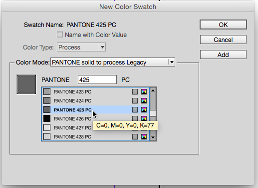
Aliasing should work. Here I want to alias the 425C Lab swatch to the legacy CMYK definition, so I make a CMYK defined spot swatch (77%K) named PANTONE 425 PC:
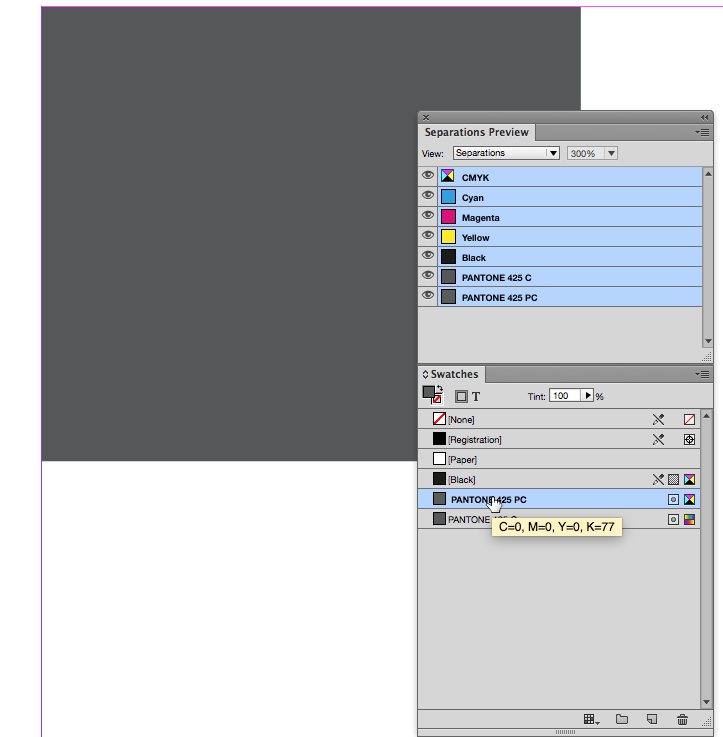
In Ink Manager I alias 425C to 425PC and then set only 425PC to output as process—don't set both colors to process

My rectangle filled with 425C now separates as the 77% Black defined in the 425PC swatch

Exported to PDF/X-4:

Copy link to clipboard
Copied
Voila!

 AdChoices